How Much Effort Would a Completely New UI be?

Hi,

For those who have experience customizing TiddlyWiki’s UI: How much effort and skill would be required to make a site that doesn’t look or feel like a wiki at all?

I am thinking of websites like Amazon, Facebook, etc… that do have a “modern web app feeling” (built with something like React, etc.), powered by TW but where a user wouldn’t guess it’s TiddlyWiki.

Is this realistically achievable with just advanced CSS, or does it require deep JavaScript and custom widget development?

I’m trying to understand the time, effort, and skills needed to achieve a truly modern, non-wiki appearance.

If not achievable at all, how far can a reasonable amount of time and skill can take you?

I think this really depends on what you think “looks like a wiki” — and arguably, to people who are most familiar with Wikipedia and other MediaWiki-powered sites, TW is already quite distinct! :wink:

Vanilla TW does have a very distinctive, somewhat dated look to it, though, and if that’s your primary issue, “fixing” it could be as simple as switching to a more modern theme. Notebook comes to mind, but there are a number of others. Talk TW is a good place to find people’s personal recommendations, and I think the CPL is probably the largest single repository of themes and plugins of all types, though I find it somewhat difficult to search — YMMV, of course.

At the other end of the spectrum, it’s possible to design your own custom web app either from scratch or by assembling plugins shared by other users — though building a “from-scratch” site will require a relatively deep understanding of TW widgets and filters as well as web dev staples like HTML and CSS, and even just curating the right collection of plugins can take time, thought, and web search proficiency.

TW has been used as the backend for blogs, ebooks, historical atlases, genealogical research tools, and even online storefronts (where I believe @Siniy-Kit also uses Google Spreadsheets to manage inventory and orders, as he alludes to here), and you can find more examples of what people have been building (and sometimes even how they built it) in the Showcase category here at Talk TW. But to my knowledge, there aren’t any extant wizards to walk you through creating a new app from scratch, so while you may not need any Javascript background, you will need to be quite comfortable with TW techniques.

1 Like

Another example I think applies here are the TTRPG tiddlywikis showcased here too. Some of them really look like tools used for D&D, custom page backgrounds, fonts, and buttons and even custom viewTemplates can really make TiddlyWiki look like a whole new program.

It’s my impression that a substantially different look starts with a custom layout. I’ve never tried creating one, but a did read through @Brian_Radspinner’s comprehensive tutorial at one point, and my impression that this is not for the faint of heart, but does not have to be overwhelming. It does require some basic TW skills and at least intermediate HTML/CSS knowledge.

But what does your “doesn’t look or feel like a wiki at all?” mean? @Jeremyruston’s commercial site, https://www.intertwingledinnovations.com/ is not a wiki, but except for a beautiful animation on load, looks a lot like a read-only TiddlyWiki… quite intentionally, I’m sure. @Christian_Byron’s HexMap and my Periodic Table show tiddlers with unconventional layout and interactivity, but within an otherwise normal looking TW. @Charlie_Veniot’s Basic Anywhere Machine has a custom layout designed like a WIMP interface. So there’s a lot you could do if you set your mind to it. But what do you actually want to do?

1 Like

IMO a completely new page-template and all new view-templates would be needed. Editing may be similar, but would be new too, to fit the new page-template.

Completely new CSS, since new page-template structure will be different.

No JavaScript changes would be needed.

hmmm.

  • Amanzon.com or in my case amazon.de has no UI at all, that would allow me to create any content and manage it.
  • I personally would think about something like WordPress, Drupal any other publishing and content management system.
  • Most of the time here in the forum TW is compared to Obsidian, Notion or other apps, that can do Journaling.

IMO it depends, what you really want to achieve. If you really want something completely new. You need to ignore UI backwards compatibility.

For a working POC (proof of concept), you would probably be good to go with 80 hours. Iff you completely borrow the UI concept from someone else.

For a full blown system UI with feature parity with the current TW UI, zero backwards compatibility, 2020 browser CSS tech, I guess: 6 man months full time - Excluding 2 months of planning and designing new reusable elements. If you want to make accessibility a main feature, you can double that time, except if you are an accessibility expert.

-m

1 Like

Hello @LoryMoney,

Not knowing your background or skill set, I would take a look at some other threads.
CSS Grid and Flexbox have been used by others on this forum.
Namely @Brian_Radspinner , @BurningTreeC and @Mohammad and others.

Grid CSS in Tiddlywiki Demystified
Grid CSS to Create a Vertical Tab Like Structure
Grid CSS to Create Left Sidebar and a Story River

Tutorial: a basic alternative layout

TiddlyFlex - a new Flexbox Layout for TiddlyWiki
TiddlyFlex v0.7.12

I hope this may give you an idea on what can be achieved and adapted depending on your timescales.

Thanks all for the responses, interesting resources emerged from the question, I think @Brian_Radspinner tutorial might be a good place to grasp the basics.

Wow! My uninformed guess was a couple of weeks of merging and joining already made solutions, I can see that the 1year full time job implies that it is not a simple task at all.
I think it will be quite cool to have Wordpress like UIs with TWs backend.

It’s not complicated if you know the existing structure - It’s complex and a lot of work.

I have to say, that I am talking about a complete re-imagination of the whole UI starting at the PageTemplate level.

Others have mentioned some very nice tweaks to the existing UI structure.

Eg: The Notebook or the Navigator Theme, which imo look nice, but still have there problems, with palette switches. IMO palettes are highly important and they are quite some work to get right.

The existing palette mechanism is based on 2014 tech. At that time is was modern. CSS could not handle any variables. Our TW palette could. But now CSS can handle variables natively, which needs a fundamentally new CSS concept.

Look at the Memory Keeper UI which uses the Navigator Theme, but seems to make it’s own changes, which completely disabled palette change.

But IMO it has the best “Hide the right sidebar” feature of all themes I know.
You would first need to do some re-engineering to move everything into a new theme plugin to make it easy available. (I think it’s not available as a plugin. At least I do not know.)

A new PageTemplate concept that I have in mind, would make it easy to create a multi-column TiddlyFlex like UI. It should not implement it, but it should keep it in mind, so it may be easier to be implemented, as it is now. (OK this one will need some JavaScript modifications too.)

BTW TiddlyFlex is a mod, that defines most of the PageTemplates new. It’s a new layout.

Left Sidebar. Right Sidebar. … which one do you prefer. The new concept should make that one easy. …

There are probably a 100 more features, that are difficult to implement atm. There are a probably a 100 things, that we did wrong in the current structure, but backwards compatibility makes changes hard.

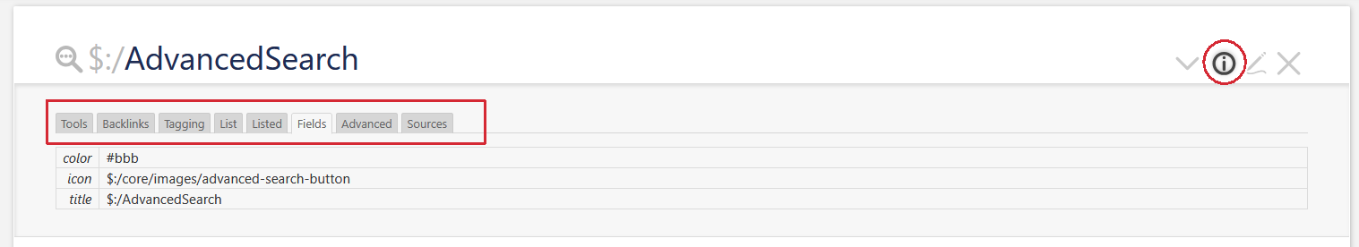
Keep in mind the UI did grow organically since 2014. Have a look at TW v5.1.0 and look at the Right sidebar → Tools or the ControlPanel → Info → Advanced and compare it with v5.3.8

The tiddler info system needs an overhaul. It contains a lot of useful information that is hidden by default. We need to move it to the bottom of the tiddler and make it available with 1 click.

Show Tiddler Info Screenshot

and - and - and
-m

I gained more of a website look to an old, never finished and now abandoned blog site just bu manipulating a few existing features on an version of tiddlywiki. Had I used the single tiddler view many would think it was a stangard website.

  • Move more out of the sideBar into the menus
  • Also consider mobile or responcive views
  • Consider speed and load times and SEO

https://tones-blog.tiddlyhost.com/
2025-10-22_12-05-04.PNG

And use newer features as @pmario discussed.

  • Sadly as long as a piece of string. In any website design or redesign I have done for clients it all depends on how fussy and the details the client has and develops over the life of a project. It is never known fully at the begining.

The Key to doesn’t look or feel like a wiki at all

  • Hide waway tiddlywiki specifics.
  • Provision equivalents to commonly found website elements.
  • Keep your revised elements independant of the underlying wiki so you can;
    • Apply elsewhere
    • Retain insight to your customisations for maintanance
    • Upgrade the underlying wiki

It took me a couple of weeks to shroud my wife’s portfolio TiddlyWiki for a university course. To look at, it’s much like a blog, I guess – certainly nothing like a TiddlyWiki. When viewed offline (i.e. locally) it’s a bona fide TiddlyWiki; online it’s a presentation piece. Indedd (and if I recall correctly) the visitor is invited to hit F11 on entry to make the presentation full-screen…

No JS, 4.5 tonnes of CSS, 7 gallons of wikitext and a pinch of config settings (the vast majority of which I don’t now recall).

1 Like

The more skill, the less time, but it also depends on what you are trying to achieve.

If you are working from an existing layout ( your own or someone else’s ) you’ll probably spend more time just familiarizing yourself with all the TiddlyWiki elements that would still be useful and figuring out how to integrate them.

If you are starting from scratch—and not a professional web designer—it could be an endless process of working and re-working. My main notebook wiki is a constant experiment that never feels quite complete and tends to break if I get a brand new idea to try and integrate. I’ve recently put out a few past snapshots of my layout experiments that I think may be of interest to at least a few people.

I can quickly work out an idea to the point of having a usable result for my own use but I’ve never achieved a properly-polished layout that I would be OK handing off to others.

This is spot on. Especially when I end up re-creating existing TiddlyWiki UI elements that are a relative pain to deal with because of the original HTML structure.

My main reason for even bothering with alternative layouts was, and still is, an excuse to keep learning about modern CSS, just for personal interest.

3 Likes

This…

and this…

is so true of TiddlyWiki – a tweaker’s paradise (or hell). See: When the joys become pitfalls

I see people respond by suggesting new page templates. IMO this will not drastically change the UI experience. What will is things like having ux to edit widgets, editing inline, a query language that is not unique only to TW, with a rich UI, etc.

1 Like

@LoryMoney this made me think of @EricShulman recently enhancing his pasteUp which is a way to present tiddlywiki in a graphical way but still including tiddlywiki content elements. In some ways this provides for “unbridled design” within a tiddler that can then be displayed as a page.

Also not TiddlyWiki could be used to build a website generator, exporting as pages content manage within it.

Neotw rolling — A modern notebook based on TiddlyWiki5

This centered page layout doesn’t look like a wiki.

My simple center layout is as follows.

My TiddlyWiki — a non-linear personal web notebook

Exactly!

The TiddlyTools - PasteUp.

It really helps visualize layouts.

The “visual” merit in working through a “grid” is design “feed-back”—tangible visible results—are quick.

In some cases you could easily use it to create a new “front end” without having to edit Layouts or Templates.

Just a comment
TT

I disagree. I mentioned @Charlie_Veniot’s Basic Anywhere Machine above. Does that look like a wiki to you?

Those sound like things that might well change the creator’s experience. But if I understand the OP correctly, the goal is to change the user’s experience.

@Scott_Sauyet mentioned my BASIC Anywhere Machine as an example of a TiddlyWiki that does not look like a TiddlyWiki anymore.

You might find it a whole lot easier to study this other TW instance that uses the same technique for laying an interface on top of the TW interface:

I’d forgotten that. I’d love to start playing that game again, but can’t get to neocities from within GigantiCorp. I’ll try to look tonight, and make a new suggestion, if you’re still interested in following up.

– Scott

Really, I completely lost interest in that thing long ago. Too many shiny objects fighting for my attention, never enough hours in a day.

1 Like