Per the suggestion of @saqimtiaz in another thread, I created a step-by-step for an Alternative Layout. The layout is basic so it can serve as an introductory lesson rather than a deep-dive.
If you want to jump ahead to the result, or read the tutorial in its proper TiddlyWiki form, go to:
A proper introduction
I started learning CSS Grid and CSS Flexobx soon after the official release that introduced Alternative Layouts. TiddlyWiki seemed like a great tool to practice on, as I could edit tiddlers and preview results very quickly.
I almost immediately ran into a recurring problem with TiddlyWiki’s UI elements: many instances of nested HTML elements (multiple layers of <span>s inside a container <div>, extra <p>s thrown in amongst transcluded lists of buttons). Flexbox and Grid, currently, only allow containers to effect direct children. A textbox inside 7 <span>s doesn’t work well when learning and wanting simple structures to experiment on. I started removing or re-making elements to keep HTML to a minimum. This eventually led to custom layouts to structure the UI just the way I wanted.
 What is in this tutorial?
I walk through creating a new Left Sidebar that can be shown/hidden easily, get the Right Sidebar to do the same, AND let the Story River more naturally re-size between them. I also make the TopBar more obvious and out of way of other elements.
This process involves looking at system tiddlers; copying & pasting wikitext code; creating system tiddlers; using system tags; editing wikitext, HTML, and CSS rules!
For each major step, I have a goal, show some code, then give some comments on the code. I can’t be exhaustive in explanations, but I give enough to help a relative newcomer gain some comfort looking at the “behind-the-scenes” of TiddlyWiki, going beyond just adding content to a digital notebook/wiki.
I suggest starting with a completely empty copy of TiddlyWiki and following along step-by-step. This is what I did writing the tutorial. Download a copy from TiddlyWiki.com’s GettingStarted tiddler. You can always migrate layout tiddlers to another wiki later on.
 This layout doesn’t work on mobile!
Yep. I’ll assume you’re using a laptop/desktop/largish tablet with room for a desktop layout. If you want mobile, you need some further CSS tweaking. Adaptive mobile design is beyond the scope of this tutorial.
Prepare TiddlyWiki for Editing
I think the Sidebar should take up less space and give you more room for editing. There are longer strings of text that are easier to visually breakdown inside wider tiddlers.
- Click the Control Panel icon ⛭ in the Sidebar, above the Search Box.
- Click the Appearance tab then the Theme Tweaks nested tab.
- Under the Options section, change Sidebar layout to Fluid Story, fixed sidebar.
- Under the Sizes section, change Sidebar width to 300px. This should be wide enough to read longer link names without taking too much space overall.
Step 1: clone default PageTemplate
We need a new PageTemplate tiddler to hold TiddlyWiki UI elements. Luckily, we can clone the Core template and adjust from there:
-
Click the More tab in the Sidebar, then the Explorer nested tab.
-
Click the link labeled 🗁 core/ to expand it, then 🗁 ui/ then 🗎 PageTemplate to view the tiddler.
-
In the top-right of the tiddler, click the ⌄ More actions button and choose 🗗 clone from the menu.
- By default, the Preview Pane is hidden. I think it best to keep it hidden most of the time, for more editing room and to prevent odd changes to the UI before you are ready.
-
Name the tiddler $:/.alt/PageTemplate and add the tag $:/tags/Layout
- this will add our new layout to the “Switch Layout” dialog in few moments
-
Scroll to the additional fields area and fill in your own values for the description and name fields. I went with:
name: Alternative Layout
description: from the early 90’s -
Save your edits to the new tiddler. As soon as you save, your wiki will probably look like this:
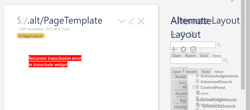
This is perfectly normal and nothing to worry about.
- Close the tiddler and everything is back to normal.
Step 2: switch to Alternative Layout
Press Ctrl+Shift+L to call up the Switch Layout dialog. It should look something like this:
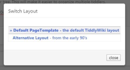
The name and description fields that you filled out will be visible. Click on your layout’s button to switch over. Since nothing has been changed, the will currently look exactly like the Default.
Step 3: edit the new PageTemplate
Goal: Explorer some wikitext
- Look in the Sidebar’s Explorer “folder tree”: there is now a new folder named .alt/ and clicking it shows a link to the new PageTemplate underneath.
- Naming the tiddler $:/.alt/PageTemplate put it in the “System” namespace (tiddlers that start with $
 ). Any other / in the title adds another level in the Explorer tree. This will make it easier to organize related system tiddlers, and to make an export file when you’re done. You can read about System Tiddler Naming for more information.
- Naming the tiddler $:/.alt/PageTemplate put it in the “System” namespace (tiddlers that start with $
- Click the PageTemplate link then put the tiddler in Edit Mode.
- If you are new to this kind of backstage code, this tiddler may make little to no sense. That’s okay. This code sets the stage for everything you can see on-screen in TiddlyWiki, but you only need to focus on the
<$list>widget starting near in the middle:
- If you are new to this kind of backstage code, this tiddler may make little to no sense. That’s okay. This code sets the stage for everything you can see on-screen in TiddlyWiki, but you only need to focus on the
<$list filter="[all[shadows+tiddlers]tag[$:/tags/PageTemplate]!has[draft.of]]" variable="listItem">

<$transclude tiddler=<<listItem>>/>

</$list>
What’s going on here?
- This code creates a list of all shadows + tiddlers tagged with $:/tags/PageTemplate, but ignore anything in Edit Mode; then transclude them—inject the contents other tiddlers into the PageTemplate tiddler).
- Shadows are tiddlers embedded inside plugins. The entire TiddlyWiki Core code is a giant plugin so the list needs to look inside plugins too.
- Tiddlers are the everyday unit of data we use in the wiki.
- System tags such as “$:/tags/PageTemplate” are tags just like any other, except that they also start with $ and don’t show up in the normal Tags tab in the Sidebar. All system tiddlers are hidden from a few places basic tiddlers can be found (basic search, recent tiddlers, all tiddlers, erc…) in order to keep users from being overrun by a hoard of strangely-titled tiddlers that most likely will be of little to no use to them.
- System tags are used by TiddlyWiki to group tiddlers into very specific lists to create and display UI elements. This tiddler has the tag: $:/tags/Layout which TiddlyWiki uses to list alternative layout templates.
- The first and last of the 5 points above mean that ANY tiddler we tag with $:/tags/PageTemplate puts the contents right into the TiddlyWiki UI instead of the Story River.
Goal: add a custom container
- Look at the bit of code above and below the
<$list>widget elements at the<$dropzone>widget surrounding it. This makes a<div class="tc-dropzone">that could be used as a container to target custom CSS, but I want to add my own container to help separate my new CSS for this layout and try to keep the default TiddlyWiki layout untouched. - Add the following line of code in between the top
<$dropzone>and<$list>code:
<div class="alt-box">
- Add the following between the bottom
<$list>and<$dropzone>code:
</div>
What’s going on here?
Adding the container gives us a common alt-box CSS class to reference when adding our custom style rules. Since it surrounds the UI elements, it should be easier to override many of the default style rules that TiddlyWiki already uses.
If you don’t want to miss anything, grab the entire code for the tiddler…
\whitespace trim
\define containerClasses()
tc-page-container tc-page-view-$(storyviewTitle)$ tc-language-$(languageTitle)$
\end
\import [[$:/core/ui/PageMacros]] [all[shadows+tiddlers]tag[$:/tags/Macro]!has[draft.of]]

<$vars
	tv-config-toolbar-icons={{$:/config/Toolbar/Icons}}
	tv-config-toolbar-text={{$:/config/Toolbar/Text}}
	tv-config-toolbar-class={{$:/config/Toolbar/ButtonClass}}
	tv-enable-drag-and-drop={{$:/config/DragAndDrop/Enable}}
	tv-show-missing-links={{$:/config/MissingLinks}}
	storyviewTitle={{$:/view}}
	languageTitle={{{ [{$:/language}get[name]] }}}>

<div class=<<containerClasses>>>

<$navigator story="$:/StoryList" history="$:/HistoryList" openLinkFromInsideRiver={{$:/config/Navigation/openLinkFromInsideRiver}} openLinkFromOutsideRiver={{$:/config/Navigation/openLinkFromOutsideRiver}} relinkOnRename={{$:/config/RelinkOnRename}}>

<$dropzone enable=<<tv-enable-drag-and-drop>>>

<div class="alt-box">

<$list filter="[all[shadows+tiddlers]tag[$:/tags/PageTemplate]!has[draft.of]]" variable="listItem">

<$transclude tiddler=<<listItem>>/>

</$list>

</div>

</$dropzone>

</$navigator>

</div>

</$vars>
Weirdly, adding blank lines between every line of text actually makes TiddlyWiki not add extra spacer <p> tags around items. The other option is to remove all blank lines, but I think this is easier to read,
Step 4: define a new Layout plan
- The TopLeftBar and TopRightBar are two, independent
<span>s that have been “fixed” or stuck, in the top corners. They don’t interact with anything so other elements must be adjusted to make room and avoid unwanted overlapping at smaller screen sizes or if more content is added to them. - The Sidebar is also fixed to the right side of the screen. The Story River needs to have a margin that keeps it from overlapping the Sidebar.
Goals: robust TopBar, flexible River + Sidebar(s)
I want the TopBar elements in their own row at the top of the screen. The TopLeftBar and TopRightBar segments will be placed inside and allowed to expand both horiontally & vertically without overlapping the Story River or Sidebar.
The rest of the vertical space below the TopBar will hold the Story River, default Sidebar, and the new Sidebar. The River will resize to fit regardless of whether one, both, or neither Sidebars are visible.
I won’t touch any of the dialog elements (notifications, alerts, etc&hellip) as they only show up temporarily.
Step 5: new Sidebar
Goal: make a tiddler to house a Sidebar
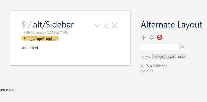
- Create a new tiddler titled: $:/.alt/Sidebar and give it the tag $:/tags/PageTemplate
- Start the text with:
<$list filter="[[$:/state/.alt/sidebar]get[text]] +[else[yes]!match[no]]" variable=".">

<div class="alt-sidebar">


</div>

</$list>
- In the empty space between the
<div>elements add some text to the tiddler. - Confirm your changes.
Perfect 
What’s going on here?
- Since the new Sidebar tiddler was most recently added to the $:/tags/PageTemplate group, it is indeed below both the Story River and Sidebar
- The
<$list>elements are there to act as a switch: as long as the $:/state/.alt/sidebar text does not equal “no” (either a blank/missing tiddler of says “yes”) then everything in between the<$list>elements will be shown. This is how the default Sidebar works: it is shown/hidden based on the value of the $:/state/sidebar tiddler. - The
<div>elements will wrap around the actual Sidebar content. This gives us another custom CSS class to target so we can add style rules just to the left Sidebar.
Goal: add more Sidebar content
- Edit and add some more content to the Sidebar. You can drag and drop existing tiddlers from another wiki or just pretend that this is a quick-link area and add links to non-existing tiddlers. I’l add a TOC macro with some filler tiddlers.
My Sidebar tiddler currently looks like this:
title: $:/.alt/Sidebar
tags: $:/tags/PageTemplate
text:
<$list filter="[[$:/state/.alt/sidebar]get[text]] +[else[yes]!match[no]]" variable=".">

<div class="alt-sidebar">

!! New Sidebar

!!! Table of Contents

<<toc "toc">>

</div>

</$list>
What’s going on here?
- Following the opening
<div>is a level-2 header to tell you what you are looking at - Next is a level-3 header to label the list below it
- And a basic Table Of Contents using the
<<toc>>macro with the parameter being a “toc” tag.
Here is how my wiki looks:
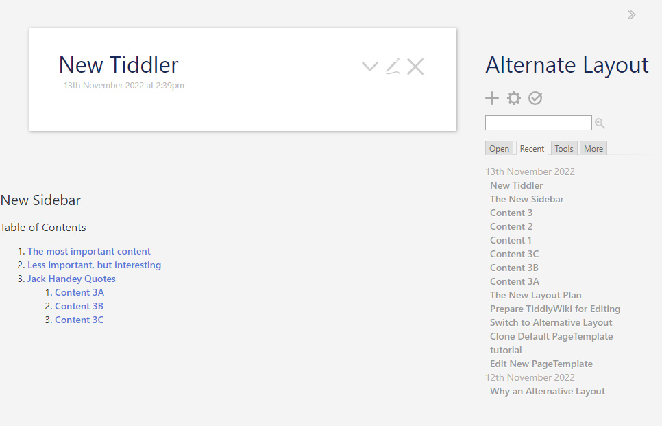
The first items in the table are all tagged with toc.
Step 6: start the new layout
Goal: remove TopBar items
- Go back to the new PageTemplate: Sidebar > More tab > Explorer tab > 🗁 .alt/ folder > 🗎 PageTemplate
- Edit the PageTemplate tiddler and focus again on the bottom half of the code. The
<$list>brings in every tiddler tagged with $:/tags/PageTemplate, but we want the TopBar items in their own element, so they need to be ignored by this list. Edit the list code, or just copy and “replaste”, with this…
<$list filter="
          [all[shadows+tiddlers]tag[$:/tags/PageTemplate]!has[draft.of]]
          -[[$:/core/ui/PageTemplate/topleftbar]]
          -[[$:/core/ui/PageTemplate/toprightbar]]
          -[[$:/.alt/Topbar]]
" variable="listItem">

<$transclude tiddler=<<listItem>>/>

</$list>
What’s going on here?
- I moved the filter rule to its own line and added some spaces to indent it.
- The very first line pf code ends with a
"double-quotation mark that holds all of the following filter rules. - I added
-[[$:/core/ui/PageTemplate/topleftbar]]to tell the filter to leave out the...topbarleftelement. The minus sign in front of the double-square-brackets tells the filter to remove whatever follows from the list of tiddlers it is building. - Same thing for
-[[$:/core/ui/PageTemplate/toprightbar]]. -[[$:/.alt/Topbar]]is a sneak peak at a tiddler we’ll make in a bit." variable="listItem">is also on its own line for consistency and to make it more obvious what all is sitting between the two sets of"double-quotes to make the entire filter expression.
After saving your edits, the Sidebar toggle button is missing, since we told the PageTemplate to ignore the TopRight tiddler that holds the button, same for the empty TopLeft tiddler.
Where did …topleftbar and …toprightbar come from?
You can see all tiddlers tagged with $:/tags/PageTemplate by going to that tiddler and viewing the tagged list:
- In the default Sidebar click on the icon to the right of the search box. In Advanced Search go to the Shadows tab and search for $:/tags/PageTemplate to get a link to the tiddler.
- Open the tiddler then click the More actions button then 🛈 Info from the menu.
- Go to the Tagging tab and you can see the list of tagged tiddlers, including the new Sidebar:
$:/core/ui/PageTemplate/topleftbar
$:/core/ui/PageTemplate/toprightbar
$:/core/ui/PageTemplate/sidebar
$:/core/ui/PageTemplate/story
$:/core/ui/PageTemplate/alerts
$:/core/ui/PageTemplate/drafts
$:/core/ui/PageTemplate/pluginreloadwarning
$:/.alt/Sidebar
I just copied the first 2 lines, pasted them into the PageTemplate filter, then added the minus signs and square brackets.
Step 7: new Topbar
Goal: create a new TopBar element
- Create a new tiddler and title it $:/.alt/Topbar
- Copy the following code and paste into the text box:
<div class="alt-topbar tc-adjust-top-of-scroll">

<$list filter="
          [[$:/core/ui/PageTemplate/topleftbar]]
          [[$:/core/ui/PageTemplate/toprightbar]]
          [all[shadows+tiddlers]tag[$:/tags/AltTopBar]!has[draft.of]]
" variable="listItem">

<$transclude tiddler=<<listItem>>/>

</$list>

</div>
- Save the tiddler
What’s going on here?
- First is a
<div>with the classes of alt-topbar and also tc-adjust-top-of-scroll. I just made up the first class to be used by CSS rules to target since it will be the new container for the TopBar. The second class is used by TiddlyWiki to make sure that the Story River shows the top of the tiddler when navigating, instead of letting it sit underneath the TopBar. - Inside the
<div>is a copy of the PageTemplate’s<$list>with some modifications:- I moved the
[[...topleftbar]]and[[toprightbar]]tiddlers to the top, just because it felt better having them first since they already exist. - I edited the original line of the filter to instead look for shadows + tiddlers tagged with $:/tags/AltTopBar . I made up this tag to use for adding future tiddlers to the TopBar just by tagging them. I could also tag them with $:/tags/TopRightBar or $:/tags/TopLeftBar to add them to the existing elements.
- I moved the
Goal: add the TopBar and wrap everything else
- Go back to PageTemplate and transclude of the new TopBar in the template right after the alt-box
<div>:
<div class="alt-box">

{{$:/.alt/Topbar}}
- While we’re at it, wrap the
<$list>widget in a<div>of it’s own:
<div class="alt-main">

<$list filter="
          [all[shadows+tiddlers]tag[$:/tags/PageTemplate]!has[draft.of]]
          -[[$:/core/ui/PageTemplate/topleftbar]]
          -[[$:/core/ui/PageTemplate/toprightbar]]
          -[[$:/.alt/Topbar]]
" variable="listItem">

<$transclude tiddler=<<listItem>>/>

</$list>

</div>
For reference, here is my code between the <$dropzone> elements:
<div class="alt-box">

{{$:/.alt/Topbar}}

<div class="alt-main">

<$list filter="
          [all[shadows+tiddlers]tag[$:/tags/PageTemplate]!has[draft.of]]
          -[[$:/core/ui/PageTemplate/topleftbar]]
          -[[$:/core/ui/PageTemplate/toprightbar]]
          -[[$:/.alt/Topbar]]
" variable="listItem">

<$transclude tiddler=<<listItem>>/>

</$list>

</div>

</div>
What’s going on here?
<div class="alt-box">starts the container for all the PageTemplate items. Now I can target this<div>along with anything inside with future CSS rules.{{$:/.alt/Topbar}}transcludes the new TopBar code and places it before the…<div class="alt-main">wraps around the<$list>that will get and display the Story River and both Sidebars in their own box.<$list>gathers all tiddlers tagged with $:/tags/PageTemplate…except for the TopBar-related items. Notice that I also added the new tiddler for the TopBar container as one to ignore.- Following that is the code to transclude the
<$list>items, followed by closing elements to keep everything wrapped up nice and tidy.
Step 8: finally…some CSS
So far, the default TiddlyWiki style rules are still being applied, but we need to add our own styles to make some visual changes.
I can’t take time to walk through each TiddlyWiki class name and each style rule in detail. To get more familiar with HTML & CSS structure of the wiki, right-click anywhere in the wiki and choose Inspect from the menu. If you right-click empty space in the Story River you will probably be able to see a few <div>s like so:
<div class="tc-dropzone">
   <div class="alt-box">
      <div class="alt-topbar">...</div>
      <div class="alt-main">
         <div class="tc-sidebar-scrollable">...</div>
         <section class="tc-story-river">...</section>
         <div class="tc-alerts">...</div>
   </div>
</div>
These are top-level elements that the PageTemplate tiddler makes and fills in with the wiki UI, based on the code inside the many Core tiddlers.
Goal: layout the basic containers
- Create a new tiddler titled:
$:/.alt/Stylesheet - Tag it with
$:/tags/Stylesheet, now TiddlyWiki knows to load it along with the other Core styles as actual CSS code. - Copy the following code into the text box:
.alt-box {
   display: flex;
   flex-direction: column;
}

.alt-box .alt-topbar {
   display: flex;
}

.alt-box .alt-main {
   display: grid;
   grid-template-rows: 1fr;
   grid-template-columns: auto 1fr auto;
}
What’s going on here?
- The rules for
.alt-boxtarget any element with the class .alt-box—which we only have one of—and tell it to be a “flexbox” container oriented in a vertical column.- The
<$dropzone>widget surrounding this container is already set to vertically fill the screen size, and setting our container to flex automatically makes it fill the entire screen horizontally as well.
- The
- The rules for
.alt-box .alt-toptargets anything inside.alt-boxwith the.alt-topbarclass, and tells it to also be a “flexbox” container. Flexboxes are oriented horizontally by default, which is what we want, so we don’t need to specify a flex-direction. - The rules for
.alt-box .alt-maintargets the container for the Story River and Sidebars and tell it to be a “grid” container. I could have made another flexbox, but I wanted to mix things up a bit.grid-template-rowsspecifies that there is a single row that takes up “1fr”—one fraction of available space—and since there is only 1 row: the fraction will be the entire vertical space.grid-template-columnsspecifies 3 columns: first column is “auto” wide (as wide as the content inside makes it); same with the third column; the second column is “1fr” wide (automatically takes up whatever horizontal space is left between the Sidebars).
- Save changes. Notice how the new Sidebar is crammed into top-right corner behind the original. Not ideal, and also not a problem.
Goal: fix the columns
- Paste the following rules underneath the existing ones:
.alt-main .tc-sidebar-scrollable {
   position: relative;
   grid-row: 1 / 2;
   grid-column: 3 / 4;
}

.alt-main .tc-story-river {
   grid-row: 1 / 2;
   grid-column: 2 / 3;
}

.alt-main .alt-sidebar {
   grid-row: 1 / 2;
   grid-column: 1 / 2;
}
What’s going on here?
.alt-main .tc-sidebar-scrollabletargets the default Sidebar only when it is inside the.alt-maincontainer. Setting the position to relative overrides the original fixed positioning and unsticks it from right side of the page..alt-main .tc-story-riverdoes the same with the Story River..alt-main .alt-sidebardoes the same with the new Sidebar.
Here’s a brief breakdown of the grid- rules for each of the above items:
.alt-box .alt-mainis a grid container with 1 row and 3 columns…-
The 1 row has 2 imaginary horizontal lines: 1 above it and 1 below.
-
The 3 columns have 4 imaginary vertical lines: 1 to the left of the first column, 1 between the first & second columns, 1 between the second & third columns, and 1 to the right of the third column.
-
- All 3 elements are placed between Row lines 1 and 2. With only 1 row, this code isn’t needed, but I put it in for consistency.
- New Sidebar is placed between Column lines 1 and 2 which puts it in the 1st column.
- Story River is placed between Column lines 2 and 3 which puts it in the 2nd column.
- Default Sidebar is placed between Column lines 3 and 4 which puts it in the 3rd column.
Goal: fix TopBar
- Paste the following rules underneath the existing ones:
.tc-topbar {
   flex: 1 0 auto;
   position: relative;
   padding: 0;
}

.alt-box .alt-topbar .tc-topbar-right {
   text-align: right;
}

.alt-box .alt-topbar {
   background-color: <<colour background>>;
   box-shadow: 0 1px 2px 1px <<colour pre-border>>;
}
What’s going on here?
.tc-topbartargets both the TopLeftBar and TopRightBar elements and sets them to have relative positioning instead of fixed (just like the default Sidebar). This puts them back in the normal page flow and actually inside the TopBar element..alt-box .alt-topbar .tc-topbar-rightgives the right side of the TopBar a right-alignment so the Sidebar Toggle Button stays on the right side..alt-box .alt-topbartargets the TopBar container and gives it a background color and shadow so we can actually see where it is.
Step 9: more CSS!
Goal: code cleanup
With the basics in place and the new layout working, we can focus on a few more details. First, I re-arranged the entire CSS code (sorry) to group and label things a bit better. Overall layout rules are first, then specific elements’ details.
For reference, here is the re-organized code:
<!-- ============
        Basic Page Layout
        ============ -->

.alt-box {
   display: flex;
   flex-direction: column;
}

.alt-box .alt-topbar {
   display: flex;
   justify-content: space-between;
   align-items: center;
}

.alt-box .alt-main {
   display: grid;
   grid-template-rows: 1fr;
   grid-template-columns: auto 1fr auto;
}

.alt-main .tc-sidebar-scrollable {
   position: relative;
   grid-row: 1 / 2;
   grid-column: 3 / 4;
}

.alt-main .tc-story-river {
   grid-row: 1 / 2;
   grid-column: 2 / 3;
}

.alt-main .alt-sidebar {
   grid-row: 1 / 2;
   grid-column: 1 / 2;
}


<!-- =====
        Top Bar
        ===== -->

.alt-box .alt-topbar {
   background-color: <<colour background>>;
   box-shadow: 0 1px 2px 1px <<colour pre-border>>;
   position: sticky; top: 0;
   z-index: 200;
}

.alt-box .alt-topbar .tc-topbar {
   flex: 1 0 auto;
   position: relative;
   padding: 0.25rem 0.5rem;
}

.alt-box .alt-topbar .tc-topbar-left {
   display: flex;
   justify-content: flex-start;
   left: 0; top: 0;
}

.alt-box .alt-topbar .tc-topbar-right {
   display: flex;
   justify-content: flex-end;
   right: 0; top: 0;
}


<!-- ========
        Story River
        ======== -->

.alt-box .alt-main .tc-story-river {
   margin: 0;
   padding: 2rem;
}


<!-- ======
        Sidebars
        ====== -->

.alt-box .alt-main .tc-sidebar-scrollable,
.alt-box .alt-main .alt-sidebar {
   margin: 0;
   padding: 1rem;
}

.alt-box .alt-main .tc-sidebar-scrollable {
<$list filter="[[$:/state/sidebar]get[text]] +[else[yes]match[no]]" variable=".">
   width: 0;
</$list>
}

.alt-box .alt-main .alt-sidebar h2 {
   margin: 0;
}
What’s going on here?
Basic Page Layout
Nothing changed here, it still just positions major elements on the page.
Top Bar
I added rules to make the TopBar “sticky” so that stays at the top of the page when scrolling, but without needing fixed positioning.
I also added rules to make both the TopBarLeft and TopBarRight inner elements flexbox containers so that anything inside them gets line up horizontally instead of vertically.
Justify-content is used to say how items are lined up inside: justify-start bunches up items at the start of a container, justify-end bunches them up at the end.
Story River
After removing fixed positioning from the Sidebar, I removed default margins and set a bit of padding on the River.
Sidebars
I adjusted more margins & padding to get both Sidebars more symmetrical, and save some space.
I added a <$list> widget for the default Sidebar that acts as a switch: when the Sidebar is hidden, the .tc-sidebar-scrollable element gets a width of 0 so that the Story River can properly fill the space.
Step 10: toggle the new Sidebar
Goal: new Sidebar must be toggled!
- Click the Advanced Search icon in the default Sidebar, in the Shadows tab search for menu.
- Click the
$:/core/ui/TopBar/menulink and clone that tiddler. - Name the tiddler
$:/.alt/SidebarToggle. - Remove the tag
$:/tags/TopRightBarthen add the tag$:/tags/TopLeftBar. - Replace the default code with these edits:
\whitespace trim
<$list filter="[[$:/state/.alt/sidebar]get[text]] +[else[yes]!match[no]]" variable="ignore">
<$button set="$:/state/.alt/sidebar" setTo="no" tooltip={{$:/language/Buttons/HideSideBar/Hint}} aria-label={{$:/language/Buttons/HideSideBar/Caption}} class="tc-btn-invisible tc-hide-sidebar-btn">{{$:/core/images/chevron-left}}</$button>
</$list>
<$list filter="[[$:/state/.alt/sidebar]get[text]] +[else[yes]match[no]]" variable="ignore">
<$button set="$:/state/.alt/sidebar" setTo="yes" tooltip={{$:/language/Buttons/ShowSideBar/Hint}} aria-label={{$:/language/Buttons/ShowSideBar/Caption}} class="tc-btn-invisible tc-show-sidebar-btn">{{$:/core/images/chevron-right}}</$button>
</$list>
What’s going on here?
- Just like the default Sidebar, this button changes based on the state of a specific tiddler and effects that state itself when clicked.
Goal: fix the new button, with CSS!
- Add the following code to the Top Bar area of the
$:/.alt/Stylesheet:
.alt-box .alt-topbar .tc-topbar-left .tc-show-sidebar-btn {
   transform: rotate(180deg);
}
- Add the following code to the Sidebars area of the stylesheet, right below the code for the default Sidebar:
.alt-box .alt-main .alt-sidebar {
<$list filter="[[$:/state/.alt/sidebar]get[text]] +[else[yes]match[no]]" variable=".">
   width: 0;
</$list>
}
What’s going on here?
- The first rule flips the chevron image so it faced the correct way when clicked.
- Just like the default Sidebar, a
<$list>element sets the width of the new Sidebar to 0 when the state tiddler says “no”.
Export your Alternative Layout tiddlers
If you want a copy all of the tiddlers involved in this, or a copy pf your own version(s), you can do so with the Advanced Search tiddler.
- Go to the Filter tab and search for:
[prefix[$:/.alt/]], change the prefix if you opted for your own. - Click the square icon between the “X” and Trash Can to pull up an export menu.
- The JSON option will work just fine
- Drag and drop your new exported file into another wiki.
Remember: Ctrl+Shift+L brings up the Switch Layout dialog.