While most modern browser supports grid css, there is little or no example how to use grid in Tiddlywiki. I start this thread in the hope other volunteers come and share their solutions
Create a two column layout like a table in Tiddlywiki
open TiddlyWiki Pre-release — 5.2.1-prerelease
create a new tiddler with below contents
<div class="grid">
<div>''Title''</div>
<div>''Modifed''</div>
<$list filter="[tag[HelloThere]]">
<div><$link/></div>
<div><$view field=modified format=date template="YYYY.0MM.0DD"/></div>
</$list>
</div>

<style>
.grid { display: grid; grid-template-columns: 250px 100px; }
</style>
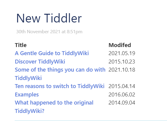
This will create a table layout with all tiddlers tagged HelloThere
The first column contains link to tiddler
The second column contains the modified date
This is what you get
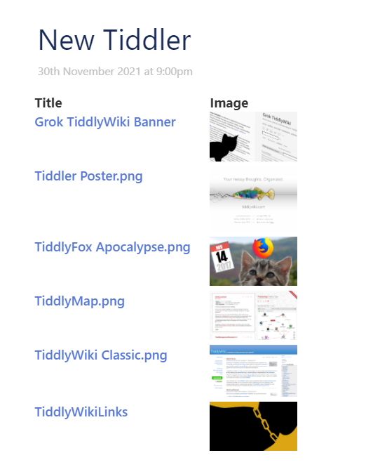
What do you get by this script?
<div class="grid">
<div>''Title''</div>
<div>''Modifed''</div>
<$list filter="[type[image/png]]">
<div><$link/></div>
<div><$transclude/></div>
</$list>
</div>

<style>
.grid { display: grid; grid-template-columns: 200px 100px; }
</style>
5 Likes
Very informative, @Mohammad , thank you for posting this.
1 Like
This is another example where you can use to make a simple blog in a long tiddler!
The required css is given below
/*for demo*/
.exmp02 {
display: grid;
grid-template-columns: 1fr 3fr;
grid-gap: 20px;
}

.exmp02 header,
.exmp02 footer {
border-radius: 5px;
padding: 10px;
/*background-color: rgb(207,232,220);
border: 2px solid rgb(79,185,227);*/
background-color:#ddd;
}

.exmp02 aside {
border-right: 1px solid #999;
}

/* bottom */
.exmp02 header {
grid-column: 1 / 3;
grid-row: 1;
}

.exmp02 article {
grid-column: 2;
grid-row: 2;
}

.exmp02 aside {
grid-column: 1;
grid-row: 2;
}

.exmp02 footer {
grid-column: 1 / 3;
grid-row: 3;
}
goto TiddlyWiki Pre-release — 5.2.1-prerelease
download blog-style.json (2.7 KB)
and drag and drop into TiddlyWiki Pre-release — 5.2.1-prerelease
The above solution uses the new cascades in Tiddlywiki 5.2.1
The above solution uses a custom viewtemplate
1 Like
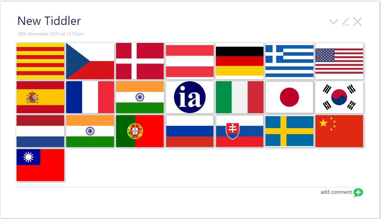
The below code create a gallery
change the filter to your need
use different size and customize based on your need
To give a try
open TiddlyWiki Pre-release — 5.2.1-prerelease
create a new tiddler with below contents
<style>
.grid {
  display: grid;
  grid-template-columns: repeat(auto-fill, minmax(128px, 1fr));
  grid-gap: 4px;
  align-items: stretch;
  }
.grid img {
  border: 1px solid #ccc;
  box-shadow: 2px 2px 6px 0px  rgba(0,0,0,0.3);
  max-width: 100%;
}
</style>

<main class="grid">
<$list filter="[tag[Language]tag[Icon]]">
<$image source=<<currentTiddler>> />
</$list>
</main>
Will produce:
1 Like
I did not add details on how grid css works as there is a plenty of tutorial/examples out there!
The above was some working example to show how grid css can be simply used in Tiddlywiki.
Good point to start using Grids in Tiddlywiki
@Mohammad , I think this is a great thread. IMO TW is actually CSS heaven .
Since “looks” matter a lot the more we can open up the available strategies on CSS the better.
TT
1 Like
Mohammad
December 2, 2021, 4:25am
8
I use css grid to get a two column story river :
.story-backdrop, .story-frontdrop, :is(.story-backdrop, .story-frontdrop)>p{
	display:contents;
}

.tc-story-river{
display:grid;
place-content: center;
grid-template-columns: 1fr minmax(0, 960px) 1fr;
grid-auto-columns: minmax(0, 960px);
grid-auto-flow: column;
row-gap: 5px;
column-gap: 14px;
}

.tc-tiddler-frame {
grid-column:2/span 1;
margin:0;
padding-top:10px;
padding-bottom:10px;
}

.tc-tiddler-view-frame {
max-width:960px;
}

.tc-tiddler-edit-frame,
[data-tags*="full-width"]{
grid-column:1/span 3;
max-width:100vw;
}

[data-tags*="$:/right-story"] {
  grid-column:-1/span 1;
}
Tiddlers with the tag $:/right-story will be displayed on the right, and tiddlers in edit mode or with the tag full-width will take a full width (unless a tiddler is open on the right).
I also use a button to ease the process :
\whitespace trim
<$button class="tc-btn-invisible" tooltip="switch column">
<$action-listops $tiddler=<<currentTiddler>> $tags="+[toggle[$:/right-story]]"/>
<$list filter="[<tv-config-toolbar-icons>match[yes]]" variable=_>
<$list filter="[all[current]tag[$:/right-story]]">{{$:/core/images/left-arrow}}</$list>
<$list filter="[all[current]!tag[$:/right-story]]">{{$:/core/images/right-arrow}}</$list>
</$list>
<$list filter="[<tv-config-toolbar-text>match[yes]]">
<span class="tc-btn-text">
<$text text=" "/>
<$text text="switch column"/>
</span>
</$list>
</$button>
With the tags $:/tags/EditToolbar and $:/tags/ViewToolbar. It’s useful for when I want to compare tiddlers side by side.