TiddlyWiki is almost 20 years old!

Yesterday, 20th September 2023, marked the 19th anniversary since TiddlyWiki was first released in 2004. I thought it might be fun to start thinking about the different ways that we might mark the 20th anniversary next year.

Suggestions and volunteering is welcome!

  • We could try to get journalists interested in writing about the anniversary
  • We could try to get YouTubers like Linus Tech Tips to cover TiddlyWiki and the anniversary (thanks @vilc)
  • We could make an expanded written history of TiddlyWiki (perhaps in its own wiki so that it can include lots of pictures)
  • We could make a video history of TiddlyWiki
  • We could make some twentieth anniversary merchandise and set up an online shop
  • We could go on ProductHunt again; last time we got a very good response and some nice feedback
  • We could make a new modern default theme/palette to give TiddlyWiki a new lick of paint
  • For the duration of 2024, we might add a twentieth anniversary banner to tiddlywiki.com
  • We could adopt a new or updated logo. I’ve often wanted to ask someone with actual artistic talent to make a better monochrome tracing of the original picture of Motovun Jack than my rough and ready version

I’d welcome ideas, particularly if you’re able to help deliver those ideas, too.

18 Likes

I would love a TiddlyWiki T-shirt.

I will think about this and volunteer, all your ideas sound great.

And Congratulations!

1 Like

I am no professional when it comes to graphic design, more of an “advanced hobbyist”, but I have done some logo designs/redesigns and graphic design in general in the past (for students’ organisations mostly). I would be happy to give it a try, if we don’t find anyone more experienced willing to do it.

A great idea! I think the not-very-modern default feel of TW has been pointed out many times. Let’s hope the 20th anniversary will motivate us to conceive something new to be included in core. I would be glad to help, as far as my knowledge of TW will permit.
There are some points to be potentially included in this change (e.g. as official plugins), to make the UI feel more modern:

  • mobile friendly layout
  • command palette/ popup search
  • more in-depth keyboard navigation

To get more audience, I would also suggest we try to reach to some youtubers/influencers (I hate the word, but I think it matches in this case :sweat_smile:). An example would be Linus Tech Tips (putting aside the recent controversies), they have an emphasis on hardware/gaming/entertainment, but cover many other topics as well, including some useful software recommendations like this one: Download These Handy Tools NOW! Essential USB Tools - YouTube

Wow! Congrats to the whole community, and especially to @jeremyruston!

In the “I knew it when” category, I remember when I first used TW (the “copy this text and paste it in a new file” days), and it was at a job I held from March 2004 to March 2005. I’ve used it semi-regularly ever since. So while I’ve only recently gotten active in the community, TW has been part of my life for a long, long time.

Thank you for this great tool, and I’ll try to think of ways I can contribute to the festivities.

I’m already using those features! Now there are many plugins that can achieve these, and many of them have topics in this forum.

Yes, many of them will be willing to have a new app for their new video, it is a win-win.

I’d love that, I will order one if someone can make it happen (and send it to China…). Or maybe you can order it in some Chinese market because it will be cheaper.

(I personally don’t have the will to organize this, I like living in the virtual world, e.g. coding, I feel the reality is too complex for me.)

Congratulations @jeremyruston and every contributor and community member!

I’d love to contribute to some of the mentioned ideas, they’re all great!

Especially the theme / palette would be a point where I could contribute

Best wishes from Southtyrol,
Simon

Thank you everyone for your support.

I’ve updated the OP with the suggestion from @vilc of trying to get coverage from YouTubers.

That would be great. It would also be useful to have monochrome SVG versions of some of the other poses of Motovun Jack.

Congratulations!
And thank you Jeremy!

TiddlyWiki is great. It makes life easier for us :heart::two_hearts:

  • We could make some twentieth anniversary merchandise and set up an online shop
  • We could go on ProductHunt again; last time we got a very good response and some nice feedback
  • We could make a new modern default theme/palette to give TiddlyWiki a new lick of paint

wow, great ideas! I like to have a mug or T-shirt with TiddlyWiki banner and I sure many fans like to.
So, go ahead and set up the online shop.

I’m so proud of you and everyone who’s contributed, code or otherwise.

A tshirt would be great. Or stickers!

I manully and very decently
reworked some corners of the original

… by the way - can we change the forum`s settings to accept svg as uploads?

2 Likes

I would love to have a reworked version of vis.js Timeline — emkay plugin, reloaded to display the history of tw.
It would be great to have an anniversary-edition which demonstrates the flexibility and power of tiddlywiki by featuring some of the eye-candy-addons. The true power of TW remains a little hidden on tiddlywiki.com which is rather a refernce site than a demo of what can be achieved in TW.

1 Like

Long time ago Thomas Elmiger created a couple of cats - discussed here: The Telmiger Cats

1 Like

Wow. I’m late (sorry)

Anyway, I don’t care what you say, Jeremy so-called Ruston,[1] I’ve been using TiddlyWiki for at least 25 years. I got the bruises and scars to prove it.

And, not wishing to cast aspersions on anyone, TiddlyWiki has kept many of us sane for decades – me most definitely!

[1]. I wish I could remember where that chuckle-worthy, misapplied “so-called” came from – Rik Mayall maybe? :laughing:

2 Likes

A refresh of the palette would be good, it feels like there are far too many different colors to choose (over 130+). My dream would be to have an easy built-in way to change the colors, with a way to insert colors from Base16 color schemes. (I am aware of https://colorplay.tiddlyhost.com/ but it would be good to have something similar in the core). Maybe a few more built-in alternative layouts might also be interesting too.

Chris Barnatt is brilliant at explaining things and puts them in context always !
TW2024 needs his input and skills

https://www.explainingcomputers.com/software.html

https://youtube.com/@ExplainingComputers?si=WUbJj613Bfp9YbDz

https://youtube.com/@ExplainingComputers?si=ZqJ94UtRePzXG_gu

Christ Barnatt
https://twitter.com/ChrisBarnatt

Christopher Barnatt’s profile on LinkedIn https://uk.linkedin.com/in/christopherbarnatt

2 Likes

Thank you very much, Birthe, for bringing this up again. (Tusind tak!)
I would still be very happy to donate these SVGs to the project as a birthday present. If anyone can use them as inspiration or part of a T-shirt design, they are very welcome.

All the best for the next 21 years to TW and the team and the community!
Thomas

3 Likes

Wow! I can’t remember when I found Tiddlywiki. I think I found Wiki On A Stick first (WOAS), then found TW after that maybe around 2006. The tags really help me as well.

It sure has helped me organize my notes though. And Tiddlyhost is a big help as well.

And here’s a blurb! Tiddlywiki is 19 years old this month! - by Bacca400

Thank you everybody. It sounds like there’s some solid support for the idea of a merchandise shop. I’ve wanted to do that for a long time, and have recently have had some experience in that field, so I think it’s viable.

I’ve started a new thread for the discussion about redrawing Motovun Jack:

2 Likes

Nineteen already? Time does fly! :partying_face:
Congrats to all the community and a very special thanks to Jeremy and all the contributors for keeping one of my personal favorite open source projects alive. It is quite unique and peculiar, and the emphasis on privacy is a rarity these days, when everything is a cloud service and user is data mined to no end.

Had forgotten all about Wiki On A Stick, but is what first introduced me to TiddlyWiki as well. Good times, thanks for the reminisce.


Those are all great ideas for a celebration, but I’m particularly interested in these

This gave me a few wild ideas.

Jeremy has in the past mentioned considering renaming TiddlyWiki to something else because of certain concerns with the name holding us back. Some brainstorming occurred in other threads

There have been a few past attempts at branding TiddlyWiki and coming up with a logo in the old Google Groups Forum. I made a few attempts myself some time ago as well.

With this in mind, this seems like the perfect timing for a full revamp. This could be a great opportunity to start fresh, and do the complete rebranding. I apologize in advance for the overly ambitious proposal, but bear with me. From the most modest to the most radical:

  1. New stylish palettes - Maybe keep it down two a handful to be manageable (quality over quantity), one or two light colored palettes, one or two “dark modes”, and one or two for the visually impaired.

  2. A new modern theme. Nico Notebook is a good example I’m currently using myself, perhaps a great starting point. Responsive design, modern look, good mobile browser support, touch interface ready, reorganized settings new clearer structure.

  3. Rename TiddlyWiki to whatever is deemed suitable

  4. Make a logo and creating branding for the fresh updated name from the get-go.

  5. Launch a new “6.0 version” to celebrate the occasion, that is a successor of the current 5 series

  6. Correct me if I’m wrong, but TiddlyWiki prides itself on mostly keeping backwards compatibility. From my limited understanding I imagine this probably lead to gaining some “baggage” in terms of code, that may be holding it back it terms of size, simplicity, performance and freedom. Take the opportunity to “clean house” and deprecate old methods with the new fresh version, without fear of breaking backwards compatibility.

I understand this may well upset some users, and may not align with the global vision for the project. Radical, changes like that are bound to break some workflows, but the opportunity does seem timely. I certainly don’t expect all of this to even be feasible, but just wanted to put it out there, maybe some of these points are worth pursuing.

I’d love to help with what I can.

1 Like

Now for the volunteering part, I’m far from being a skilled artist, and I don’t have a lot of free time these days, but whatever I can spare, I volunteer for any artistic or illustration purposes, like themes, mockups, palettes, graphics, logos, merchandise decor, or anything of the sort.

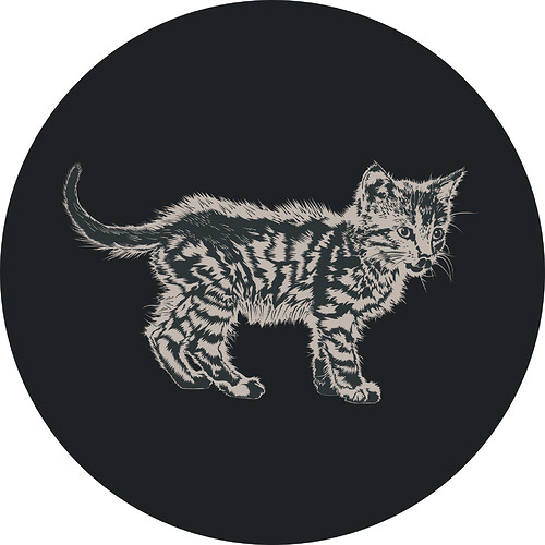
Anyway, took me quite a while but I’ve been playing around with Motovun Jack and came up with a few monochrome versions. This is my rendition of our illustrious mascot

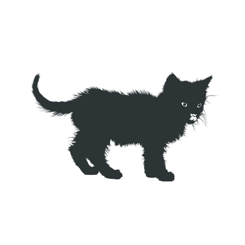
I realize now from the other thread a more stylized version may required, so I made a slightly simplified silhouette as well.

I have a few more waiting, but I don’t think these would be adequate as logos. They are way too elaborate, don’t work well at small scales, and are too complex for a logo, but may still be somewhat useful as a mascot, “mood image”, for illustration purposes, or as example file.

There was a lot of trial and error, but it was fun to make, so I’ll share them here. I can make them available as vector SVG files if there’s any interest, but I’d like to hear Jeremy’s thoughts on the logo matter first.

I’d love to help come up with something that pleases the community, but Jack the cat doesn’t seem the right way forward, and before tackling the logo itself any potential branding changes should be settled first.

11 Likes