The origami is strongly gimped to demonstrate that TW could be modulated in the stripes.
<svg xmlns="http://www.w3.org/2000/svg" viewBox="0 0 420 260" width="510pt" height="317pt">
<path d="M 308 36 C 310 17 312 12 323 4 C 331 11 336 15 342 23 C 356 22 367 26 367 26 C 380 19 407 10 412 11 C 411 17 400 27 397 43 C 395 53 394 85 391 92 C 388 100 378 120 362 121 C 357 121 348 117 348 117 C 346 135 330 154 309 161 C 305 169 305 172 303 177 C 295 192 304 220 310 230 C 310 230 325 236 327 243 C 328 251 322 256 322 256 C 322 256 295 257 294 254 L 288 247 C 271 253 267 249 264 243 C 264 243 261 238 260 232 C 258 218 258 198 262 184 C 259 172 261 172 252 158 C 227 161 203 163 180 152 C 172 166 166 184 164 194 C 163 205 178 223 195 228 C 204 231 205 233 206 239 C 209 249 169 247 168 245 C 146 221 127 202 127 195 C 127 193 132 186 134 179 C 129 185 120 192 121 196 C 122 201 124 213 134 219 C 144 225 151 221 152 234 C 152 240 131 238 124 237 C 117 236 104 221 88 181 C 87 174 112 154 122 129 C 106 119 100 107 101 91 C 93 89 95 94 59 90 C 23 86 -5 53 6 17 C 9 8 11 2 16 3 C 22 6 16 13 16 29 C 15 67 63 76 104 66 C 115 57 133 48 149 47 C 162 46 197 51 219 53 C 241 54 254 54 266 56 C 278 58 288 60 302 65 C 302 53 305 46 308 36 Z" fill="black"/>
</svg>
The @Thomas_Chuffart 's idea is interesting but it need more element to do it something similar.
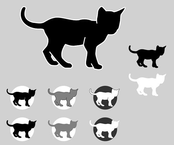
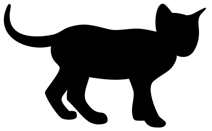
I simplified the first version I dropped last time.It is a little bit smoother, with less points and some small adjustments. In the picture only 1 SVG but drawn with or without contour and differents shades.
.
<svg xml:space="preserve" viewBox="0 0 61.8253 37.2073">
  <g style="display:inline">
    <path d="M203.4426 426.5542c-.506.406-.8184 1.0946-1.221 2.018-.1114 1.138-.2228 2.3387-.3341 3.0552-.3528 1.413-.4535 3.0586-.1567 4.0894-.134-.5067-.1981-1.5356-.1981-1.5356s-2.2507.0258-2.9205-.1367c-2.5506-1.0216-5.241-.9989-7.4517-.3105-1.6371.2632-3.4356.0426-5.278-.3104-3.1037-.5465-6.4669-1.6205-9.2369-1.0478-2.77.5726-4.3425 1.699-6.3649 2.833-1.8913.7956-4.033.2514-6.3325.0268-4.178-1.0812-5.5723-3.84-4.15-7.8181.4635-1.2965-1.0989-1.7252-1.7814-1.135-.7496.6484-1.6254 2.4578-1.3971 5.2006.6686 4.9124 5.508 7.4155 9.7026 7.6844 1.2722.2102 3.1345-.2844 3.9938.5223.4478 1.8918 1.3358 3.0474 2.177 4.5242.7234 1.3245.3929 3.6904-.3816 4.9116-.7898 1.2121-2.486 2.6342-2.607 3.4702 1.1831 2.2693 2.7798 7.411 5.5254 8.0498.557.1197 2.7783.2701 3.4513-.0322.4008-.3154.6938-.6932.943-1.1418 0 0-1.484-1.5798-1.4685-1.6127 1.165 1.136 3.5597 4.3775 5.3654 4.4394h2.9495c.4671-.1848 1.0072-.8239 1.0364-1.3744.0292-.5505-.8531-1.6482-1.6253-1.7162-1.8265-.0769-2.8946-1.4727-4.2236-2.8085-1.676-3.2 1.6335-8.1608 1.7077-8.1502 1.9146.7916 3.7847 1.2505 5.6661 1.0091 1.8814-.2414 3.3664-.2486 4.9501-.8193.3016-1.6062.549-2.892.9571-4.2276-.4241 1.4064-.5888 2.4345-.9474 4.2345.3164 1.5797 1.5217 2.9258 2.0894 4.3971-.0867 2.3073-.7756 4.6033-.8396 6.4283.0407 1.3318.6517 2.42 2.0183 2.7555l2.6326-.0799-1.24-2.2232 1.7122 3.0406c1.9297.3359 2.8214.7624 4.502-.0776.9548-1.7901-.0492-2.167-1.05-2.5332 0 0-.4908-.156-.8538-.458-.5938-1.38-1.544-4.2338-1.6667-5.6247-.08-1.1043.4108-3.8163.4108-3.8163.1392-1.2933 3.3854-2.3794 4.6524-3.923 1.133-1.1632 1.2806-2.68 2.3024-3.8433.6527.1298 2.6487.3149 3.6007-.3665.7991-.8118 1.3744-1.1 1.6856-2.2165 0 0 .5847-.487.951-1.1644.3988-1.3115.6483-2.7338.873-4.0361.2612-1.441-.023-3.4991.6404-4.3468.7463-.9185 2.6944-3.6024 2.0764-3.9198-.3925-.2016-3.9772 2.3318-6.5201 2.6003-1.4042-.8047-3.0479-.5578-4.6572-.5822-.6438-.9832-1.341-1.5057-1.7644-1.9973-.5232-.7983-1.4857-.5172-1.9045.0956zm-25.4775 31.3197c-.5692 0-1.3406-.055-1.6526-.1922-.312-.1372-1.3745-2.0588-1.3745-2.0588-.014-.4334.297-1.1934.297-1.1934l-1.3151-1.647s2.7664 3.4426 4.0452 5.0913z" style="fill:#000;stroke:none;stroke-width:.374362;stroke-linecap:round;stroke-linejoin:round;stroke-dasharray:none" transform="translate(-156.5828 -425.9681)"/>
  </g>
</svg>
I would say the simple black cat without the extra inner lines is the one I would choose. It cures most of the problems of the prior version.
There could be a slightly more distinct edge at the top of the tail.
I like this one a lot. My only objection is to the lines cut into the body: the neck, the front shoulder, and the hind knees. Those versions which don’t show these among your variants look much variants look much better than those that do. OTOH, I like the cut between the front paws, although I think it should move rightward a bit (doesn’t seem aligned with the shoulder above.)
But who am I to critique? I couldn’t do anything half so good. Kudos!
There are some nice improvements here, the indented lines really do add to the clarity of the silhouette.
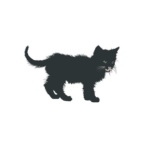
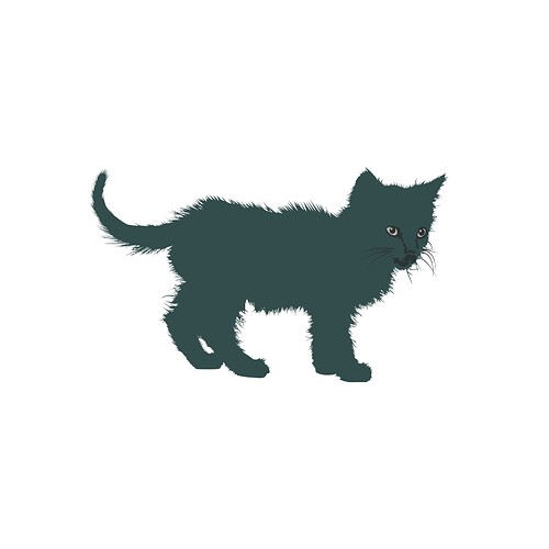
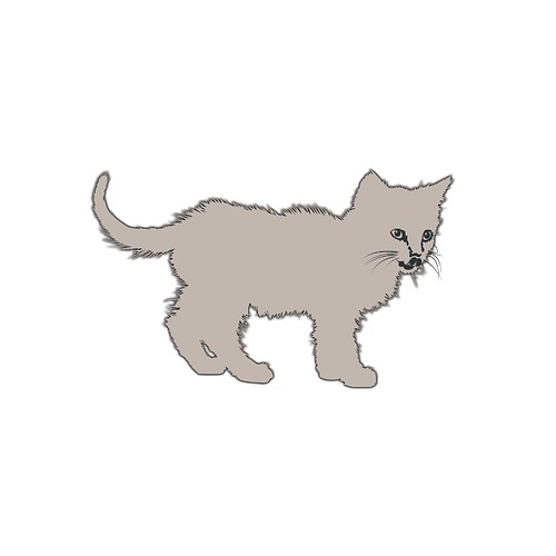
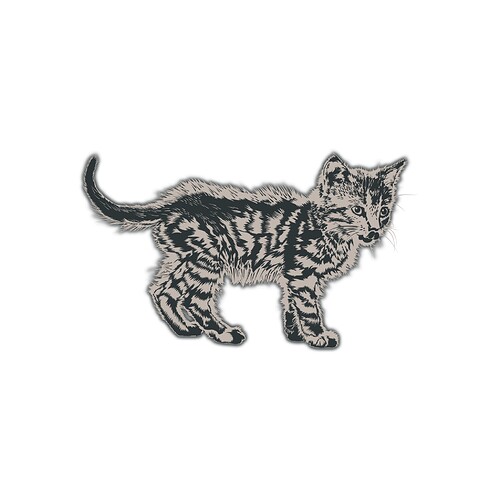
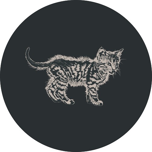
Vector illustration is something that captivates me, though I’m an amateur, I decided to make my own renditions of Motovun Jack.
It took a lot of trial and error, that backlit fuzzyness was really hard to capture in vector graphics, but it was quite fun to make. They come in minimal, detailed and partially “shaded” variants showing the tabby pattern and his fuzzy appearance.
And a gif showing them all

As mentioned in other thread about TiddlyWiki 19th Anniversary I don’t really think any of these make for a good logo.
They are too detailed, lack focus or a clear message. Though I believe they may still make for a very nice project mascot and general image for illustration purposes, like a featured images, example picture, mood definition, advertising, merchandise, etc. they don’t seem adequate for a dedicated logotype.
Since Jeremy Ruston specifically mentioned it I made these any way, but I’d really be up for designing an actual logo, and proper branding for the project.
At some point in the past he mentioned considering renaming the project into something more serious since the name could be unintentionally holding it back.
If it ever came to pass, I think now would be a great opportunity to do so, so that any “rebranding” efforts would be invested in something lasting, rather than a dead end.
I’d be really interested in hearing @jeremyruston thoughts on it, if any. I’d be willing to lend a hand in you are interested. I don’t have as much free time these days, but I think I can spare enough to work on something worthwhile if you are interested.
What do you think?
Maybe we can try changing the color. Black always gives me a bad feeling. If a logo can give people a sense of intimacy or cuteness, a bright feeling is very good, such as go’s marmot logo.
Hi there, this idea of modifying the TW logo is still tickeling my mind, so after few hours of trials I can present you the result of that work.
First, I’ve read that @jeremyruston wanted a redesign of his original “motovun” icon and he would be happy to have other variations based on the other pictures he has of that lovely kitten.
So looking at thoses pictures, I found this 

On the left, the original one, but I’ve always thought that the pose was not perfect specially to use as a silhouette because of the position of the head and the open mouth.
On the second picture, the head is looking a little bit on the right and the general contour seems more “iconic”.
On the third picture, the overall attitude looked to me to be more dynamic and also permit to apprehend the legs, whitch is also better for an iconic sign.
So to start, I initially modified just the head from the last version I had produced :

The difference is subtile but better I think for the look of the ears and the cheeks.
From there I tried to change the body to add dynamism to it while keeping the position of the tail :
I was then happy with the result and thought to add the TW name to it as a brand :

I choose the opensource Gentium font whitch is classical style with a contemporary and timeless look. It works quite well but the picture ant the text are “floating” close to each other. The cat is walking on the air.
So I modified a bit the lettering to let the cat stand on the text :
It looked that the position of the letters was meant to be a resting place for Motovun.
I tried also some variations. The yellow circle was inspired by the initial logo of TiddlyDesktop.
Now I see the circle as a nice full moon whitch is globally working fine with the overall picture.

Tell me what you think of this !
While I do like the more dynamic look of your revised version, the walking with head looking to the viewer gives me a feeling of apprehension, like the cat is being cautious.
The original photo of Jack walking has the face in the direction of movement rather than looking to the side or behind. The edited version almost looks like the cat has stopped and is pulling back while looking around. That might be where the unsure feeling comes from for me.
I like the effect of the cat standing on letters. Only tho bottom seems slightly too big and too high. And the caps height should be one tidy line.
Here with the head looking right but I’m concerned by the fact that at small size the silhouette looks like a monkey more than a cat…

Anyway other variations of fonts …
.

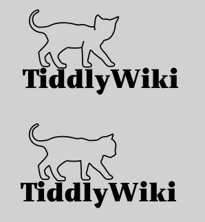
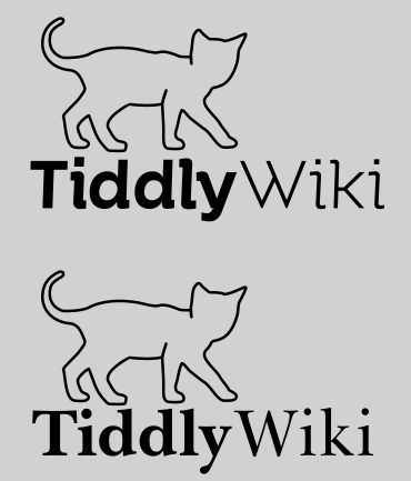
The previous version without inner lines was better. One addition to the points remarked above: In this position all paws could end on the same line.
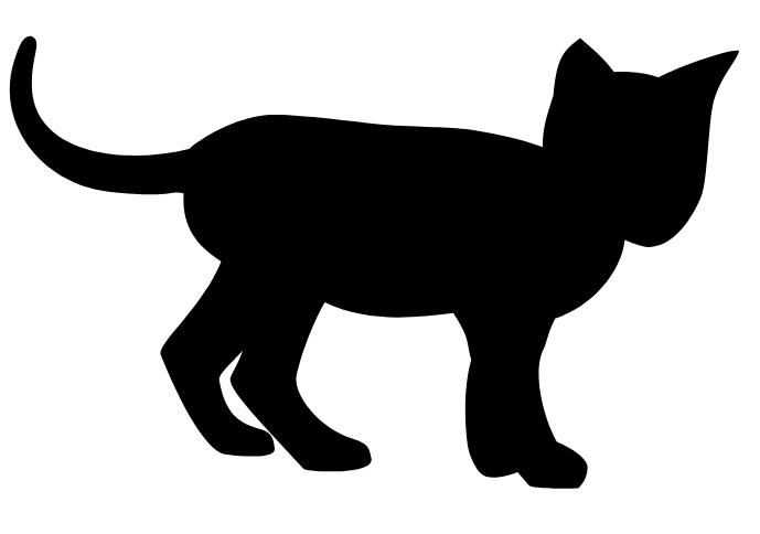
I know it has been quite some time and there have been many great entries. But there hasn’t been any closure or winner design, so I decided to give it a try.
I did a rather conservative approach, I tried not to change too much. I concentrated on the points that Jeremy has indicated in OP (except for the dip in the back, I left that unchanged) and adjusted minor other points (removed some redundant nodes, smoothed some corners).
<svg width="510pt" height="317pt" version="1.1" viewBox="34 107 510 317">
	<path d="m425.03 116c-15.438 1.5662-20.859 42.76-14.573 67.68-10.904-2.9058-31.717-7.0196-43.019-7.5367-15.575-1.005-40.949 3.7675-58.786 3.2651-17.836-0.50241-52.939-15.889-82.147-12.561-11.743 1.4153-23.141 3.9024-34.043 8.7436-6.6696 2.9618-19.549 12.695-31.784 15.189-47.841 9.7499-115.2 6.6228-101.68-61.897 1.264-5.547 1.6253-10.548-0.8877-11.795-3.131-1.554-4.8884 1.7003-6.7354 5.2793-28.402 60.441 22.312 99.122 79.395 99.505 6.9415 0.0466 19.647-1.4219 26.07-3.3311l-0.42773 2.3174c-3.1558 33.213 19.274 40.071 21.063 49.19 2.2363 11.397-33.691 52.734-35.182 59.384-2.082 9.2816 30.47 58.908 41.126 63.643 9.3804 4.169 29.862 4.2099 34.598-2.499 1.6912-3.1548 0.52071-10.761-1.3178-13.108-0.46748-0.59673-2.5931-1.3268-4.5854-1.9479-1.8677-0.58231-5.5586-1.2425-9.3282-0.49591-1.0742 0.21273-2.348-0.34893-3.1846-0.85254-0.69903-0.42081-1.7109-1.7505-1.7109-1.7505-4.9991-6.1825-17.891-18.47-15.523-28.468 2.0235-7.4111 10.287-14.255 13.254-21.296l-0.10547 0.72803c-0.53151 8.7951-1.9957 23.445 0.88476 26.08 9.4755 8.6668 24.478 25.788 25.094 26.487 7.7931 8.8485 18.635 20.586 28.967 26.354 6.2506 2.921 12.52 4.8148 19.535 5.0508l8.915-0.41895c4.4566-0.94098 9.7011-1.6458 12.686-5.5298 3.3718-5.62 0.22444-21.355-13.712-22.48-13.937-1.125-22.928-6.293-35.741-24.951-10.556-18.037 2.2148-42.879 6.5112-60.627 22.047 3.477 44.255 6.2147 66.614 6.2695 9.7003-0.48336 19.313-0.82623 28.875-2.6265 3.0501 7.6351 11.587 28.99 11.66 35.023 0.20568 16.996-6.372 34.087-3.5068 51.07 1.0105 5.9896 1.4744 14.024 10.128 14.87 7.9619 0.778 12.569 0.47437 18.858 0.29444 9.8546 16.205 20.71 16.674 36.53 16.579 8.0446-0.0482 12.03-2.8813 14.028-5.9513 6.531-9.296-10.393-12.922-16.422-23.222-6.03-10.299-30.899-66.824-12.059-82.651 18.842-15.827 37.697-23.017 46.978-37.181 4.1033-6.2627 9.4592-15.853 8.8696-25.138 3.7161 2.5111 11.014 4.015 17.183 3.7222 16.084-0.7636 25.193-12.201 31.888-31.056 3.9064-11.001 5.125-24.263 4.2026-35.146-1.2148-14.334-3.1511-26.914 5.0522-37.036 4.8309-5.9604 13.215-12.242 11.662-15.015-0.89691-1.6018-6.0024 0.95789-18.941 7.8407-12.938 6.8828-15.05 8.9998-27.07 9.9176-10.793-3.212-23.738-6.2867-35.145-5.8367l-0.0234 3e-3c-5.6011-7.1506-16.285-22.763-22.988-22.083z"/>
</svg>
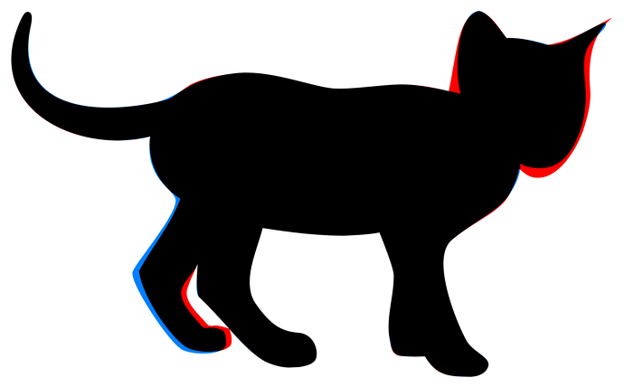
Here’s an attempt at a visual diff, old version in red, new in blue, overlap in black:
Here is a different attempt focusing more on the head.
While I still think it is too elaborate to be an actual logo, it does have a more contained shape and better readability at small sizes. It could perhaps be simplified into one.
It is based on one of the other photos from Jeremy’s Flicker album
This looks great. The Tabby that’s a Tiger inside.
Coloured origami suffers from colour doing too much work.
Stick with one colour paper to convey essentials.
Anyway, did you fold this yourself? 
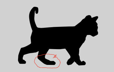
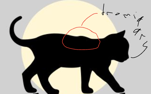
Has aged Moggie developed lamefootitis in the posterior sinestra legus? And Backus flatus. 
He has had his struggles with Tiddlywiki and us, I guess. Now in his old age we want to use another image. Even worse we want to stop feeding him tiddlers constantly from all over the world and only deliver notes. Not easy to be an aging cat.
Does that account for the Incipient Dromedary Syndrome? 
