There’s been a good response to that idea, with @JanJo and @telmiger already making contributions.
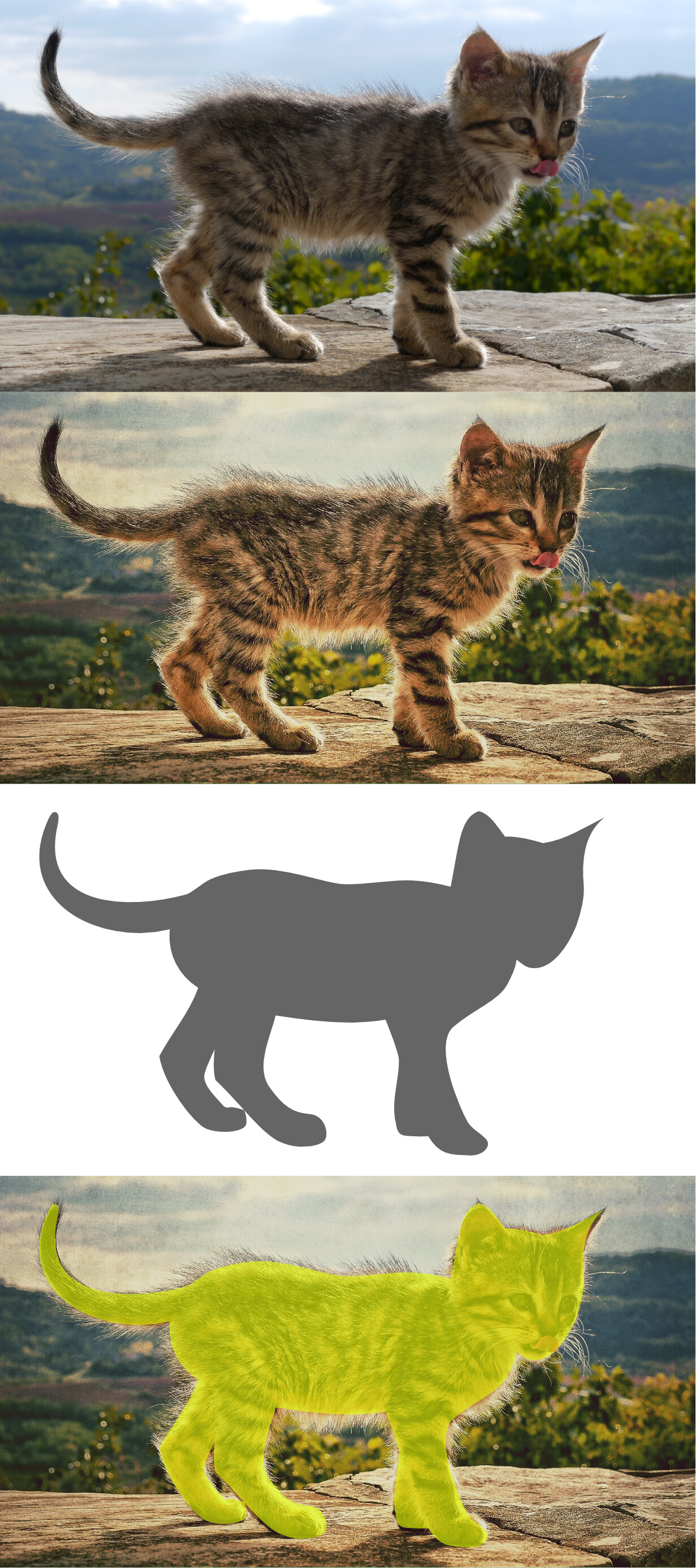
I’d like to take a bit longer to explain what the problem is. At the bottom of this post, there’s a strip of images showing:
The original photograph of Motovun Jack
The published version, with some postprocessing
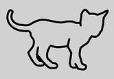
My original monochrome SVG version of Jack
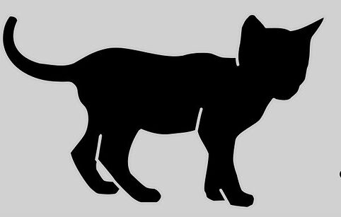
The monochrome SVG overlaid over the photograph
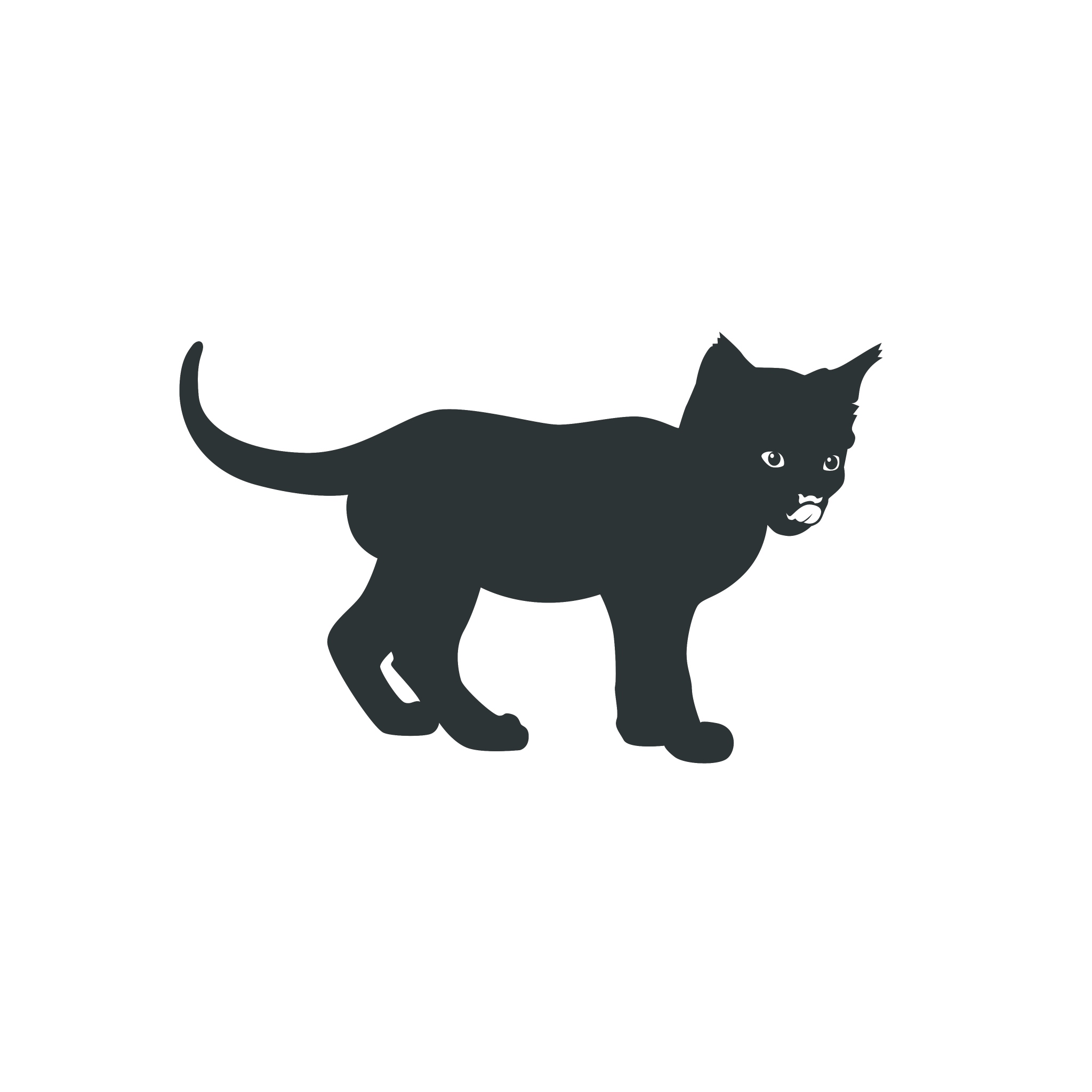
The fundamental problem is that I was trying to produce a sharp image with clear lines from an original image that has fuzzy, indeterminate outlines. I tried to take some artistic license, but I think there are some significant flaws:
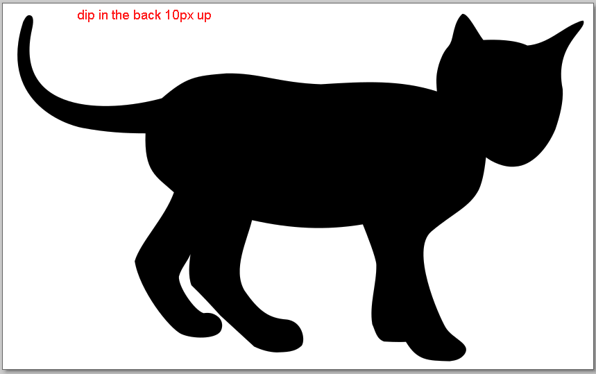
The dip in the middle of the back is unnatural
The back of the neck looks too thick
One ear is too pointed
The face looks twisted and distorted
The chin is a weird shape
The hairline join between the back legs is distracting
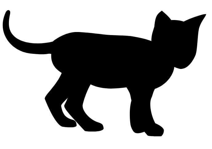
But those critiques are details: the main problem is that the monochrome image just doesn’t look alive. I’m full of admiration for the way that artists can capture lifelike movement in a single curve, and that’s what I think we need to try to achieve.
One specific suggestion that might make things easier is that perhaps we should move away from a monochrome silhouette, and instead include details within the image. Perhaps just a line to indicate the chin, and some curves to indicate the eyes and tongue. Or perhaps we might go further and move away from strict monochrome so that we can reproduce the tabby stripe pattern.
Also to clarify that the goal is an SVG image that we can reproduce at multiple sizes, and that we’d incorporate into other designs (eg the TiddlyDesktop icon).
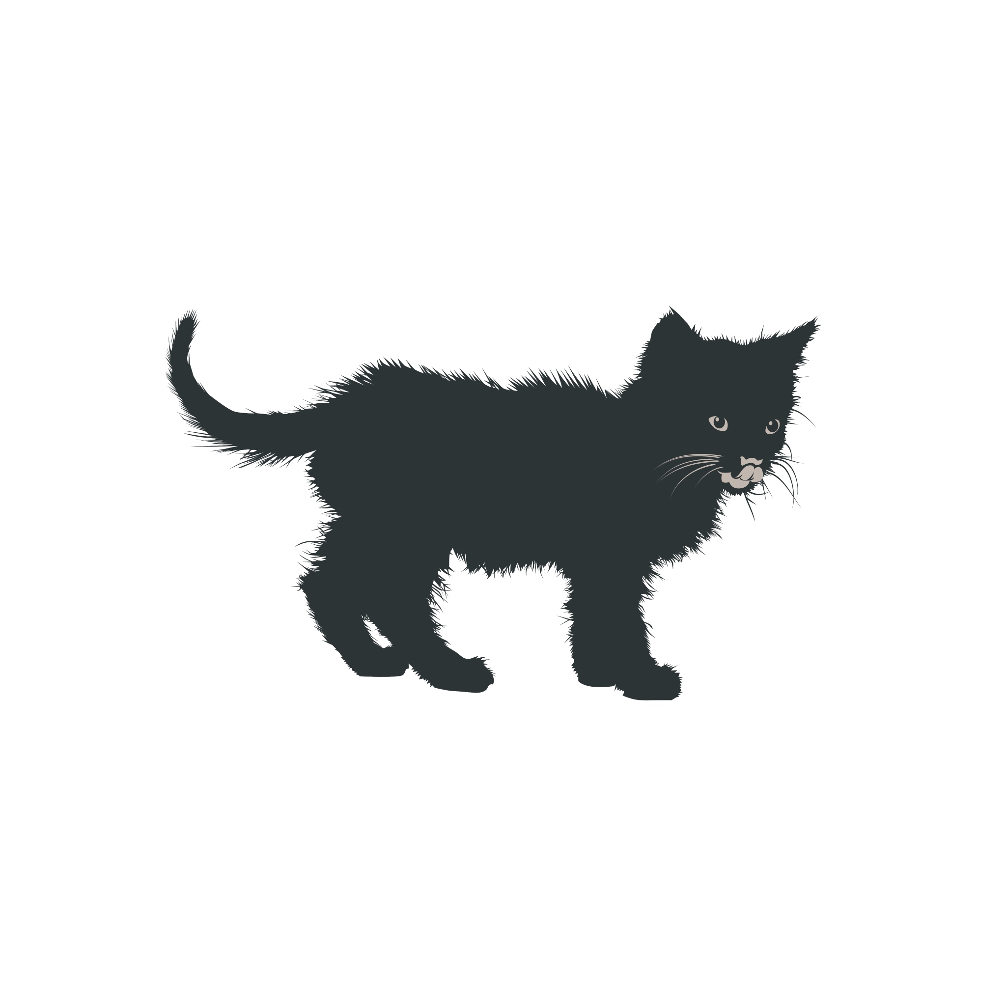
I did change it, and the body starts to look like a potato. The following image only switches the dip 10px upwards and imo the body already starts to look like a potato. I would be inclined to keep the dip or only make very small changes.
The preview also addresses all the other issues you mentioned.
The ears and the head are very tricky to change. Very subtle changes already destroy the proportions.
I did try to accentuate the neck so the shape of the head
The left ear was moved a bit into the head
The right ear is still pointy, because I think it’s a signature of the icon.
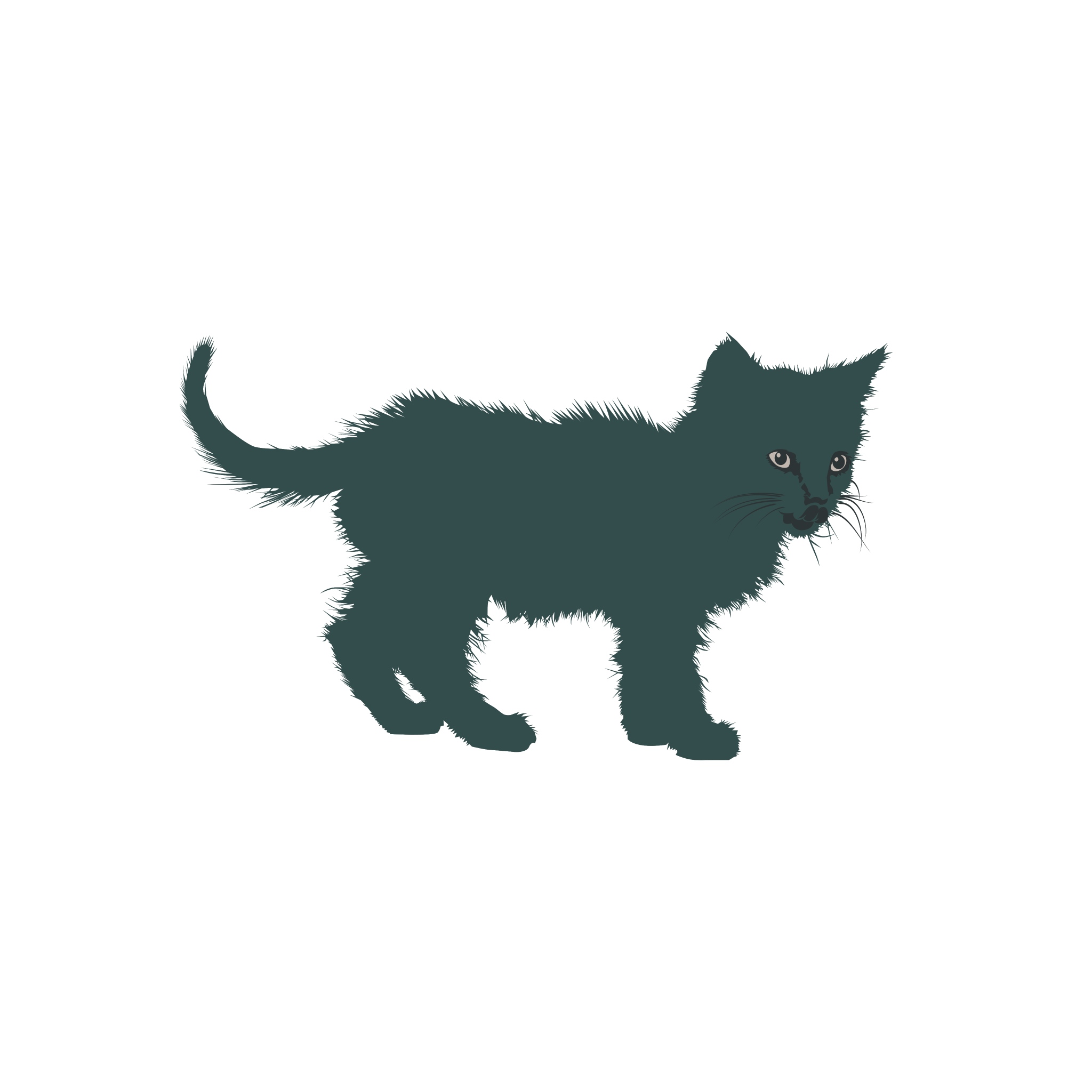
This challenge is interresting. I used the picture as a reference and tried to find the best curves to express the overall shape.
It is not ready to use, just a work in progress. It needs to be polished, smoothed and tested in different sizes.. Maybe smaller shapes needs to be drawn differently as high qualiy typographic families have their characters redrawn for different sizes.
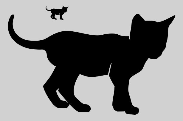
Here the small cat is just a downscale verion of the big one.
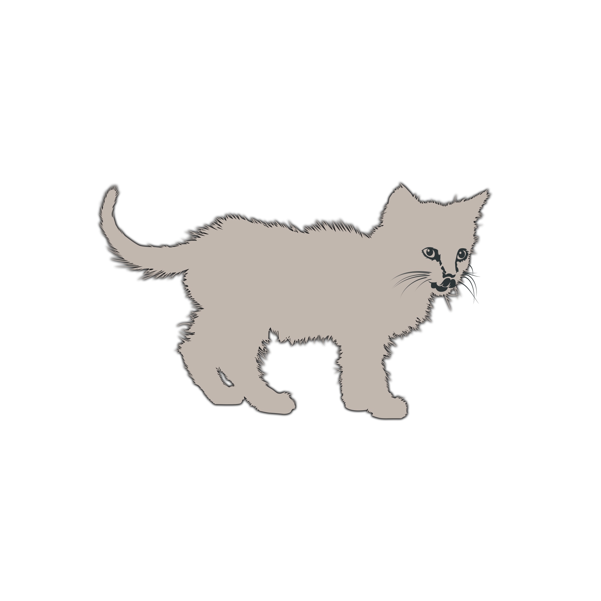
I think the use of whitespace to visualize those contours is a good idea. Perhaps it’s worth experimenting with using the same method on the legs as well?
I’ve modified the contour and here are different sizes and presentatons with contour or not, and different fillings.
All the cats are drawn with the same contour.
This happens if you change the position of the feet. It does not look as kittenlike anymore.
But at the age of 19 the kitten has grown up. I already thought to suggest to change the logo to a tiger.
look good, and there is nothing to be afraid of in this approach. However we should check if it also looks good with inverted colors (light icon on dark background).
Since we’re talking about other ideas than simply redrawing Motovun Jack, I have some loose thoughts on the whole topic:
Detail level. One problem of the current design used as logo, is that it looses its details at small sizes. It’s still recognizable as a cat, but not unique anymore. We could experiment with using just the head, it would be easier to expose some details even at smaller sizes of the logo.
Object. Many logos of software products with animals in it contain an object that refers to the software’s purpose, e.g. Firefox (globe), Thunderbird (envelope), GIMP (paint brush), Evernote (post-it note). Maybe Motovun playing with a (here’s the difficult part of conveying TW with a single object) notepad/ flashcards/ puzzles/ thread/ fishing tiddlers out of the story river would make the logo more alive and reference the purpose of TW.
Who’s work is that? The head seems too complicated for Montroll.
Actually, I’ve noticed various advertisers, especially Amazon, use pseudo-origami drawings to illustrate their sites. It has the advantage that it can be reproduced at various scales and that people don’t get bogged down critiquing small deviances from reality, since those are expected.
I simplified the first version I dropped last time.It is a little bit smoother, with less points and some small adjustments. In the picture only 1 SVG but drawn with or without contour and differents shades.
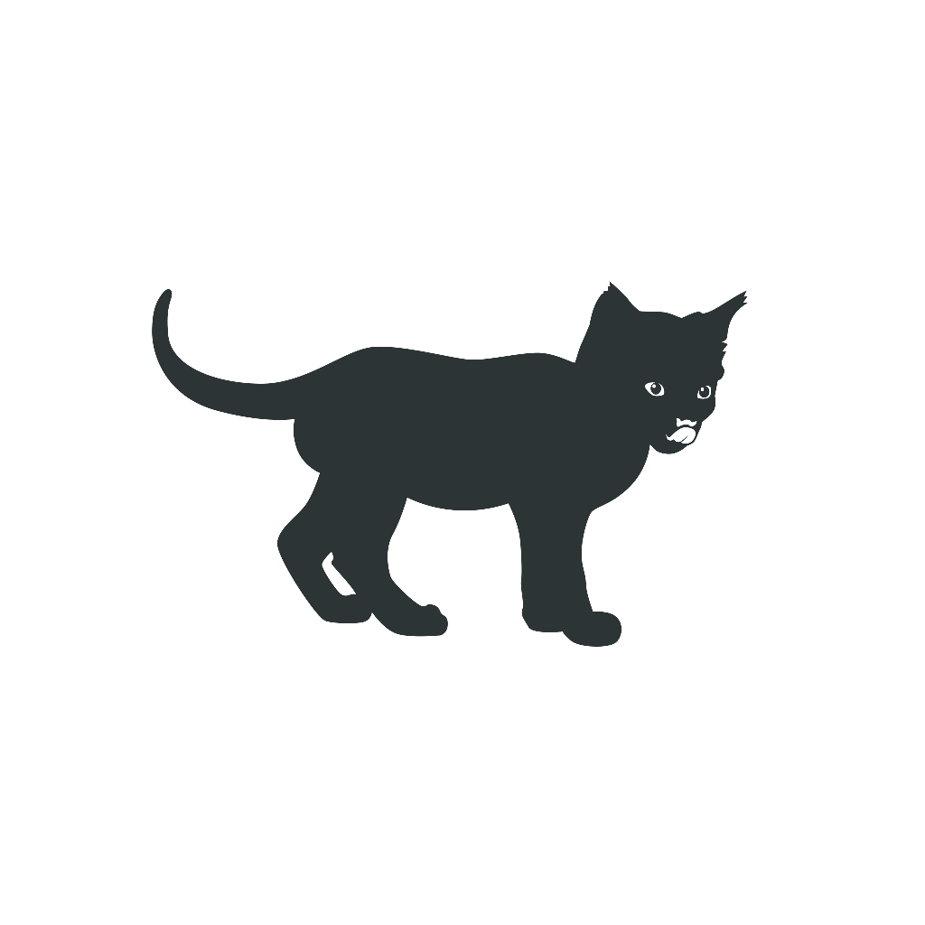
I would say the simple black cat without the extra inner lines is the one I would choose. It cures most of the problems of the prior version.
There could be a slightly more distinct edge at the top of the tail.
I like this one a lot. My only objection is to the lines cut into the body: the neck, the front shoulder, and the hind knees. Those versions which don’t show these among your variants look much variants look much better than those that do. OTOH, I like the cut between the front paws, although I think it should move rightward a bit (doesn’t seem aligned with the shoulder above.)
But who am I to critique? I couldn’t do anything half so good. Kudos!
There are some nice improvements here, the indented lines really do add to the clarity of the silhouette.
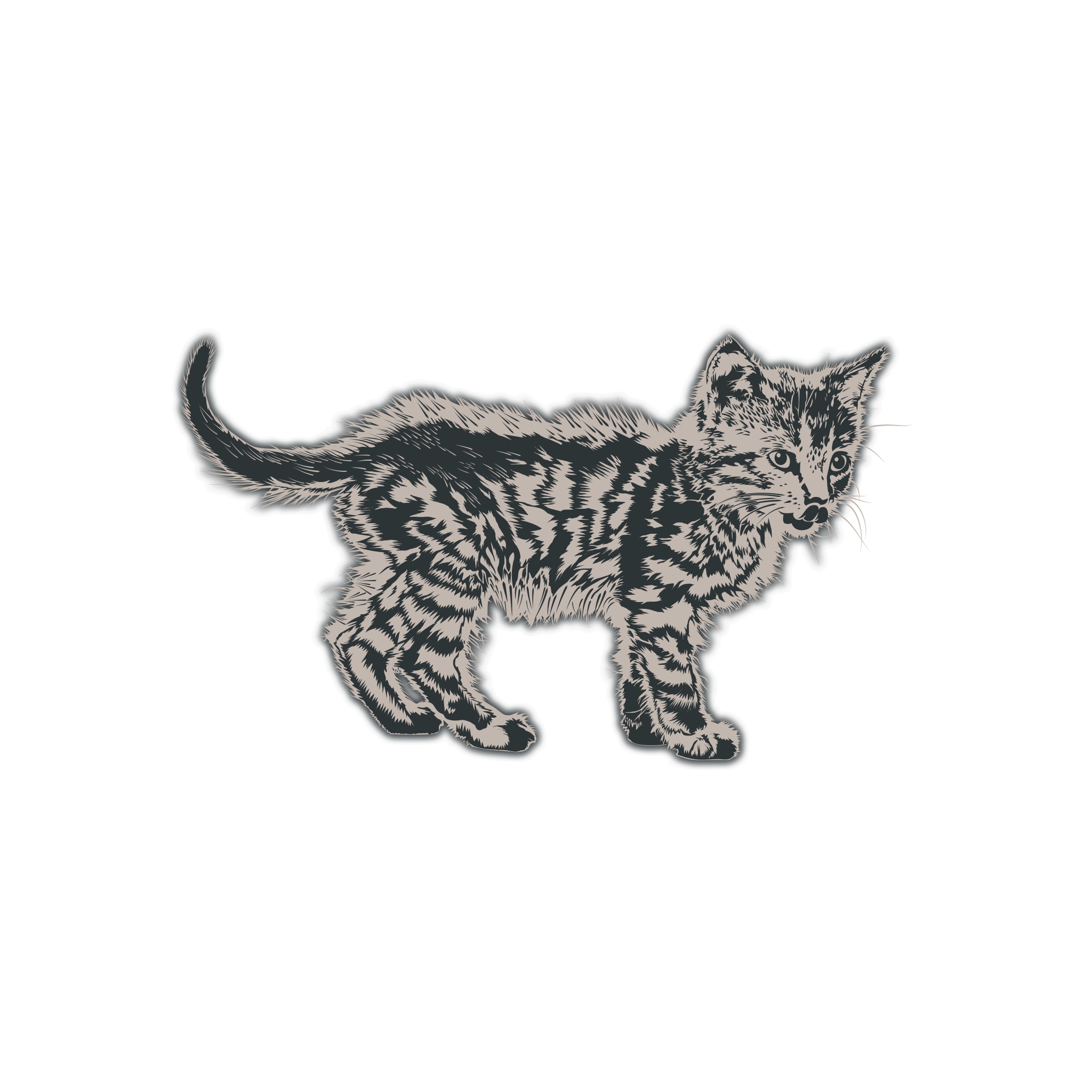
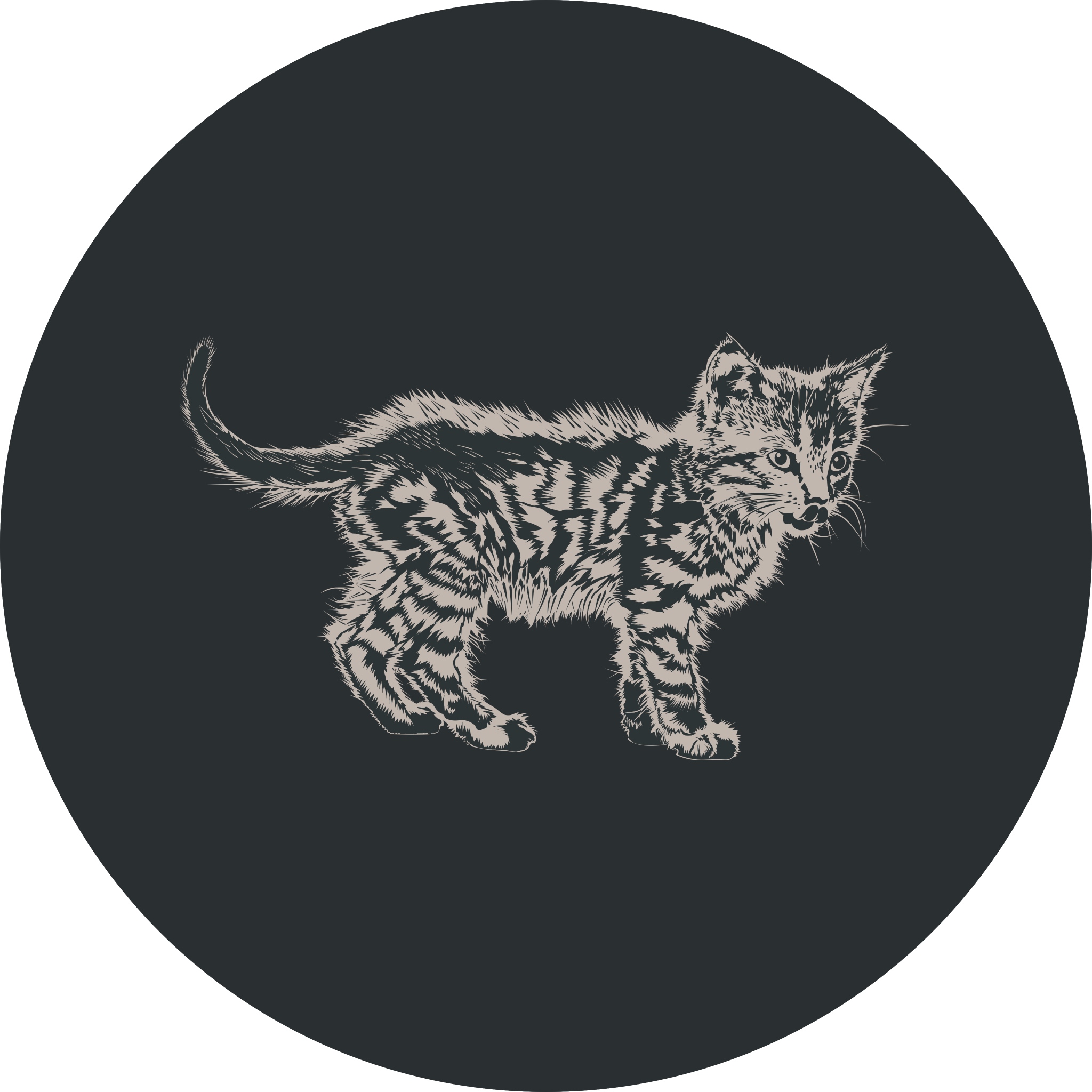
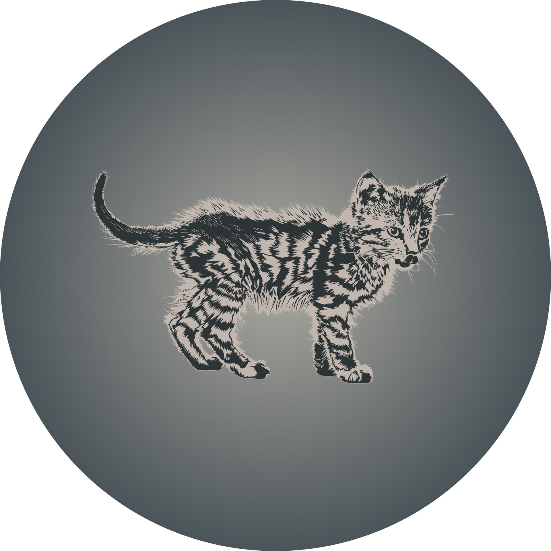
Vector illustration is something that captivates me, though I’m an amateur, I decided to make my own renditions of Motovun Jack.
It took a lot of trial and error, that backlit fuzzyness was really hard to capture in vector graphics, but it was quite fun to make. They come in minimal, detailed and partially “shaded” variants showing the tabby pattern and his fuzzy appearance.
As mentioned in other thread about TiddlyWiki 19th Anniversary I don’t really think any of these make for a good logo.
They are too detailed, lack focus or a clear message. Though I believe they may still make for a very nice project mascot and general image for illustration purposes, like a featured images, example picture, mood definition, advertising, merchandise, etc. they don’t seem adequate for a dedicated logotype.
Since Jeremy Ruston specifically mentioned it I made these any way, but I’d really be up for designing an actual logo, and proper branding for the project.
If it ever came to pass, I think now would be a great opportunity to do so, so that any “rebranding” efforts would be invested in something lasting, rather than a dead end.
I’d be really interested in hearing @jeremyruston thoughts on it, if any. I’d be willing to lend a hand in you are interested. I don’t have as much free time these days, but I think I can spare enough to work on something worthwhile if you are interested.
Maybe we can try changing the color. Black always gives me a bad feeling. If a logo can give people a sense of intimacy or cuteness, a bright feeling is very good, such as go’s marmot logo.


 would make the logo more alive and reference the purpose of TW.
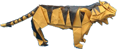
