Slideshow / presenter based on horizontal storyview

Seeing how well @BurningTreeC 's multicolumn works I ask myself whether there is an implementation for a horizontal storyview where the tiddlers are placed in a horizontal row and how this could be elegantly realized
The basic concept I would like to have:

  • a horizontal storyriver
  • @Mohammad 's section plugin to be able to control long tiddlers
  • a mechanism to navigate from section to section
  • a toggle to switch the tiddlerwitdh to viewportwidth and sectionheight to min 100 vh.

furthermore I’d like

  • the zoom mechanism of the singleTiddler storyview if links are followed.

Are there working implementations or ideas of a horizontal storyview out there?

I don’t use horizontal story views, but I do present long-form tiddlers as modals using…

For book-like material, I much prefer the affordances of horizontal layout.

Hi @CodaCoder,
thanks, is there a way to use this to build a storyview?

Sure, similar CSS could be applied to the story, but I have to say, it would look pretty awful given that tiddlers have varying lengths and the longer ones would “wrap” up and down across the columns, or, worse, make a mess trying to optimize for the best break points.

Then I am still looking for a good way to align single Tiddlers in a horizontal row that could be the basis for a horizontal storyview

Is this what you want

https://crazko.github.io/krystal/

Thanks @arunnbabu81
I stumbled upon Krystal, but it is not exactly what I want for the slideshow, though it is a very nice metaphor for a pile of pages.
I thought of a scrollable simple straight row - with each tiddler being individually scrollable vertically
I guess this can be done by css, but I do not now how to make a real storyview of this.

How about using muuri with horizontal layout and keyboard shortcuts to navigate through the tiddlers.

https://burningtreec.github.io/tiddlywiki-muuri/#%24%3A%2FControlPanel

http://tiddlywiki-keyboard.tiddlyspot.com/

Muuri devides the viewport into columns, here the tiddler should have a fixed width (in mobile an slideshow the width of the viewport) thus the row will be much broader than the screen.
I think it is a question of CSS, I think this here could be an approach, especiallcy this codepen demonstrated there .
I would like to learn how to cast this into a custom storyview.

Ciao @JanJo

Just a side note.
I thought this thread very interesting in that it explores liberating the horizontal fully.

The examples you point to are very good. They don’t look too complicated CSS wise.

UPDATE: I thought the examples interesting also for potential easier use on mobiles? That matters to me as my end users mainly live on phones. FYI, I notice, at caniuse, reasonable support for scroll-snap.

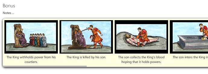
Just FYI I have interest in potential infinite horizontal scroll / jumping to examine and analyse sequences of images … Here is a shot of a sequence from alchemy that would work well that way …

Best wishes, TT

1 Like

Hi Josiah @TiddlyTweeter ,
that’s interesting, let’s work on this … btw: Did you know I am an arts teacher?
Pershaps the pic macro I did for the wrappit dropdown could also interest you sliZer Test

1 Like

Yeah it i useful to see Slizer, Tx.

FYI I am doing some tests with the codepen you posted a link to. It is looking promising. I had to modify it slightly to get it working in TW (TW does not like “.section__item”; I changed all those to “.section-item” and then it started working).

IF I get anywhere real I’ll let you know.

Best, TT

@TiddlyTweeter Because I am just starting to tinker myself, I would even like to see your work in progress ;-).

1 Like

TW likes it – my guess, you hosted the CSS in the same tiddler; TW wikified the _ as <u> elements. Had you put the CSS in a stylesheet tiddler, 'twoulda been fine.

Right! I tend to do that when testing :roll_eyes:!

@JanJo

Here… put this in a new tiddler at TW .com

<div class="section">
  <div class="section-item bg-1">Item 1</div>
  <div class="section-item bg-2">Item 2</div>
  <div class="section-item bg-3">Item 3</div>
  <div class="section-item bg-4">Item 4</div>
  <div class="section-item bg-5">Item 5</div>
</div>

<style>
.section {
  display: flex;
  gap: 20px;
  max-width: 325px;
  overflow-x: auto;
  scroll-snap-type: x mandatory;
  box-shadow: 0 3px 10px 0 rgba(#000, 0.1);
  -webkit-overflow-scrolling: touch;
  scroll-padding: 1rem;
  padding: 1rem;
  margin: 3rem auto 0;
  border-radius: 5px;
}

.section-item {
  display: flex;
  justify-content: center;
  align-items: center;
  flex: 0 0 300px;
  width: 30px;
  height: 150px;
  scroll-snap-align: start;
  scroll-snap-stop: normal;
  background-color: #ccc;
  font-size: 1.5rem;
}


.bg-1 {
  background-color: #f1c2c6;
}

.bg-2 {
  background-color: #dac2f1;
}

.bg-3 {
  background-color: #ccf1c2;
}

.bg-4 {
  background-color: #c2e9f1;
}

.bg-5 {
  background-color: #f1ebc2;
}

</style>

May be you can use

https://tid.li/tw5/plugins.html#%24%3A%2Fplugins%2Ftelmiger%2FBtx

with krystal. I haven’t tested it .

Good on you @CodaCoder. It is good to have your eye on the biz!

One thing I noticed is the codepen maybe has more CSS than is actually needed for @JanJo’s needs?

I found the “display: flex;” under “.section-item” class not needed for my use cases.

Just to update you, @JanJo, I beginning to get what I need. But it needs testing on mobile for touch actions so not to waste your time.
IF it gets past that test I’ll upload an example wiki.
Maybe in a couple of days time, fingers crossed.

Just FYI here is what it begins to look like in TW …

Best, TT

Hi @TiddlyTweeter that already looks good.
It seems this is within a tiddler, I would like to have a storyview where tiddlers align that way.

As I said I would also draw profit from an untested TW. No TW ever did harm to my PC.

1 Like

Is there a documentation on how storyviews work?

  • What is needed?
  • What happens, when they are changed?
  • What ressources of other storyviews can be while they are not active?

Given the power of that tool my knowledge here is quite incomplete.
In Kristal for example this does not seem to be used correctly. horizontal figures as a storyview…but you cannot switch to normal.

PS: This question was a little too hidden, so I decided to dedicate it a proper thead

1 Like