Right. It is ironic that pure touch devices make d-n-d that is easy on DT difficult.
I’m not tech enough to know the answer, if any, but I do see it is a puzzle.
Just a comment
TT
Right. It is ironic that pure touch devices make d-n-d that is easy on DT difficult.
I’m not tech enough to know the answer, if any, but I do see it is a puzzle.
Just a comment
TT
Swoon! 
Definite step. Pretty remarkable. Very smooth here on Windows combo tablet. Both in keyboard mode and plain tablet with MOUSE or PEN. Though FINGER doesn’t work.
Esoteric comment
TT
Not sure if difficult is the right term. Touchy, maybe? 
They tend to use “modes”. You setup to use a mode (copy, for example), then select the operation to be performed. Tres touchy and “lengthy”. As Jeremy intimated to me many moons ago, TW tries to be “immediate” – something (I vouch) touchy platforms haven’t mastered, yet.
I dunno. I been testing on a Windows tablet (has pen and mouse) and a Chomebook in tablet mode (no mouse or pen). The MOUSE seems to mark the easiest difference.
It all gets a bit too esoteric for my brain working out what to do.
In terms of final usage. Well my users are mainly on touch-only devices so it is an issue to implement for them. But for DT work it is already brilliant.
A comment
TT
It is really easy to use now, when ON the drag icon is almost always present. But then this will “compete” with other drag and drop or click to edit zones. However we can drag these tiddlers to another wiki Just tested).
It seems to me we need a few conventions so people know where to find a drag “handle” by default, with or without switching on. Then It would then be helpful if we could select what function the overall tiddler body has. For example
So my suggestion would be for us to agree on some conventions so that;
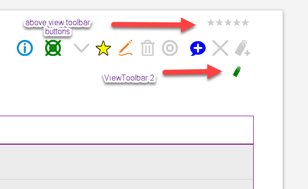
Note: We are not limited to current User Interface elements for example here on one of my wikis, I introduced new UI Elements;

What I am suggesting is provide icons or area conventions for different operations but then also allow them to be switched between installed alternatives.
Then it we could have a switchable config to choose what individual tiddlers or all tiddlers body is;
So I suppose I think we need tiddlers to have a convention that we can plugin or configure for different functions.
I hope what I say makes sense (I know what I mean)
Hi folks,
now columns are dynamically creatable / removable 
https://burningtreec.github.io/tiddlywiki-multi-columns
If anyone is interested to dive in and help in the development process, here’s the GitHub page:
Best wishes,
Simon
Ciao @BurningTreeC
Very neat. Very useful! The Ctrl+Alt+N to make new columns is super. And the Sidebar navigation to columns is also v. neat …
This is just a comment … allowing new columns can be a challenge horizontally … in that the overall total available width is preset and limited.
For my kind of use it might be interesting to allow infinite width? Meaning you’d get horizontal scrolling once the columns exceeded the standard width. I certainly think for this kind of app, with more than a few columns, overall width figures? I’d say it is likely better to have a “width of Tiddler” set and force horizonal scrolling to ensure it persists.
(I hope this is clear.)
Overall I think it great.
Tanto grazie, TT
Ciao @TiddlyTitch
Thanks, I try my best …
The horizontal challenge:
Overall it’s clear what you intend, thanks!
Grazie mille,
Simon
Very cool. Just opened on my phone and it glides very nicely from column to column in portrait and shows all three columns in landscape.
I can’t drag tiddlers from one to another.
Just spotted horizontal scroll bar!
Is this building on your muuri work?
Hi Simon
Wonderful!
I can open the same tiddler in more than one column! This is amazing!
The new feature of adding/removing new columns is absolutely neat!
This is very useful!
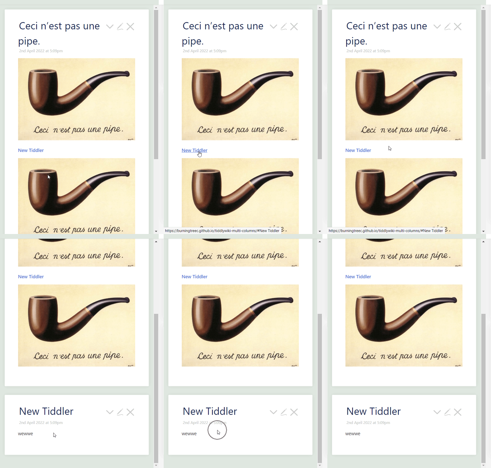
A small issue: Clicking a link to a tiddler is open in story river (same column) does not scroll to that tiddler
Example:

A Sample Application of Multi-Column Layout:
This screencast shows one usecase for multi-column layout. It employs an editor with a select widget to select among tiddlers, edit in one column and live preview in another column.
The multi-column layout allows separate scrollbars. This is useful for long tiddlers, like the one contains solution to an exam question!

1 column, 2 columns, infinite columns.
There are all kinds of use cases for infinite columns. All related to the ability to see and/or navigate to more information.
First one that comes to mind is Kanban. The use cases for more than two Kanban columns, you could find the same kind of uses cases for more than two columns in TiddlyWiki. All about visual organization and navigation.
Same reasoning when you look at Ted Nelson’s Xanadu.
Same reasoning as why anybody would need more than two columns in a spreadsheet.
A use case: a column of current events and how they related to events of 50 years ago in a second column, and to 50 years before that in a third column, and so on and so forth.
Nice one! Use case - storyboarding. Thanks BTC.
Hi @Ste_W ,
this isn’t building on my muuri work, it’s all wikitext 
yes for mobile use I will have to add some css to make it work
Hi @Mohammad ,
yes there’s this navigation issue and I wanna solve it somehow
I’d be interested in what @jeremyruston would have to say about it 
No problem, what is the issue?
Thanks for jumping in @jeremyruston 
The issue is, that navigation within the different columns doesn’t work
What I mean is the automatic scrolling to the domNode when opening a link for example
Hi @BurningTreeC
Thanks for this usefull innovation, which to mind has great potential.
Some Ideas:
Best wishes Jan