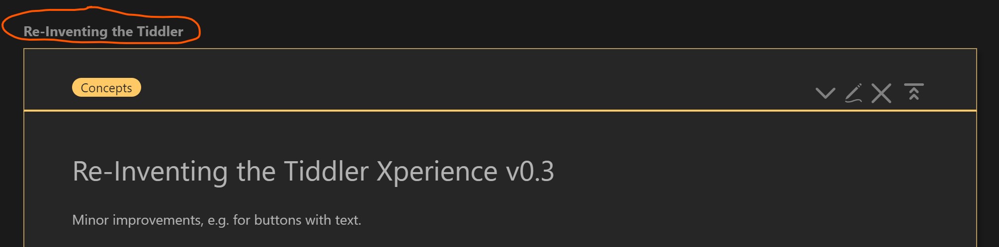
Several times before I have tried to adapt the design of TW to my likings. Changing the structure of tiddlers in the story river has never been satisfying – until now! With the prerelease of TW 5.2.2. I was finally able to put my ideas into TW without too much hacking. Without overwriting a single core tiddler to be more precise. ($:/AdvancedSearch was changed for testing only.)
Here is my first version (alpha, beta?) of a new and flexible tiddler layout:
There is some documentation in the test wiki, I paste the main features here so you can decide if this is worth your time.
Tiddler (View Template)
separate content (field text) from tiddler meta info in other tiddler fields
the content of the field title – that I see more as an id than as a title – should not interrupt the flow of the page content
responsive design
nice look on every screen width
keep together what belongs together
flexible order and display of meta info
order via drag and drop/tags
style easily via CSS
show/hide meta info in flexible ways
configuration options for the whole story
sidebar config panel, see Story UI
The redesign targets only “normal” tiddlers and not system tiddlers at the moment.
Story
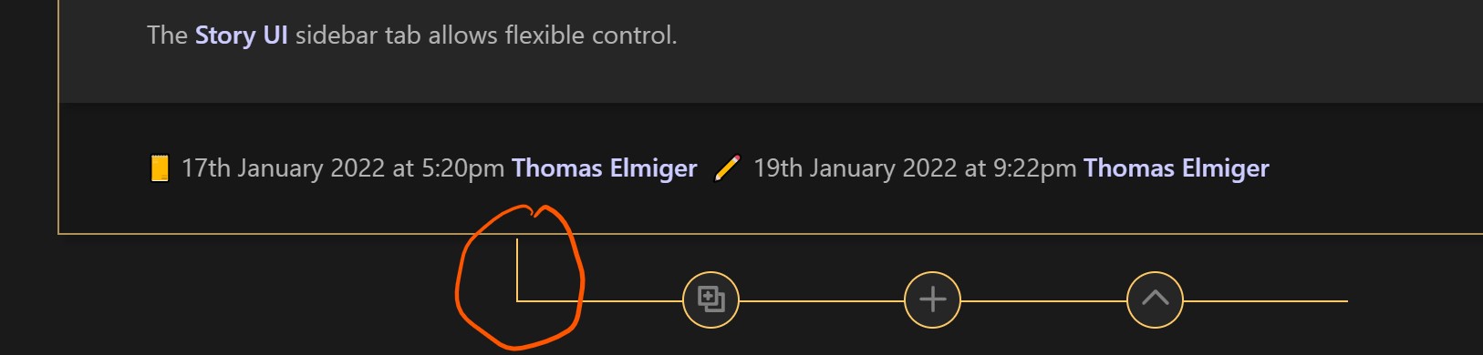
a button that inserts a new tiddler in the story below an existing tiddler (insert new here)
reduce the need for activating the sidebar
reduce scrolling and dragging tiddlers around
I might pack this into a plugin at some point in the future, so feedback would be appreciated.
Would you be interested in using this?
If yes, should it be a plugin?
Do you miss something?
Are there any bugs?
Do you have hints for the design? (send CSS if possible)
Are there features you would not use?
Are there features that should be available separately?
My time is still limited and I have other projects with higher priority – but it was fun to tinker with TW again. TW 5.2.2 is a big promise in my eyes and there is a good chance that what starts here will become a finished plugin sooner or later.
Thank you for your attention and all the best,
Thomas
You don’t know how much it pleases me to see the viewtoolbar separate from the tiddler title. That was a major design flaw of TW5, as it makes it hard to adjust the font-size of the tiddler title, and made longer titles messy.
Your separating of things made it easy for you to have independent toggle buttons for those elements in the sidebar. Very useful. Similar to my old Customizer plugin, but adding more flexibility. Nice!
Given what you are doing with the tags and title, the viewtoolbar buttons make sense outside the tiddler frame.
Might get tedious double-titling everything all the time. But I like the idea of separating the tiddler title from the title of the content. And toggling the header and toolbar off made it look really clean, thinking of web publishing.
I recommend the Resizable sidebar plugin. More flexible than your ‘responsive design’ approach. I have need of wide sidebars a lot. So does TiddlyGraph or Maps or whatever it is called.
The ‘fold this tiddler’, unfold this tiddler and unfold other tiddlers seem to be missing from the viewtoolbar > more actions menu. But the fold other tiddlers button is there. I recommend reinstating the 3 missing buttons.
Oh, I just noticed that new tiddler button between each tiddler in the river. Cool idea! And toggleable, too!
It’s not immediately clear to me what the icon next to the Story Wishlist title does, or why it does not appear next to titles on other tiddlers. There is no tooltip on hover, either.
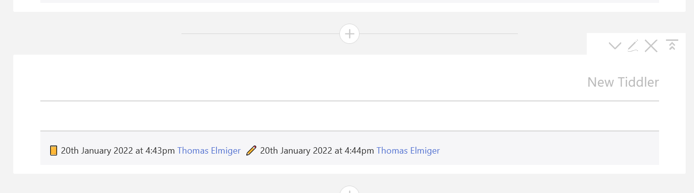
I like the created and edited info on the bottom. I don’t recall seeing that done elsewhere before. While I tend to hide it altogether it is nice to see another approach.
The thought occurred to me to have the tiddler title between the tiddler frames, and the tags and viewtoolbar in the top of the tiddler frame. The tiddler title is less helpful since you have titles in the content. So it would be the first thing I would toggle off. But I might not want to toggle the tags off along with it. I am on the fence about how those three elements would best be arranged. But I offer the above as food for thought.
Hope this is helpful. Blessings, and thanks for making us rethink some basic stuff!
Thank you, Dave, for the detailed feedback. It will make me think things through one more time, especially the role of the tiddler frame element and the parts inside.
First thoughts about your points:
good
The position of the toolbar at the moment has one effect that seems not optimal to me: when you click a link and a tiddler is scrolled into view, the toolbar is placed above the visible part. You have to scroll up to see and use it.
It would be easy to make toggles for every single element (title, icon, author name) but I would like to keep the list as short as possible.
See 2.
In an earlier experiment I created ids automatically. But then I had to use captions and introduce them to search results as title alternative. Search relies on titles. Advantages of double-titling besides being able to start with h1: the id can be static, links and tags are not affected when you slightly change a title. You can have a long title for a short tag.
I will have a look at it. The goal is of course, that my layout works flawlessly together with such plugins. At the moment the story is in my focus, the sidebar might follow later on.
fold this tiddler is visible all the time, so yes, it dissappears from the more menu then (standard TW behaviour) – the fold other tiddlers is at the bottom of the menu. I have never noticed an “unfold other tiddlers” anywhere. There is no such button on tiddlywiki.com either.
Thanks. A “duplicate tiddler from above here” might also be an idea for this toolbar.
Decorative icons (without tooltip) are a standard TW feature I kept and tested here. See Advanced Search for a standard example. (This feature displays the tiddler referenced in the icon field of the tiddler.)
For conservative styling the meta section could be moved to the tiddler header just by changing the tag from footer to header.
Will consider this idea for the next version. Thanks!
The core has “tc-tiddler-body” as class on the body part. I see no reason to change that. By coherent styling I mean I can use the same naming scheme for all my classes. That makes it easier to see where the style comes from for everyone and easier for me to only target my own stuff. Sorry for the confusion.
This looks pretty good and has a lot of potential. Also it helps the non web developers, like myself, to have a more modular approach on where to go when making a change and get the desired result (CSS can/tend to be pretty cumbersome and labyrinthic).
I wonder how such approach would let to changes in your mobile first themes for your Bricks CSS TW Toolkit. Some of my wikis use such themes and most are based in Notebook and Projectify themes. But as TW keeps evolving, and some other approaches get unmaintained, I wonder how we will migrate the old functionality and content to the new possibilities.
I know that usually “life happens” and gets in the way of more playful stuff. So once you have time again, would be nice to know your thoughts
There is a new version 0.2 «Tix» online for you to check out – many thanks for the feedback so far!
Especially @DaveGifford motivated me for the second round – I hope my initial answer and the new version are proof for you, that everything is possible now.
For @jeremyruston I discovered a tiny improvement that could be worth inspecting and adapting for the core: In my tiddler-icon template (that I separated from the existing title template) I changed the code structure so that the span that surrounds the icon is only generated, if an icon is found.
This omits a minor flaw of the core version; Even if no icon is found, a <span> is present in the code and pushes the title some pixels to the right.
@Offray Of course it is one of my (longer term) goals to integrate the new tiddler experience with my older plugins and themes where possible. Where impossible, it might lead to new and better versions or solutions. But you are right: After every update to the core, Bricks gets a bit more outdated and bugs in the design might appear also in my themes when you update your wikis. New features might not be supported. This is why I am really happy for the new options in TW since 5.2.1 – they allow us to implement our own designs from the ground up instead of hacking an “old” TW design. My designs until now were real “hacks” in the sense that even if TW developers always try to save backwards compatibility, I might have hooked on wrinkles that were ironed out and thus my hacks might produce bugs. In the new era we should be able to develop our own layout, our own page structure, our own sidebar or our own tiddlers in a way that is much closer to the separation of content and presentation as it should be.
@telmiger I have only had the opportunity for a quick peek but it looks interesting and fresh, and I particularly like the ease of configuration.
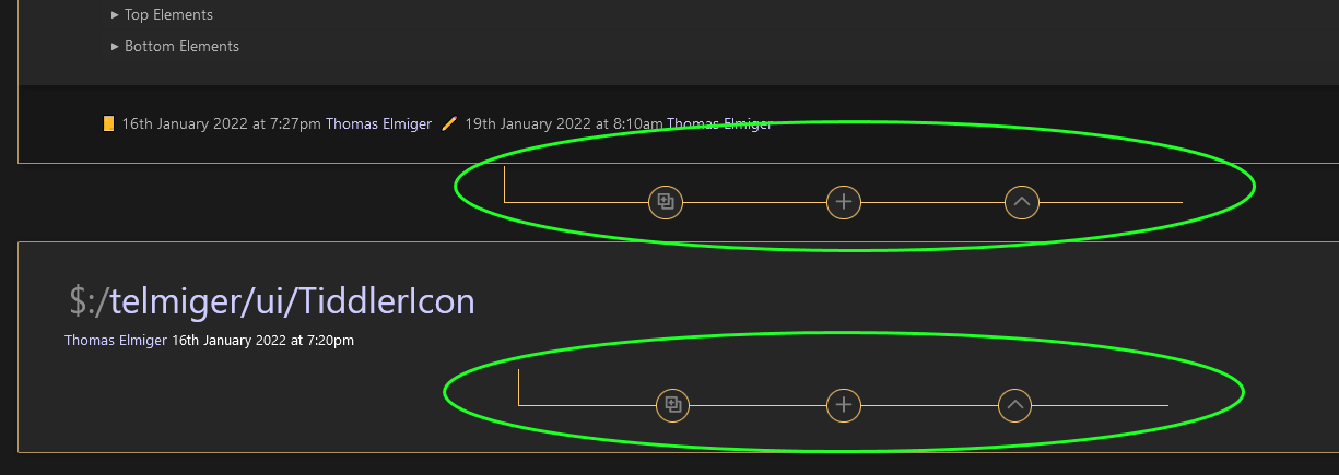
One thing that I did notice is that for the buttons between tiddlers in the story river, it is somewhat confusing for the uninitiated as to which tiddler the clone and permalink buttons refer to, the one above or below.
I forgot to link to my Customizer plugin before: CustomizerPlugin — Reimagining TiddlyWiki. May have some additional inspiration for you. Click the checkbox at the top left of the story river to see what I mean.
Now, on to the new feedback (rushed since I have an appt in 10 min)
Folding in the viewtoolbar, looks nice!
Clone-permalink-New buttons:
a) I never really thought of those as a set until now. Thanks for that mental connection!
b) Very handy set of three buttons, though I also echo Saq’s concern for newbies.
c) I LOVE that circle and horizontal rule CSS for buttons! I would love to try that on viewtoolbar and other buttons. Gorgeous!
I am still wondering about having a way so that tags are visible when the (fairly less important) tiddler title is hidden.
Tix (pronounced tee-nine? short and memorable. Tix the right boxes for plugin names.
Thanks for doing this! Very cool ideas and implementation!
@saqimtiaz thank you, of course you are right, the clone and permalink buttons are there only for testing and demonstration purposes. If I would want to keep them I would adapt them like the “insert new tiddler here” button, so that they get an appropriate title attribute at least. For the experienced user who has tagged some core buttons to appear there it might be o.k. as it is. – I also just realize that the “include text” setting for toolbar buttons does not work for all three buttons there.
cc @DaveGifford
Some quick answers before I check out your link (thanks!):
see my reply to Saq
With Tix you could place the title in the top part (and mostly hide it) while placing tags and maybe toolbar buttons in the header part and keep that visible. You only would have to change some tags to achieve that.
Tix is very short for Tiddler xperience (like UX for user experience). So yes: ticks like my watch.
Ciao @telmiger, I just wanted to comment what I can. I don’t have time to review this fully ATM But. I did want to quickly comment that your new approach looks stellar! Briefly the looks are real neat. I also think integrating the sidebar tool to “hide” things is a totally relevant, important, dynamic aspect of real visual design.
A minor issue for me is that “sticky titles” no longer work. Just in a design sense, sticking some kind of title so it doesn’t scroll off (either the title per se, or just the first line of the text field) is often good.
Looks very interesting. … Only tested it for 1 minute
I was also confused a bit with the buttons “outside” the tiddler … So I did make a small mockup (image edited only), which would make it more clear for me.
This config considers the wish from @DaveGifford to have the title outside the box. Who can spot the other improvements?
Thanks for the feedback to @TiddlyTitch – sticky titles are still missing, this is another TW feature I have never used.
And thanks to @pmario for the sketching – the tab design looks nice and might be beginner friendly. On the other hand it misses my point of keeping non-content “outside of the box”. If users prefer to see the tiddler toolbar inside the box and with background, they shoult tag it to appear in the header part.
Can I leave a wish here for the developers of TiddlyWiki X? A mode to drag and drop UI elements around to rearrange them would be really cool. (Before you ask: That would be beyond my skills and resources.)
Hi @telmiger, I was messing around with it. Particularly using the sidebar options to switch things off. Here is something I’m working on that needs a very minimalist presentation. It needs a lot more CSS custom work but I think this tool will make it easier to achieve what I need … This is a step in that process …
One of the things that previously was complicated this makes easier is “hiding” stuff dynamically. In my own case I hide nothing when editing but use StartUp Actions to set the more minimalist styles that are applied online. Your tool makes that easier.
In the kind of things I work with the normal Tiddler title is used mainly for reference, for finding Tiddlers, by the editor. In final output for users I rarely find they are necessary and they certainly don’t need to be big.
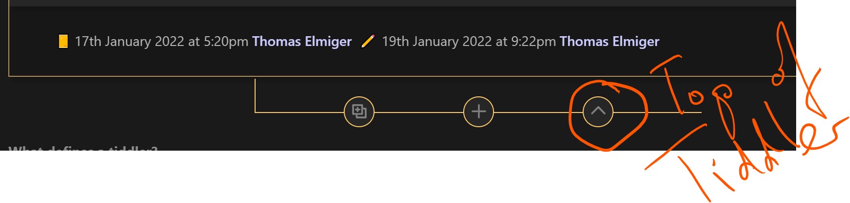
The “leg-up” on the bottom thing I think solves the problem of associating those buttons with the correct tiddler (pace @saqimtiaz’ & @pmario’s various comments ).
The fact I’d like the “leg-up” more left is a minor aesthetic thing. Here is what I mean …
Looking at function in v .3 the “jump to top of Tiddler” button from the bottom of it will be very useful in some many use cases. Jumping to top of Tiddler is a regular need–often you want to “read again” or “close” (the latter you need to see the buttons at top).