Plugin Idea: Tix – New Tiddler Layout (for TW >= 5.2.1)

Thank you, Stefan, for your feedback. I will see how I can optimise Tix for “users” like you. :slight_smile:

The page TOC is an interesting idea, but it is beyond the scope of Tix as it is on the page level, while Tix is on the tiddler level.

(Also, anchor links – https://tiddlywiki.com/prerelease/#Anchor%20Links%20using%20HTML – don’t work reliably in my brower, so I am not a fan of this kind of linking. In my eyes, if you create enogh tiddlers for your content, it is not necessary to have in-tiddler links as you can always link to the corresponding tiddler and the sidebar is your link list or page TOC.)

I hope you will test the next version of Tix again and I am looking forward to your feedback.

All the best,
Thomas

Thomas:

I have just started looking at this so all I can say now is: “My compliments (and appreciation) of a great piece of work”.

Some personal context that may provide a bit of background:

I generally prefer a most “minimalist” UX so that I can maintain focus on my IdeaOfTheMoment. Consistent with TW philosopy, I am totally focused on just a single Tiddler. But, life is all about interruptions, both Life and Work. Inevitably these force me to “jump” elsewhere.
With luck, I can get to the destination before I am interrupted again and at risk forgetting what I had to attend to to deal with the initial interruption.

I’ve enjoyed looking at in your work-in-progress and I am quite optimistic that I will inevitably be an enthusiastic user. After all, I switch to Dave Gifford configuration plugin when it became available and I’ve been tweaking my tiddlers for my optimal use for a very long time. Your work is a significant extension of what I’ve got now!

I noticed your comment that you do not care much for Preview mode and the Clone function. I have recently become very fond of both since I make extensive use of CamelCase words. Since these are rendered in the preview, they effectively create links that can be styled quite easily with minimal markup. What is emerging from my use is that I have a set of Tiddler “styles” that are the “root” tiddlers which I generally name SubjectDate0. Then I simply Clone to create the next instance.

The result is a set of tiddlers that fill the story with while I am working. At a end-of-day break, I simply transclude all of them into one larger tiddler that may eventually get refactored if the need arises.

My apologies if this is Too Much Information, but, as stated, I really liked what I’ve seen. I wanted to express my appreciation and perhaps even a bit of encouragement for a bit of attention to edge uses like Preview and Clone.

Best regards,
Hans

1 Like

Hans, I think it was @StS who does not use the clone button too often. I use it very often and I think I will leave it where it is in my bottom-of-tiddler toolbar.

I don’t know if or where the preview was mentioned before. If you are talking about the edit view of the tiddler and the preview there, then it is not something I would touch with Tix. Tix is only changing the view mode of tiddlers.

Thanks for the rest of your feedback, I appreciate it very much and will happyli consider it while working on the next version of Tix.

Cheers, Thomas

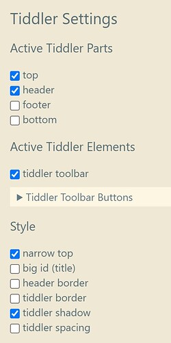
Tix v0.4 is live for you to try out – this time you will be taken to an almost endless flowing river of documentation in the Solarized Light palette. (As before: Use the Story UI tab in the sidebar to switch thins on.)
Besides many optimisations under the hood, there are also a few new options and much design tweaking, many ideas supported by the feedback from @TiddlyTweeter, @StS and @Hans_Wobbe.

https://tid.li/tw5/test/tix.html

While testing, I found the available palettes in TW more appealing than ever before. On the other hand, I always have to set the browser zoom to 120% to find everything readable. Is this just me getting older?

I am looking forward to more feedback, thank you in advance!
Thomas

2 Likes

Thomas:

My apologies for the errors in my comment. I was initially so impressed by your work I tried to immediately comment in the few minutes I had at that time., rather than waiting until I had done a deeper review.

1 Like

Nice! It is fun following this thread to see what you will cook up next!

I notice you have been putting all your efforts into the viewtemplate and story river. Have you thought about making us rethink the edittemplate as well?

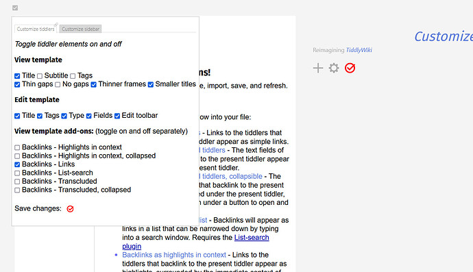
FWIW, here is what I use to hide the elements of the edittemplate. Feel free to use or adapt any of this. Documenting TW — a non-linear personal web notebook

1 Like

Right. They are good.

Your love of spaciousness does come over in your designs :slight_smile:. I doubt your eyesight is failing. Rather, I guess, you like space to breathe :smiley:.

2 Likes

I wanted to immediately comment that whole approach with the “one-click” settings IS the way to go. It will simplify real use quickly and to the point for end-users …

I will comment more later on specifics after using it a bit more.
TT

1 Like

This a left-field comment. But it comes up.

Looking at the CSS styling in TW there is a division between the internal Tiddler styling and the big level layout thing you are doing.

I think it salient to note, right now, you are cooking-the-chicken-well to shape it’s shape AND @twMat is simultaneously baking the inner-chicken .

Between the two of you there may emerge a nice holistic pragmatic approach to alternative TW CSS?

Just a side question, TT

Ciao Thomas

Titles & Tool Bar: The new variants that allow neat variations like …

… are great.

But I also suggest you give an option to HIDE THE TITLE (but leave the tools).

Why? Well I thought your .2 version with a toolbar above the Tiddler was a good design choice & I’m already missing it! :-).

Best TT

1 Like

Ciao Thomas

This is not directly a comment on the plugin, rather my comment is inspired by what you are doing with your plugin. I think these questions are worth asking, though I don’t expect you to solve them.

Your use of the sidebar to quickly set layout I think is very illustrative that we could get a lot better at custom layouts using easy already established TW methods.

One thing that struck me, that never occured before to me, till I saw your latest, is your approach shows it may well be possible to have a "Save This Layout" system. We have story savers already. Layout savers seem equally relevant!

A thought!
TT

2 Likes

I’m also happy with all the 5.2.x series, in my case, with forms and JSON storage, but I’m also pretty glad and curious with what 5.2x has enabled in your themes prototypes. I would like to see in some iteration on how a mobile first bricks alike theme looks like when updated to your current explorations.

Ahhh… good times are coming. Thanks again for helping building them.

FWIW, here is what I use to hide the elements of the edittemplate. Feel free to use or adapt any of this. Documenting TW — a non-linear personal web notebook

Not to get too much off track from the topic, but I really like Dave’s approach here, and I want to note one could also use the same approach to control other toolbar elements, especially if you create your own versions of the core/ui. I extended on this idea and added:

<$checkbox tiddler="$:/core/ui/Buttons/more-tiddler-actions" tag="$:/tags/ViewToolbar"> view-more</$checkbox><br>
<$checkbox tiddler="MoreTiddlerActions" tag="$:/tags/ViewToolbar"> ~MoreTiddlerActions</$checkbox><br>

I created a separate MoreTiddlerActions.json (1.6 KB) that just export tiddler, delete, permalink, permaview, and open in new window

You can be assured, I would like to see that myself. :smiley:

1 Like

Hi Mark,
I like @DaveGifford’s tool too – really cool stuff! And I tried your MoreTiddlerActions … do you suggest to make the More actions menu as configurable as the tiddler toolbar? I will think it over again, but think it is a good idea at first sight. Thanks for throwing it in.

Cheers, Thomas

Hi Josiah,

Interesting – I will keep this in mind. I am not sure though. Maybe you shold save your favourite layout in an empty TW as your starter edition and then throw content at it. Or would it be better to have content first and then throw a layout (configuration) at it? Would you have examples where this could be useful?

Good night,
t

Hi all,

A new version 0.5 is up for your amusement under the usual address: Tix v0.5 — A Novel Tiddler Experience
(The old ones can still be found by adding their number like tix04.html.)

Almost everything is new and better – but not much of that is visible at first sight. What you will notice is: Icon Independence Day has come. The tiddler icon is no longer part of the title/id, but a full blown member of the tiddler like other elements – with its own view template. The only thing it has still in common with the title/id is that it is turned into a link at the same time. So if you opt for links in titles (active in the demo), the icon becomes a link too.

Otherwise, besides the look not much stayed the same. The Story UI sidebar tab makes useful configurations easy. And not so useful combinations are possible too. I tried to keep complexity low, but that is difficult with a growing list of features.

I will stop writing here and go to bed now. The docs in the demo are updated.

Have fun,
Thomas

2 Likes

Very nice! I was just thinking about icons today. My thinking didn’t amount to much. Yours amounted to a nice alternate placement!

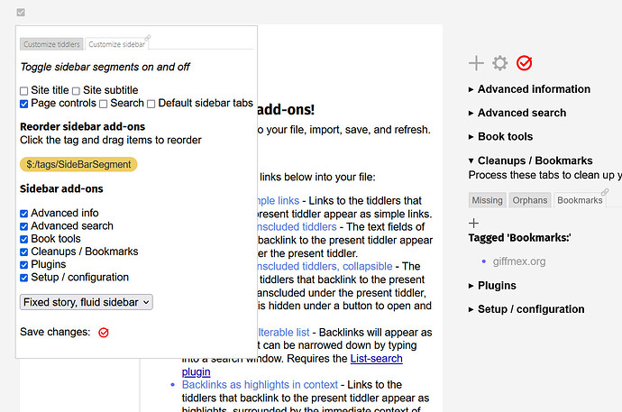
Also, for those commenting on my edittemplate checkbox thingy, that was a first step toward my Customizer plugin, CustomizerPlugin — Reimagining TiddlyWiki, . This plugin was in part to show/hide UI elements, and in part to maximize the sidebar with custom content. See images below. I mention it not to draw attention to myself or to draw attention away from Thomas’ work, which I find fascinating and very useful, but only in the hopes that Thomas or anyone else here will find something useful in Customizer for your own projects.


1 Like

@telmiger, thanks for the notice.

Maybe this should be for a different thread?

It seems to me that saving a complete layout is good.

BUT, I also meant saving several layouts.

I’m not sure the idea fully fits with what you are doing as “layout” in TW could include many settings your tool does not cover. So the idea is somewhat broader. But I still think worth mentioning …

I DO think there is an argument to have a generic “Layout Saver” that …

  1. could save what my TW currently looks like

2 . provide alternative layouts that could be radically different on click

  1. improve precise layout portability

  2. address specific use needs like a “one-click read-only”

Just, initial thoughts
TT

I’m not sure @DaveGifford we should do this here, maybe needs a new thread, though I think it relevant to @telmiger’s interest to mention …

The whole thing with how much you need set for a complete layout seems important.

I do very much like your Customizer. But is it enough?

My fantasy is a “Layout Saver” that saves the architectural stuff of @telmiger, adds a palette, adds tiddler width settings & alignment, removes any component not needed, and, a la you, tweaks anything left to tweak.

Activated through a one-click changer.

With saveable / restorable setups.

You get the idea?

Just a thought
TT