Tix Plugin: New Tiddler Experience (Release)

Hello TW community,

Tix and the supplemental Btx and Lox are now available as plugins on Plugins — Utilities for TiddlyWiki.

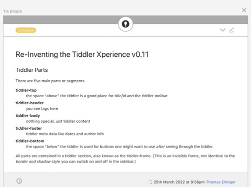
  • Tix offers a new tiddler experience for the vanilla basic theme – incredibly flexible and configurable thanks to several parts: top, header, the standard tiddler body and a footer. It comes with configurable toolbars at the top, in the header and in the footer. Using tags you can add anything to any part you like.
  • Btx as a separate plugin adds a matching bottom part including toolbar number four. Buttons to jump to the top of a tiddler, to the next or to the previous tiddler and one more button that inserts a new tiddler just below are included. The bottom toolbar also accepts standard toolbar buttons.
  • Lox is a placeholder for demonstration purposes. While you wait for the Lox theme to provide a new lay-out experience, you should try this with Tix to add design configuration options to the sidebar.

The plugins are also usable with the theme Notebook by Nicolas Petton. At first sight TW 5.2.2. works just fine.

Many improvements and fixes have been applied since the last discussion in the former thread on the plugin idea. Thanks again to everyone who posted feedback there, that was invaluable! Hat tip to @DaveGifford, @jeremyruston, @Offray, @saqimtiaz, @pmario, @StS, @Hans_Wobbe, @markkerrigan, @DesertDwarf, @john.edw_gmail.com who showed interest and provided feedback and advice.

Disclaimers:

  • Remember to save a back-up before installing and using my stuff.
  • My time is still limited but there is a good chance that I will respond to feedback and implement improvements at some point in the future.
  • It is incredible how many bugs I had been able to integrate in roundabout 120 kilobytes of plugin code – some might still be left undiscovered. Send reports and fixes in my direction if you encounter any of them.

All the best,
Thomas
7 Likes

Special thanks to @TiddlyTweeter and last but not least @poc2go who provided an extra amount of feedback and motivation in the previous thread. (I had to move you to a separate post because I am not allowed to mention more than 10 users in one post.)

1 Like

Will do that!

Grazie, TT

2 Likes

Hi all,

Great news about the release! Will be implementing Tix in my next project which am putting together now. Plan on using the underlying design of Tix as the foundation.

Have upgraded to 5.2.2 and so far no issues. So will give (am sure all positive) feedback on how it all goes.

Really appreciate the effort @telmiger and the community put into this first Tix release.

1 Like

Been on a 30+ hour coding binge so hopefully this makes sense.

Running on an ‘empty.htnl’ with Notebook, Details, Tix, and Btx plugins. The experience has been awesome - but a few minor snags.

Since I work in the dark, I changed palette to ‘Gruvbox Dark’, which I found not all the friendly with the ‘Details’ plugin. Changed to ‘Twilight’ which works fine - so not going down the TW palette rabbit hole for right now.

There are only two UI oddites that I have stumbed upon -

  1. Added the ‘close’ button to the Btx bar - simple enough. Found that when the button is pressed to remove the tiddler - the scrolling to the top of the previous or next tiddler does not happpen, so visually end up in the middle of some tiddler in the story. Will investigate further if needed - @telmiger pls advise.

  2. The ‘info’ button. If the ‘info’ button is removed from both the Tix header and footer - then if you select ‘info’ from the ‘more’ dropdown, info does not display. While on that topic - if the ‘info’ button is in the footer - and the ‘info’ is selected from the ‘more’ dropdown in the header - the info is displayed, but the scroll does not move to it - so unless manually scroll to the ‘bottom’ - users don’t see it.

Will check this post tmw and edit if need be - but makes sense in my totally fried brain right now - just wanted to get it out their.

Thx! for the plugins.

Hi @poc2go , creator of the GruvboxDark palette here

How can I tweak it to be more friendly with the Details plugin?

Best wishes,
Simon

1 Like

Actually I was aware of this possible issue so I wrote a chapter in the readme file about it. Please revisit the instructions under “Tiddler info button” in the readme and let me know if anything is unclear or missing.

Thanks for reporting your findings, I will answer more later.

Cheers, Thomas

Well, the close button is still the close button and it does what the name suggests: It closes a tiddler or in other words it removes a tiddler from the story. It does not scroll.
If you have the close button in a toolbar at the top of a tiddler, you see the top of that tiddler before you close it. If there is another tiddler below the closed one, it will come up and fill the gap of the now closed tiddler. Naturally, you will see the top of the tiddler that came up now. The browser does not need to scroll for this.
If you place the close button in a toolbar at the end of tiddlers, that might lead to the effect you describe. You do not see the top of a longer tiddler, when you close it from the bottom. The next tiddler comes up to fill the gap and is placed where the top of the now closed tiddler was before. No scrolling happens, so you might see the middle or the end of the tiddler that came up.

If you go to https://tiddlywiki.com/ and close the two tiddlers below HelloThere (the one at the top) you will see the end of HelloThere as no scrolling is happening.

Conclusion: I would recommend to activate the close button in the top or in the header toolbar of Tix and not in the footer or bottom toolbars.

1 Like

Hi Simon, thanks for offering your assistance – but this seems to be a flaw of my Details plugin.

There is a stylesheet $:/plugins/telmiger/details/colours.css that defines colours a bit unlucky:

details {
   background-color: <<colour tiddler-info-tab-background>>;
   color: <<colour foreground>>;
}

That does not play well with some dark palettes, my own Twilight might be an exception. So I think @poc2go could get better results by adapting the colours in the CSS above, either by using fixed colour values or by replacing <<colour tiddler-info-tab-background>> with another colour from the palettes. pre-background seems to work with some dark palettes like Gruvbox:

details {
   background-color: <<colour pre-background>>;
   color: <<colour foreground>>;
}
3 Likes

Hi @telmiger and @BurningTreeC ,
Thanks for advise about the Details palette styles - I had not looked into it yet, but will go through all the standard palettes and see if can come up with a fore/background combination that works reasonable for all standard palettes. Maybe will get lucky.

I can tweak the palettes for my specific site - but hoping not to have to do that. Will report my findings here.

@telmiger - I still need to read the readme on the info button - my bad. Is not effecting me because I do display the info button in the header so works great. Love the header/footer/bottom tools in info!

The non-scrolling on the close button - figured what you said was happening. The reason added to Bottom is because after reading a somewhat lengthy tiddler is nice to be able just close it without scrolling back to the top of the tiddler.

Is not all that big of a deal. When using a mouse doesn’t really matter. Is more noticeable on mobile device without a mouse. That being said, mobile device screen control not all that great to begin with.

The experience using Tix and Btx has been really great!

1 Like

Used Tix and Btx to build a web based TiddlyWiki that is at https://tw5.poc2go.com. The functional parts work fine but still work-in-progress. Check it out!

The few issues that I hit:

1.) On Chrome (technically, Chromium) the buttons in the Tix-header are centered, while in FireFox show properly on the right. Added this to my stylesheet fixed the problem

.lox-tiddler-toolbar:not(:first-child) {
   justify-content: flex-end;
}

2.) When exporting a Tix/Btx tiddler as ‘static HTML’, the images of the Btx buttons (circles) display on the exported page. They don’t look all that ugly, but probably shouldn’t be there.

Previously I mentioned issues with various palettes. Found two things had to be done to use most palettes out of the box:

3.) To handle proper display of dropdown boxes - added to my stylesheet

select {
  background: <<colour tab-background>>;
  color: <<colour tab-foreground>>;
}

and

4.) Ended up commenting out the following in $:/themes/tiddlywiki/vanilla/base

html button {
	line-height: 1.2;
	color: <<colour button-foreground>>;
	fill: <<colour button-foreground>>;
	background: <<colour button-background>>;
	border-color: <<colour button-border>>;
}

Tried to override - but keeps getting in the way on some palettes. With it gone - palettes display on Tix pretty much as expected.

I still have a lot to do on the site. But thought you might want to see a preview of my use of Tix in the wild!

1 Like