Gird CSS to Create an Elegant Carousel and Image Slider in Tiddlywiki

Ref

  1. Grid CSS in Tiddlywiki Demystified - Tips & Tricks - Talk TW
  2. Grid CSS to Create a Vertical Tab Like Structure - Tips & Tricks - Talk TW (tiddlywiki.org)
  3. Grid CSS to Create Left Sidebar and a Story River - Tips & Tricks - Talk TW (tiddlywiki.org)

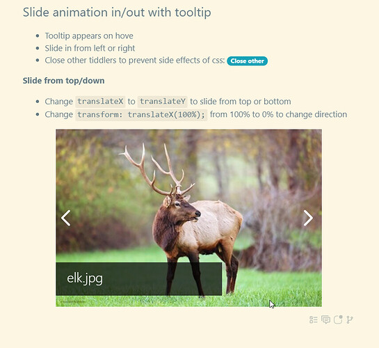
This is an elegant portable carousel created using Grids CSS + CSS3 Animation in Tiddlywiki.

To give a try

  1. download image-gallery-tooltip-animation.json (866.8 KB)
  2. drag and drop into https://tiddlywiki.com
  3. open the image-gallery-01/grids-css 1 tooltip

Screenshot

Customize

  • use better name for state tiddler
  • make the macro global
  • use a separate stylesheet

See also Gird CSS to Create an Elegant Carousel and Image Slider in Tiddlywiki - Demo II - Tips & Tricks - Talk TW

1 Like

I hope I can find free time to publish these tools created in Tiddlywiki + Grids on GitHub!

  • This carousel has few lesson to learn and worth to be documented
  • The example is portable, it does not deepened to any third party plugin, JavaScripts, etc, only vanilla Tiddlywiki
  • You can learn how to make tools to navigate in specified pages/tiddlers/images, go forward/backward to show next/previous tiddler/image/contents

Request for help

  • A continuous sliding from left to right or vice versa would be great. the current design uses sliding animation but, it hides the current image and slide the next one.
  • The current design is size dependent, it would be great to make it size independent
  • Image zooming would be great

Please share you improved version here!

Thank you everybody! I hope you enjoy my recent posts on using Grids in Tiddlywiki and the sample tools posted!

Good bye!

Whoa! Very good @Mohammad. Very useful! Thankyou!

FYI so far I tested on Windows 10 using (1) mouse & (2) touchscreen on Fifefox, Chrome & Edge.
It works well on all of them.

It also works fine on my Chromebook (up to date) touchscreen on Chrome.

It also worked for me well on my Android (older) smartphone. (Note on Android: it is best in landscape mode as the CSS is not fully adaptive to narrow screens.)

I’ll post later about thoughts about how I would use it with a few suggestions for improvements.

It is immensely useful for users who need to show many images!

Very best wishes
Josiah

1 Like

@Mohammad, I hope you get more feedback! What you have done is great. You need a few more comments I think. You certainly deserve them.

Flexible image gallery tools have been an “elusive obvious” in TW for a long time.

Your approach is definitely in the right direction.

Best, TT