ECharts - Bringing amazing visualization tools to TiddlyWiki!

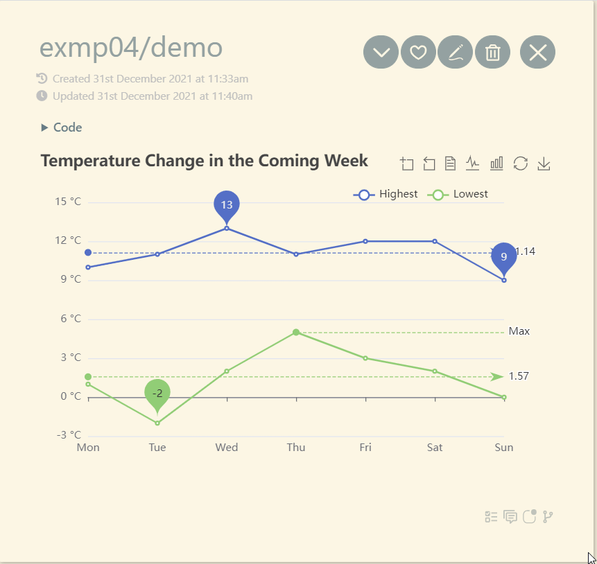
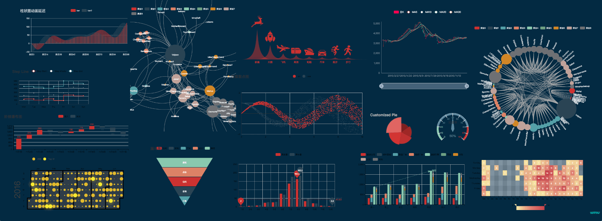
I am proud to present to you my latest work: an all-in-one highly customizable visual library plugin. This plugin is based on the famous visualization tool ECharts.

A few days ago, @oflg introduced my this plugin in his plugin, so I believe some of you already know about this plugin. Now, I have prepared the English documentation for the plugin, so feel free to come read the details and use it at

https://tiddly-gittly.github.io/tw-echarts/

Welcome to star this project!

v0.0.3

  • Support clicking the refresh button to reload the chart.
  • Support the no-browser render (will generate <script> node containing addon code).

v0.0.4

  • Now ECharts supports directly text mode! It’s very newbie-friendly!
  • Add echarts macro.
13 Likes

Thanks a lot for sharing this great addon and taking the time to translate the doc !

The plugin has been upgraded to v0.0.2 with four powerful third-party extensions!

  • ECharts WebGL: is an extension pack of Apache ECharts, which provides 3D plots, globe visualization, and WebGL acceleration.

  • ECharts Liquid-flow: Liquid Fill Chart plugin for Apache ECharts, which is usually used to represent data in percentage.

  • ECharts Stat: is a statistical and data mining tool for Apache ECharts. You can use it to analyze data and then visualize the results with ECharts, or just use it to process data.

  • ECharts Graph modularity: will do community detection and partition a graph’s vertices in several subsets. Each subset will be assigned a different color.


All the above can be found and installed in TW5 CPL!

5 Likes

Thank you @Sttot !
I think TW5-ECharts is a revolutionary plugin and has given Tiddlywiki a step forward!
As using Echarts in full power needs some maths and logics, I would highly recommend to add more examples and share here lets demystify them!

I have tested release 0.01 and I think still there are barriers to efficiently use Echarts by ordinary users!
I would suggest to have wrapper for creating JSON or other input tiddlers, so one can use plain wikitext to create data to feed to Echarts for different purposes!

Thank you again! and please keep going on!

1 Like

Thank you for the high praise!

I agree with the point that echarts needs more examples, especially examples that can be used by the average user with just some simple settings. But one problem is that the visualization scheme and configurable items of echarts are massive and there should be no way for me to do this work independently.

That’s why I want to invite more people to join the collaboration, which should be a community-based project.

3 Likes

I think there are volunteers for testing and creating examples!

So, if there are some wrapper for example, how to create a 2D charts from a simple data tiddler (e.g flat JSON), one can use plain wikitext to create such a tiddler! then pass it to $echarts

One question:

a chart needs data and setting (config).

Can we separate these two: data and settings?

  • for a simple graph like average room temperature per day or average blood pressure per day one needs a flat JSON or dictionary data tiddler
  • then we need type of chart, markers, lines or bars, colors, axes settings, etc.

If we use some default setting for 2D charts, then user has only to prepare the data!
Then he/she can think of presentation skin (colors, type, …) and use ready to use basic settings or prepare and pass his/her own settings

So I think separating these two may help to simplify using Echarts!

What do you think?

I will use echarts to make more applications that users can use more easily.

3 Likes

I think it’s a great idea!

Did you see the Others attributes in $echarts? I think I can write a user-friendly component (let’s call it SimpleChart for example). It would take some simple parameters, like type for the type of visualization, and data to a JSON tiddler containing only data. and text to a JSON text containing data information directly.

Just for example.

<$echarts $tiddler="SimpleChart" type="line" text="""
{
  x: ['Mon', 'Tue', 'Wed', 'Thu', 'Fri', 'Sat', 'Sun'],
  y: [
          [150, 230, 224, 218, 135, 147, 260],
          [250, 130, 201, 300, 240, 100, 240]
     ]
}
"""/>

But I don’t think there’s a very good way to do that. Because if I go to write it this way, I can only do a very limited configuration, and the result is that this only draws a simple line graph. And in ECharts, in fact, the x-axis is not necessarily the kind, and the data is not necessarily the line graph. So this would drastically limit the expressiveness of ECharts.

Does everyone have a better way?

Yes, I am reading ECharts — Awesome Visualization Library for TiddlyWiki5 now

I also had a look at $:/plugins/Gk0Wk/echarts/addons/SimpleExample.json which seems to be the simplest input tiddler! (user should be able to create this)

  • Yes, I do not mean to add any restrictions! I just said we can separate data from settings! I just compared this with Matplotlib in Python, I believe Matplotlib is simple to use!

  • As you said Echarts is very rich in features and it can draw many many different type of charts and diagrams! I thought if we can separate data from presentation and have some defaults for most common charts, then we can have a jump start for the average users! It is quite reasonable to have a much flexible interface if we want to use Echarts in its full power!

Lets collect other ideas! and see what others say!

1 Like

I understand where you’re coming from. But I found that ECharts configuration and data may be mixed up. Some styles are defined in the data, and vice versa. Like xAxis and yAxis, which are both descriptions of the whole chart and contain some data. This bothers me.

I know some ECharts frameworks like pyecharts that seem to try to separate the data from the configuration, so maybe it’s something to learn from.

Question: Can I copy examples from Examples - Apache ECharts and test with TW-Echarts?

See below as a sample:

option = {
  xAxis: {
    type: 'category',
    data: ['Mon', 'Tue', 'Wed', 'Thu', 'Fri', 'Sat', 'Sun']
  },
  yAxis: {
    type: 'value'
  },
  series: [
    {
      data: [150, 230, 224, 218, 135, 147, 260],
      type: 'line'
    }
  ]
};

Creating a tiddler with name exmp01/data and putting the above example as body and then call Echarts as

<$echarts $tiddler="exmp01/data"/>

dos NOT work!

Changing exmp01/data as below

{
  "xAxis": {
    "type": "category",
    "data": ["Mon", "Tue", "Wed", "Thu", "Fri", "Sat", "Sun"]
  },
  "yAxis": {
    "type": "value"
  },
  "series": [
    {
      "data": [150, 230, 224, 218, 135, 147, 260],
      "type": "line"
    }
  ]
}

DOES work!

Changes:

  1. remove option =
  2. wrap all key:values in double quotes like "key": "value"
  3. remove the last ;

What is the problem behind this? Why not be able to directly uses official examples?

Sample Charts

I have tried to create some examples from ECharts Docs

To give a try:

  1. download attached JSON Echarts-Examples-Set01.json (4.1 KB)

  2. drag and drop the downloaded JSON into ECharts — Awesome Visualization Library for TiddlyWiki5

Screenshot

This is a screenshot of example 4

img_765_%pn

Remarks

@Sttot - if you find above examples useful feel free to add to TW-Echarts doc
Please note that: the ECharts refresh button does not work and one has to close the tiddler and reopen it! Check this with exmp04/demo

2 Likes

More Examples

  • TagCloud
  • TheBrain

To give a try

  1. Download the attached JSON Echarts-TagCloud-TheBrain.json (501 Bytes)

  2. open https://tiddlywiki.com
    2.1. install Echars as described in first post or drag and drop from (ECharts — Awesome Visualization Library for TiddlyWiki5)
    2.2. Install Hotzone
    2.3. drag and drop Echarts-TagCloud-TheBrain.json from step 1 above

  3. Open the sidebar TheBrain and see how Tiddler Graphs work

  4. Open the TagCloud in the sidebar and see how Tag Clouds work

Screenshots

  • TagCloud
    img_771_%pn

  • TheBrain

img_780_%pn

4 Likes

Thank you very much! I will add these.

I will try to fix this refresh issue.

1 Like

I have been reading this thread with great interest and have checked out the plugin. I have found it quite intriguing and I’m anxious to start using. I haven’t quite figured out how to use it in my application yet so maybe one of you can give me some pointers. I have a ton of tiddlers with data in their fields which I’d like to plot in various ways. Each tiddler represents a segment of railroad mileage between two cities. The data in the fields represents how many miles are between the two cites, what date that mileage was constructed, abandoned or sold, etc. I want to be able to plot the number of miles constructed in any given year or decade for example. How can I use ECharts to accomplish this? Right now, I’m using filters and simple bar charts, but I want something more eye appealing.

An intriguing and truly fascinating thread, for me.

Thanks to all of the contributors!

Happy New Year,
Hans

I am not an expert in data visualization. But you can try to depict these routes in a diagram, where the points are cities and the sides are railroads, and the side lengths are related to the length of the railroad, and the color and style of the sides may reflect other information about the railroad.

Another example would be to plot a bar graph of mileage per year. ECharts can region select the bar graph to present the part you wish to see.

2 Likes

I found another echarts implementation in tiddlywiki while searching for tiddlychess in GitHub today. Might be useful for someone.

4 Likes

This looks cool! I’ve always wanted something like this to track my habits inside tiddlywiki and see visualisations like longest streak, etc. Maybe it is possible with echarts, but being the newbie that I am, not sure how much work it will take to actually implement this with my data. If anyone has already had some luck in this regard, would be great to know.

I guess what I’m looking for is a way to feed Echarts data by using lists and filters rather than a JSON file.

1 Like