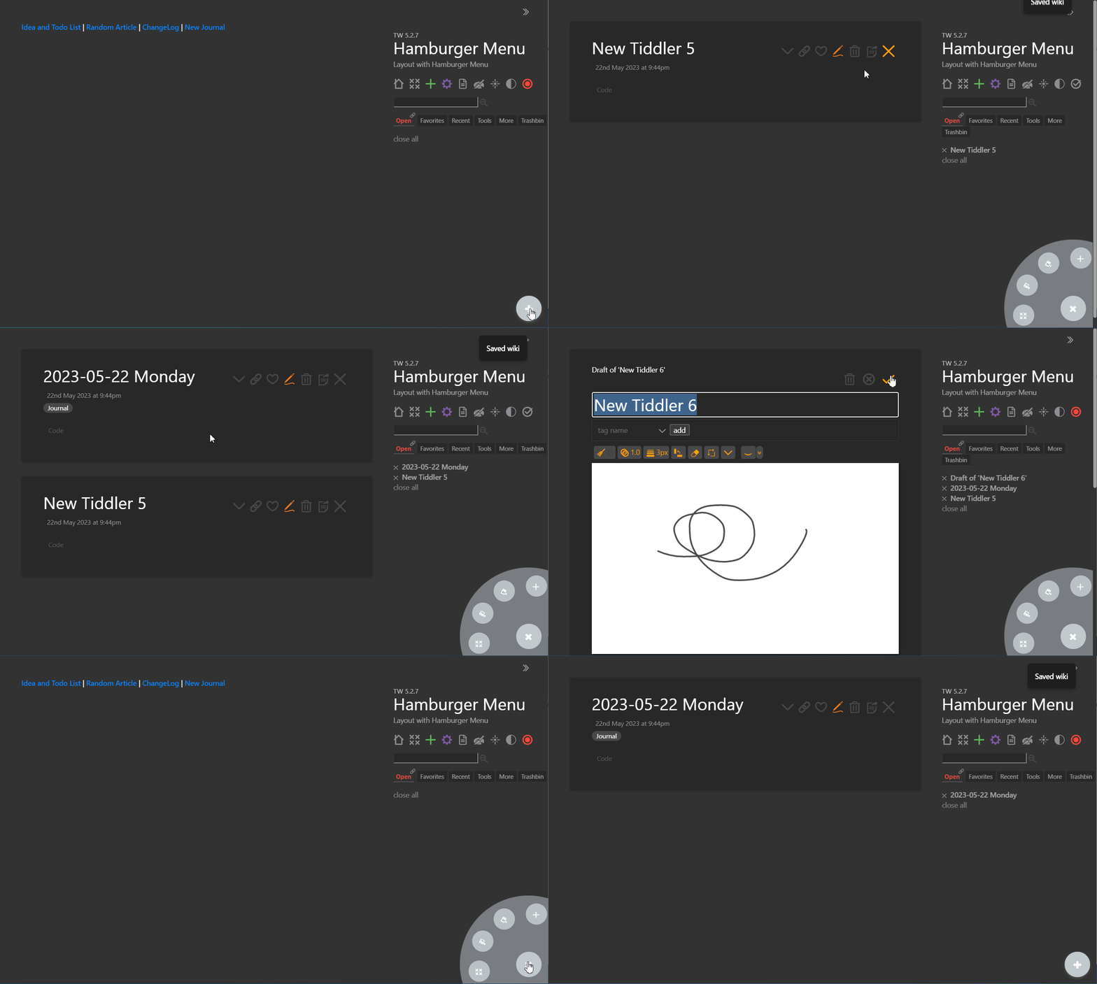
Page Layout was introduced in TiddlyWiki 5.1.23. This is a very powerful feature in TiddlyWiki needs more attention by all type of users.
It allows to create a very different alternate face for TiddlyWiki. You can create a Webpage for your personal use or even for your business, you can have Kanban layout alongside with standard layout, you can have a landing page and then switch to normal page, and much more.
Here, I cloned the standard TiddlyWiki page template and add a little CSS+Wikitext to create a hamburger menu as a floating button at the bottom right of TiddlyWIki. I called it Hamburger Menue Layout
If you have a wiki that holds a large variety of information, alternate layouts can let you further customize the viewing/editing experience.
On my todo list:
“focused writing” layout with a minimal editor taking up most of the workspace, with a tabbed sidebar: story river, pinned, search
something similar to the above mode, but specifically for translating Kpop lyrics
since I’ve been having trouble getting my current layout to work the way I want at all screen sizes, I may look into an alt layout just for mobile that won’t have me beholden to the UI structure I want for larger screens
since I use Google Keep so much on my phone, I may eventually try to make a layout that more closely resembles that program for mobile-editing
huh, neat idea. does it expand on hover or on click? because if it’s click, using a left click to trigger a new tiddler and a right click to open it would be really space efficient.
Thank you for highlighting this feature. It is not something I realized was there. However, after skimming through the linked articles you have I still don’t feel I understand what this feature does. Considering that the main tiddlywiki.com site only has one, and the tutorial basically copy/pastes the current layout I don’t understand what a layout does.
Specifically, how does this differ from a theme? TW has several themes available out of the box and making your own theme was surprisingly easy. I made my own with tritarget.org to make the chevron button in the upper right corner I had to make a custom shadow tiddler to include the switching of the hide side bar and switch themes between the Vanilla Snow and my custom “Blog” theme to switch between wide view and column view.
This feels like a layout to me and thought the layout switcher was the better choice. But that doesn’t seem to fit the implementation of themes and the ease of discovery when working with them—discovering settings | appearance | themes seems far more useful then memorizing CTRL+SHIFT+L.
I have to ask what is the difference between a layout versus theme? And why is a layout better or worse than a theme?
I’m willing to conjecture, seems like themes are for the way we display a TiddlyWiki based on the story river. Layouts are for complete redesign of a TiddlyWiki backed website regardless of the story river?
The distinction still feels confusing to me. Perhaps the difference is more in the technical implementation details then it is about the rendered result?
The limitation I ran into before the introduction of the layout feature (which is essentially switchable page templates) was that smaller tweaks, additions or hiding things from the default page template were easy enough but larger changes were clunky to implement. The advantage of a layout is that you create your own page template that can be as bespoke as you want, without the cruft of the default page template.
The relationship between themes and template is indeed fuzzy, and I have at times packaged the layout configuration as part of a theme essentially treating the page template (layout) and even the palette as part of the theme.
Nice demo @Mohammad . But I tend to write layouts for a “full-screen app”. A small widget like this can be done using the above story tag, do you think so?
This is the initial version.
After importing to an empty tiddlywiki, donot forget to change the layout. For example by pressing ctrl+shift+L on Windows.