Redrawing Motovun Jack

Hi there, this idea of modifying the TW logo is still tickeling my mind, so after few hours of trials I can present you the result of that work.
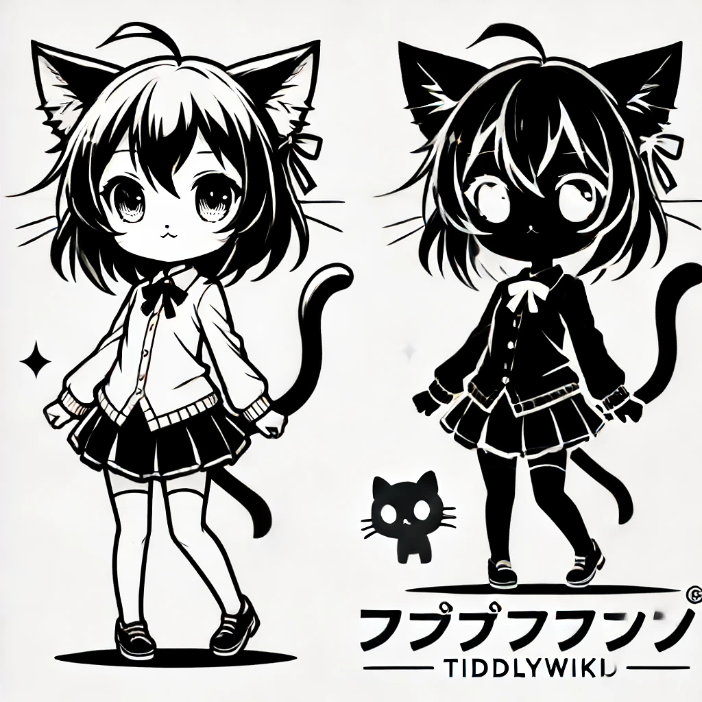
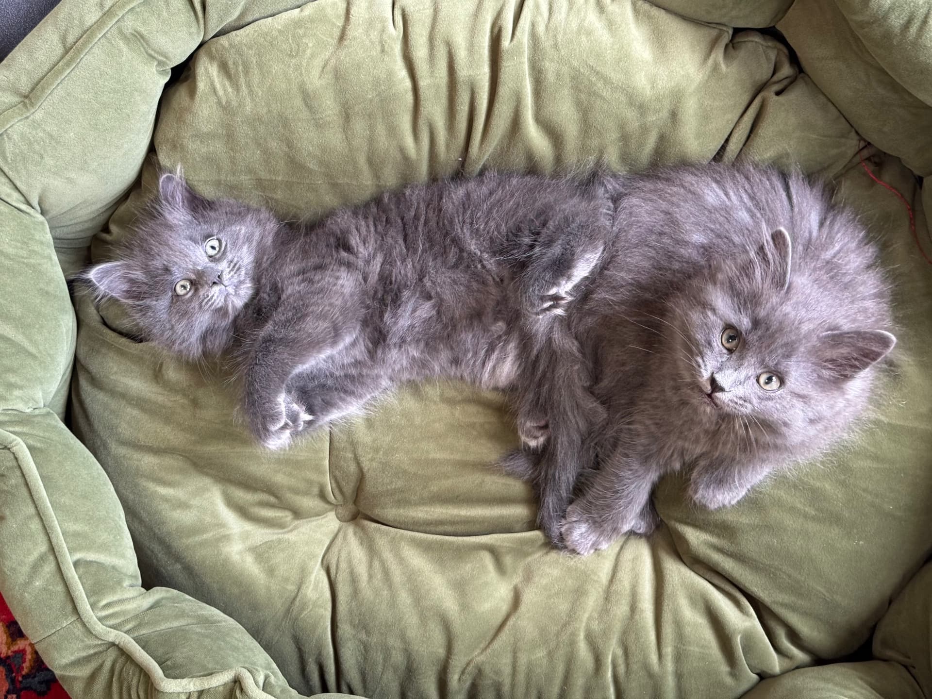
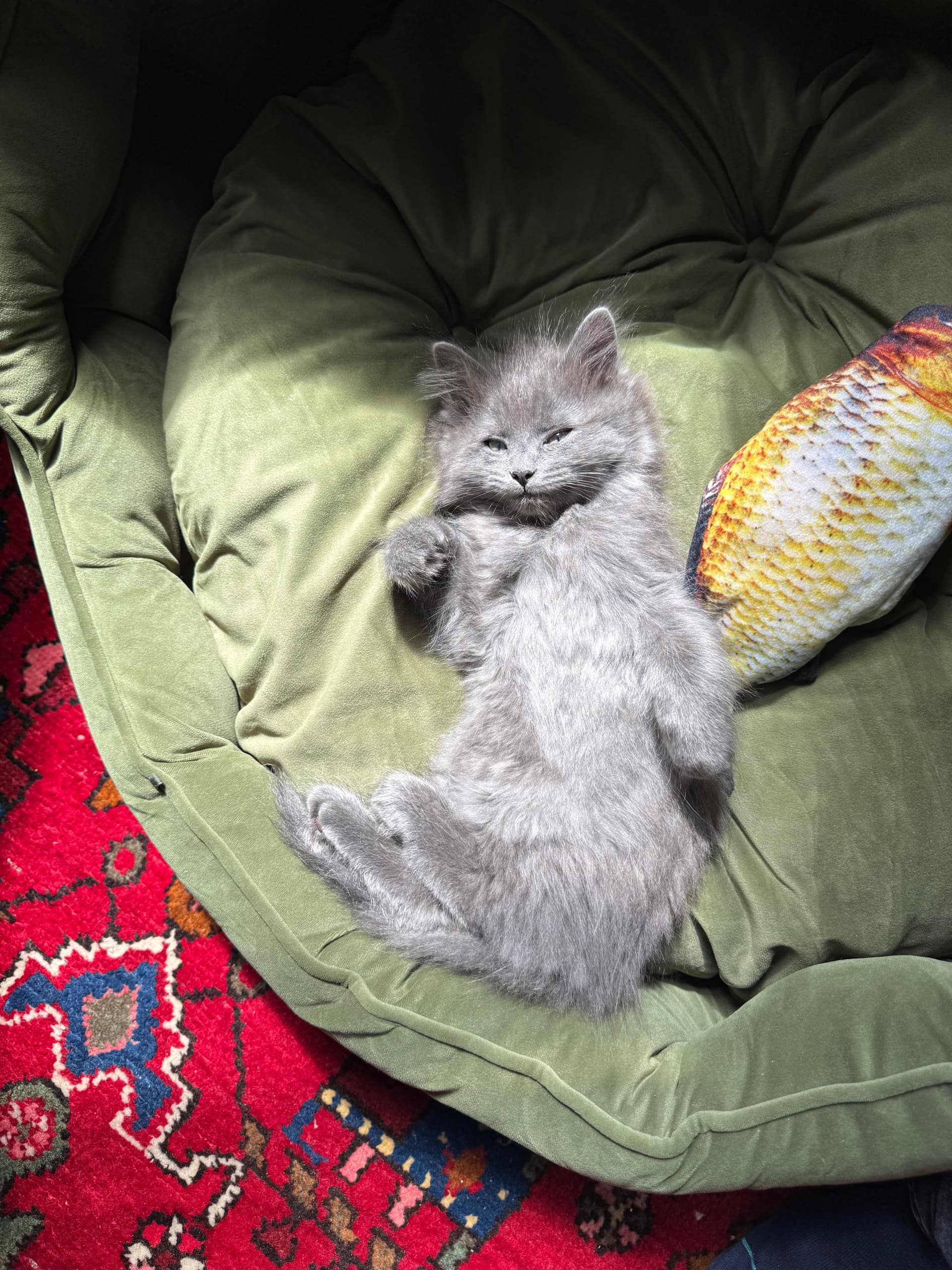
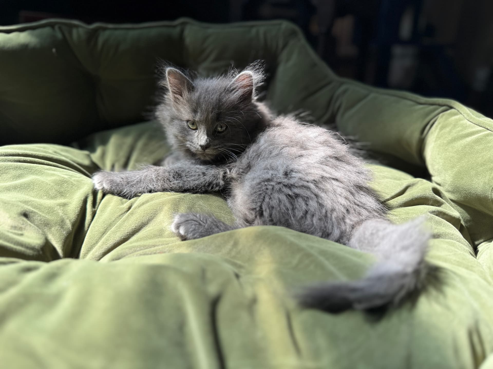
First, I’ve read that @jeremyruston wanted a redesign of his original “motovun” icon and he would be happy to have other variations based on the other pictures he has of that lovely kitten.
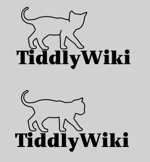
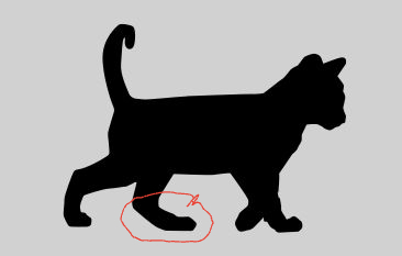
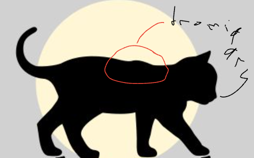
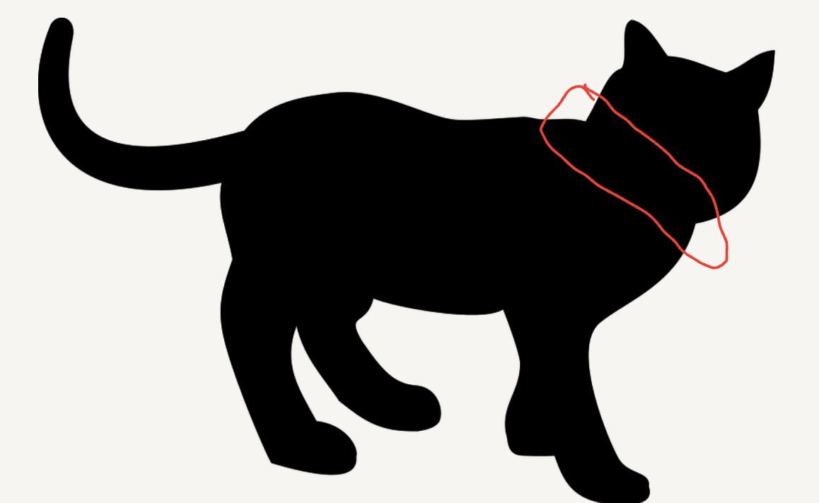
So looking at thoses pictures, I found this :grinning: motovun-inspiration
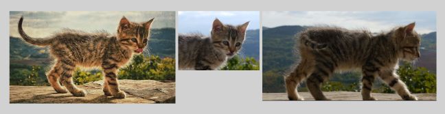
On the left, the original one, but I’ve always thought that the pose was not perfect specially to use as a silhouette because of the position of the head and the open mouth.
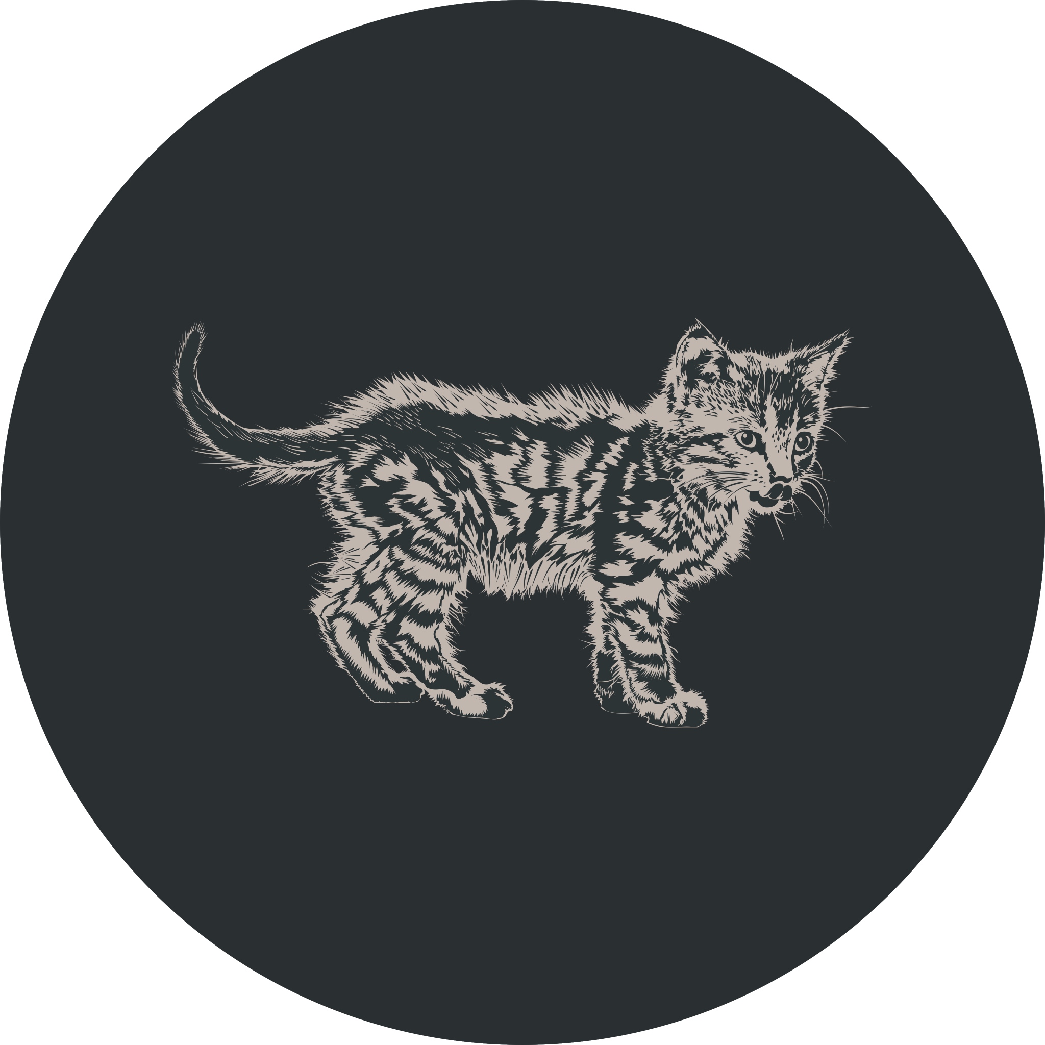
On the second picture, the head is looking a little bit on the right and the general contour seems more “iconic”.
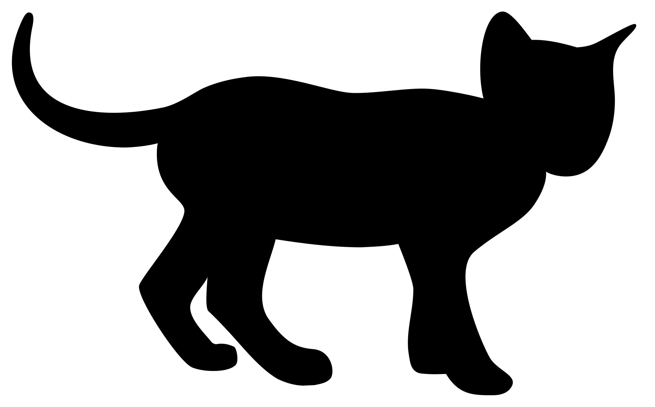
On the third picture, the overall attitude looked to me to be more dynamic and also permit to apprehend the legs, whitch is also better for an iconic sign.

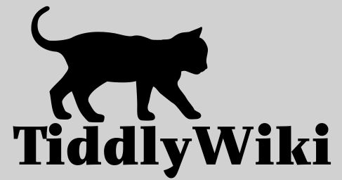
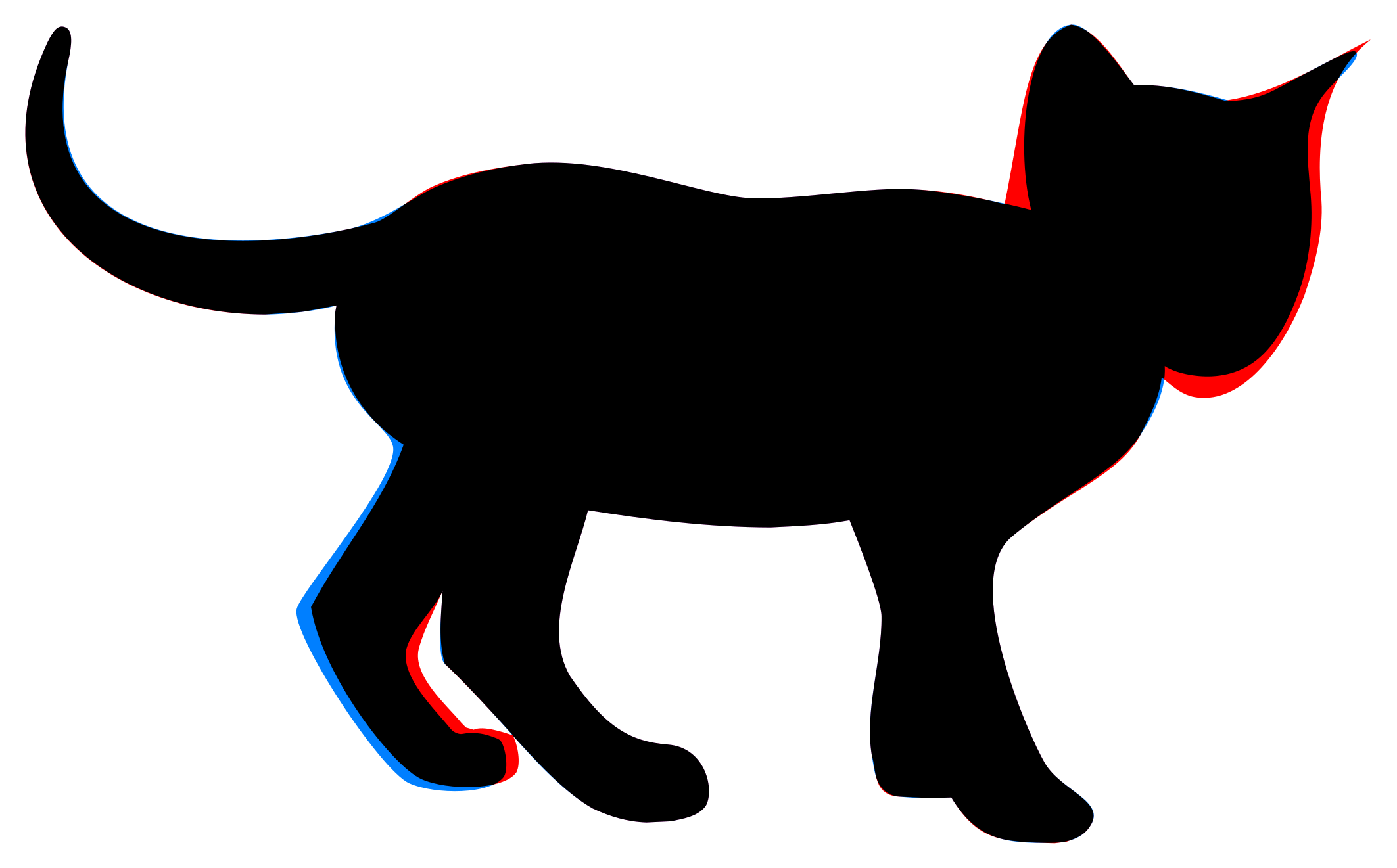
So to start, I initially modified just the head from the last version I had produced :

motovun-head
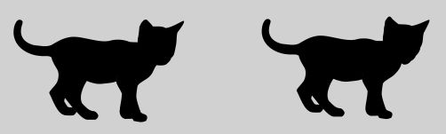
The difference is subtile but better I think for the look of the ears and the cheeks.

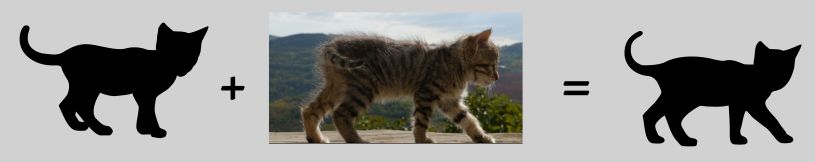
From there I tried to change the body to add dynamism to it while keeping the position of the tail :

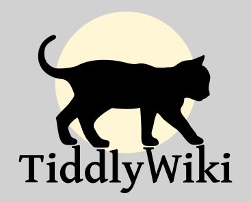
I was then happy with the result and thought to add the TW name to it as a brand :
motovun tiddly
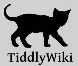
I choose the opensource Gentium font whitch is classical style with a contemporary and timeless look. It works quite well but the picture ant the text are “floating” close to each other. The cat is walking on the air.
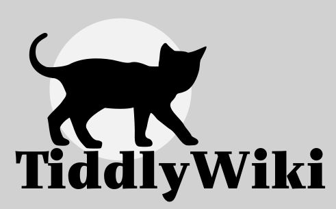
So I modified a bit the lettering to let the cat stand on the text :motovun final yellow

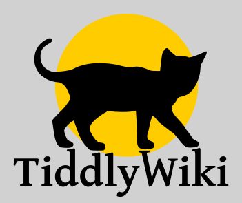
It looked that the position of the letters was meant to be a resting place for Motovun.
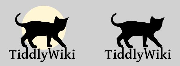
I tried also some variations. The yellow circle was inspired by the initial logo of TiddlyDesktop.
Now I see the circle as a nice full moon whitch is globally working fine with the overall picture.

motovun final variation

Tell me what you think of this !

10 Likes

While I do like the more dynamic look of your revised version, the walking with head looking to the viewer gives me a feeling of apprehension, like the cat is being cautious.

The original photo of Jack walking has the face in the direction of movement rather than looking to the side or behind. The edited version almost looks like the cat has stopped and is pulling back while looking around. That might be where the unsure feeling comes from for me.

I like the effect of the cat standing on letters. Only tho bottom seems slightly too big and too high. And the caps height should be one tidy line.

Here with the head looking right but I’m concerned by the fact that at small size the silhouette looks like a monkey more than a cat…
motovun profle

Anyway other variations of fonts …
.motovun arapey

profile arapey

silhouette

alternate fonts

2 Likes

The previous version without inner lines was better. One addition to the points remarked above: In this position all paws could end on the same line.

I know it has been quite some time and there have been many great entries. But there hasn’t been any closure or winner design, so I decided to give it a try.

I did a rather conservative approach, I tried not to change too much. I concentrated on the points that Jeremy has indicated in OP (except for the dip in the back, I left that unchanged) and adjusted minor other points (removed some redundant nodes, smoothed some corners).

<svg width="510pt" height="317pt" version="1.1" viewBox="34 107 510 317">
	<path d="m425.03 116c-15.438 1.5662-20.859 42.76-14.573 67.68-10.904-2.9058-31.717-7.0196-43.019-7.5367-15.575-1.005-40.949 3.7675-58.786 3.2651-17.836-0.50241-52.939-15.889-82.147-12.561-11.743 1.4153-23.141 3.9024-34.043 8.7436-6.6696 2.9618-19.549 12.695-31.784 15.189-47.841 9.7499-115.2 6.6228-101.68-61.897 1.264-5.547 1.6253-10.548-0.8877-11.795-3.131-1.554-4.8884 1.7003-6.7354 5.2793-28.402 60.441 22.312 99.122 79.395 99.505 6.9415 0.0466 19.647-1.4219 26.07-3.3311l-0.42773 2.3174c-3.1558 33.213 19.274 40.071 21.063 49.19 2.2363 11.397-33.691 52.734-35.182 59.384-2.082 9.2816 30.47 58.908 41.126 63.643 9.3804 4.169 29.862 4.2099 34.598-2.499 1.6912-3.1548 0.52071-10.761-1.3178-13.108-0.46748-0.59673-2.5931-1.3268-4.5854-1.9479-1.8677-0.58231-5.5586-1.2425-9.3282-0.49591-1.0742 0.21273-2.348-0.34893-3.1846-0.85254-0.69903-0.42081-1.7109-1.7505-1.7109-1.7505-4.9991-6.1825-17.891-18.47-15.523-28.468 2.0235-7.4111 10.287-14.255 13.254-21.296l-0.10547 0.72803c-0.53151 8.7951-1.9957 23.445 0.88476 26.08 9.4755 8.6668 24.478 25.788 25.094 26.487 7.7931 8.8485 18.635 20.586 28.967 26.354 6.2506 2.921 12.52 4.8148 19.535 5.0508l8.915-0.41895c4.4566-0.94098 9.7011-1.6458 12.686-5.5298 3.3718-5.62 0.22444-21.355-13.712-22.48-13.937-1.125-22.928-6.293-35.741-24.951-10.556-18.037 2.2148-42.879 6.5112-60.627 22.047 3.477 44.255 6.2147 66.614 6.2695 9.7003-0.48336 19.313-0.82623 28.875-2.6265 3.0501 7.6351 11.587 28.99 11.66 35.023 0.20568 16.996-6.372 34.087-3.5068 51.07 1.0105 5.9896 1.4744 14.024 10.128 14.87 7.9619 0.778 12.569 0.47437 18.858 0.29444 9.8546 16.205 20.71 16.674 36.53 16.579 8.0446-0.0482 12.03-2.8813 14.028-5.9513 6.531-9.296-10.393-12.922-16.422-23.222-6.03-10.299-30.899-66.824-12.059-82.651 18.842-15.827 37.697-23.017 46.978-37.181 4.1033-6.2627 9.4592-15.853 8.8696-25.138 3.7161 2.5111 11.014 4.015 17.183 3.7222 16.084-0.7636 25.193-12.201 31.888-31.056 3.9064-11.001 5.125-24.263 4.2026-35.146-1.2148-14.334-3.1511-26.914 5.0522-37.036 4.8309-5.9604 13.215-12.242 11.662-15.015-0.89691-1.6018-6.0024 0.95789-18.941 7.8407-12.938 6.8828-15.05 8.9998-27.07 9.9176-10.793-3.212-23.738-6.2867-35.145-5.8367l-0.0234 3e-3c-5.6011-7.1506-16.285-22.763-22.988-22.083z"/>
</svg>

Here’s an attempt at a visual diff, old version in red, new in blue, overlap in black:

6 Likes

Here is a different attempt focusing more on the head.

While I still think it is too elaborate to be an actual logo, it does have a more contained shape and better readability at small sizes. It could perhaps be simplified into one.

It is based on one of the other photos from Jeremy’s Flicker album

8 Likes

My point of view of completely different is completely different!

3 Likes