[RFC] New Lucide Icon Set Plugin - Intended to be a core drop-in replacement

I have noticed a small issue with the “holes” in the tag labels.

On lucide.dev the “hole” always appears as a solid circle, same as for the tag-button in your plugin. But the new-here-button and the alternative new-here-button-2 have “holes” that show up as a empty circle with a thin (thinner than the rest of the icon) border.

Btw, I think the alternative version with the off-set plus is much better. The plus inside the tag looks confusingly like “x” written on a label, it feels like it’s for “removing” something.

Yes. I designed the current TW5 icons myself because I wanted them to be consistent and coherent, with a simple visual language (eg + meaning “new”, or “x” meaning close) that allows elements to be combined to convey more complex concepts. I quite enjoy that sort of work; it is a satisfying combination of intense problem solving and relaxing pixel pushing.

But I have to recognise my limitations, and when I look at the Lucide icons I see a hundred little details that make them much more professional and harmonious.

I also think the enthickening feature is important both for accessibility and giving users the level of customisation expected of modern systems.

I appreciate the challenges in making enthickening work in a way that is fully backwards compatible. However, it is the accumulation of these sorts of possibilities for improvement that is likely to eventually drive us to create future versions of TW that trade backwards compatibility for modernity. I am referring principally to TWX, but we should also keep alive the possibility of a less ambitious compatibility break in the form of a TiddlyWiki 6.

1 Like

That’s right, that’s why I mentioned it. Some more experiments are needed. I am not sure if it can be done in a backwards-compatible way.

The easiest way would be to create several different icon sets with different outline widths. This approach is guaranteed to have no side effects, except it would not be configurable.

Changing our default icons to stroke-based icons will require adjustments to our core UI code in roughly 600 places. However, this will be incompatible with all existing third-party UI code and CSS, which is a no-go.

I think it would be nice to have if we can do it reliably. If there is no core configuration, the “hack” will still be available on a per-icon basis for users. So, if needed, they can use it if we prepare the icon code to be able to do it

Good catch. I’ll have to have a closer look.

That’s right I did think the same way, that’s why I did add new-here-button-2 as an “easter egg”, so we are able to test it.

I did change the core button to new-here-button-2 and found out, that the plus “+” sign is a bit too small, but in general will look better. – So I think we should use the second version as the default.

Very nice work. I’m supporting @vilc about the + sign on the labal icon and also the + on the calendar icon is not the same size as on the different icons with it. I think it is important to be consistent in the way those ‘diacritics’ signs are inserted in icons. It has to be consistent across the all set.

I’m impatient to be able to use the set with color and thickness.
It would be also interesting to add the 3 generic TW icons ($:/core/images/plugin-generic-language, $:/core/images/plugin-generic-plugin and $:/core/images/plugin-generic-theme) in a new design.

I proposed those in my Feather set :


Just a proposal…

@Thomas_Chuffart – Thanks for the feedback. I do like your suggestions for the filled icons.

plugin-alternate is a “package” – But it would be interesting if we could create a “lego-brick” (and name it differently)

I would love to have a different version of the theme icon.


Changing “Motovun Jack” will be it’s own project – So I did not even try to touch it :slight_smile:

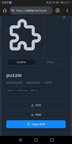
I think the jigsaw in the icon for plugins is a little strange. It may be better to use the one in tabler.io

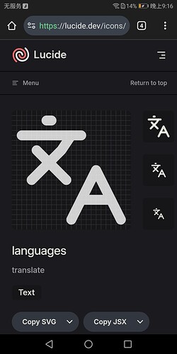
For the languages I think this one is acceptable:

Thanks for your suggestion. It is very welcome and I think we can work with it.

The main problem is, that those 3 icons need to be filled and the paths have to be subtracted. So the icons need to be smaller than normal to fit inside the outline.

That’s why I left them alone for the time being.

@Thomas_Chuffart’s designs are a good idea in the meantime, if we’d like the plugin to be published asap. But in the long run, we will need non-filled designs per Lucide rules, for two reasons:

  • for consistency of the looks
  • so that the mechanism for making them thinner/thicker can work properly (right now applying a stroke would make the actual lines thinner, not thicker)

I find it quite difficult to design icon by Lucide rules, which is inside a hexagon, and is still well readable and obvious in its meaning. Here are my experiments (also for other icons): https://lucide-icons-wilk.tiddlyhost.com/
Screenshots of the plugin-icons:
image
image

One idea that might designing easier would be to apply the hexagon (or other metaphor of plugin like brick or electrical plug) as a small diacritic/modifier. So e.g. if a t-shirt is a theme, then a t-shirt with hexagon modifier it theme plugin.

@vilc do you have a zip-file with all your original SVG files not imported into TW. So I can play with them.

I think GitHub issues allows us to attach ZIP files. We can also discuss details there.

Or at the the new repo: lucide-tiddlywiki-plugin , which contains my custom files at the origin directory. There is a an SVG template, which has a “locked” background which makes it easier to align strokes following the Lucide rules.

Yea, that’s right. Icons inside a hexagon are very challenging. But their rules will allow them to scale the stroke-width up to 3 and the icons should still work.

A side note:

Mario, one area of using core svg icons and hence Lucide is using them as background images in html widgets like details. For example I like to use arrows for this purpose.

Right now the background-image: url(<$transclude $variable="datauri" title="$:/core/images/up-arrow" $output="text/plain"/>); does not work as the tiddler type is not svg and the presence of extra script like \parameters (size:"22pt")

I would like to be able to use core/luide icons like svg image in such cases. I know core images are inline svg elements and does not contain <?xml version="1.0"?>

So do I, and not only for the tag label icon. I also find it better in other cases like $:/lucide/images/calendar-x-2, $:/lucide/images/file-x-2, etc.

Fred

I uploaded a zip to the GH issue in TW repo, have fun :wink:

What exactly would these changes need to be?
I am using Lucide icons in my wikis for a while now, slowly replacing the core icons whenever I add an appropriate icon for my own context. The only thing (mostly) that I needed to change was to add an extra CSS rule to SVG elements. If an element until now has some matching CSS rule like

.some-class svg {
    fill: #cccccc;
}

I’ll add a rule

.some-class svg.lucide {
    fill: none;
    stroke: #cccccc;
}

I use stroke="currentColor" within the SVG code, so the stroke will be the current text color, unless set separately like above. I don’t believe I changed any core code to make the Lucide icons work.

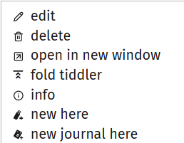
Currently, it is a bit of a mixed mess, though, until I get around to replace them all:
image
(edit, delete, open in new and info are Lucide, with stroke-width: 1.5)

It should just be a matter of finding all CSS declarations for SVG elements and appending a new one for each, plus some finetuning. This can come in a separate stylesheet, e.g. in a plugin.

I do not know “exactly”. There are about 600 places in the core code (including core plugins and documentation) where fill is used in one or an other way. We have to check every single one of them, if there are any side effects. Especially but not limited to hover effects.

We are talking about 100% compatibility. Not 80%, not 99% – Most importantly all 3rd party adjustments to icons our users ever made still should work, without changing anything. That’s a completely different beast to tame.

That’s the problem. You needed to change something in your own wiki, where you know what is going on.

I do not know what’s going on in your wiki and the plugin still has to work. – So we need to avoid problems that we do not know.

Right. And exactly what you described here has to be done for every wiki ever made, that wants to use the new icons. – But what if you want to disable the plugin and use the core icons again?

Every description, that we can find here at Talk, that talks about CSS fine tuning for icons. Every description at the GoogleGroup that talks about TW5 icons will be outdated.

The goal is a “drop in replacement(s)” where nothing else has to be changed.

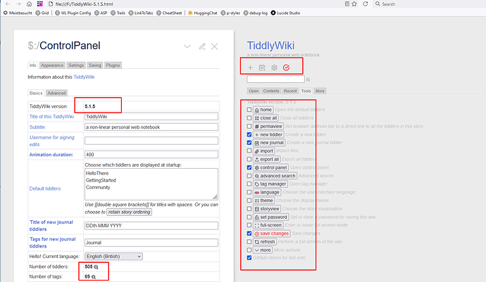
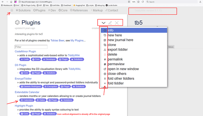
Some more legacy tests:

Important: Nothing to make the following screenshots possible has been published, since there are some manual adjustments needed at the moment. The build process and the plugin creation should be possible to be completely automated.

TiddlyWiki v5.1.5 – lower than that is not possible.

Old page from Tobi Beer at: tb5 — Welcome – Tobi Beer’s pages are heavily moded. After installing pluigins those old wikis need a save and reload but seems to work.


Well then, do you intend to distribute all ≈1500 Lucide icons with the plugin and keep it synchronized with the weekly changes to Lucide?
If not - because of size - what if I want to use a Lucide icon that is not part of the plugin? How do I get that tiddlywikified?

I did publish an experimental plugin of all-icons. See link in OP. But it’s big. 2MByte

Everything is work in progress – There is no plugin creation atm.

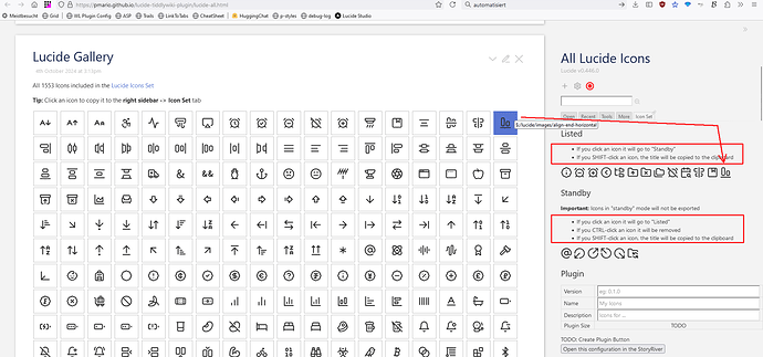
On the right sidebar → Icon Set tab there are 2 areas.

  • If you click an icon in the Lucide Gallery, it will be added to the Listed section
  • If you click an icon in the Listed section it will be moved to Standby
  • The Listed section can be converted to a custom plugin. in the future
  • If you click an icon in the Standby section it will be moved to Listed
  • Standby icon will not be transferred to plugins

It is intended to save the configuration in the browser storage or export it.

So users can easily import and modify their plugins.

Not initially. But we could create a GitHub build process, that watches the Lucide repo and update if needed.

There seems to be a Lucide Lab repo, which contains an additional 300++ icons. We could grab that one too. But we need to be able to differentiate them from “standard” icons. I did not experiment with them yet.

There is the Tabler icons set, which is MIT licensed and seems to be very similar to the Lucde icon set. They list 5650+ icons and also have a lot of brand icons.

It should be relatively straight forward to use that one too. I did not try to auto convert those icons.

Possibly because the tick is sized to fit inside a ballot box? A big tick is required for our done icon.

@pmario I like access to more icons and a set to replace the core icons is nice so cheers for your effort, however I would like the option to install core icons replacements and a seperate one to install all lucid derived icons.

  • A nice way to do this would be to install all icons in a plugin as shadows then provide a mechanism such as setting a field to turn those used or to be used in the current wiki, into non shadow tiddlers, once finished selecting such icons we can delete the plugin and remove the unused ones
    • This is easier than needing to visit the custom edition although it is still good to have such an edition.
  • There is no harm in publishing a 2mb icon set if it is possible to then extract the desired icons for a new wiki. I currently have a wiki of collected icons I go to when needed, and I would add the full set there.

Love your work @pmario

Have a look at the OP. There are 2 links. One to the core replacement and a second one, which publishes 2 plugins.

Since all 1500+ icons are heavy weight, the goal is to have an UI, that allows us to easily create custom plugins, that contain icons needed for a project. So users can create and modify their own plugins as they need them.

The icon selection UI is working already. The plugin creation functionality still needs some work and is not published yet.

That problem is resolved.

What you describe will be hard to keep up to date. With the mechanism I envision, it should be possible to

  • Import a custom plugin configuration into the Lucide edition
    • I intend to add the “browser storage” plugin. So user configurations will be persisted if the user wants to
  • Click the “Verify selection” button, which shows a log-tiddler, with some info what will be done in the next step
  • Click the “Create plugin” button, which will create a plugin that will contain the latest icon versions.
  • Done