[ Muuri Storyview ] - A new Release

Hello folks,

I’ve released v0.2.14 of the Muuri storyview
It has the following changes:

  • styles are added to the tiddler that we navigate to, so that it’s easier to visually identify it
  • the auto-save option is removed because it didn’t work consistently

The Demo page:
https://burningtreec.github.io/tiddlywiki-muuri/

The GitHub repo:

As now I’d like to invest some time into the development of the Muuri storyview I’d like to get some feedback if there are users using it and how they get by it.

As always, I welcome ideas and bug reports

best wishes,
Simon

6 Likes

This is pretty cool, I remember seeing it before but thanks for the reminder. I just opened it on mobile and it’s difficult to fund screen area for me to “scroll”. If there was smaller drag n drop areas (even if it was just for mobile) that’d be an idea? You might not be worried about mobile with this though. Cool project!

Thanks @stobot

Well for mobile use it’s difficult to scroll, I know and it’s true that I don’t worry much about it

I have mostly used Muuri Kanban, but I love to play around with Muuri Storyview. It looks so impressive with a few of my more decorative tiddlers from my other TWs. Trying to tempt some friends into using TW.

I still remember the shock I got when seeing it for the first time. So beautiful and so different. I hope for some ideas from users to make good use of it. I think that is what we need.

1 Like

This is amazing! I like the fact that I can view many tiddlers on the screen without scrolling.

When you open a tiddler, the tiddler would turn black for a moment and then becomes normal white color (with vanilla palette). I guess the purpose is to show the user which tiddler is being active. But I find this a little distracting especially when you open many tiddlers quicky. Is it possible to customize this animation (change color/reduce flashing time) or disable it altogether?

Edited: Ok I think the animation corresponds to “Animation duration” setting of the wiki. So reducing this value to a small number will reduce the flashing time. A little animation is nice but the transition from black → white is kinda eye hurting. Would love to be able to set it to pale-yellow → white or other smoother color transition.

Hi @Pak, thank you!

I think I’ll make the animation an opt-in configuration with the next releasee, but for now you can add the following to a Stylesheet tiddler to disable it:

.tc-tiddler-frame.tc-navigating-to, .tc-tiddler-frame.tc-navigating-to .tc-tiddler-title .tc-titlebar {
	background-color: <<colour tiddler-background>>;
	color: <<colour foreground>>;
}

Alternativelly, you can choose a different color than tiddler-background for this (I chose foreground which might be a bit too eye-hurting)

1 Like

Thanks @Birthe - yes in fact the muuri storyview can be used to play around with it. It’s as simple as

<$list filter="[list[myTiddler]]" template="myTemplate" editTemplate="myEditTemplate" storyview="muuri" storyViewConfig="$:/config/myconfignamespace/"/>

Just the configuration namespace needs a little bit of tinkering (see also)

The configuration options are many, which may hold users off from using this, but there are only some really needed, the others are optional

Hello all,

There’s a new Release now (v0.2.15) which allows to opt-in / opt-out of the navigate-to animations
One can also change the colours of the animation

The storyview now also preserves the scroll position of the window over refresh cycles, which means that if we for example edit a tiddler, the window will no more jump to the top and then scroll to the Draft tiddler but it will stay at the same position, which makes things smoother

I hope you like,
best wishes,
Simon

1 Like

Just updated the version 0.2.16. Thank you for implementing the option to customize the color animation. It works great!

Thanks for your feedback @Pak !

Meanwhile I’ve released version 0.2.18 which makes it possible to use the storyview in new windows and in Modals, too

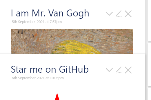
Great! Just a quick small bug report. Occasionally, when I open a new tiddler it would be partly overlapped by an existing tiddler. Here I just opened “I am Mr. Van Gogh” and the bottom part is covered by the existing “Start me on GitHub”

Screenshot 2021-09-06 235718

It does not happen every time and I’m not sure how to reproduce it. But it does happen from time to time.

Another nice feature to have is the “Kanban style” for the whole storyriver (rather than in a single tiddler).

  • A tiddler stays in its column (does not move to the adjacent column) when a new tiddler is opened.
  • Clicking a link is an existing tiddler opens a new one in the same column.
  • This is already possible with the Stories plugin. But it would be nice to have more than 2 columns (customizable) for large screen.

Hi @Pak and thanks for your feedback
I remember that I have encountered this bug before, but I haven’t been able to reproduce it neither consistently
But I’ll investigate

That would be a nice feature to have but it would also present me some issues that I’m unable to solve right now, like popups being hidden underneath adjacent columns for example

But I understand the concept you have in mind and I already tried creating a prototype, but it has some issues and is not presentable :frowning:

That said, I believe the standard muuri layout with the single tiles one beneath the other is the best solution that can be achieved with the muuri storyview

1 Like

The overlap is only seldom seen now. I saw it more in earlier versions. To me it looks like it is not totally finished reading and positioning everything. Refresh and it goes away - but now is rather slower - we can see it kind of slide into place - where the problem were seen last refresh. (Sorry it is difficult to describe).

I love the Kanban as it is now. It looks good, works well - and is understandable to people not into Tiddlywiki. (I know because I also took the “Do the laundry” idea from you - it has to be done" - guess what? It worked my friend did it - not even complaining.

You convinced me to finally sign up to github (what a lot of questions just for that) :star_struck:

1 Like

hello @BurningTreeC ,

I am curious to know if you’re still maintaining the Muuri StoryView plugin in light of the recent work on the [multi-column/multi-river layout plugin].([MCL] Let's do it - #17 by TiddlyTweeter)

For a few reasons, I think this plugin is better suited to my use case. I tried to install on latest and on pre-release and I wasn’t very successful. Is there a step after installing the plugin I need to do? (the layout seems to be correctly set to the Muuri layout

)

Found the issue @BurningTreeC : most likely a minor packaging issue. You only need to create a $:/view tiddler, with the text muuri, after installing the plugin.

I still use Muuri as my go-to multi-column solution, greatly preferring it to the newer and more popular A multi-column Layout / Storyview.

At the same time, I have an enhancement to propose. I have created a View Toolbar button that configures the field muuri-tiddler-width. I find it quite nifty and it provides maximum flexibility.

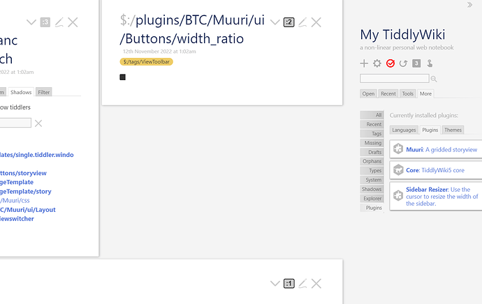
Here are a few screen captures. The button toggles between (0) and rangeMax (maximum number of columns as per Muuri settings), where zero removes the field (in that case defaulting to the width defined by the main Muuri column counter).

Screen 1: When the muuri-tiddler-width field is not set, thus defaulting to the ratio defined by main column count:

Screen 2: When the field is set to :1, overriding the default width and forcing full width:

Screen 3: In this image, we have a three-column layout, with one tiddler forced to full width (bottom), one tiddler forced to half-width (right-hand) and one defaulting to one third (left-hand):

To be clear, none of this functionality is new; it was achievable by setting the field manually. The toggle button in the View Toolbar just makes it much easier/faster to do and as a result, extremely convenient if one needs not to change the overall column layout but only wants to view two tiddlers side-by-side, for example.

Happy to package as an add-on (seems to be my thing) if this enhancement was of use to anyone else, unless @BurningTreeC feels like it is useful enough to include in the plugin itself.

I could use some advice with CSS for sticky titles; seems to not be compatible with Muuri sadly. I noted some CSS rules in the plugin, designed to prevent sticky titles from working, and, well, I saw why when trying without these rules …

mandatory json (requires 5.2.1 because of the $let widget):muuri-addon.json (3.2 KB)
1 Like

@fastfreddy This is a nice addition to the muuri plug in. I tried it out. I have one doubt. Can there be a modifier key like shift or control click on this button to cycle through the widths in the opposite way. Or can there be another button to cycle in the reverse direction. Currently one have to press 5 times to come back to full width if a tiddler is made half width. That would be even better.

There already is. Is it not working for you? It is the same modifier key that you have configured for the Muuri plugin, and that you can use on the main column count button.

Examples:

  1. If the tiddler width ratio is unset and at default, e.g :2 in a 2-column configuration (half-width), click will set to :3(third-width) whereas modifier+click will set to :1 (full-width).
  2. If the tiddler width ratio is set to :1, modifier+click will reset to the default ratio (based on the Muuri column count), whereas click will set to :2 (half-width).
  3. If the tiddler width ratio is set to the max number of columns (based on the Muuri config), click will reset to the default ratio (based on the Muuri column count), whereas modifer+click will set to :max-1.
1 Like

@fastfreddy
Its working. Thank you for the explanation. I will have to use it more to understand the working fully I guess.
You always come up with very useful add-ons to popular plug ins like streams, editor autolist, context menu, now muuri. Great work @fastfreddy. Thanks once again.

1 Like

One benefit of using muuri over MCL is that you can use all existing plug ins with muuri. But in case of MCL, all plug ins may not be compatible with its multiple column and multiple story river concepts. Or else we have to modify the plug ins to be compatible with MCL which won’t be possible for users with non programming background.

@fastfreddy How do you use muuri ? Do you use it with Stroll and two stories plug in. @saqimtiaz had earlier shown a demo wiki where he use muuri within two stories. Have you tried it? I am interested in seeing a sample of your wiki using muuri if possible ? Can you upload it to tiddlyhost whenever you are free ?

Glad you like it.

The set/reset can be confusing. In a way, setting the tiddler width ratio overrides the default tiddler width that is derived from the plugin’s number of columns.

The easiest thing to think of it is that the :0 would be the equivalent of reseting the override, returning to the default. You’ll never see :0, the icon will show the default width instead. You’ll see the icon changes appearance when it is unset (i.e. matches the default width for the number of columns) and when it is set to override that value.

1 Like