I want a simple mobile layout that can write new todo or thoughts in a few seconds (using a voice input method).
The layout UI I can think of now is something like Twitter. Do you have an existing layout plugin, or any design suggestions?
I want a simple mobile layout that can write new todo or thoughts in a few seconds (using a voice input method).
The layout UI I can think of now is something like Twitter. Do you have an existing layout plugin, or any design suggestions?
The Notebook theme has a layout for mobile
a bit hacked together, but it’s working well for my own use:
i’m using a menu which uses $:/tags/TopRightBar
please see tiddler: topbar 20220521
which opens a revealmenu across the top of the screen when the … is tapped, one option is the (customised) new tiddler
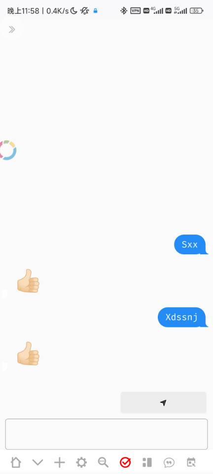
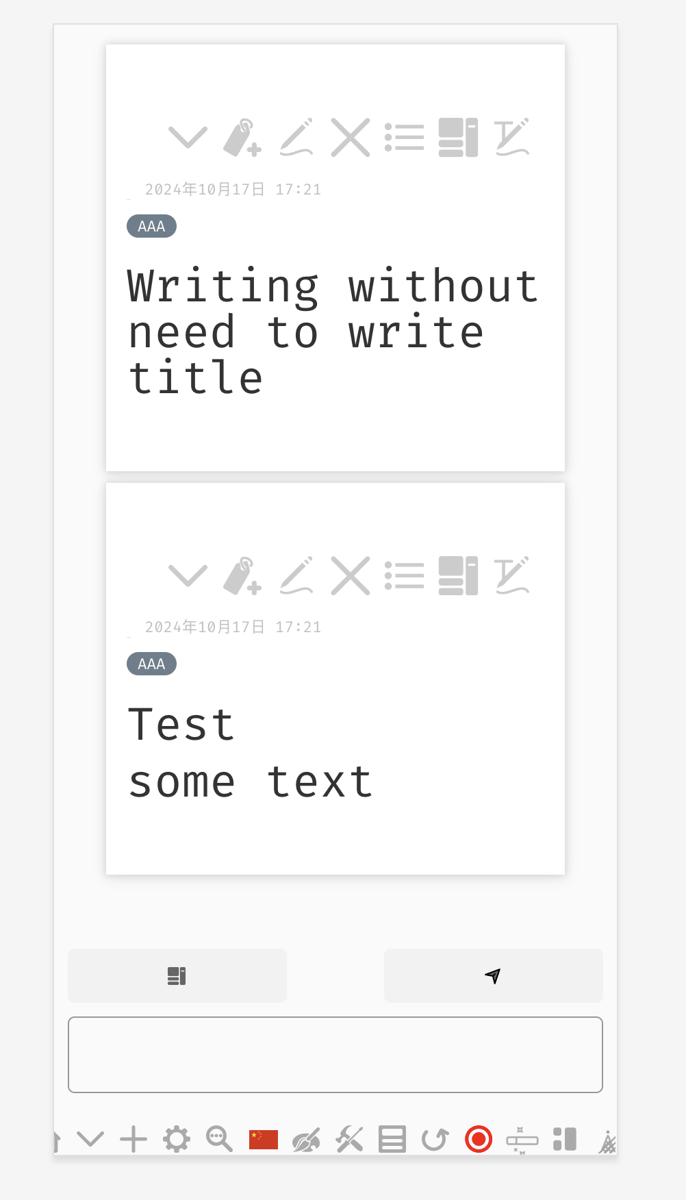
Demo of a mobile friendly layout. Just input, very quickly.
You can switch to default layout, and view created tiddler in the recent tab of sidebar. (note that sidebar can be opened via button on the left-top)
I don’t expect latest text entry to appear at the top of the list though?
It appears on the bottom, like the messaging app.
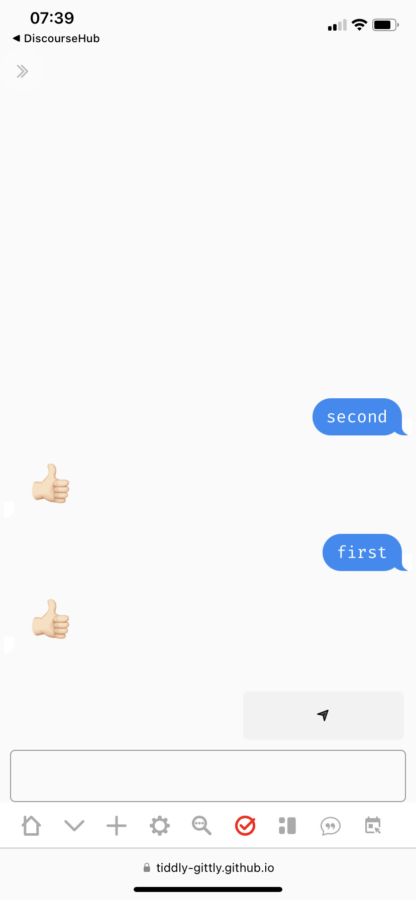
The issue is in .mobile-imessage-layout-imessage and it is caused by
flex-direction: column-reverse;
with the following it works correctly
flex-direction: column;
justify-content: flex-end;