Do you want your wiki to have 3-10 different layouts?

I’m thinking this when writing Feat/button default layout by linonetwo · Pull Request #7197 · Jermolene/TiddlyWiki5 · GitHub

New apps like AFFiNE and AnyType have multiple layouts, each of them will have a completely different “layout” and functionality.

I’m experiment this with:

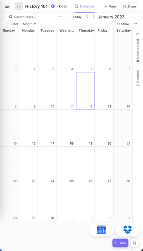
And I found a fullscreen calendar layout is very convenient for me. Maybe a fullscreen things3 or routing like task management layout will fit my use too. And tiddlywiki will be the unified data source for all of them.
5 Likes

Most of my wikis have 2-3 layouts and I cycle between them with keyboard shortcuts. I can imagine needing a dropdown or similar with more layouts.

1 Like

Also a Kanban layout like the one by Riz ( Tekan — Kanban that stays with you (ibnishak.github.io)) would be very useful!

To see the Kanban click on the layout button on the PageControl. Riz is among the first who developed and used a layout switch button!

3 Likes

I’ve personally only used the standard layout, however after checking out the calendar layout you’ve made, I can say I’m a bit of a fan of it

Currently a problem I have is defining a standard way of navigating between layouts, especially on mobile.

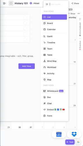
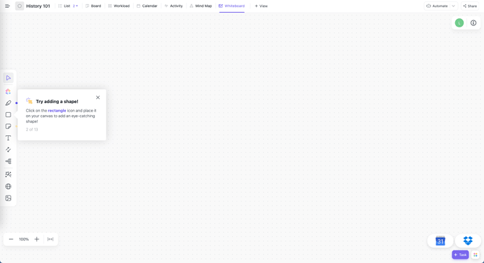
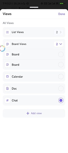
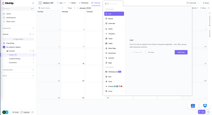
Clickup is one of the best multi-layout app.

It shows existing installed layout on the top, like tabs of browser. Which I think is not very suit for TW, but we can have a try.

I can create a LayoutList plugin, and let you decide where to put it, on the sidebar, or on the topbar.

It is not very mobile friendly.

Also can switch to the whiteboard layout

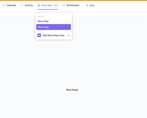
In clickup, you can have multiple variance of same layout, which means sub-layout, seems like “Mind may that show your folder structure” and “Empty mind map” here in the screenshot below.

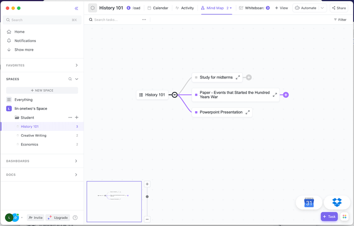
In below is the auto generated folder tree mind map, which can mean the tag tree in tw.

When width is not enough, layout list can be nav by clicking < > button, just like the browser tab bar.

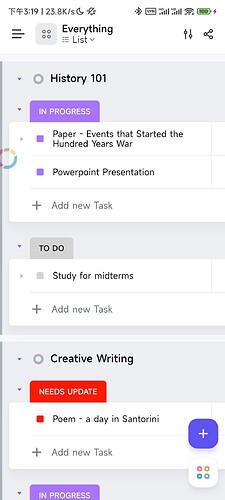
On native mobile app, we can only add limited layouts:

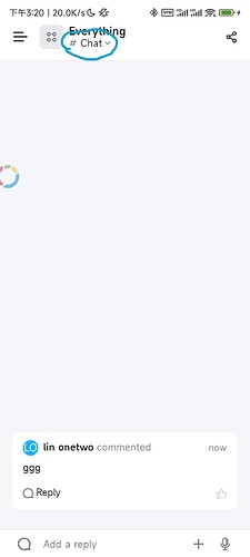
Here is the chat layout similar to iMessage layout

Use a button here on top bar to open the layout picker drop down.

2 Likes

Would it be a switcher between different views(/utilities)? Calendar view, whiteboard view, (default tiddlywiki) story view(s), multistory view, …

It would be a great feature.

1 Like

We already have, new button is in page control button, just enable it in the control panel.

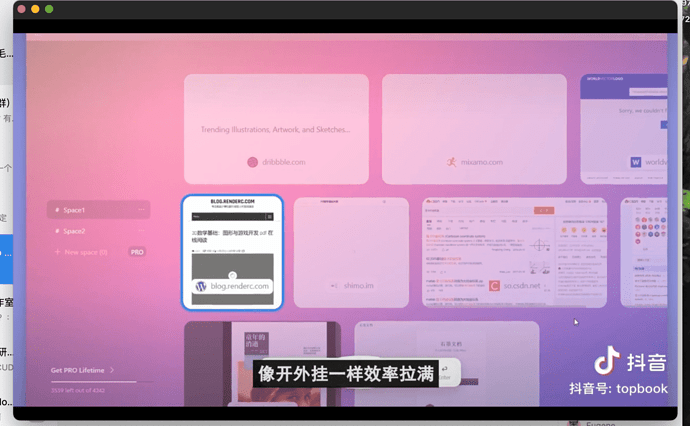
I’d like to create a launcher simillar to https://stackbrowser.com/ 's UI

1 Like

I suggest there can be a layout implementation guideline, that includes

  1. layout should have at least a button including $:/core/images/default-layout or $:/core/images/layout-button, so a user can go back to the default layout on mobile
  2. shouldn’t add layout’s shortcut button to page control, instead, use plugins typed “Layout launcher” to launch them.

I think a simplest layout launcher is a toolbar like Page Control, but only shows layouts. I’ve developed at least 4 layout plugins, I sometimes imagine an Android launcher or Windows StartMenu for them.

Quote from feat: new icon for default layout by linonetwo · Pull Request #8020 · Jermolene/TiddlyWiki5 · GitHub