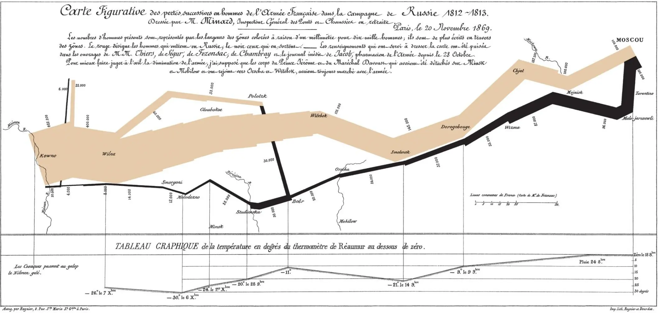
 … The thing is, that chart is the product of brilliant purpose-specific information design. I don’t think it generalizes very well. The technical aspects pale in comparison to the conceptual work of getting the variables neatly defined and seeing how variables such as color, line-thickness, and temperature-graph can map into a shared space.
A nice segue here is Tufte… who loved this map/chart.
But as we’re noticing over at the Tufte notes thread, it’s very hard to know in advance of use-case details what kind of alignments (sizes, colors, block positioning) make sense. Commentary surrounded by white-space in margins works great when commentary/notes tend to be more concise than the original main text. Such a solution isn’t going to scale well for, say, layers of midrashim (Jewish interpretation/commentary on Torah and other canonical texts).
I think the thing about a good design professional — whether it’s in print media, charts, maps, or whatever — is the ability to engage in a back-and-forth process that moves from provisional data format to tentative layout, and back to rethinking/scaling and tinkering with layout, based on what comes across cleanly.
I’m quite intrigued by the question of how to nudge TW toward a more spatially savvy field of objects, with something like intuitive lines of ordered and non-ordered connection among objects.
I’d be thrilled with this starting-point: Get something like the event-catcher canvas to allow for “smart” lines that keep elements connected even as they’re dragged around (rather than having arrows be themselves additional objects that need to be separately re-oriented when the things they point to move).
But bear in mind this stuff is the kind of challenge that major paid graphic-design software solves with tons of code. Getting complex things to look simple is … complex!

 An interesting idea for a plugin would be “charts” that would use this strategy to allow the user to create any of a dozen types of charts using some kind of graphical UI, rather than having to enter the raw data.
 otherwise find the source data or a small subset to use seperatly.
 [line updated with Titles]