Tufte’s style is known for its simplicity, extensive use of sidenotes, tight integration of graphics with text, and carefully chosen typography. See: Tufte CSS (edwardtufte.github.io)
Also see the note on Feymman Books (very famous professor in science and engineering is known for his wonderful lectures in Physics).
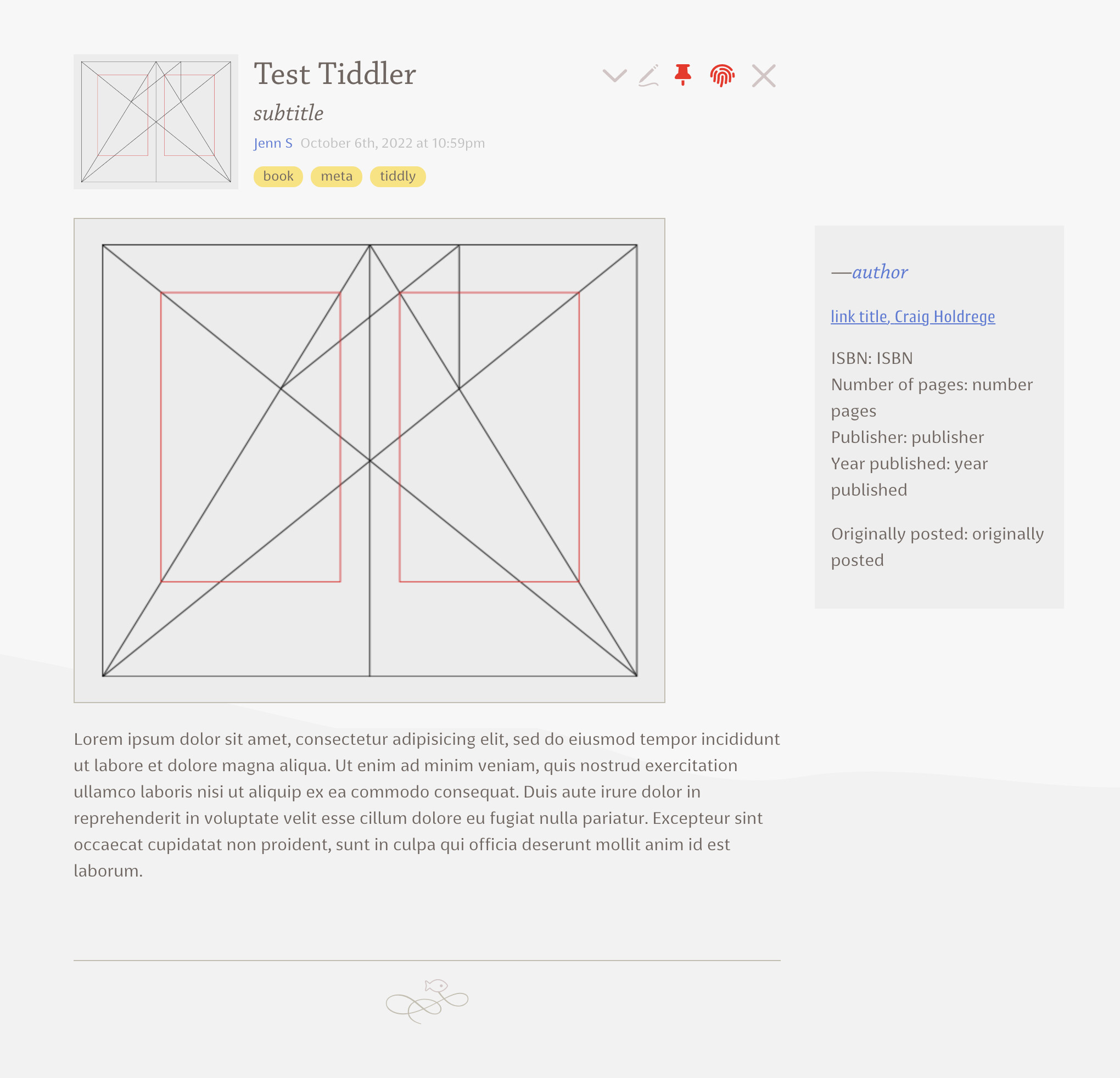
I am looking to see if there is any implementation of Tufte’s style in Tiddlywiki.
This can be
a two columns tiddler
left column with 60% of width for text
right column for 30% of width for sidenotes
NOTE: This is different from multi columns story river or tiddlers already available.
Finally, a reminder about the goal of this project. The web is not print. Webpages are not books. Therefore, the goal of Tufte CSS is not to say “websites should look like this interpretation of Tufte’s books” but rather “here are some techniques Tufte developed that we’ve found useful in print; maybe you can find a way to make them useful on the web”. Tufte CSS is merely a sketch of one way to implement this particular set of ideas. It should be a starting point, not a design goal, because any project should present their information as best suits their particular circumstances.
Typography definitely does not get enough attention in TiddlyWiki.
I implemented something very similar in TiddlyWiki Classic for the Student Notebook project. I will see if I can dig up a copy, it might provide some inspiration.
I appreciate this line of thinking, Mohammad. I think in general there is something about the emphasis on verticality in digital documents that impoverishes our understanding and enjoyment of the material. A physical book presents us with spreads of two pages at a time, which allows us to cross-reference, move our eyes from side-to-side, and feel anchored in a way that a one column display of text can never do.
Here’s a good article on this from the dawn of the “e-readers.”
I also feel a need for more horizontal approaches to tiddler layouts. I love Tufte and his allowances for annotation. I’m experimenting with putting my custom field information for my tiddlers into a sidenote for when the sidebar is hidden. I’m doing it by pulling out that HTML and positioning it absolutely to the top of the tiddler frame element. Easier than trying to create a grid out of the tiddler frame itself.
As you say, this is distinct from having multiple columns of tiddlers, which I find attractive, in a pinterest sort of way, but not very meaningful in the long-run.
The CSS is just something along the lines of:
<div style='background: #eeeeee;padding: 1em;position:absolute;top:16%;right:-40%;width:15vw'>

Side notes

</div>
Yes, this works fine for me in the past. I remember that the left tufte style annotations of @Anjar can be used as anker position, but not (easily) as links (ph due the coding in html) to other tiddler or anker.
I appreciate this better implementation in TW5.
Best
@JenniferS following your link and the discussion of location or place as something we humans make use of to remember and learn. I just want to flag I have researched and considered this a lot. Just as people took to touch devices quickly because touch is already something we are designed for (Haptics feedback helps as well), I have tended to recognise more and more we humans also have both locational and “trail memory” skills we underestimate.
Unfortunately most user interfaces are overly simplistic and do not help us leverage these innate skills.
I believe we have a long way to go before User Interfaces resonate more deeply with our innate inherited or natural world developed skills.
[Edited]
“Way finding” and or “place making” are other areas considered by some relating to this.
Of course tiddlywiki allows many more different ways to organise content than a book, so there is possibly no universal solutions, but more opportunities.
That’s true! BUT,
This is a sample article styled using a minimal version of Tufte CSS. The goal is to present information clearly and elegantly, focusing on readability and typographic harmony — just like in Edward Tufte’s books. Tufte’s style is known for its simplicity, extensive use of sidenotes, tight integration of graphics with text, and carefully chosen typography.
Tuft’s style introduces a methodology for writing!
In the example I only implemented the side and margin notes but, Edward Tufte’s philosophy, as reflected in his textbooks and the tufte-css implementation, emphasizes:
Clarity & Minimalism – High data-to-ink ratio, removing unnecessary decoration.
Side Notes & Annotations – Using marginalia instead of footnotes for better flow.
Side column looks great on laptop, and slides under the text on my Android phone in Chrome. It also does this when I open your tiddlywiki sidebar.
My only suggestion might be that the sidenotes be in text boxes with a background color to match the page background. That way they are also more noticeable as footnotes when they slide under the text in the main column.
Looks great! I need to set up a wiki in the near future that will be used to publish some standalone articles as static HTML and this might making an excellent starting point. Your work on this is highly appreciated.
I wonder if using <sidenote>this is a side note</sidenote> might make for a better writing experience than <<sidenote "this is a side note">>?
 like the look of it though.