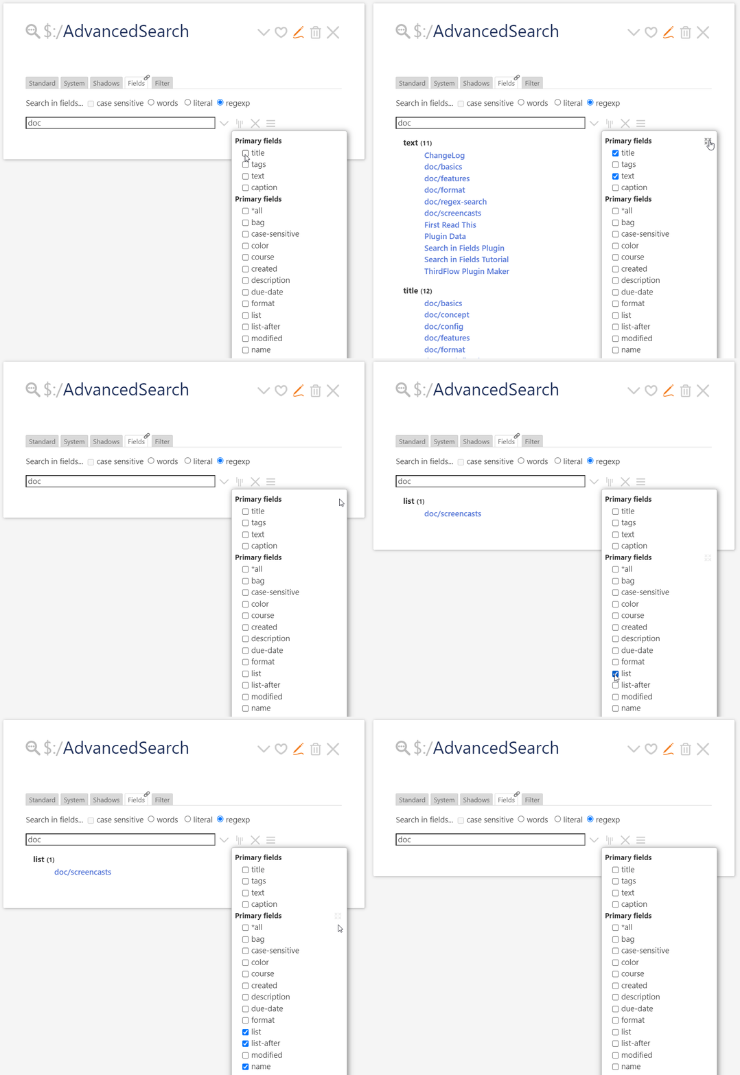
Search in Fields v0.6
- buttons to clear selected fields
- primary and other fields have separate buttons

Search in Fields v0.6

Added! I will upload new version soon!
*all -[excluded] now and works better*all now is *all -[excluded] to prevent confusionDo not forget to to have Shiraz installed on your Tiddlywiki.
https://kookma.github.io/TW-Search/#Search%20in%20Fields%20Tutorial
Hi Mohammad,
great work!
I am very late to have an idea:
What about just showing the fields in the dropdown where in whatever tiddler the searched word appears? This would make it much easier to got through the list.
Greetings Jan
If correctly understand you: your comment is about field selection part not listing the results.
The reason I switch from drop down to list was for multiple selection, drop down ($select) create a visible box and destroy the minimal design of Advanced Search.
The original idea by Tobias was dropdown menu!
I you have a solution, please let me know!
To benchmark the Search in Fields and also make challenge for Tiddlywiki,
HI Mohammad,
I did not mean the style, I ment that the fieldnames that do not have the searchword are omitted in the list.
Yes, the Search checks if a field has at least one matches, then it list that field with number of results and title of tiddlers!
The dropdown by way lists all the fields in the search scope (see sidebar > More > Search in Fields) except those excluded!
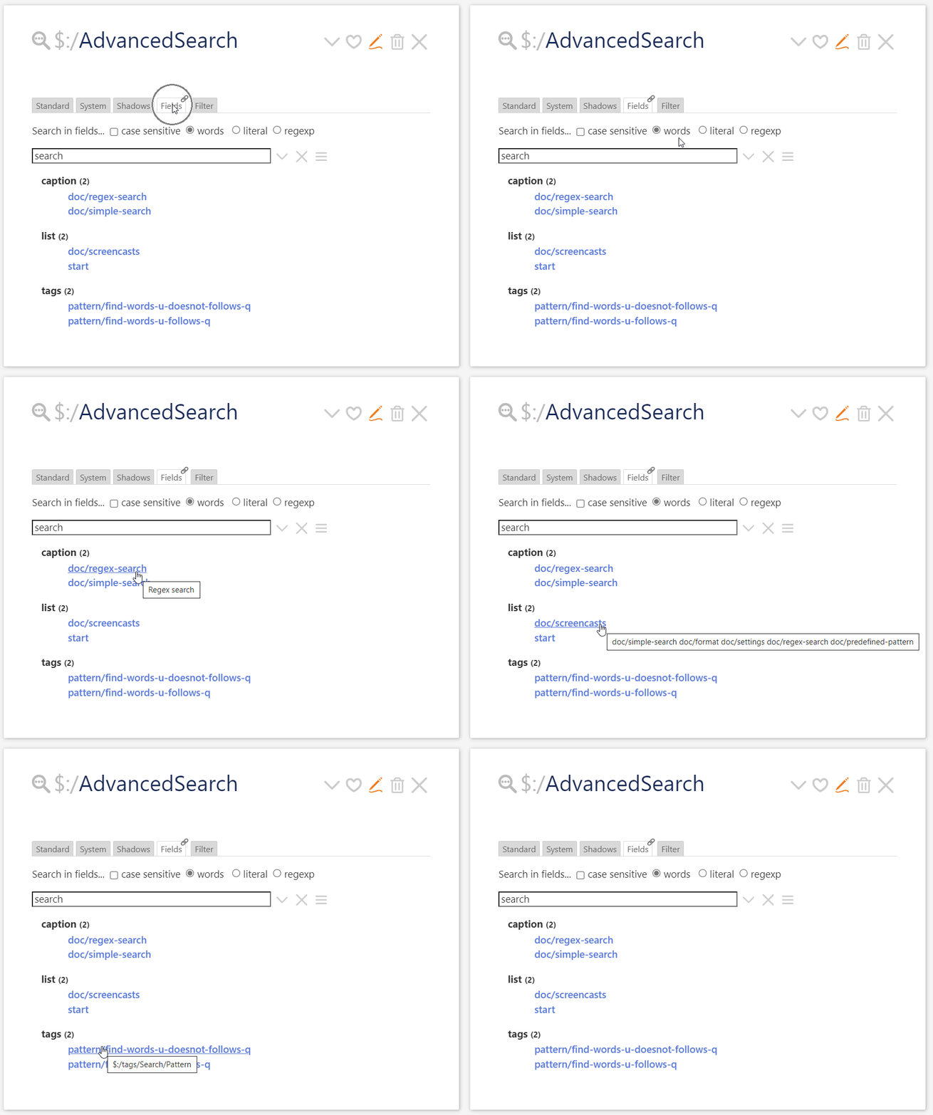
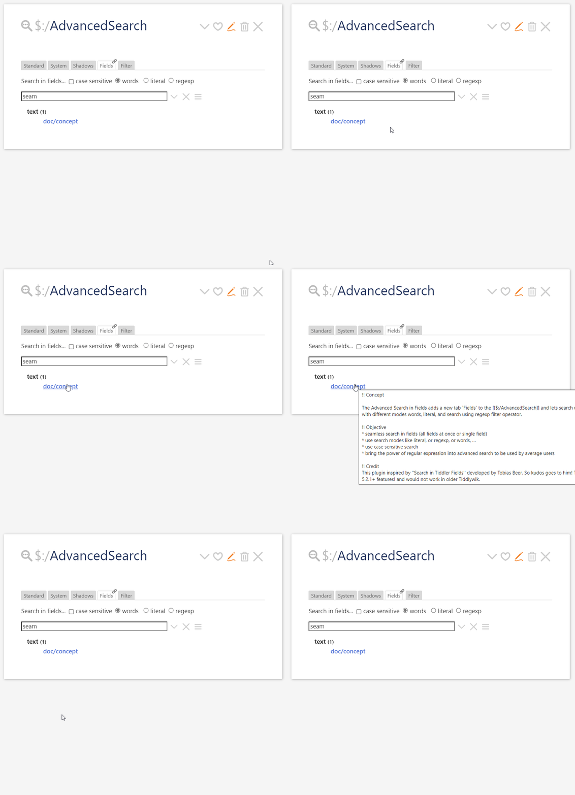
In Search in Fields 0.7.0 (will be pushed within few hours) I have added a tooltip (through title attribute) to show the content of fields on mouse hover, but sadly this does not work on touch screen devices like mobiles and tablets!
Is there any solution? I don’t want to go through tooltip as TW has issues on correct locating tooltips.

It even works for text field (it truncates long texts)

What do you think?
I do like the whole project. … For my personal taste the tooltip starts to feel “over engineered”
Thank you Mario! I will remove it as it does not also work on touch screens!
sFieldsTid is missingDo not forget to to have Shiraz installed on your Tiddlywiki.
Not so fast – while I agree with @pmario about the tooltip, previewing links is a good thing. Without it, a user MUST click to see the content. With a long list, that could be very tedious.
Proposal…
You have enough room to the right of the list (even more room if you remove some of the left margin) to place a dedicated area to show a preview on hover. Use CSS to show an always present, abbreviated copy of the content, only revealed on hover.
EDIT: not possible – For touch devices, use long-press (or whatever they’re calling it).
Make sure to subdue the preview rendering (perhaps using opacity and/or low contrast text) implying it’s nothing more than a courtesy rendering, not for editing and navigation purposes. And my preference, very subdued borders around it.
I think there is no function in TW to detect this.
It is very practical to have a preview because navigating to a tiddler (and opening it to see the content of a hidden field) costs quite a lot of time.
What about adding the possibility to open a preview-modal which displays the field on rightclick.
This is faster than navigating there, costs less resources because it does not have to be re-rendered and you would even have the possibility to put highlight or even search-replace in there.
You know TW is not good at locating tooltip and you will experience off screen tooltips / dropdowns!
It makes Search Plugin complicated, if I want to add a dedicated CSS tiddler to create well located tooltips, some needs JS (see for example https://openbase.com/categories/js/best-javascript-tooltip-libraries)
So there will be two methods remained: 1. use html title attribute (not bad, but it may go off screen) and 2. stretch text (use $reveal+button+popup) or macro like KISS Macro to Create an Inline Tooltip - Stretch Text
If you have installed Shiraz, then you can use tabular output and you do not need in-place preview!
It’s purely CSS. There’s no issue with being off-screen. You’re using screan real estate you already have – it’s empty.
Every result row has a tooltip div element (preview) positioned to display at the top of the results set to display:none but is display:block on hover. Allow the results to scroll, but not the preview.
I don’t know what else to tell you.
If I get time (doubtful), I may try to knock up a quickie POC on TW-com.
As soon as you display a long text (like the text field), it needs more spaces and goes off screen! Specially when you use TW on tablet and mobile or on desktop with closed sidebar!
Would be great!
See: Advanced Search in Fields: The Next Step
My next step is to search in fields from sidebar: Tiddlywiki standard search!
I am thinking if these are not too much and over engineered for search in fields!
What do you think?
Great idea, I’d love to have something like that for dropdowns