Feel free to play with the prototype even if many things are not working yet.
You can switch Layouts as always by Ctrl-Shift-L
Things to try out:
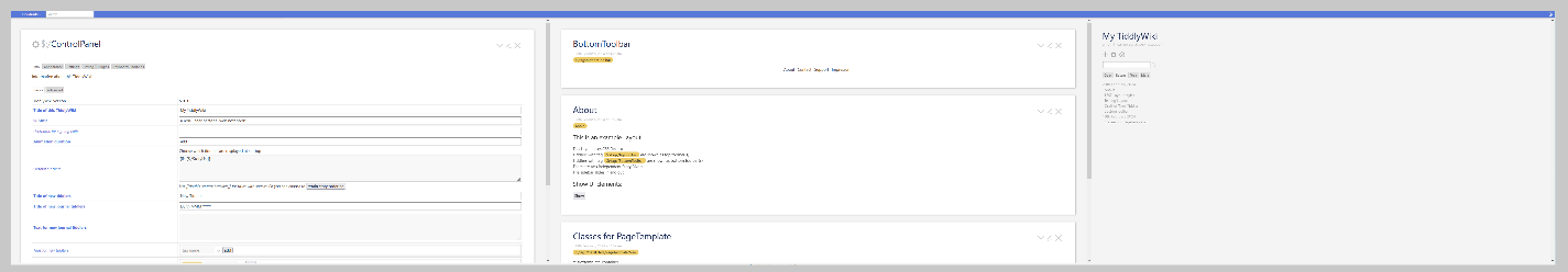
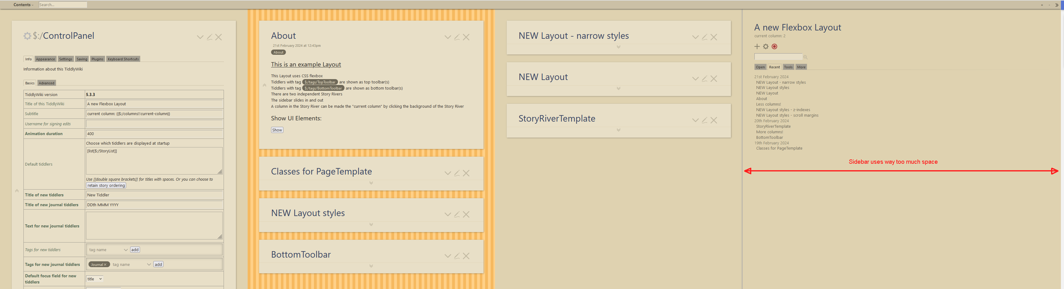
the sidebar
the toolbars (top and bottom)
the single-column headers and footers
link handling
How would your flexbox Layout look like?
Do you like my ideas and should I invest some time in this kind of Layout?
Now if you think - wait, this looks like the MCL Layout - it does a bit, but it will be different in certain aspects and it should be more responsive and faster
As always, please let me know what you think, ideas and criticism are welcome.
I’ve long wanted to extend the simplicity of the settings in the Appearance > Sizes area for top, bottom, left, and right, and this is most of the way there! Love it.
Couple of thoughts / questions / suggestions:
Would love complimentary $:/tags/Leftbar and $:/tags/Rightbar to work the same as $:/tags/TopToolbar and $:/tags/BottomToolbar. If you could add those and they could “stack” like the top and bottom ones do, that’d be awesome.
Meaning a new Leftbar would stack to the left of the default Sidebar
Would love to flip back and forth from one story to two stories based when needed, or at least be able to control that easily.
How would you control the height of something tagged $:/tags/TopToolbar so that the story river adjusts accordingly?
I prefer plugins to be small & clean, but click-and-drag sizing of bars would be awesome to add if it doesn’t add a lot of weight.
I assume this works without Menubar? I’d much rather build my own than use that plugin.
How do you move tiddlers between stories with this?
For now I’m just focusing on the Layout, not the functionality within, story-river handling and so on, but here are my answers:
Yes, that’s a thing I’ll add. It’s a very good idea!
Yes, that functionality will be added.
The story river adjusts automatically to the height of a TopToolbar / BottomToolbar
Giving a toolbar a height by CSS would do it.
I think click-and-drag sizing of such a toolbar is out of the scope of the future plugin.
Yes, this works without the Menubar plugin. I just added it for demonstration purposes.
I have some ideas and tested this intensively in the MultiColumn Layout.
Right now there’s no such functionality added, but it will come.
How would you like to move tiddlers between stories?
Ah, you’re right - I thought it wasn’t working but appears to be doing so now - nevermind.
I actually don’t use MCL myself - haven’t felt the need, but would use something like this (and suggest something like it is incorporated into Core) just for the topbar/bottombar/leftbar/rightbar enhancements that I expect will be part of this. This would be such a nicer experience for new users of TiddlyWiki to do this layout stuff without having to understand any CSS - like the default settings that are there. Tag based layout is perfectly in line with core TW. It’s funny to me that just adding a leftbar otherwise requires partners to use CSS or install a 3rd party plugin.
In terms of how I’d do it from a UI perspective, while not my area of specialty, I’d think the most “intuitive” way (for me at least) would be to have kind of a droppable zone for the gap between tiddlers, and if the tiddler headers were links (or otherwise draggable), then they could be dropped in the gap, even if within another story. I’d love a keyboard way as I’m more inclined to work that way, but I don’t believe we reliably have a real activetiddler that’s reliable in base TiddlyWiki, I assume you had to build something to fit that need in MCL.
Yes @stobot - I would also like to see some solution in the core
I think what MCL does is smoother (and what Muuri does is overkill)
Note that the drag-and-drop mechanism of the MCL needs just a small adjustment in a tiddlywiki core tiddler. The rest is wikitext and CSS
I love this kind of stuff, but can never seem to adapt it (them) to my way of working. There is an implicit assumption being made that the display, end to end (I’m mostly taking about the X-axis here) is the entirety of the TiddlyWiki story river display, in a conventional 1-screen environment. Understandable, that’s how most users use it, out of the box.
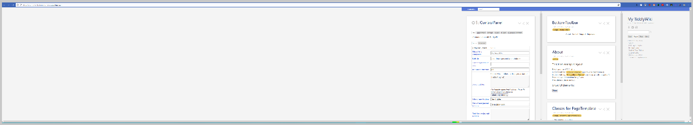
On my setup, my TiddlyWikis occupy 3, sometimes 4, 1920x1080 screens. This usually means I have a ton of work ahead of me to even get started using stuff like this. In actuality, I back out, which is a shame.
So, here’s your demo, the river occupying the entirety of 3 screens:
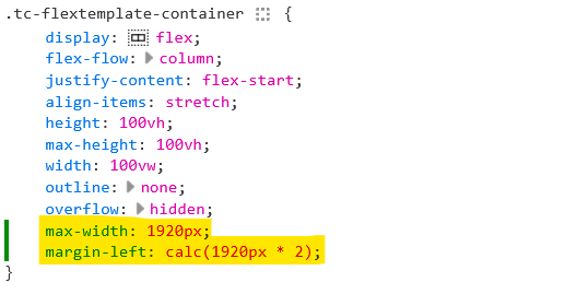
I combine a flexbox based layout with a max-width for columns (which may or may not be story rivers). Without a max-width flexbox based columns get really unwieldy in large windows as you have described.
I see, I plan making the width of the sidebar configurable which is obviously important. For the amount of story rivers I plan that you can use as many as you like. I think it’s better not to hardcode just two.
Would that fit your needs better?
I can imagine setting different widths for different rivers. But I believe I don’t understand your idea well enough…
I’m not sure about different rivers, unless you mean dividing the river to end up with notional sub-rivers.
Regardless, here’s a quick hack. Note, I may not have chosen the most apt or efficacious placement for it, but it’s constraining the current flexbox/river to the (in this case) third screen:
Simon, it would be easy to get into the weeds on this, so just focus on this – then you’ll be good, I think:
If that assumption was removed from the code, I’d be very happy. But this is just me – if you want to ignore my requirements, I’ll understand completely. It’s a unique requirement that only I (it seems) require.
Have you considered using CSS Grid instead of Flexbox?
While Flexbox is great for controlling one-dimensional layout, with CSS Grid’s two-dimensional focus, you should be able to provide much more flexibility with TiddlyWiki layout alternatives.
@CodaCoder there is another approach for multi screen setups. Additional windows spawned from the one wiki.
With recent improvements its possible to build window management tools, Open, close, find and navigate between windows, Advantages include;
you can design windows with or without a story of its own.
you can pull a window or another app in front/behind on each screen with the others visible.
windows can consume only part of the screen they are on or view full-screen.
windows can all be layered on one screen.
multiple wikis could be similtaniously spread accross multiple windows and screens and the operating systems tools can also be used to navigate between windows including more than one browser.
each window could have its own behaviours and be addressed seperatly.
All you need is one or more window templates defined with the content and layout you desire then open the ones you want.
perhaps a way could be found to select or emulate a different layout in each window.
This approach remains to be explored in depth but it may be superior to a single wiki visible in one window stretched accross multiple screens.
I love watching these layouts develop, and I keep wondering when I’ll find a need for it in my own work. I never seem to need it… which I find sad, as I really like MCL and this looks like it’ll be great too.
How is that different from the default TW layout, which already has that? (Except that somehow it doesn’t in your demo if you switch to the default page template. Hmm…)
Thanks @Scott_Sauyet
I love tinkering on these layout, learning CSS and wikitext is fun
It MOVES in and out, the default page template jumps. In my demo in the default pagetemplate there’s no sidebar-button because it’s removed for a menubar experiment

 because it’s removed for a menubar experiment