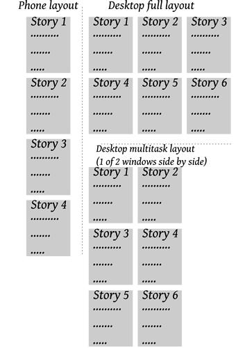
I’m new to Tiddlywiki and going through Grok Tiddlywiki right now to learn. A saw this forum post and thought it was close to what I wanted in layouts compared to standard TW. What I want is a multi column story river which fill the screen (kind of like how email utilizes columns: folders on the left, emails list in the middle, and content on the right). So if I had my tiddlywiki on my computer I could have multiple tiddlers visible and editable if needed, but on my phone where space is limited it would switch to a one column river (default TW). Having learned of MCL and flexbox from this forum post, I tried both out on my computer, but they remain several columns if you shrink the window (meaning you have to scroll horizontally). Would it be possible to have the columns dynamically adjust to windows/screen size? So it has the columns in a full window, but if you tile the window to 1/2 screen it would only display only how many columns would fit in that space without horizontal scrolling. I have a quick drawing of what I mean in case my explanation was lacking.
