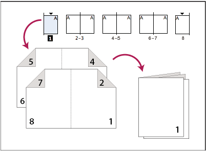
Is there a template to turn a selection of TIddlers into a foldable booklet. I nebulously remember something like that existed in TW Classic…

This task really needs a css wizard!
Is there a template to turn a selection of TIddlers into a foldable booklet. I nebulously remember something like that existed in TW Classic…

This task really needs a css wizard!
There was one …to make little mini booklets that you folded and put a cut down the middle. Can’t find it right now. Will try and dig it out.
I think that would be Paul Downey’s Tiddly Pocketbook:
The original site is gone, but here’s an archived snapshot:
https://web.archive.org/web/20120506205408/http://tiddlypocketbook.com/
Yes. That’s the one.
I was just about to post exactly that having remembered where I’d saved the link!
I imagine this was done with CSS somehow? In which case it could be recreated for TW5? Or is there something fundamentally different about TW5 that prevents this?
My solution now uses libre-office and a python script.
The main issue with tiddlywiki and printing is the page formatting and breaks. This is hard to automate, although you can use print preview and return to the content and insert page breaks, we can’t see where a page break will occur from within tiddlywiki, so it is a manual process. However this is not an issue in many cases.
is an example, how practical it would be to have a template to print other TiddlyWiki content like this. I would like the possibility to make little - analogue - cheatsheets in this form.
Hi @john.edw_gmail.com ,thank you, this is a great step towards the solution … althougth it does not work perfectly yet.
Looks like there is a missing secret ingeredient. Does nobody have an ancient copy? Waybackmachine does not seem to have understood the tiddlywiki logic.
A thing that I missed during my research was a css way to overflow content from one div to another. This would facilitate the layout, but I guess this needs js.
This is fantastic. I will be playing with this, as I was going to build a trifold brochure this week as a political handout for the local election. A book like this would be so much more interesting! I will try to create one that does all 16 subpages from both sides of the sheet, using a cut/fold as described here: https://www.youtube.com/watch?v=ozCQe0dRr44. I’ll report back if I have any progress.
I think this might be best done without thinking of overflow, ensuring that each tiddler fits on a mini-page, and using overflow: hidden if necessary.
Sadly, CSS doesn’t have the capability to flow content between one box and another.
A possible workaround might be to use tid2png to render a single tiddler as a tall thin PNG, and then render cropped and transformed copies of the PNG across the page using CSS.
I think this also would involve quite a lot of code, or can we know the height of the png by advance. The approach I stumbled upon in the web is similar, but without the step to render as a png
…but I still wonder, why there is no standart web-design apporach to this.
Here is another workaround by rearranging the pages of a pdf for printing a booklet.
…but again, this means lots of aditional steps - because you have to export a pdf with correct paages first.
There is now a range of html/CSS features for “responsive” or multi-device screen layouts and lots of options via media queries you would think we could prepare the content for print as well. eg
Or is print now neglected?
[Post Script] I did build a PDF print layout solution and found value using page break avoid, and page break after, successfully, tables are good at this, however it is very fragile and footers, harder than headings.
I’d like to see that.
What is neglected in css is the ability rearrage pages so that they correspond to the retro-verso-nextpage necessities of a booklet (see the image at the top of the thread). Therefore it would be usefull to detremine a div into which the overflow goes. This is of course a print use-case, but the feature could be usefull for web as well.
It is hard to separate what I did from the wiki I built for a commercial client, but I am happy to share what I learned.
The key is arranging the content to be printed in a hierarchical form and decide which parts will not be allowed to break across pages, or they will move to the next page. Then also indicate where you want a specific end to the page, like before a page heading.
TW > {Publish_Script_Plugin} > Pandoc > LaTeX > PDF
Where are you there?
Some progress: I will try to post more this evening if I can, but I did manage to get something to work well mostly with CSS, with no attempt to overflow between the <div>s.
The HTML looks like this:
<div class="print-brochure">
  <div class="brochure-page page-1" >Content 1 here</div>
  <div class="brochure-page page-2" >Content 2 here</div>
  <!-- ... more here ... ->
  <div class="brochure-page page-16" >Content 16 here</div>
</div>
where the <div> contents are transcluded tiddlers.
.brochure-page {width: 2.75in; height: 4.25in; overflow: hidden; padding:.125in; font-size: 8pt; line-height: 1; position: relative;}
.brochure-page h1, .brochure-page h2  {text-align: center; font-weight: bold;}
.brochure-page p.overview {text-align: center; font-size: 125%;}
.brochure-page .logo {text-align: center;}
.brochure-page .logo img {width: 75%; margin: 0 auto;}
.brochure-page h3 {margin-top: -.1in; line-height: 1; font-size: 175%;}
.brochure-page .role {font-size: .75em; font-style: italic;}
.brochure-page div.avatar {margin-left: 0;}
.brochure-page .avatar img {width: 1.25in;}
.brochure-page ul {padding-left: 2em;}
.brochure-page .skip-in-brochure {display: none;}
.brochure-page .footer {text-align: center; margin-top: 2em;}

.print-brochure {height: 21.5in; width: 8.5in; position: relative; padding: 0;}
.print-brochure .brochure-page {margin: 0; position: absolute; top: 0%; left: 0%; }
.print-brochure .brochure-page.page-2 {transform: matrix(0, 1, -1, 0, 75, -100)}
.print-brochure .brochure-page.page-9 {transform: matrix(0, -1, 1, 0, 600, -100);}
.print-brochure .brochure-page.page-3 {transform: matrix(0, 1, -1, 0, 75, 225);}
.print-brochure .brochure-page.page-8 {transform: matrix(0, -1, 1, 0, 600, 225);}
.print-brochure .brochure-page.page-4 {transform: matrix(0, 1, -1, 0, 75, 550);}
.print-brochure .brochure-page.page-7 {transform: matrix(0, -1, 1, 0, 600, 550);}
.print-brochure .brochure-page.page-5 {transform: matrix(0, 1, -1, 0, 75, 875);}
.print-brochure .brochure-page.page-6 {transform: matrix(0, -1, 1, 0, 600, 875);}
.print-brochure .brochure-page.page-10 {transform: matrix(0, 1, -1, 0, 75, 1135);}
.print-brochure .brochure-page.page-1 {transform: matrix(0, -1, 1, 0, 600, 1125);}
.print-brochure .brochure-page.page-11 {transform: matrix(0, 1, -1, 0, 75, 1450);}
.print-brochure .brochure-page.page-14 {transform: matrix(0, -1, 1, 0, 600, 1450);}
.print-brochure .brochure-page.page-12 {transform: matrix(0, 1, -1, 0, 75, 1800);}
.print-brochure .brochure-page.page-13 {transform: matrix(0, -1, 1, 0, 600, 1800);}
.print-brochure .brochure-page.page-16 {transform: matrix(0, 1, -1, 0, 75, 2125);}
.print-brochure .brochure-page.page-15 {transform: matrix(0, 1, -1, 0, 600, 2125);}

.brochure-only {display: none;}
.print-brochure span.brochure-only {display: inline;}
.print-brochure div.brochure-only {display: block;}

@media print {
  div.tc-titlebar, div.tc-subtitle {display: none;}
}
Those matrix transforms do two things. First, they rotate my content either +90° or -90°, then they slide the resulting rectangle around in my output. If I play with this beyond my current practical needs for a brochure for this weekend, I would probably generate the repetitive part of the CSS as well from a simpler data structure. The odd ordering in the CSS is to show where the small pages (whose page numbers are ordered in a fairly logical reading order for the funky brochure) is about how they layout on the sheet. That is, the first two pages listed are 2 and 9, which are the top-left, and top-right of the front page, and they continue on until we hit 16 and 15 which are at the bottom of the back page.
I haven’t yet tried to make this into a function/macro with a passed filter listing the tiddlers, but that’s an obvious next step.
The output looks like this:
These are printed duplex, flipping on the long edge.
The borders in these images are just an artifact of my screenshot; there are no folding/cutting guides, but you can simply fold and cut this as described in the video above to make a very cute little booklet. The paper size is U.S. Letter, 8.5"x11", so this will not translate exactly to A4. We would need to tweak both the <div> dimensions and the offsets in the matrix transforms for a different paper size.
It’s real progress. Now if I can only get the three holdouts to send me their bios!