Streams: exploring ideas for new features

This thread discusses new ideas for Streams that are being explored and tested. Not all of them may make it to release.

I had a chance to revisit Streams development recently as it dovetailed nicely with other work. Here are some of the improvements that I am currently exploring:

  • expand all / collapse all affordances for the children nodes of a stream
  • further simplification of the templates and DOM structure
    • improvements in performance and drag and drop behaviour
  • the possibility to select node(s) with the mouse and copy and paste them between streams.
  • the above will entail coming up with a string representation of a node tree which will also allow creating templates of node trees and re-using them easily
  • different node types for each node - each with their own template - that can be switched between: default, task, etc
    • affordances for easily switching between node types while writing
    • potential removal of the default bullet styling of nodes in favour of something more generic
  • the possibility to edit the root tiddler within the Streams UI. Recent improvements to the core have removed the obstacles in the way of a clean implementation.
  • the ability to add nodes to a tiddler without modifying it

Any new thoughts, ideas and suggestions are welcome - if it fits with my vision and interests, I will take it on board.

Edit: added last two bullet points

5 Likes

Not discounting for one second the giant’s shoulders on which Streams is standing…

Steams is starting to look/sound like the closest thing to a digital manifestation of “stream-of-consciousness” I’ve ever seen/heard of.

Kudos.

Awesome work Saq, I look forward to checking it out this week. :slight_smile:

To be clear @joshuafontany this is for now just an insight into what I have been exploring and experimenting with, to allow any relevant user feedback a chance to influence the design process. There isn’t a Streams pre-release with these new features for testing just yet, but perhaps soon!

1 Like

For those who did not discover this great plugin yet:
Because I found it hard to find the link to the newest version in this thread, I added it here - I hope it is the most recent version.

https://saqimtiaz.github.io/streams/

PS: Streams is not listed in the ressources of tiddlywiki.com yet, and it should be.

3 Likes

Thanks @JanJo, I’ll add the link to the top post as well. That URL is always the place to find the latest version of Streams.

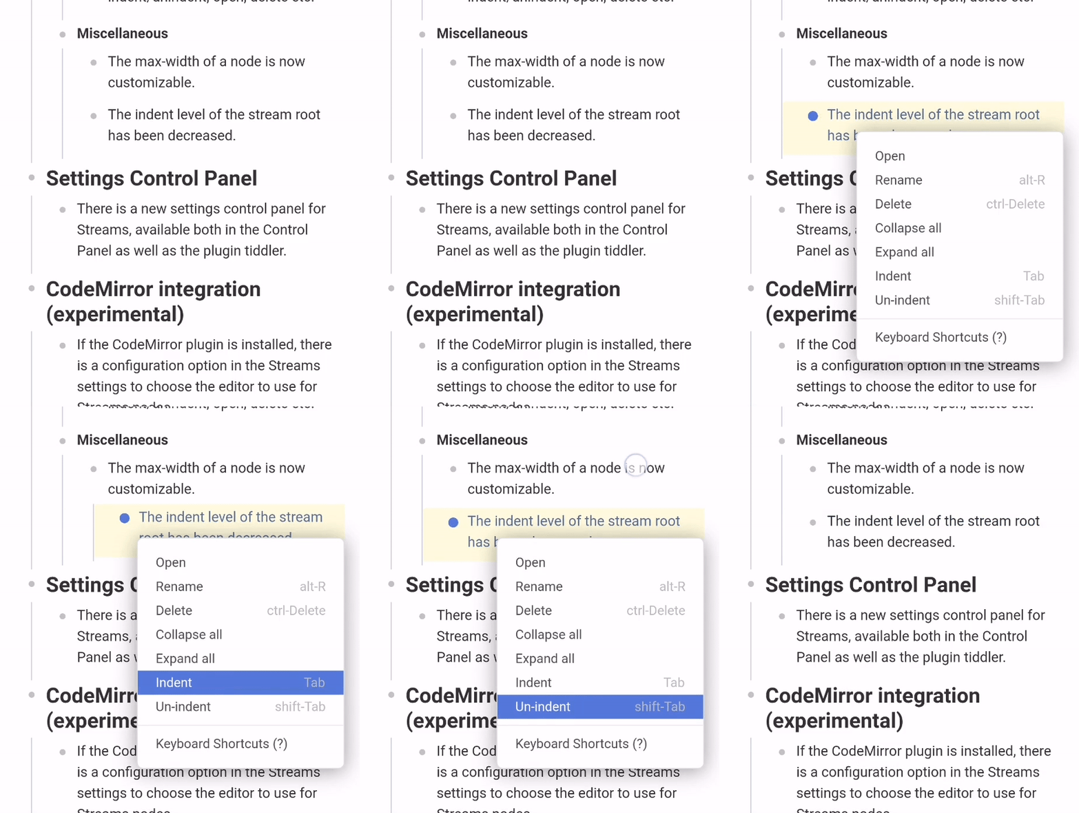
I am experimenting with a new configuration option that makes the context menu sticky, that is the menu is not dismissed until you click or tap outside of it.

The thinking is that especially on mobile, it can be a bit disorienting to find a node after you indent it, and can be especially tricky to try and undo it. A sticky context menu makes it easier to see the node you are working with.

ezgif.com-gif-maker

Oh I guess there is an accidental peek at the new collapse all and expand all context menu entries. I am undecided on whether they should have default keyboard shortcuts configured and if so, what they should be. Suggestions are welcome.

1 Like

ctrl+shift+S/alt+ctrl+shift+S if those are not taken. :slight_smile: Looking very cool.

Thank you @joshuafontany. Out of curiosity, are you familiar with those particular keyboard shortcuts from elsewhere? https://defkey.com/ was not much help in figuring out if there is an existing UX pattern that we can adopt for such behaviour.

Other ideas under consideration include small sub-plugins that:

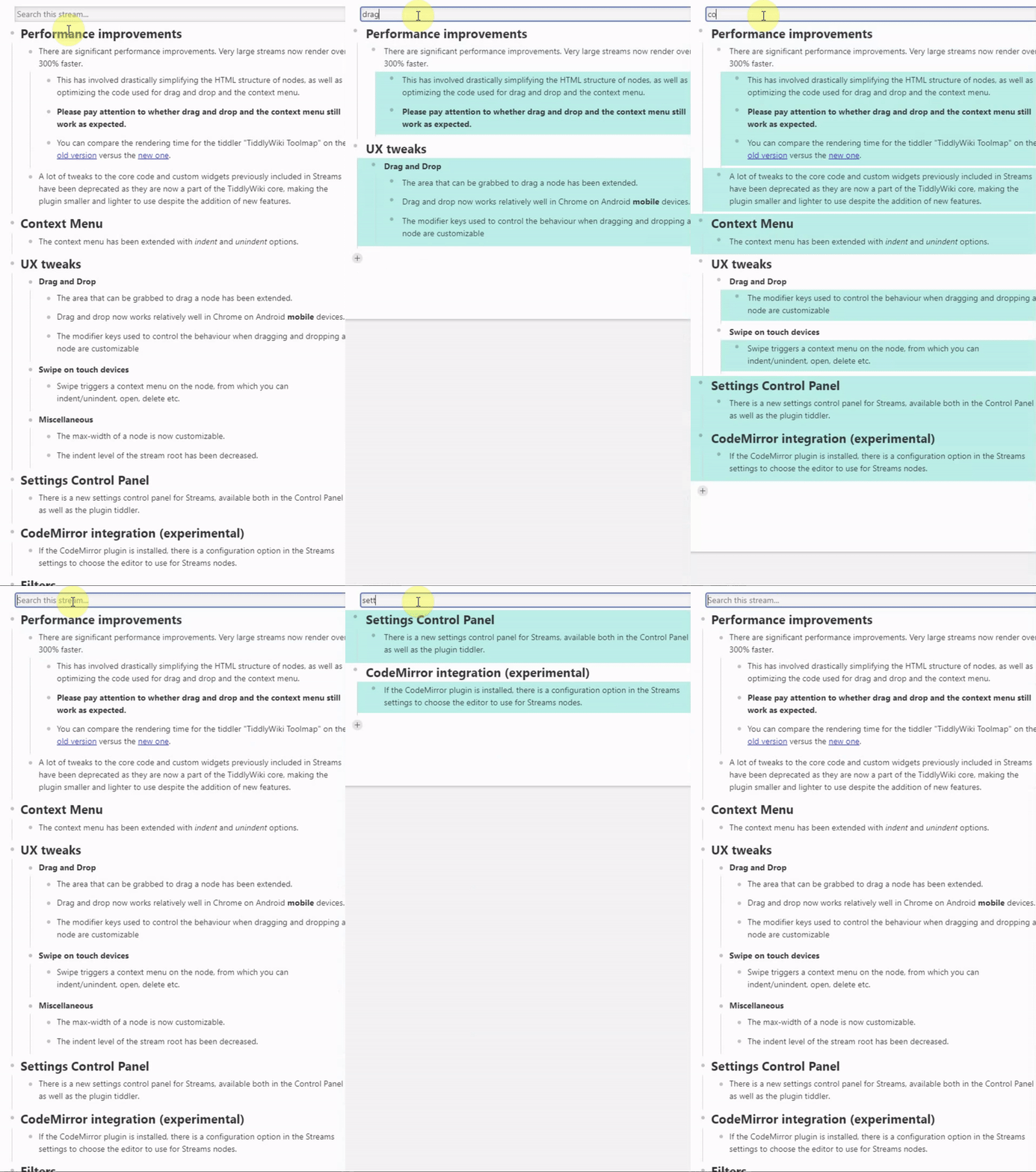
Preview of a very early take on searching in a Stream:
streams-search

4 Likes

I have been working with Adobe products a lot recently (book layout & photo retouching), & these were just off the top of my head. I know Ctrl+Shift+S is “Save As…”, not sure where I’ve seen the 4 button one - but it seems complicated to me atm.

I think there would be a better option, but I’d need to refamiliarize myself with the current TW keycodes.

2 Likes

The dynamic Stream search demo is very nifty @saqimtiaz! I think I will be using this!

I think I have customized just about every list (e.g. Recent, backlinks) to show only the root tiddler’s title. The filter operators that come with Streams make that very easy to do.

1 Like

I am quite pleased with how that is turning out. It is only about 30 lines of code and adds zero extra complexity or performance drawbacks to the main Streams plugin. We just hide the nodes that don’t match using CSS.

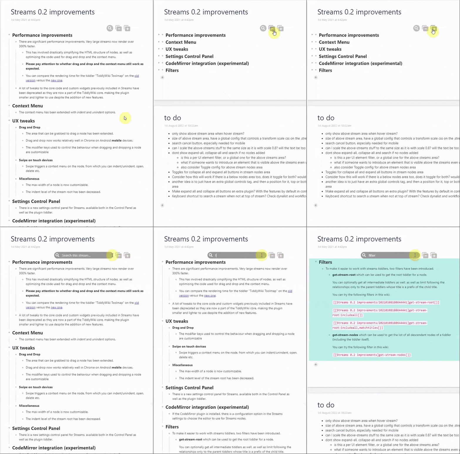
I am now contemplating UI related decisions, namely whether to introduce an area at the top of a stream for stream wide interface elements like the search and buttons to expand and collapse all the nodes, which can also be used by sub-plugins like Streams-Fusion or the above mentioned Search-in-Streams.

I agree, however it seems a lot of users find these customizations intimidating.

The filter operators are indeed useful. One of the recent user questions I have had was how to find the nearest common ancestor of two nodes:

[<tiddlerA>get-stream-root:includeall[]] :intersection[<tiddlerB>get-stream-root:includeall[]] :and[last[1]]

2 Likes

I am getting close to beta testing for a new release of Streams.

A UX design question that needs answering is where to place global affordances for features that relate to the entire stream and not just to individual nodes, such as expand/collapse all or searching in the stream.

One idea is an area above the stream where such controls can be added via an extensible mechanism. The concern is that this might be visually discordant, especially when the root tiddler has body text.
stream-above-nodes

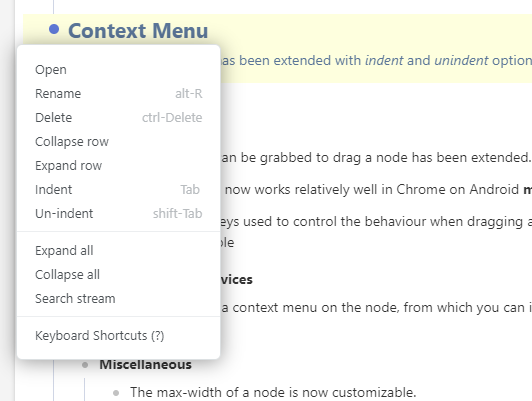
An alternative is to extend the context menu with a section for global commands, where for example the search option when triggered displays a search bar above the stream, which can be closed after the search. Currently all context menu commands are specific to the node on which the context menu is triggered, so this would be a change in that regard.
Mockup:

image

Alternative layout and visual design ideas are welcome.

5 Likes

If I had to choose one method, I would choose the context menu so that I can long press to access it on my phone.

Looking forward to the beta!

I have found that what would be useful is a way to toggle the display of the body and or the stream - with the stream indicating if it has any content when closed. Sometimes I summarise what I plan to do in the stream within the text field, but once underway I just want to hide the body and view the stream and vici versa. Its a bit like a selective fold feature.

  • Mention it now because perhaps this too could be toggled - just show it at the top and provide a toggle to move it to the context menu?
  • A custom stream button on the view toolbar with a dropdown could even be used to start a stream on the current tiddler, toggle the streams display and provide the features you are exposing.
  • Me personally I would prefer them on the top, and to the left, and the opportunity to indicate it is a stream, but thats just me.

Those features look exciting :nerd_face:

Hi @Tiddlybob, can I ask why you feel the context menu option would be more usable on phones than the controls above the stream? Thank you.

@saqimtiaz When I first read your comment this morning, for some reason I thought that all of the controls on the parent header only showed up on hover, in which case a context menu would be more accessible for mobile. Now that I look back and see the persistent buttons, I think the first method would be a bit easier on mobile.

That being said… I agree that the first option might be visually discordant. What do you think about including an ellipsis that triggers the context menu for the parent header? That might help keep the UI uncluttered, while also providing a visual cue to the extended options.

Sorry to be late to this conversation; have been away from TW, mainly for want of exactly this: an agile outliner that integrates reasonably well with TiddlyWiki (absent that, my go-to notetaking app remains DynaList).

What it would take to make this work for me is two simple enhancements to existing functionalities -essentially:

  1. When i click the Fuse button that collapses a set of outline nodes into a single TiddlerName_fused tiddler, then all those separate node-tiddlers should be deleted -either automatically, or else by giving me a one-click option to do so.
  2. Given a view of all those cryptically-named node-tiddlers, i’d like to be able to shift-select any combination, or select all, and delete with a single click.

For all the sense this makes from my own UX experience, i guess from Developer perspective it’s more complicated, seeing as how it involves 2 plugins (Streams and Streams Fusion, AFAIK) for 1st point above, and maybe core UI element(s) for the 2nd… And may even run counter to the TW philosophy of “everything’s a tiddler,” which may imply having a tiddler for everything. I get that, in principle, but still…

Much as i appreciate the experience of agile-outlining in TW via Streams, then organising & saving the work to one or more well-named tiddlers as appropriate via Streams Fusion, all that joy evaporates when i contemplate the mess of tiddlers in my Recent list, whose names mean nothing to me, yet i must then click each one and pull down to delete each one individually.

Perhaps there’s a better workflow within the product as it stands that i am failing to see?
If so, perhaps it could be made more obviously accessible with some contextual help affordance.

Anyway: kudos to you both, @saqimtiaz & @fastfreddy , on this dynamite plugin combo; am happy to see that development continues -especially regarding that sub-plugins idea Saq presented above, which might be away to address my little wish-list above (?).

/walt

I like both! Not helpful to you in deciding, but an affirmation nonetheless.

1 Like