Section Editor Plugin: First Stable Release

I understand that SE will not work without text in the text field. That makes sense. I do have text in the text field, but it’s displayed with a custom ViewTemplate and the hide-body field is set to yes. I do this because of the order I want certain things displayed. My ViewTemplate must be interfering with SE somehow.

My ViewTemplate has a bunch of stuff to create an infobox that I want in the upper right. After that code, I simply include the following statement:

  <$transclude tiddler=<<currentTiddler>> field=text mode=block/>

Could the problem be the block mode?
I can confirm that this is happening. If “hide-body” is set, it hides the section editor as well. I wonder if the CSS that Mohammad uses to hide the body accidentally hides his template if hide-body is set? Perhaps after hiding the body, the selectors are matching the wrong elements.

1 Like

Have a look at $:/plugins/kookma/section/viewtemplates/sections
Actually SE supports the fold/unfold from core! So, if you use folding tiddler, SE shall be hiddlen!
You can edit $:/plugins/kookma/section/viewtemplates/sections and remove the conditions for hide-body! at the cost of not supporting the fold tiddler button!

Mark, it is because to support core fold tiddler function! but you can remove it, see $:/plugins/kookma/section/viewtemplates/sections

I removed the !hide-body[yes] from the viewtemplate and it didn’t make any difference. It’s as if SE is not installed at all. No section folding and no section editor.

I just tried it (removing !hide-body[yes]) and it seems to work. Maybe a screen shot of the code and of what you’re seeing so we can verify that something else didn’t get accidentally broken?

I’m starting to have a better understanding of what’s happening.

SE displays the text of the tiddler via a viewtemplate. That’s why Mohammad had the hide-body statement in there. My viewtemplate also displays the text of the tiddler body. Both were being displayed with my viewtemplate being displayed at the top and not including the SE features and the SE viewtemplate below that with the SE features.

If I remove the transclude from my viewtemplate, then all works fine with the exception of one thing. I have an infobox that uses float:right to position it in the upper right. The text from my viewtemplate will wrap around the infobox, but the text from the SE viewtemplate is either above or below the infobox and not wrapping around the infobox (depending on the order of the viewtemplates). It really has nothing to do with the hide-body field.

I’ve got some more work to do to figure out how to get my infobox to work the SE.

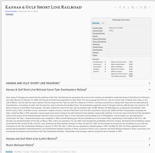
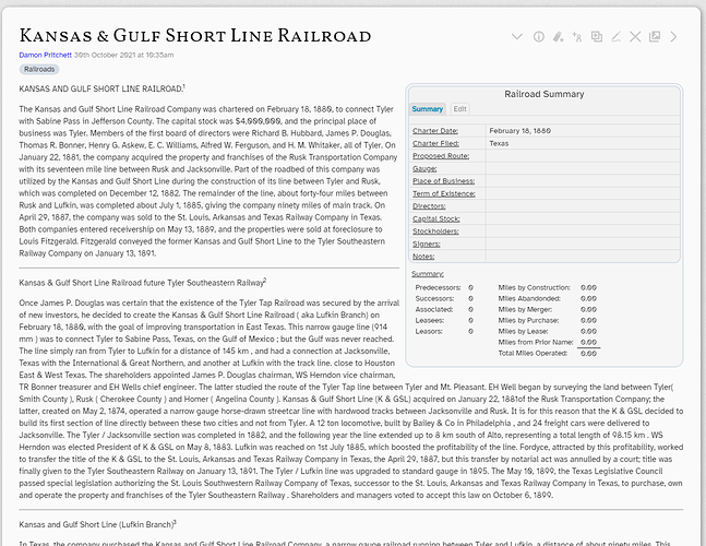
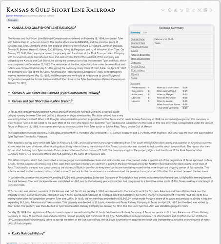
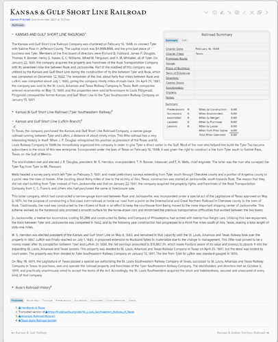
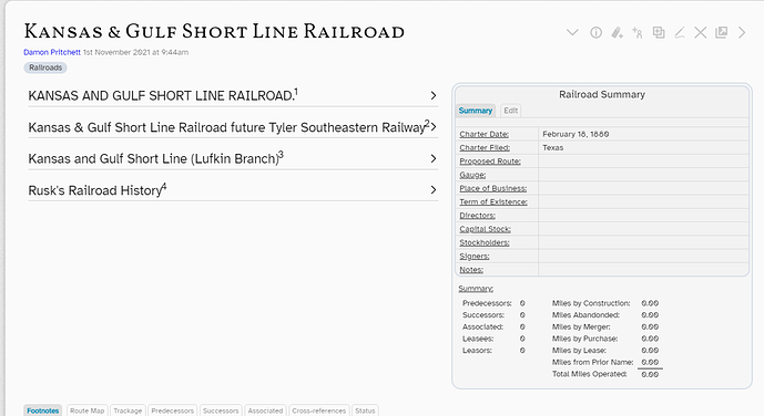
As an experiment, I replacement the transclude widget in my viewtemplate with the code from the SE viewtemplate and removed the hide-body part of the filter. This worked mostly. See below:

However, upon unfolding one of the sections, all of the sections move below my infobox. See below:

Not sure what is causing this. Further experimentation is required. Any thought would be appreciated.

@HistoryBuff
SE uses view template, you have other tools uses view templates! the order of them are matter!
open one of those template tiddler click on $:/tags/ViewTemplate ans check the order!
Reorder if you like!
You can also hack SE bu using its view template merge into one your own template! For example to use a two columns layout!
By the way I checked SE with several other plugins like drift which uses such template and it works!

Let’s see what @Mark_S says!

To me this looks like something with whatever CSS you’re using to float the info box. When you open one of the SE sections the resulting text is too long, so everything gets pushed down.

Could be, but this is what it looked like prior to me trying SE.

All I did to implement SE was to remove the horizontal rules and add !! for the headings.

These two divs float the infobox:

<div style="float: right; margin-left: 10px; margin-bottom: 10px;">
 
<div style="width: 500px; float: right; margin: 5px; background-color: #f2f2f2; border: 2px solid #d7dee8; border-radius: 12px;">

The one floats the box and the other floats the table at the bottom labeled Summary.

Not sure if it’ll help…

<div style="float:right; ...">
  < ... Railroad Summary ... >
  <div>
    < ... Summary ... >
  </div>
</div>

The point is, one floater.

@Mohammad check you’re not doing a break or css clear:both or similar.

I like the idea of one floater, but when I do that it messes up the box. It looks like somehow I ended up with two boxes so removing one of the floats de-nests the boxes. So it’s clear that it could be optimized. Having said that, it did nothing to solve my current issue.

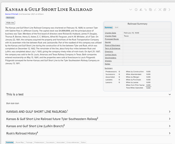
I also did two short tests: one with a very short line of text with as a section with SE and the other with a long paragraph of text with the accordion reveal example from tiddlywiki.com.

The short section with SE did the same as the long sections so it’s not the long text of those sections causing the issue.

Utilizing just the reveal widget with the long paragraph copied from the first SE section worked just fine.

One of the first things I tried was reordering the viewtemplates via drag and drop. The only effect that has is to move the sections above or below the infobox.

Screenshot below with both tests:

I think I’ve found the issue. SE has various styles where the width is specified as 100%. When I removed these as an experiment, the text flowed around the infobox as I had hoped. I do not know what other ripple effects this will have, but it solved the text wrapping around my infobox problem.

@CodaCoder - SE uses many line breaks! It actually uses \n to extract any line and then rejoin them using linebreaks! After each section there is a line break <br>
But there is no clear:both!

SE uses few flex but as much as I remember I have not used float to clear!

All,

I’ve got it to work just the way I want. I had to take out the transclude from my viewtemplate and add some code from the SE viewtemplate (minus the hide-body[yes] part) for those tiddlers with the field se-type. I also created a custom stylesheet to remove the 100% widths. No modifications to any SE tiddlers at all. Thanks to all for walking me through this with your ideas.

1 Like

Good lookin layout there. :wink:

Thanks! It’s even better when I add the whole tiddler to the view.

1 Like

Wow, this is lovely!