A new update is there! Note that, it has not been polished yet! but it is stable and working!
See 0.2.7 on GitHub
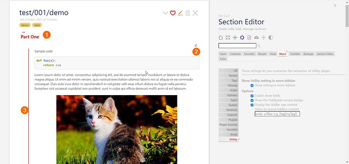
Code and demo
- Demo: Section Editor — create, edit, fold, manage sections
- Code: GitHub - kookma/TW-Section: create, edit and manage big and lengthy tiddlers through sectioning
Release 0.2.7
- Oct 8th, 2021
- [NEW] sections can be customized through predefined stylesheets
- [NEW] several new disclosure styles added
- [FIXED] namespace
seis used in temp, and state tiddler - [FIXED] section editor only works on sections with headings
- [FIXED] preview tab is disabled for main editor
- [FIXED] tiddler fold/unfold (core behavior) supported
CSS tweaks are needed!
You can star the repo if you like it! Open the GitBub repo page given above!
So, how are you hiding the tiddler bodies? Inquiring minds want to know!
I have given the Section Editor my first spin; very nice Mohammad!
I have not changed that part, and still use the dynamic stylesheet to list those tiddlers with se-type field! In long run this is not a good solution!
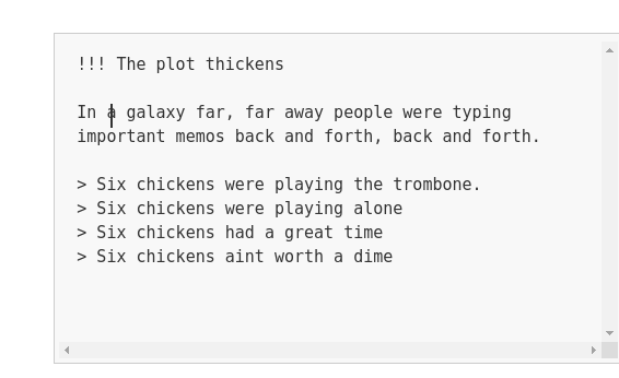
I like the dt setting best, because it looks most like standard TiddlyWiki. But the editor is weird, with the cursor in the wrong place. That is, the cursor will be right on top of a letter, instead of in front of it or behind it. At the moment I can’t capture a screenshot that includes the cursor to demonstrate the problem.
When I use faq mode, the editor is OK. I’m just surprised that changing the view mode also changes the edit mode.
Edit – I was able to get a screenshot. Notice where the cursor is.

Strange, I do not see this cursor problem. I am using my laptop with linux and firefox in a freshly downloaded TW. Only Shiraz and Section Editor installed.
I testet in Chromium too, still not seeing the problem. The wiki look strange though with ugly shadows around the tiddlers (Browsers grrr!)
I also like the dt setting best. looking as you said most like standard TiddlyWiki. I do think that faq mode could grow on me, but after the first fun watching it “slide” in and the letters moving around I get a little tired of it.
Best part we are able to select.
Those were for testing! in the next update I will correct the name and also add more styles!
I think the editor shall get focused when opened! It is not the case now!
Also there some edge
cases may cause problem! For example if you editing a section with level 3 and then from setting changed sectioning only up to level 2, the editor will be opened in freeze mode until you change the setting
dt just was for testing! If both you like it, I will polish it and choose a semantic name and add to Syles!
I have seen this error! I just checked in FF. But I will take a closer look
Some screencasts have been added to the original post (first post in this thread: Section Editor Plugin: First Stable Release)
Hi Mohammad
This is getting really nice. I can definitely see myself starting to use this now. This will really cut down on the number of tiddlers for me, and make long tiddlers easier to edit.
Two questions:
Will there be an option to turn off that animation that slides things toward the right when opening a closed header? I find animations distracting.
I don’t see “user custom stylesheet” on your roadmap. Could you eventually give instructions on how to adjust basic styles you use, such as being able to change the color of the red texts? There are a lot of stylesheets in this plugin to have to dig through to find something like that.
Hi Dave,
Yes, you can turn them off! There are four stylesheet shipped with plugin, open and comment out the transitions! I hope I can use better css settings to follow user settings
The folding uses standard details tag! I have seen you have custom styles for these tags in your wikis, so it is not difficult!
You can use your own css!
New Update
Section Editor just has got new update!
- Update 0.5.0
- Bug fixes
- Better styling
- Improved documentation
- Improved hackability
- Independent from Shiraz
Code and demo
- Demo: Section Editor — create, edit, fold, manage sections
- Code: GitHub - kookma/TW-Section: create, edit and manage big and lengthy tiddlers through sectioning
Star it, if you like it!
I like the styling! Especially that you got rid of that wasted space between the header and the content. Nice!
There’s a little bug. When you save the current section, the editor forgets the open/close status of the other sections. So it displays everything as “open”, even though you had previously set it as “closed”.
A future request would be “close all” so you can quickly find the section you were working on.
I cannot reproduce it! Would you please check this on demo page?
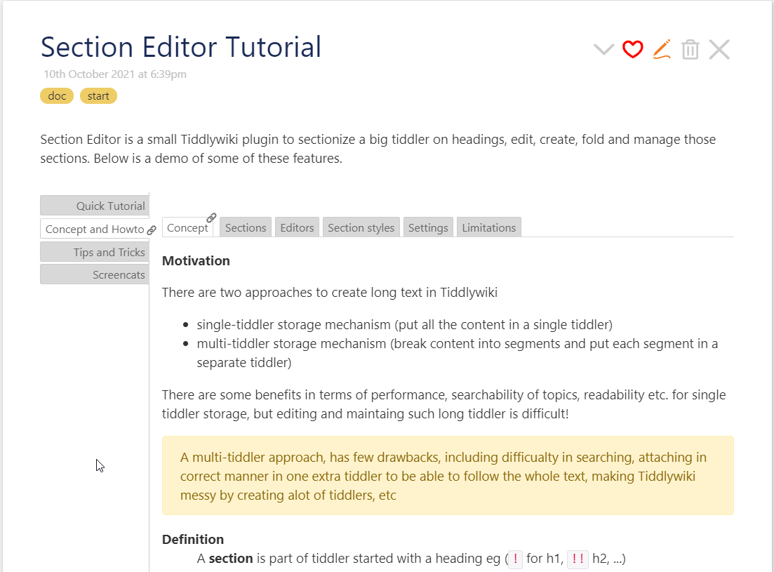
Very nice Tutorial, Mohammad.
A few spelling errors (only mentioned because I really did not find anything else)
Tiddler Screencasts field caption Screencats
Tiddler Quick Tutorial the last part Customize and enjoy different settings -Choose the number of levels for scrtionizing
I like you selection of section styles - and found, that editing late last night - green box made it a little clearer. Nice and discreet.
Many thanks for your feedback Birthe!
Sure I will correct the docs.
I will also add more description to add your own customized styles! I think may user may like to use their own styles!
Yes, the problem occurs on the demo page as well.
To recreate, type this into a tiddler and assign the se-type field:
!! This is a paragraph

Text goes here

!! This is a paragraph two

Other stuff

because

!! And yet more stuff

blah blah blah blah
Close section #1 and #3. Edit section #2 and add some text. Ctl-Enter to finish. The sections you closed (#1 and #3) will now be open. Or at least for me.
I’m using Chromium 92 on Linux.

