Proposal - HelloThere Tiddler Using a Card-like Style

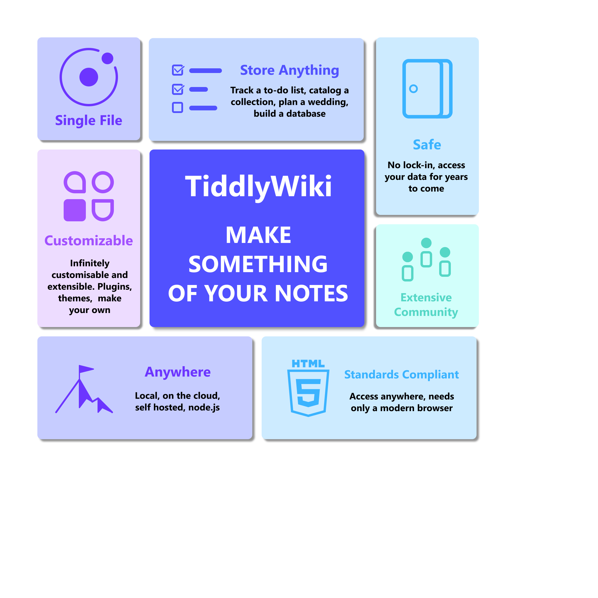
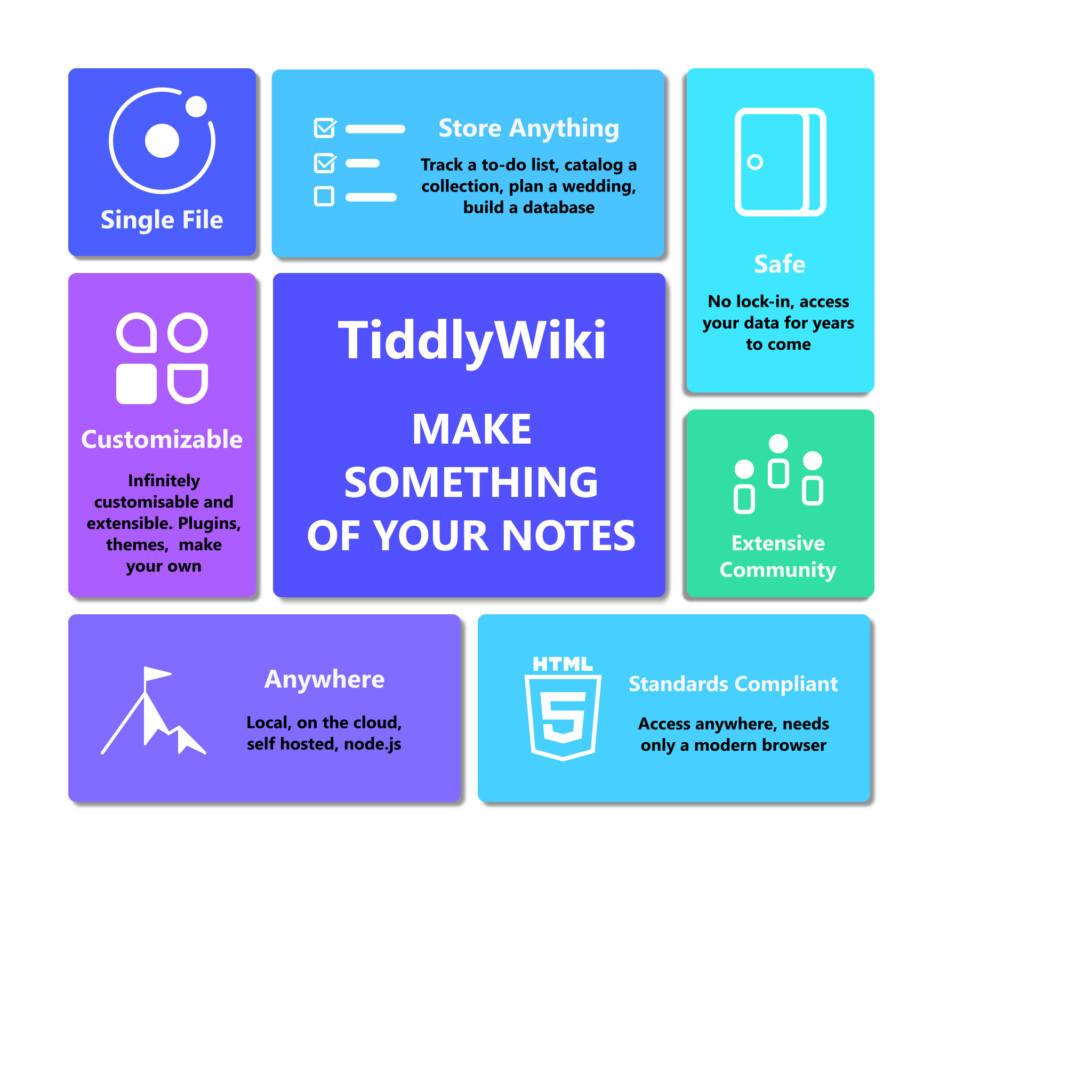
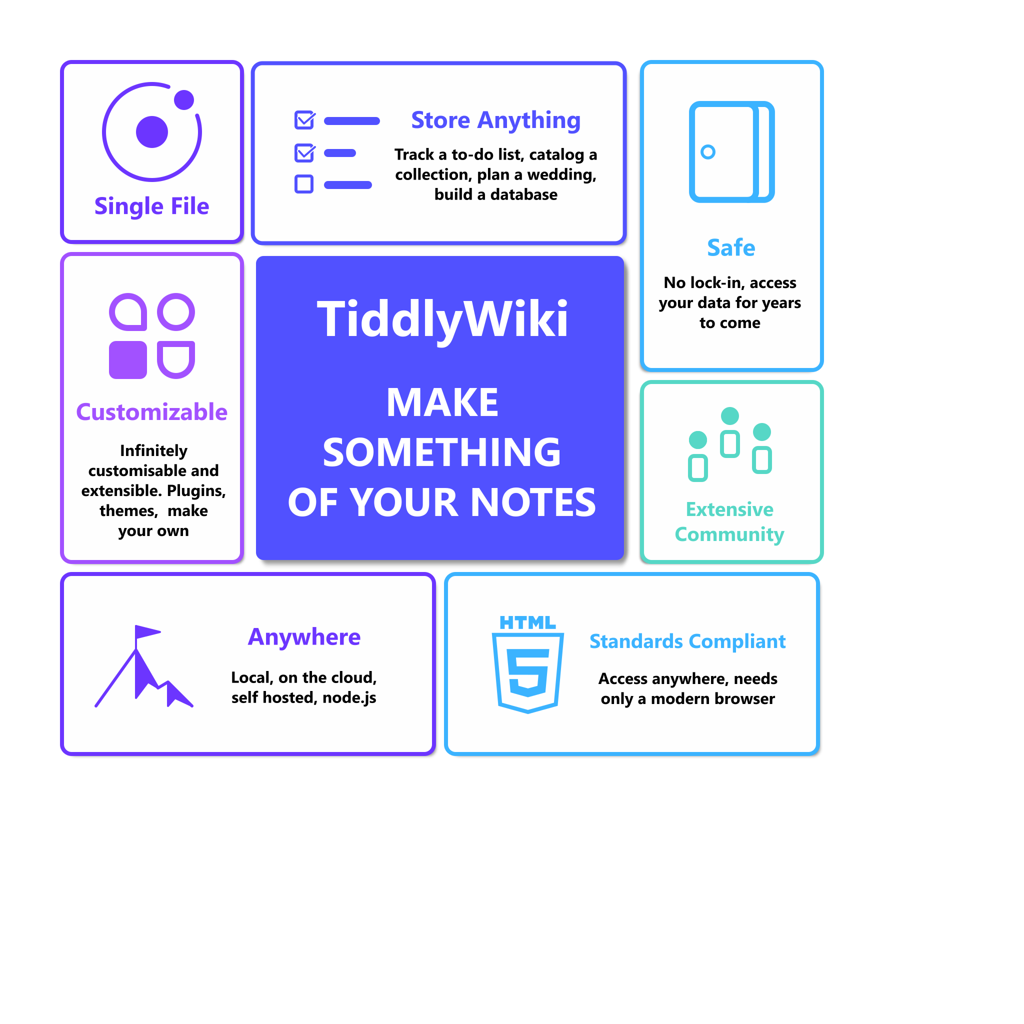
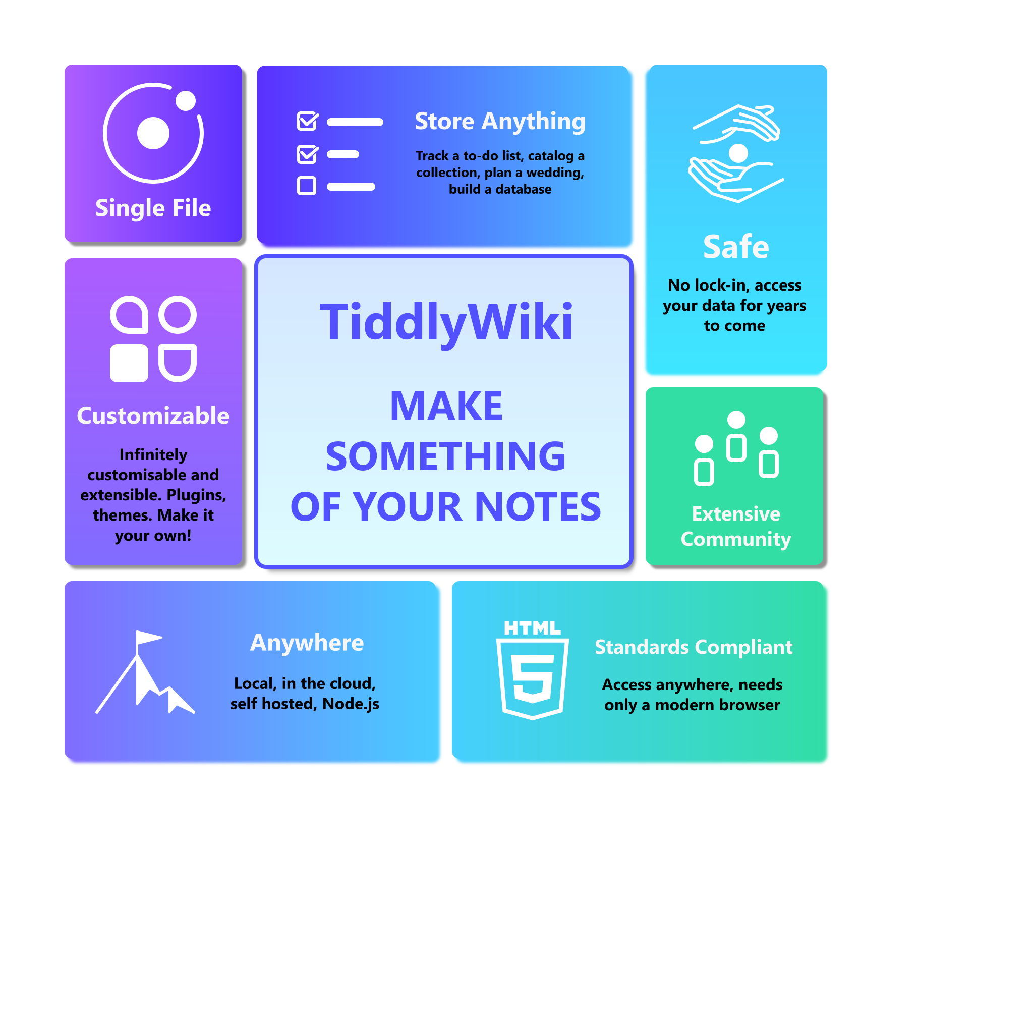
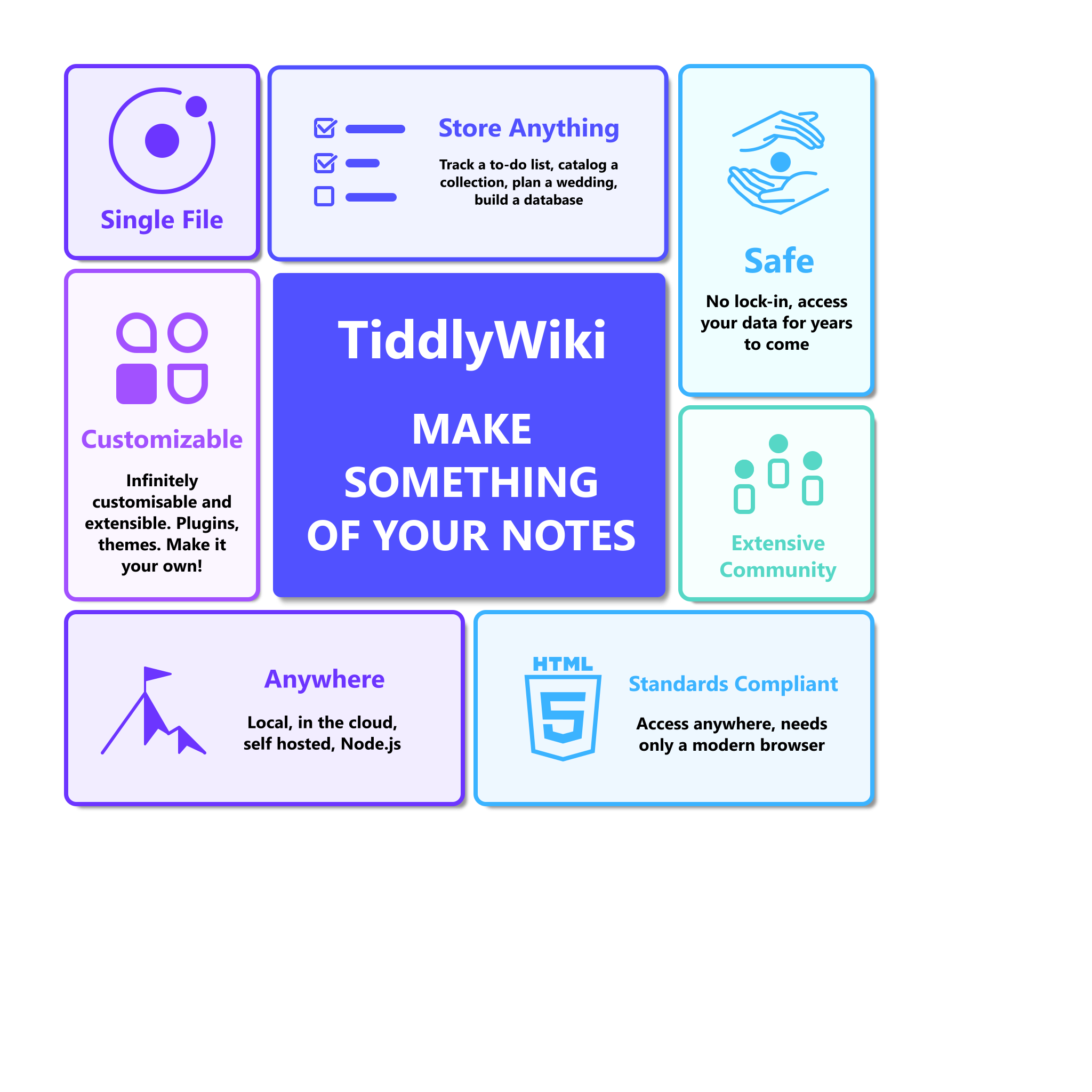
Here are some initial mockups of how I’d envision bento grids for TiddlyWiki.
A few considerations I felt more adequate:

  1. More pictorial approach - Bento layouts work better with some accompanying by graphical elements, even purely accessory.

  2. Itemized text - Messages should be less verbose, succinct and quick to parse. Walls of text look daunting and risk losing the audience.

  3. A centered main tile with a stronger color for the tag line/slogan

  4. A consistent color palette - TiddlyWiki.com default palette seems to favor bluish tones, so I designed this around variations of cool colors.

  5. Revised item list - There were the items I personally felt were the main selling points for TiddlyWiki, but are obviously subjective.

There a few versions below, a lighter one with saturated colors over light backgrounds, and a heavier one with white content over denser background and one with outlines and white backgrounds only. The lighter ones emphasize the tagline more but are softer.

Option 1 - Light theme

Option 2 - Heavy theme

Option 3 - Outline theme

Open questions:

  1. Are rollovers technically feasible? I’m not imagining anything overly fancy, but if we could we could change the content of each tile on hover, we could show an “expanded” version of the text with a more elaborate description of each item, possibly including multiple relevant links where needed. Downside being it is not very “mobile” out touchscreen friendly. If we do want to get fancy, some fade effect or “card flip” would be nice to have.

Are the colors adequate? I went for this “winter palette” around cool colors which felt matched the default blue accent, but we could go for something else. Maybe some soft gradients for background.

  1. Do you feel items are adequate? There were pretty much based on my personal perception, but I’d very much welcome a “technically accurate” curation.

Nothing is set in stone, everything is pretty much open to debate, let me know your thoughts.
All graphics are available as lightweight SVGs for embedding. I’ll make them all available under permissive license.

@jeremyruston Sorry, just making sure you got pinged to the new thread.

5 Likes

Nice work!
I did move this post into a new thread, so it can be discussed seperately

1 Like

Very nice!

I do like the “Outline” version the most, because it makes the centre topic stand out very well.

The colours of the “Outline” work well for me. - We will need to check text and icon foreground colours with the different palettes. (Which is also true for all other “Landing Page” tiddlers) - but that’s for the future

The “Safe” card may be “Future Proof”. In my mind “Safe” stands for Encrypted - Just a thought

“Anywhere” … Is it “on” or “in the cloud”? – (I am not a native English speaker - so not sure)

“Customizable” … IMO “make it your own” would be better

May be: “Extensive and Welcoming Community”


About “rollovers”: I think if users click a “card” it should open a new tiddler, which goes into more detail. So we do not have problems with mobile devices.

Just some thoughts
-m

1 Like

Tiddlywiki is already in Card style. That’s why I choose it on the first place, I want an app where every note is a card or at least look like a card.

What you are describing is Win Phone style Masonry layout. I like this too my phones look like this:

And What mobile launcher are you using, how will you design the TW layout launcher? looks like it.

Thanks, feels more adequate here.

Good point, maybe some “cupping hands” icon would be more adequate here :thinking:

I struggled with that one myself, you are probably right :sweat_smile:. Proof reading from a native speaker is also welcome.

Indeed, my mistake will be fixed in the next round. Should have proof read once more.

This is the type of feedback I was looking for. Thanks PMario

It does remind me a lot of the old Windows Phone “Metro” layout. Never used it myself, but was always fond of its aesthetics.

Found this one: image - seems to be from VectorStock.

May be the hand with a small Motovun-Jack (May be a bit too cheesy)

This looks great!

Agreed. It also simply feels the most clean.

It would be useful if the colors came from the current palette.

See also: Web design trend: bento box.

I’m sure they are, just with pure CSS; no TW tricks should be necessary.

We could play with long press. In many environments, that mimics browser hover.

There have been some examples of TW card flips, but I don’t recall details now. Perhaps something by @telumire? But one alternative I could imagine is if on hover, the image shrinks to 20-30px and moves to one corner as the hidden text fades in in place. And of course the reverse would happen when hover completes.

I think it importiant for the initial views to be easy to read, selective, not overly complex but its should not only be this.

  • Yes a bentobox summary, but one card should go to a comprehencive list.

I have learned from my own behaviours I dont like finding content that is too “dumbed down”, the top 10 features are only the top 10. Thus I think it importiant to provide access to comprehencive content in which case this bento box style is not adequate, There are a few threads in talk.tiddlywiki and the old google groups that brainstormed the functions, features and posibilities of tiddlywiki.

  • Once one is persuaded the tiddlywiki may have something to offer (Inspired by a bento box) there is great value letting the visitor to scan and read a comprehensive list, enthusiastic people will spend the time on an infinite scroll to read a lot of content.
  • We need to find another way to present items on such a list, perhaps like a features list.
    • Short name, description and details
  • Perhaps such a list could be filtered on major groupings such as;
    • Server features
    • Hosted wikis (tiddlyhost)
    • Customisability
    • Asethetics/look
    • Data independance manipulation import/export
    • Editions/applcations
    • Website/App
    • In local custom browsers and host access
    • Plugins
    • Open Source
    • etc…
1 Like

Wow, I like these mockups very much @duarte.framos – thank you for making them!

Like earlier commenters, I like the outline view best, although to answer your question below, at the moment I think the foreground-background / colour contrast could be made more readable and accessible:

If colours are hard-coded, as in the mock-ups, you might find this website helpful for choosing high-contrast foreground and background colours throughout: WCAG Color Contrast Checker (it uses the W3C’s Web Content Accessibility Guidelines v2.1 – click to open overview page – to help with choosing accessible and readable contrasts). For instance, the “extensive community” bento area on the right of the outline mockup has a contrast ratio of 1.72:1 according to the WCAG Color Contrast Checker webpage, when a ratio of at least 7:1 is rated as most readable and accessible, according to the WCAG 2.1 guidelines linked to above.

If you go with colour choices determined by palette, the most accessible and readable option might be simply <<colour foreground>> and <<colour background>>. However, this would not be very colourful! My own view is this would still be a really eye-catching design, but that is obviously just my opinion!

Either way, it was a pleasure to see these mock-ups: thanks again!

1 Like

Thanks for the feedback guys glad you like them.
Here are a few more variations just to put them “out there” see what works best.
Changes:

  • Cupping hands for the “Safe” card
  • Fix typos and grammar
  • Adjust some text sizes
  • Soft gradients in the background filled version
  • Soft background in the outline version for a better sense of unity

Option 4 - Light theme

Option 5 - Gradient backgrounds

Option 6 - Outline with soft backgrounds

As for the colors, I initially imagined them as hardcoded, but now that you mention it I’d also love to see them come from the tiddlywiki palette instead, for the sake of accessibility and integration. The issue is I don’t think palettes currently have the necessary subtlety for an elegant bento grid. If this could be improved upon, then that would definitely be the way to go.

Either way from my part. I’d make the SVG icons color agnostic, so they can inherit from wherever CSS tells them to.

When I asked about the feasibility of the hover effects, I was wondering more about Jeremy’s willingness to invest the time and resources to make them work, since with some CSS tricks they are probably not to hard to make.

Either way, If Jeremy is willing to make them, the intent would definitely serve the purpose of elaborating on the intentionally terse topics. The “back of the card” could have a more verbose description that could indeed link to a complete list of features or myriad of relevant tiddlers concerning the various topics.

1 Like

I did try to sneak in a cat somewhere in there, but it never really integrated and always felt out of place.

If Jeremy was open to the idea, I was hoping to propose also revamping the Find out More tiddler. It currently has a mix of very differently styled images that feel very dissonant.
I’d love to make a new set of images featuring various depictions of cats illustrating all the links there, maybe in the style of my previous Motovun Jack renditions.

These are great too. If the original ones were 1, 2, 3, and these ones 4, 5, 6, then my favorite is still 3, but I also like 5 and 6 quite a bit.

The cupping hands looks great.

As to hover animations, I’ve thought of one more which I imagine would be quite useful to show additional content. I don’t quite know how we could accomplish it, but I’m sure some experts could show us: On hover of a card, that card expands atop the current grid in the same shape/color/gradient it currently has, at a larger scale, with additional content fading in. If the whole grid is 4 x 4, then a 1 x 2 card expands to 2 x 4, and a 2 x 1 expands to 4 x 2, each pinned to the edge(s) of the main grid they share. I’m not sure how the 2 x 2 grows (if at all). And it’s unclear how much the 1 x 1’s should grow. Should they grow to 2 x 2 to grow by the same proportion as the rectangles, or should they grow to 2 * sqrt(2), to end up covering the same portion of the original grid as the rectangles? Or perhaps they just grow to 3 x 3, which fit the grid well, and take only slightly more space than 2 x 4? I worry that this might be difficult to do with pure CSS, but I think it would be a great UI.

I do prefer you options 3 and 6. 6 more than 3.
Although I feel that TiddliWiki and the catchphrase would need to be more “separated” from each others.
Maybe a different police ? Or more difference in font size ?
I don’t know, I feel that tiddlywiki feel almost secondary, useless…
But I do know that I have an unusual way of analyzing spaces, so maybe it’s making me unusually sensible to this.

About the cat, what about a really fainted watermark on the background of the central image ? Or maybe the cat could be standing/crouching on the text itself, as if it was a floor. But that’s trickier to do, except if we use an image.
If I was to combine my previous statement about the catchphrase, I might suggest to reduce the size of of the catchphrase so that it only take two line :

Make something
Of your notes

And then have the cat moving in-between the words. Like standing on the your and curving in-between make and something, his paws catching the top of words as if he was towing himself out of this narrow space. Having the little cat flex might symbolize the flexibility of tiddlywiki.
But I might be making things to complicated… That wouldn’t be a first for me.

Yeah, the central tile does feel a bit off. Maybe I’d ditch the TiddlyWiki altogether. What it needs is a logo or an emblem, but we don’t have an official one.

A watermark background cat could work really nice.

I imagine a faded cat head with a distant, brooding, 1000-yard stare, meditating deeply about the slogan “Make something of your notes” could quite transmit that “inspirational image” vibe. Or maybe just a full body cat silhouette facing away staring into the distance. :grin:

2 Likes

Hi @duarte.framos thank you for your work on this. The mockups are very impressive, and I like the general direction.

I think we also need somebody to join this initiative who has the CSS and HTML skills to implement the mockups, and make a PR so that during development we have previews for the community to use.

Touch devices nowadays have pretty good heuristics for handling hover effects, and so I would support including them here.

That would be terrific, thank you. It would be much better for these tiddlers to be harmonious.

Could we omit the word “TiddlyWiki” in the central cell? At least when used on the homepage it would seem to be redundant. The slogan “Make Something of Your Notes” would be more readable in mixed case.

Each cell needs to express a clear benefit for prospective users. So “Standards Compliant” is not a great heading because it doesn’t directly express a user benefit. Similarly, it might be better to say “Helpful Community”, rather than “extensive”.

I would be interested to explore more eye-catching, colour images within the cells, rather than the present schematic style. I notice that Apple, for example, tends to use a mix of photos and schematics in their Bento grids (there’s a collection here).

Having said that, it’s hard to see much in the way of potential imagery. We might move the new release banner up from “Find Out More” into the HelloThere grid. The “Anywhere” cell could perhaps be illustrated with photograph of a mountain or other remote environment.

Best wishes

Jeremy

Certainly, I was leaning towards the same conclusion.

I ad-libbed most of the content, guided by the existing ones. The suggestions were by no means authoritative, and I was hoping for some curation from a native speaker, and most importantly from what you as the creator feel more adequate.

If we settle on hover effects it also opens up the possibility of having just “headlines” and leave the expanded text to be revealed on hover.

I could see photo based images working well, but as you say, most of our items don’t lend themselves much to photos, and we don’t have a physical product to illustrate. Photos present a few additional challenges; like making it harder to achieve a consistent/coherent look, and finding suitably licensed ones, or capturing them ourselves if we can’t.

Perhaps a middle ground could be reached. I opted for a more minimal set of icons, with a monochrome theme, maybe a more colorful illustration style could be used. We could even go with rendered 3D models if you prefer. Example 1 2

This could also help harmonize with any cat images for the Find Out More.

I’d be hesitant to include the Whats New in the Hello There bento grid, because it will inevitably have a different style by whichever artist wins the latest round, that could feel awkward in an otherwise bespoke arrangement.

I was hoping for this type of feedback, so to get a more focused idea of what you are aiming for:

  1. Do you find the tiles content adequate? Do you have a list or specific topics you’d like to see illustrated?

  2. Can we go for just images and a headline, then show the expanded text only on hover?

  3. What should replace Standards Compliant? Completely different item, just different wording? Perhaps something like “Browser Based” instead? Or replace entirely it with the latest version Whats New?

  4. Would a pictorial icon theme with more colored imagery be acceptable, or do you prefer actual photos? Maybe some semi-realistic rendered imagery like 3D versions of some of the icons?

I’d like to make a new round of mockups, with a more focused goal. Let me know what you think, so I can better aim at your envisioned target.