I’m enjoying following what @BurningTreeC is doing with the new TiddlyFlex - very impressive! That said, it has gone far past what I’m looking for personally, and thus I’m left with trying to figure out how to disable / remove the parts I don’t need. This has happened many times throughout the years, and it makes me think of the new user experience.
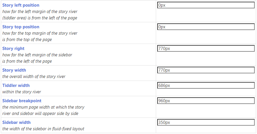
One of the neat things about the default empty.html is that it gives you some easy ways to tweak the layout without need for CSS knowledge. The core has the Theme Tweaks area (by the way, I thought I remembered that the default switched from fixed-fluid to fluid-fixed a while ago? Doesn’t seem so):
As I think about how this could evolve, I started thinking about some of the more common requests and tutorials I’ve seen:
- Move the sidebar to the left
- Add a sidebar on the other side
- Add a top bar (and occasionally a bottom bar).
So, could the standard layout options be improved to:
- Allow the above options out of the box but maybe disabled?
- Implement them in a way that by default empty.html doesn’t look different (use current settings as defaults - I think a visually simple starting point helps)
- Allow for these adjustments without CSS knowledge?
Unfortunately, I don’t have the CSS knowledge to do this - especially not in a robust method. I’ve tried many times over the years but always get stuck by things like sticky titles, overlaps, etc.
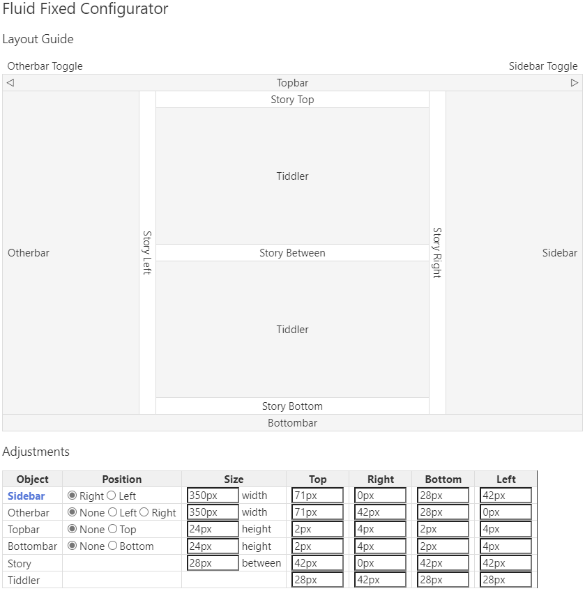
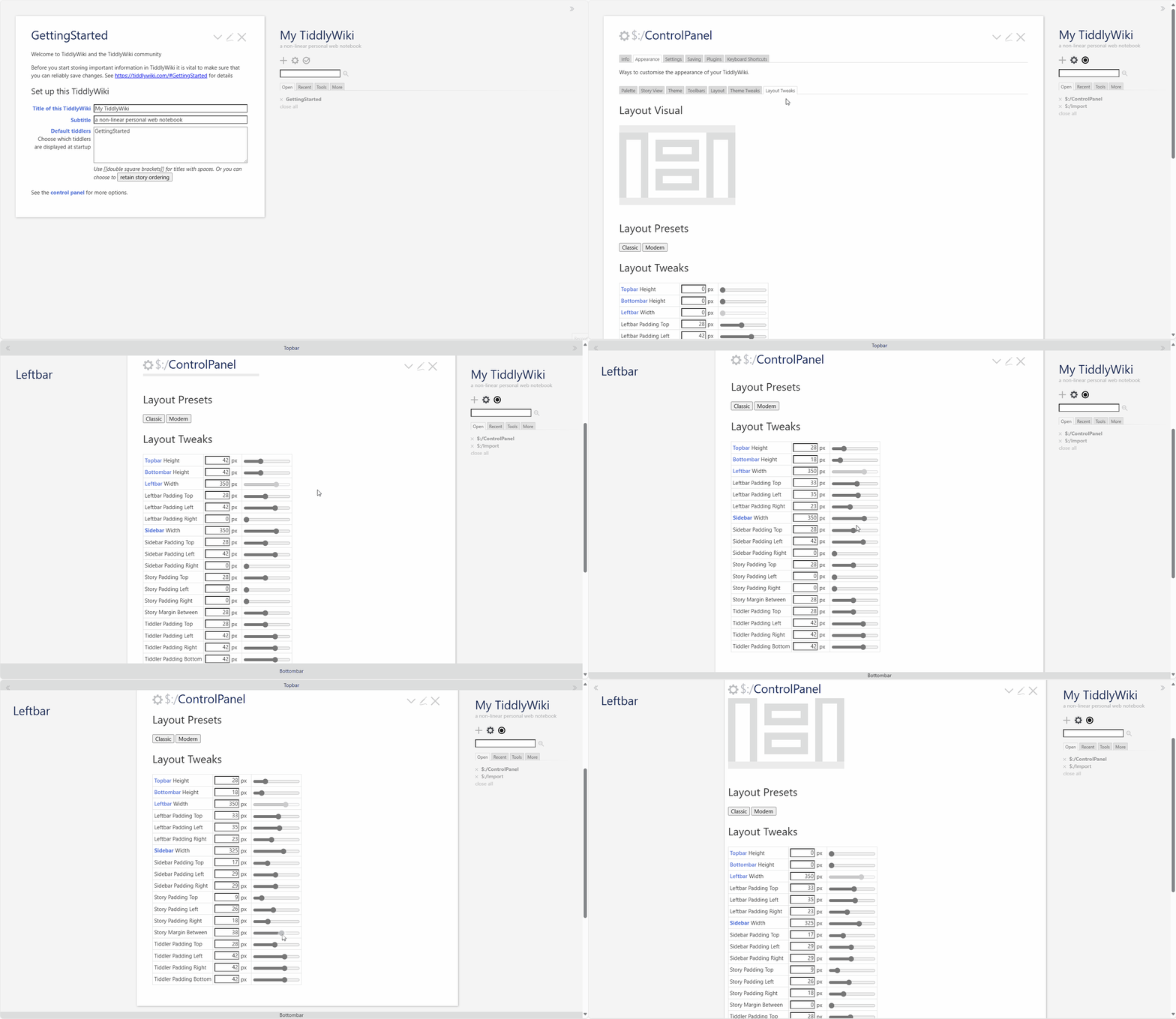
Here’s what I have in mind to include in the Control Panel - both a visual guide, and areas for new users to key in values. I went one step further and put boxes for padding in as well, as it is a key part of layout.
Layout Settings.json (6.0 KB)
For me, I’m focused on adding the absolute minimal amount of: core overrides, animations, extra features, formatting. The less that’s changed from vanilla/core, the better the compatibility with other stuff.
While the plugin community here is great and I’m very grateful for that, I’m also interested in knowing from the core developers what the vision is in this area, as I’d be much more interested in a small core evolution than a larger 3rd party add-on.


