Plugin Idea: Tix – New Tiddler Layout (for TW >= 5.2.1)

Hey, TT, we already have a generic “Saved Layout” – it is called a theme. Honestly, I think that part is solved and has been expanded to whole layouts since TW 5.2.1. And for the rest of your wish – I heard “make it easy to save theme variants”: @Mohammad is working on Gatha for that part: Proof of Concept: Gatha a Plugin Maker and Component Manager - #6 by Mohammad

After realizing the parts are there I think we can conclude: 1. Good you brought this up. 2. Your dream is not only a dream, it’s a thing. 3. There are other threads for it.

:wink:

2 Likes

Yes, I like the idea of being able to check a bunch of boxes and save a layout

Okay. Lesson taken. I’m behind already. I’ll try catch up.

TT, x

@telmiger told me off for not grasping the recent changes in TW that make this much, much easier. So, in purgatory, I defer for a moment, though I do think click-n-set-&-save will likely still be a good idea somehow even after my rehabilitation :smiley:.

TT

Me too. I am only at the tiddler level. After that, the sidebar is waiting, several navigations, the whole page layout, old mobile first themes would like to be updated. I am already looking forward to the next retirement. :wink:

There were so many bugs in version 0.5 that I just had to upload v0.6 before I will leave the house for a meeting this evening.
There remains much to be done and the interface is cluttered with buttons for testing purposes – but if someone finds the time to check the extended config options in the sidebar then it might be fun to try different button styles (at the bottom).
Hint: The new options – with/without text, include icon, empty buttons (!) as well as rounded and boxed styles – are standard TW settings you would find in the Control Panel. So not my own invention. (But I took some time to make them look o.k.)

Cheers,
Thomas

1 Like

May I ask a favor? Can you (or a mod) add “Tix” to the title somewhere? I keep forgetting that this is THAT project and have to scroll up to see if it’s Tix or not. lol

2 Likes

Love the overall look, so I have been playing with the Tix v0.06 and Shiraz 2.4.6 to see how an existing wiki migrates and my tiddlers with floating images cause the image to break the tiddler frame in Tix.

update: Just realized it was due to the change from .tc-tiddler-body to .ui-tiddler-body that was breaking the clear-float fix.

1 Like

Ah! Thank you – I will try to restore the original class tc-tiddler-body in the next release v0.8.

That said: v0.7 with all improvments from the weekend is available. Amongst many other things, sticky titles have been fixed for @TiddlyTweeter. (I could get used to them.)

Have fun!

1 Like

Ciao @telmiger

Thanks for listening! Sticky titles do have advantages that enhance use-end experience. Mainly on visual scroll navigation.

Just a comment
TT

1 Like

Ciao @telmiger 0.7 is excellent!

Realising a DESIGN is many things.

This is what was missing, that your approach may finally solve.

Integrative one-clicks designs an end-user could use to customise without needing to understand complex TW CSS.

Just a comment
TT

Thank you, Josiah!

Is there a reason, your arrow is pointing to the toolbar button design options? These are actually TW standard – available in the Control Panel and maybe overlooked by many. I just made them appear in the sidebar. And I took a lot of time to make sure they look good. (Hopefully.) :wink:

The advantage of having them in the sidebar is – at least on big screens – you see the effect without scrolling around.

1 Like

Yes. Simply because bringing them all under “ONE design interface” is much more effective.

It is certainly true that many, many settings for stuff on layout are under Control Panel. The power of TW! But, IMO, each setting is a “fragment” of the whole with no indication of how it exactly impacts what.

I like your approach because it tries to bring the “bits” together as a whole for more easily integrated layout.

I hope this is clearer?
TT

2 Likes

Exactly. That was the intention. Thank you for describing it so nicely!

2 Likes

Hello TW friends

Version 0.8 is ready for testing: Tix v0.8 — A Novel Tiddler Experience

There are many improvements under the hood, but also nice new options for easy configuration:

  • Button to open palette chooser in new window
  • Range sliders for the text zoom (font size) and line-height
  • link on icon independent from id
  • hidden anchor text on the tiddler icon (accessibility)
  • focus visibility

This will be the last update for at least a week, so take your time.

All the best,
Thomas

2 Likes

Whoa! That is seriously good. Deserving of a "Mountain Conquered" award …

360_F_251284036_cU2F5jsod18MupuAAZDNtviJ68TCvLjN

I will comment in more detail in a while.
Very best, TT x

1 Like

Lovely aesthetics. I have only had a quick look and a few thoughts came to mind:

  • A font config setting for the tiddler title font size would be nice.
  • The ability to hide the tiddler title is nice, most of my wikis are designed this way without visible tiddler titles. (I have also played around with a template design where the tiddler title/caption is displayed below the tags and just before the body as an actual h1 that feels like the beginning of the tiddler content.)
  • An option to display the modified date to the right of the tiddler icon, at the same level as the tags, for those that refer to it more frequently.
  • In my few wikis that actually have a traditional story river/tiddler layout, I use the info section very often and it feels inconvenient at the bottom of the tiddler. It can be moved further up but clashes a bit visually.

If I were adapting this for my own use I might consider something along the lines of moving the info button back to the toolbar, the modified date on the right at the same level as the tags, and the info area hidden but just below the header.

As always of course, more options equals more complexity and you wont be able to satisfy everyone :).

  • Love the icon presentation, I may adopt that idea for my tasting notes TiddlyWiki that has a “cards” based UX.

Excellent work and very nice to see the well documented thought process behind it.

2 Likes

Side note…

If @telmiger has one thing it is a lovely brain! :brain: :joy:

More down to earth, his approach here is very mature with a lot of previous work behind it (e.g. Bricks & ColourAction). Though he talks as if TIX were a new layout (singular), it is actually, also, a very smart generic design system that embraces / integrates the tools we already have natively in TW in exactly the right, relevant, way IMO.

Just saying, as a side note
TT

1 Like

Thank you for the feedback, @saqimtiaz – food for thought. :smiley:

That would be possible, just tag the meta template accordingly and arrange the items in the header part by dragging them around under the tag pill.

That’s already there, but a bit minimalistic:

The id big option would do it. Do you want more flexibility?

My next demo might be a Saq-inspired version, but that will take a while. :wave:

1 Like

Hi all,
Sorry about TL;DR - just excited about Tix - finally! good foundation - see it going places no one’s gone before.

Tix is going to be the core UI component of a wiki I’m building for my brother, Mike. He still uses a wiki I made for him 10 years ago! He called and was having import issues “I go into the back stage area and bring up Import …” - I forgot TiddlyWiki even had a BackStageArea, had to look it up. So time for a rewrite. Is a testimate of how useful, ageless, and priceless TiddlyWiki really is!

But anyway…

Kicking Tix tires and discovered the palettes, especially the dark ones, sometimes apply colors where the background and foreground are the same or very close to the same color. For example, if you:

  • Load up Tix-v0.8
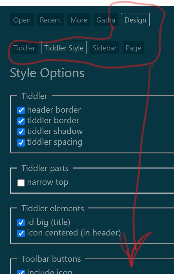
  • Open ControlPanel → Appearance → Palettes (probably already there)
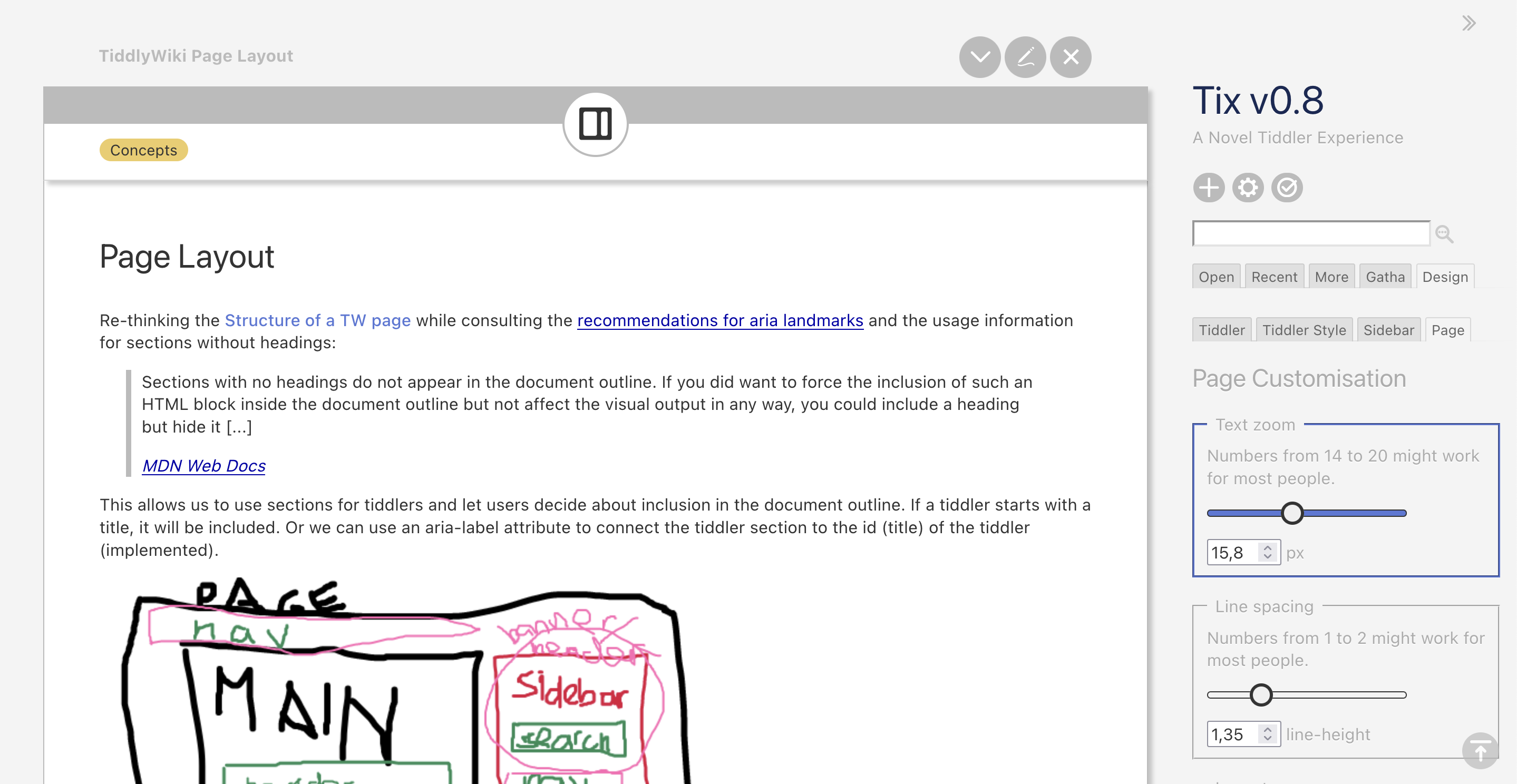
  • SideBar → Design → Page (should already be there too)

Look in the Design Page tab ‘text zoom’ legend and both the slider and textbox display fine. The default palette ‘Vanilla’ displays correctly.

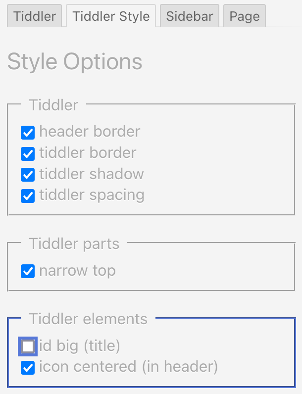
  • Select the ‘Spartan Night’ palette in the ControlPanel.

The textbox value is actually there - but the fore/background are almost identical colors. Also notice the slider-thumb has disappeared - is also there but is Transparent. (can’t come up any reason for a transparent slider-thumb - a poor man’s progress bar maybe?)

  1. Obvious and quick solution is to edit each offending class in the palette and set with HTML color codes, so at least the back and foreground of elements of interest are presentable. Basically hard code it. Upgrades to core palettes would not take effect since are overridden. Cloning is not much better - as would double the number of palettes, most (barring a few classes) are duplicates as Core and Tix both in the active palette list.

  2. Use stylesheets to override offending classes. A little bit of fancy footwork needed when switching palettes. Find/unload current stylesheet from DOM and load new one based on ‘$:/palette’ text field. Ugly bandaid, tho upgrades of core palettes for a majority of classes would still take effect.

Color values in the palette can be a HTML color codes or references to other color codes defined in the palette. In the Spartan Night palette the ‘alert-background’ class entry references ‘background’. Changing the ‘background’ color code changes ‘alert-background’ as well.

By harmonizing these fore/background references of interacting element classes one can make a theme.

  1. So, another solution is to design templates making a common pattern of references to colors. Basically a theme. Over simplified, a theme has a set of Hues (colors), there are 360 possible Hues (each degree on the color wheel), Solarize theme has 24 Hues - some unused. Two other values for each color are percentages of the Hue - saturation and lightness (HSL). By changing a few core colors (like primary background and foreground - normally are 6 to 8 core colors in a 24 color palette) a computer can do some of the grunt work by adjusting the other colors using deltas and offsets of HSL values.

So SolarizedLight can become SolarizedDark, SolarizedSunrise, etc. by changing a few base colors. The class references remain the same (ie: the Solarized theme). Sadly, for each new palette manual tweaks and adjustments of the colors are normally be required for aesthetics.

  1. My ultimate goal. With TW under the hood, Tix Xperience driving, build an interface where the the end user adjusts the core colors in a theme. So they can say “This one kinda yellowish-red, hmmm… ‘SolarizedSunset’ Perfect!”. Long way off, getting ready to take that first step, hope is not off a cliff!

I’m going to do 1) anyway, build a test page or two of TW and Tix elements, override the few classes in the palettes not working, commit on GitHub. Looks like some are already done - will snag those so palettes are all in one place.

Depending on feedback on #3 (is this the best option?, do you even want it done?). Option #3 is pretty labor intensive so got to spec out the project (gonna use Tix - drink our own poison), throw around some ideas, feedback, dig deeper into TW5s palette system which looks pretty robust, what themes to do, build a prototype - see if can carve out enough time. Figuring on 5 theme templates - that should give at least a light and a dark palette for each - totaling 10 new palettes.

At first blush - think I have energy and the time, hopefully the skill. I haven’t even searched yet for stuff that is already out there. Have used TW for years - time to give something back.

Please advise.

poc2go
PotOfCoffee2Go

1 Like