Whoa! That is seriously good. Deserving of a "Mountain Conquered" award …

I will comment in more detail in a while.
Very best, TT x

Whoa! That is seriously good. Deserving of a "Mountain Conquered" award …
I will comment in more detail in a while.
Very best, TT x
Lovely aesthetics. I have only had a quick look and a few thoughts came to mind:
If I were adapting this for my own use I might consider something along the lines of moving the info button back to the toolbar, the modified date on the right at the same level as the tags, and the info area hidden but just below the header.
As always of course, more options equals more complexity and you wont be able to satisfy everyone :).
Excellent work and very nice to see the well documented thought process behind it.
Side note…
If @telmiger has one thing it is a lovely brain! 

More down to earth, his approach here is very mature with a lot of previous work behind it (e.g. Bricks & ColourAction). Though he talks as if TIX were a new layout (singular), it is actually, also, a very smart generic design system that embraces / integrates the tools we already have natively in TW in exactly the right, relevant, way IMO.
Just saying, as a side note
TT
Thank you for the feedback, @saqimtiaz – food for thought. 
That would be possible, just tag the meta template accordingly and arrange the items in the header part by dragging them around under the tag pill.
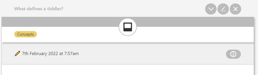
That’s already there, but a bit minimalistic:
The id big option would do it. Do you want more flexibility?
My next demo might be a Saq-inspired version, but that will take a while. 
Hi all,
Sorry about TL;DR - just excited about Tix - finally! good foundation - see it going places no one’s gone before.
Tix is going to be the core UI component of a wiki I’m building for my brother, Mike. He still uses a wiki I made for him 10 years ago! He called and was having import issues “I go into the back stage area and bring up Import …” - I forgot TiddlyWiki even had a BackStageArea, had to look it up. So time for a rewrite. Is a testimate of how useful, ageless, and priceless TiddlyWiki really is!
But anyway…
Kicking Tix tires and discovered the palettes, especially the dark ones, sometimes apply colors where the background and foreground are the same or very close to the same color. For example, if you:
Look in the Design Page tab ‘text zoom’ legend and both the slider and textbox display fine. The default palette ‘Vanilla’ displays correctly.
The textbox value is actually there - but the fore/background are almost identical colors. Also notice the slider-thumb has disappeared - is also there but is Transparent. (can’t come up any reason for a transparent slider-thumb - a poor man’s progress bar maybe?)
Obvious and quick solution is to edit each offending class in the palette and set with HTML color codes, so at least the back and foreground of elements of interest are presentable. Basically hard code it. Upgrades to core palettes would not take effect since are overridden. Cloning is not much better - as would double the number of palettes, most (barring a few classes) are duplicates as Core and Tix both in the active palette list.
Use stylesheets to override offending classes. A little bit of fancy footwork needed when switching palettes. Find/unload current stylesheet from DOM and load new one based on ‘$:/palette’ text field. Ugly bandaid, tho upgrades of core palettes for a majority of classes would still take effect.
Color values in the palette can be a HTML color codes or references to other color codes defined in the palette. In the Spartan Night palette the ‘alert-background’ class entry references ‘background’. Changing the ‘background’ color code changes ‘alert-background’ as well.
By harmonizing these fore/background references of interacting element classes one can make a theme.
So SolarizedLight can become SolarizedDark, SolarizedSunrise, etc. by changing a few base colors. The class references remain the same (ie: the Solarized theme). Sadly, for each new palette manual tweaks and adjustments of the colors are normally be required for aesthetics.
I’m going to do 1) anyway, build a test page or two of TW and Tix elements, override the few classes in the palettes not working, commit on GitHub. Looks like some are already done - will snag those so palettes are all in one place.
Depending on feedback on #3 (is this the best option?, do you even want it done?). Option #3 is pretty labor intensive so got to spec out the project (gonna use Tix - drink our own poison), throw around some ideas, feedback, dig deeper into TW5s palette system which looks pretty robust, what themes to do, build a prototype - see if can carve out enough time. Figuring on 5 theme templates - that should give at least a light and a dark palette for each - totaling 10 new palettes.
At first blush - think I have energy and the time, hopefully the skill. I haven’t even searched yet for stuff that is already out there. Have used TW for years - time to give something back.
Please advise.
poc2go
PotOfCoffee2Go
Hi poc2go,
Welcome to the team! Your commitment sounds like a perfect match – testing, using and improving colour palettes is a need.
Thank you for your feedback, I will reply with several comments. Be assured that it is very motivating to hear that I have an ally. I have planned to release v0.9 really soon, your interest will not delay that – guaranteed.
Yep. That is an issue I also mentioned in another thread:
I do not have the time to fix other peoples palettes at the moment, so I am really happy if you can improve the situation here. If you discover things in Tix (e.g. in my CSS) I can improve, please let me know.
I actually was able to reduce CSS in v0.9 and stay closer to TW standards. On the other hand I tuned even the vanilla palette … My goal is to make stuff as accessible as possible and when I tune colours I use tools like WebAIM: Contrast Checker to check contrasts.
Regarding resources already out there: Check out my Bricks app – it is not up to date regarding TW version, but has nice tools for colours and palette generation.
https://tid.li/tw5/apps/bricks.html
More will follow later.
Cheers,
Thomas
I agree. @telmiger is definitely in a new direction that helps a lot, a lot on Design. It illuminates “bringing things together” we already have plus innovation on layout. IMO it is a superb approach. It integrates, not dissipates.
If I get time I will try and comment in more detail. I just wanted you to know that “good foundation” are accurate words for what Tix is about.
Best wishes
TT
Well, these elements are rarely used in TW and the styling of the range slider is difficult and cumbersome. The text input has the type “number” but is not fully supported by TW. Both have the advantage that you can use the arrow keys to adjust the value – but only the range slider supports small increments as needed.
As a possible improvement of the situation I considered to show the value below the slider as text only instead of an input field. But this would probably harm the accessibility of the solution. So in v0.9 I use an input of type text which seems less sensitive for colour issues.
Yep. I tried that rabbit hole too: Palette Tool — Thomas’ Wiki Colourizer is an experiment I made some time ago. Take it, if you think it might be of any use. I think I gave up when I realized how complex the theming matter is and how many manual finetuning will be needed for every palette. And that they all might need updates in the future, if TW introduces new colours for new features.
Final message for today: Tix v0.9 is available for you to try.
(And Tix v0.8 is archived as usual.)
Besides testing a configuration inspired by @saqimtiaz and some tuning of the vanilla colour palette for better contrasts, v0.9 demonstrates:
Plus many improvements under the hood (e.g. refined namespacing and tiddler naming for a better overview in @Mohammad’s Gatha). And some new bugs I did not find yet.
Looking forward to feedback and bug reports.
Hi Thomas
Wanted follow up with a little background and about why I picked this project.
I have been in the computer industry starting back in the late 60s. Lucky as a teen to live beside Dartmouth College and had access to the computer center - computers lived in buildings back then. In 90s started my own company doing Computer System Architect work in accounting, personnel, warehousing, and stock trading systems. Retired couple years ago - workaholic - totally burned out.
Rested up now and have for months been looking for a project that is interesting, challenging, somewhat under the radar, useful, and field of study that is new to me. Wanted a project that is associated with something new like Tix - but… based on a mature product. TiddlyWiki is here to stay.
Colors are not going to go away any time soon - I hope! Palettes have always been that thorn in any user interface I have built, or worse yet had to maintain. Countless tedious hours messing with these colors. Fixed it ‘here’ - but now ‘that’ broke - grrr.
I am committing myself for the long term on this project. I wanna build it with the help of others, maintain it, give it focus and direction, standardize computer palettes.
Hopefully will keep me engaged throughout my retirement years - go crazy otherwise.
Thanks for the opportunity!
poc2go
Checked out Tix v0.9
Tested on Rasberry pi 4b - 4-gb mem - 32 gb sd card drive
OS - Linux Debian Buster - Raspbian 10 (32-bit)
LDXE Desktop
Browser Chromium - Version 92.0.4515.98 (Official Build)
For testing web stuff - if runs on the Raspberry runs on about anything.
Plus any performance or memory issues are glaringly obvious.
Scope of test is to press any/all tabs, buttons, dials, knobs, sliders, and boxes
Basically act like a 5 year old 
Most issues I found you probably know:
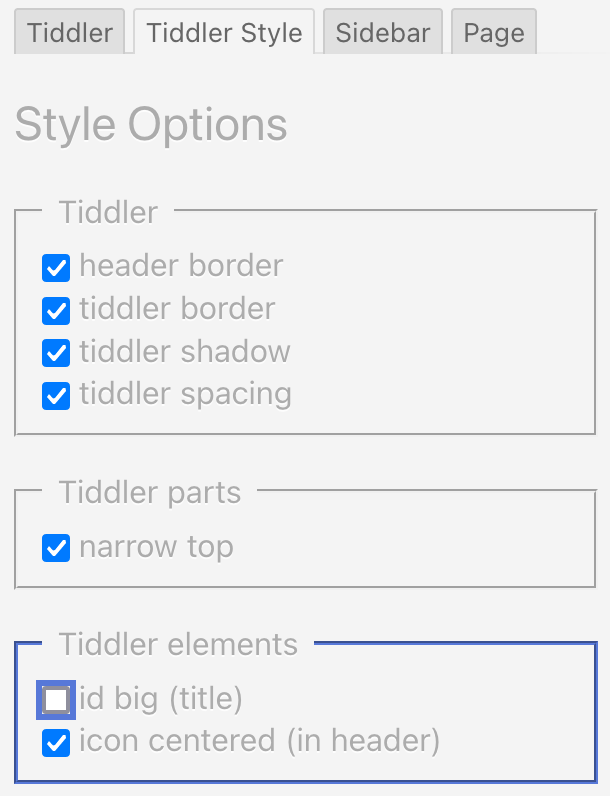
tiddler style → tiddler elements → icon centered

Sidebar Options → Active List
Sidebar Options → Arrange tabs
Page Customisation
Page Customisation → Toolbar buttons → Include icon (and text)
Page Customisation → Toolbar buttons → Include text → show text
Speaking of which - late, so gonna find my Teddy Bear and go to bed.
poc2go
Thanks a lot for testing – this is great support, very appreciated!
The checkbox text is “icon centered (in header)” that means that the icon can be centered, if it is in the header part. In the demo v0.9 it is in the top part. Possible solutions:
1 better text for the checkbox (add “part”?)
2 only show the option if the icon has the tag $:/tags/TiddlerHeader
3 explain how it works in the readme (to be written)
Maybe 2 + 3 would be the best?
b) Gatha is only there for development
a) There is a to do remark that should remind me to make this feature dynamic instead of hard coded (you never know what people put in the sidebar)
I will tackle a) later as the sidebar is not related to Tix (tiddlers) but to the rest of the page layout (Lox theme). – UPDATE: Consider a done.
Here I was so lazy to transclude a core control panel option that might not be useful for single page wikis or only in special cases. I think we could remove it without damage. It will still be available in the control panel.
{{$:/core/ui/ControlPanel/Settings/DefaultSidebarTab}}
That’s how things are named in TW world.
https://tiddlywiki.com/#ColourPalettes
You are assuming rightly, the behaviour is the same if you change these things in the core control panel → Settings.
Button texts
Include text includes the button text in the html, but this text can be visually hidden (!), this is done/undone via the subordinated “show text” option.
There are independent options for tiddler buttons (Tiddler Style tab) and for the rest of the page (Page tab). The latter means mainly the sidebar. So yes: might be a bit confusing, not only for five year old children but also for teenagers and even twens.
Now it is bedtime here in central Europe, so this was it for today. Evenings during the week will be busy, so more updates might have to wait until the weekend.
Good night,
Thomas
Hi all,
Just throwing out an idea.
Maybe we should from the onset create a tab ControlPanel → Appearance → Tix to place default, less intuitive, and dev options? Add/remove ‘Gatha’, ‘Notebook’, ‘Use visibility: hidden; vs display:none;’ kinda stuff. Tix should not only be user friendly but dev friendly too! Already is awesome that can ‘inspect’ an element and know exactly where we are in the document. Which if I understand correctly - is TT’s main point!
I’ll frame that up if you want? After all - not TW rocket science.
Please advise with your ideas.
poc2go
Hi poc2go,
Let’s frame the target groups and solutions for them – I think the developer/user segmentation is essential here. My plan is to publish:
Now there is one target group missing here: Advanced users with an understanding of how TiddlyWiki works, how HTML and CSS play together and who would like to use all configuration options Tix and Lox have to offer. What options they should find where is yet to be discussed and suggestions are very welcome. Options that come to my mind:
Gatha will not be there, so that is not an issue. Maybe a remark in the readme tab “This plugin was made with Gatha, find the raw files on …”.
What do you mean with “Notebook”, @poc2go ? What else should be on the advanced level?
Please let me know your thougts.
Thomas
I got to take a few weeks to get up to date with lox, stx , etc. new to me.
Notebook at [[nico/notebook|https://nicolas.petton.fr/tw/notebook.html]] is awesome for the novice TW user - provides a menu bar - ‘hamburger’, search, etc., and always displayed above river.
I got to run …
poc2go
I also second the @poc2go proposal of a Notebook inspired theme or something along the lines of your mobile first Bricks themes (you may remember some suggestion at the beginning of this thread).
Here at our local community (several persons/cities in Colombia and in Cuba) we used a modified version of Projectify for project based learning/teaching of TiddlyWiki. So, being able to use your Tix as a foundation for a mobile first theme with support for Projectify plugin would mean a small community of pretty active users. Also I wonder you Tix can support lateral navigation, like the one you can find in the Notebook powered Study theme (see screenshot below).
I think that Tix developments are so exiting that @poc2go and me are wondering what would be a migration path from the experiences and users we already support with Notebook based themes, to the innovations that Tix is showcasing us.