An example is worth more than a 1000 words 
What do you think about this?

Looks like a really nice time saver. Will this also modify the color-scheme field from dark and light?
(Also, if possible, showing what colors have been previously used in document would be a game-changer for palette design, if you’re looking for things to add)
Is there a way to import palettes into it to edit it?
Great job!
Also please consider missing colors! TW needs some standardization for palettes!
I don’t know yet. I’m still in the process to create the different elements, so users can see what they are editing. … It’s much more work as I thought, because some rules don’t have an effect at all. … It’s a matter of the CSS cascade. The order is/was wrong for some elements.
Yes. Playing with the values while testing the templates also shows, that an “undo” or “reset to default” is absolutely missing. As a user I would like the “safety net” to feel comfortable.
That’s the default PaletteManager, that is shown in the ControlfPanel. I want to create a new field eg: origin or parent that links to the original palette, that was used to create the new one. With that field, it will be possible to implement the “undo” function.
I can’t wait to see the final product 
hihi, There can never be enough colour
For me personally there are already way too many parameters. But with the new info we will at least know what will be changed. … And I’ll take care, that every parameter, if changed, actually has an effect.
Tables alone have 4 sets, which I think has the potential to create visual inconsistency.
tc-muted is used for 43 different CSS rules  That’s a bummer. …
I don’t see any way to get that changed without breaking backwards compatibility.
We probably will need some new parameters that will take precedence … With the result of even more complexity instead of less. … So in the end I’ll just leave it as it is and live with it.
At the moment you need to open the palette data-tiddler to add components. …
Yea. One goal of the new info is, to make similarities visible. eg: Every “tab-set” will show a working tab-interface.
So we will see, that “tabs are important” for the TW UI, but we will also see a possibility to “inherit” settings.
eg: tabs-in-tiddler define the main set with real colors → tabs-in-sidebar inherit from it and only change the differences → tabs in dropdown only has background and background-selected → tab in tiddler info area only has a background parameter.
… I think it will be an improvement
Would it be possible to show the modified and added colors in a different color?
Since palette editing is all about colours, I think it would be confusing to add “colours” as an indication for something new or changed.
It should be possible to use icons to indicate, that something changed. …
As I wrote. I’d like to have the possibility to do a “reset” on a per colour basis … So if there is a reset-button, it should be clear, that this colour has changed.
Comparing 2 palettes should be a completely different project (for someone else). …
At the moment the whole UI is table based, which makes dynamically adding and removing stuff a challenge. I’ll be happy, if I can show something working soon.
At the moment I did create about 60 new “preview” tiddlers, that contain “real” UI elements. So future changes should be included automatically.
Except
Buttons, that could “break” something (eg Delete, Cancel, …) are deactivated and listed as “Dummy Buttons” … They can still be “hovered” or “clicked”, but they don’t trigger actions. … At least they shouldn’t
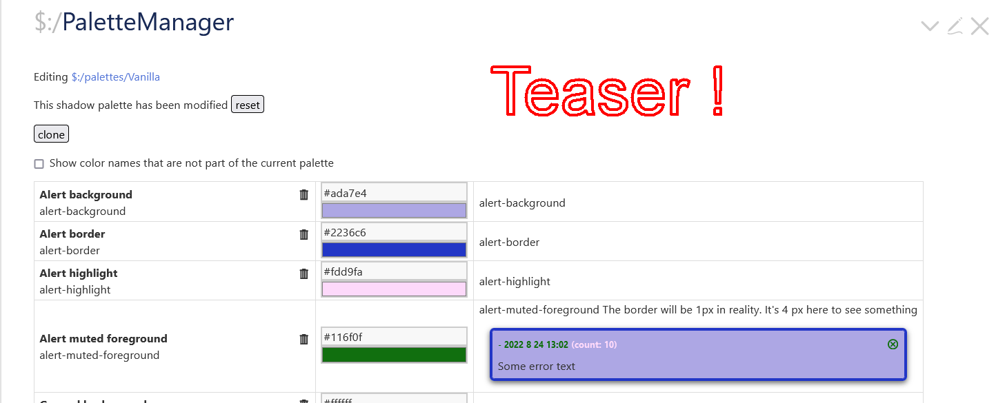
I’m afraid I need even more words to understand: Does the image show a how an “alert” will look with the colours applied? Very nice! Is the intention that the PaletteManager will show this for all elements? What, elements are those, actually?
[I hope the following is considered on-topic even if I’m not 100% sure…]
For most elements that “matter”, i.e that are often visible, I think it would be nice with a fully GUI PaletteManager that uses the UI of TW as a starting point, rather than the current PaletteManager that lists all cryptic class names (or whatever those are) in a table as a starting point. I.e a miniature “image” of a TW (perhaps an “inner wiki”) where the user clicks its various elements as a “remote control” to set the color of the real surrounding TW elements. This would make it much simpler to understand what element is actually being set. (Actually, I’d wish all(?) “appearance settings” were set in this visual manner - but that discussion would deviate a bit too much from this thread)
I have looked at something similar a few times, including one in which mouse over shows the classes on the standard elements, click to copy to clipboard, that is a simple version of a browser dev tool for inspecting.
Oh! That is getting really good! It makes it very clear that I didn’t even know what many of the classes even referred to! 
Hi Mario, great initiative, thank you!
What I missed often when working with palettes was:
Search for similar elements that have variants, e.g. all backgrounds or all tabs. So an integrated filter or search would be on my wishlist for palette management. My own version to demo what I mean is the Colour Manager here: Bricks — CSS Construction Set for TiddlyWiki 5
It also has an html color preview instead of an input of the type color. The input with associated color picker does not provide a correct preview for transcluded colours or rgba colour definistions. Edit: by transcluded colours I meant colours reused via the colour macro.
Contrast or accessibility information would be a nice feature too – at least for the elements in your demos that should be possible. I often struggled to find a reasonable pairing of background and foreground colour to compare. But in order to assure accessibility for as many palettes as possible, I think this would be a really helpful asset.
Last but not least I would like to leave a pointer to my plugin ColourAction that allows to compare colours (as needed for the functionality mentioned above) and to calculate new colours based on other colours in many different ways: Plugins — Utilities for TiddlyWiki
I hope this is helpful.
Cheers,
Thomas
I think that wonderfully useful. One great thing about it is it will also educate you about TW CSS as you colour with it!
I do have suggestions…
That this tool is put online for use with docs and examples. I don’t think one needs to install the plugin locally (unless you are palette mad
).
With palette handling for export, after a visitor has made one, be integrated with The Bundler…
Just thoughts, TT
I agree that a full-on palette manager would benefit from…
A demo space where paired contrasts can be examined.
Maybe, also, a bit of colour theory might be useful in docs?
One thing that I think @pmario’s new tool will make easier is the creation of palettes for users with visual disabilities (e.g. 8% of men are colour blind).
Just comments, TT
@telmiger … Thanks for the feedback … I wanted to respond to your different paragraphs, but that’s not necessary. I’m 100% with you — with all of it.
While testing the new previews I saw and fixed some problems with the existing CSS “order”. Some colours could be changed in the manager, but the change didn’t come through to the UI itself.
Users had to create their own and more specific CSS, which sometimes result in a problem somewhere else. So a new rule needs to be created to fix that “unintended side effect” … and so on.
I think, with the new live previews changes will be much more obvious, since users can interact with the previewed UI elements.
… I’ll prepare a pull request at GitHub and post a working example … with some docs.
Yea, I did think about that one too. … BUT there are many different forms of colour blindness and the perceived contrast between foreground text and background colour may be very different.
I did find a simple online test … but no simulator.
It would be nice if this improvement will make live easier for everyone.
For users that are able to create palettes there should be a button to “simulate” different forms of colour blindness. … BUT that’s definitely out of the range of this project.
I think it would be good to give developers the possibility to see, how others may see their theme or palette.
Found a js simulator: http://mapeper.github.io/jsColorblindSimulator/# which looks promising, from a technical implementation perspective.
The $:/PaletteManager is already part of the core. I did add the possibility to add preview tiddlers into the mix. … I’ll create a PR and I think it should be part of the core.
At the moment the library, that is used to “parse” colour settings is very limited, especially converting from 1 colour scheme to an other. … But there is “help” in sight. color-js .io
Which was released end of June this year: Releasing Color.js: A library that takes color seriously – Lea Verou
It’s a library that has a chance to be part of browsers in the future. So we may be able to get rid of it again.
I’m fascinated of this blog post from stripe where they talk about their colourful journey. … I would like to have a similarly contrasted and beautiful palette for TW one day. … We may just “steal” theirs
That’s very close Captivate Theme — gives your wiki a pop of color … and simple to use. It only needs 3 colours to change the whole palette.
