Looking fantastic @pmario certainly worthy of core inclusion.
Some new users are really going to be influenced by the easy of customisation and even hardened users will appreciate the WYSIWYG nature of this. Thanks for your effort.
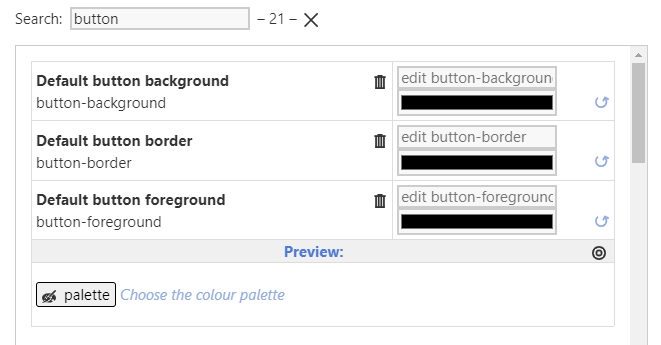
I am curious why the preview shows the grey Default button background but the picker does not, and other elements. I am not asking for a solution necessarily but at least making it clear why this differs, in some ways showing its black is misleading. If perhaps it means “undefined” perhaps there is a better way to indicate as such without suggesting its black. This comes from the core I believe, not your Palette Manager.
This is really nice tool, thank you, @pmario. I tried it in action inside the demo, here are some observations from “final user” and they are mostly about how the manager appears, so please feel free to ignore them.
It’s very good to have Reset button and the colour square next to it, as the customization can go wrong very quickly, I used it immediately, and also I created multiple clones to save intermediate versions. Previews help a lot. The possibility to search an element to change is also handy.
First I went on clicking around and then watched the video. After watching, everything became quite clear, but before I had some doubts.
The ‘colour name’ help text in the search box was a bit confusing, as I was typing “red” or a hex code to search elements (should I call them elements?) that use that colour.
It would be more comfortable for me to have more visible elements first in the list and less visible after and not in alphabetical order, like river background, tiddlers background etc. And also to have some kind of headings, like River, Alerts, Buttons and quick way to jump there.
The preview area, I think, could be emphasized with different background colour or in some other way. In some cases, I was confused about where the setting ends and the related preview starts.
In the external-link area, the colour for external link background is inherited and is shown as black, while actually it is not, there are other cases similar.
For me personally, foreground is not a very clear term. I guess it comes from CSS documentation, and it is good to see the name of the element, but the text on the left of the picker could be something like Text on buttons button-foreground.
Ah – I see. That’s right. It’s the palette “colour name” … So “red” wouldn’t find anything. .. only he elements like: “alert”, “background”, “highlight” and so on can be filtered
I think I change the text to name - eg: alert, which may make it clearer out of the box
hmmm, That should be even harder with the default manager at tiddlywiki.com, where you don’t have any visual clue what is changed at all.
May be a bit more docs will help, which explains the different elements of the new UI … So 3 or 4 screenshots with some info and a link to a video may do the trick here
Everytime I do suggest custom ordered lists, that are sorted by “relevance” or “simple to complex” it is rejected. The only default sort order Jeremy approves for the core is alphabetical.
It should be possible to create a custom sort order by “hacking” the palette tiddler. It’s a text based data-tiddler, so it should be easy to make a clone and copy paste the different groups.
Groups are created by the first colour-name element like eg: alert or button and so on.
So if custom sort order is a thing, I think I will go with a dedicated edition. … Since it is already started now, it only needs to be extended with some more docs ..
inherited is a native CSS value, which the palette colour macro can not resolve, since it doesn’t know about it at the moment. …
With the new colour-widget, which is part of the plugin, it should be possible to resolve such edge cases. …
BUT it’s a million times easier to remove such values from the palette settings, than create an algorithm, that is able to resolve it.
At the moment it’s possible to handle the <<colour xx>> macro only.
It’s completely out of the scope of this project, which started as a way to add the preview-elements. …
Adding the “filter” and the new colour-macro resolver did already “blow up” the “cost” to probably 100+ hours. ..
But I think as the project is now, it adds real value and give us the possibility to create consistent and high quality palettes, which isn’t the case at the moment.
That’s right and the Palette Manager as it is now makes that obvious. There is a lot of potential for improvement. IMO the new UI gives the users the possibility to see and articulate those problems.
So I think that’s one of the biggest wins of the whole effort, which makes me proud.
Hmm, I think that makes sense if we consider TW as a programming environment or a language. It would be strange in fact to ask, say python, to change their language reference and put the most used modules first, however the alphabetical order looks too strict.
To be honest, I never used it. For those small changes I did for now, I searched for “applying custom style” in documentation and went with writing css for classes discovered with inspect element.
Hi ! Here’s a neat thing I’ve discovered today, maybe this will give you or someone else some ideas for improving the Palette Manager’s UI even further : a named color wheel
Hi Mario,
I tried this tool today and found it very usefull, thanks a lot!
Some feedback after the first iteration over a palette:
great stuff: Cloning palettes, restoring original values, the improved colour macro (colour-picker-resolved) and the Manager in a new window are really useful and should be integrated into the core as soon as possible.
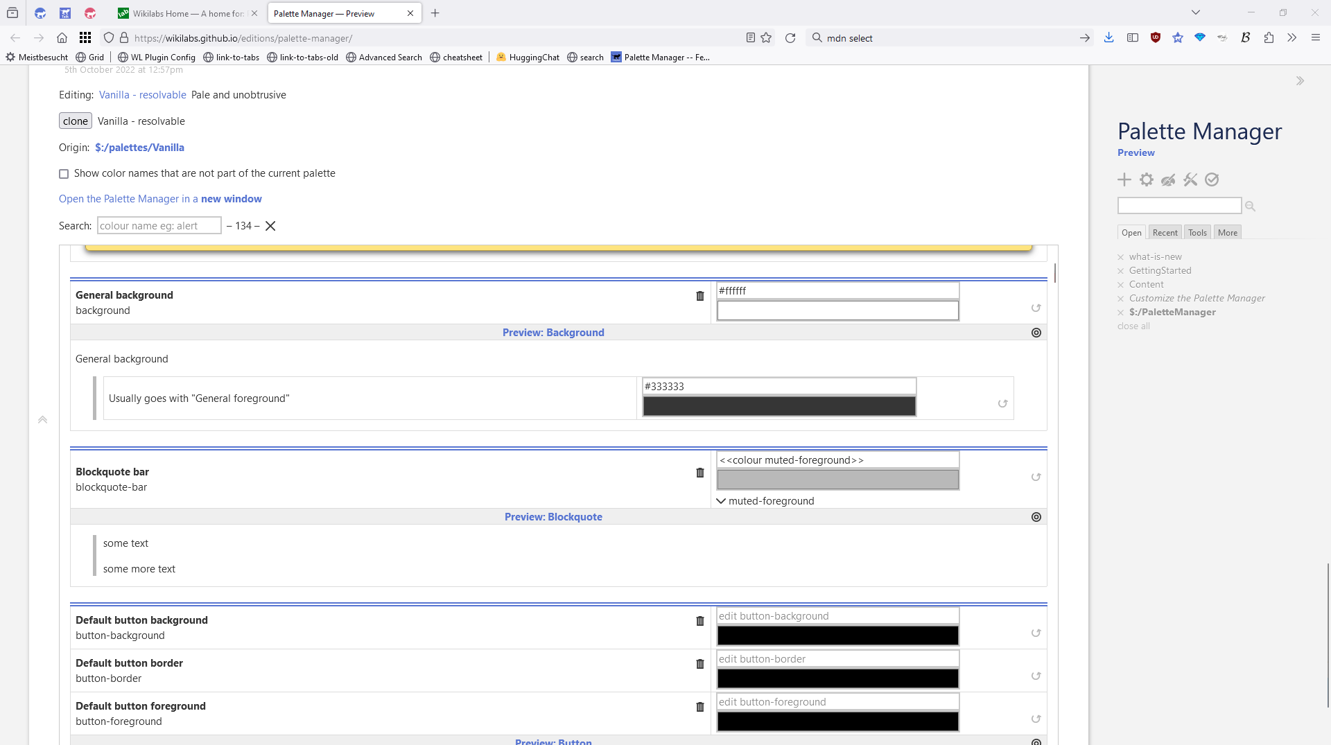
new window: there is a typo in the link text “Open the Palette Manager in a new Window” (window).
background colour: For some previews, background colour seems important to me. My adaptation of the previews (see my demo page) is not the most elegant — I am sure you will find a better way — but it shows what I mean.
link examples: tiddlywiki.com alone is not a good example, as for many users it will always be shown in the visited variant.
Plugin contents: You included $:/themes/tiddlywiki/vanilla/base in a modified version. It seems to be an older one. I replaced it with the v5.3.3 theme from tiddlywiki.com and the Save changes button displayed correctly again. – Could you perhaps explain in a few words, what kind of changes in the theme would be necessary?
In my testing and demo page, I apply a CSS hack to ensure better readability of editor buttons. Thus I had to add
to your $:/palettes/preview/tiddler-controls-foreground-selected in order to see the effect of my own hack. – I would not expect the previews to foresee that, of course. But in general I would say: more relevant context makes previews more valuable and reliable.
Thanks for this input. I’ll have to remove the changes there and move the palette-manager stuff into it’s own stylesheet, so vanilla stays untouched. – I’ll publish a new version of the Palette-Manager Edition soon.
The vanilla changes have been there since the original PM version was intended to be merged into the core, which did not happen, due to the complexity of the code.
Just to say … @pmario as always your (always on-going) attention to details is the nearest thing to a miracle. Your pallette tool is brilliant.
(Almost as good as Cuban music.)
Mario, Because of your new release I thought I would revisit your palette manager and it is great. I tend not to play with palettes as much as I could but there are few colours I usually want to change, possibly the most annoying to me is a red code-foreground, (single backticks) I change it to black.
I thought I would investigate using the color macro and color names using 5.3.x release features. Such as using it for attribute values, I am still working through that.
In the process of doing this I noticed in the color Macro documentation it says this;
If no such entry exists in the current palette, the vanilla palette is used instead. If no such entry exists in the vanilla palette, the system looks for a configuration tiddler with the title$:/config/DefaultColourMappings/<colour-name> and transcludes the colour from the text field. This enables to plugins to ship defaults for colours that are not present in the core palettes.
In particular creating the tiddlers $:/config/DefaultColourMappings/<colour-name> and I realised perhaps you could add a save and delete button to each color name in the pallet manager, to create/delete such default colour mappings?, perhaps tagging them with the current pallet name to group them.
This would allow people to generate single color pallet changes they can include in a plugin or distribute separately form the whole pallet.
Your pallet manager would then also be aware of this override mechanism and make it visible.
What do you think?
[Edited] I just found $:/config/DefaultColourMappings/<colour-name> will not override core colornames, only provide additional color-names.
Is there still a way we could save out individual color-name override values independent of the palette?
On a given pallet item in the pallet manager, a button to create (or delete) the tiddler $:/config/DefaultColourMappings/<colour-name> containing the color value and tagged with the current pallet name (or something else).
I understood these will override even the current palette settings.
I have discovered this will not override the Pallet but provide a “last resort” value, if not found in the pallet
If it had;
One can then drag and drop this tag on any wiki to transfer the set of overrides.
By also providing a delete button in the pallet manager the user can see an override exists and remove it.
For example I would create $:/config/DefaultColourMappings/code-foreground with a value of #000000