Intro Video
Please Like and Subscribe!

Function Overview
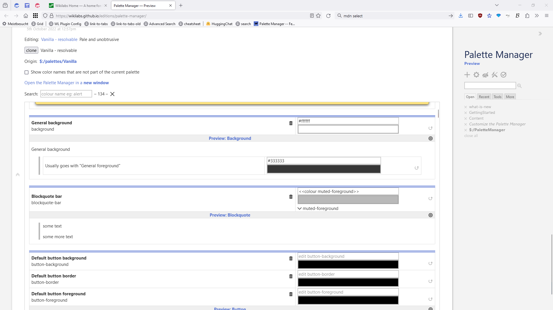
- Cloned palettes have an
originfield now, that allows us to have an “undo-button” per color changed - New Undo button if a color is different to the shadow palette
- There is a new “Search input” to filter based on colour names
- There is a new “Focus button” that sets the filter input to the first element of the colour names
- eg:
alertto focus on the alert notification element
- eg:
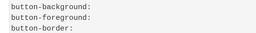
- If TW
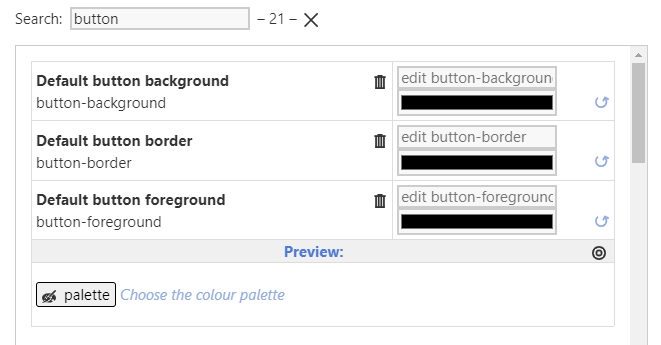
<<colour xxx>>macro is used the color-widget will show the resolved colour - Every colour-group has a preview element now
- It’s straight forward to create your own previews
- if the colour is eg:
alert-muted-foreground - the preview tiddler is named:
:/palettes/preview/alert-muted-foregroundwhich will be shown right below the colour
- if the colour is eg:
- The palette manager can be heavily customized. See Customize the Palette Manager
Known issues:
none
Demo
Demo: Palette Manager — Preview
Have fun!
Feedback is very welcome.
This code should have a chance to be part of the core in the future.