Design a new layout for the top and bottom areas

During recent use of TiddlyWiki, it was felt that a new layout could be designed to add to the sidebar presentation.

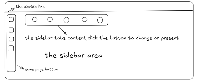
Namely, a top and bottom areas layout. This layout is easy to visualise by drawing a line down the middle of the screen, with the River of Stories area above, which is the left area of the default layout. Below that is the sidebar area.

You can then choose whether the story river area is above or below.

The next thing is to split the sidebar. The first line is the buttons, which can be placed below that line or at the bottom of the screen. Then on the left are the sidebar tabs, which need to be clicked on to be displayed. Of course it could actually be converted to buttons. I feel it would be better to convert it to a button, so that it is only displayed when you click on it.

The line in the middle could have a button on the far right for the full screen story river area or the sidebar area below the full screen.

Does anyone know of a similar theme plugin? Or any experience with it? I don’t have much experience with it, but I’d like to give it a try. Of course there could be other considerations, that’s all I can think of at the moment. Any discussion is welcome, thanks.
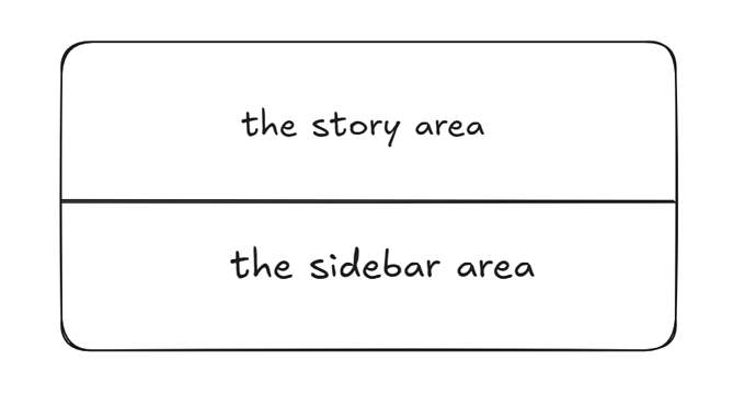
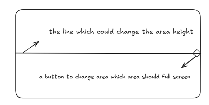
Some draft diagrams for easier understanding.

Like most web apps, the design makes the assumption that…

  1. the app uses only one desktop monitor. Design would look terrible spread across two, three, four screens
  2. the app is running on a desktop, period. Design would be cumbersome and less than useful on a smaller device like a phone

Sorry, but you really need to think outside the confines of your everyday, personal experience.

EDIT: My layout, which I can’t imagine your design working with:

Yes, later on I realised there was a problem with the design. Because the normal screen is placed horizontally, naturally it should divide the area by left and right, not up and down.

I was thinking more about how to use the sidebar more efficiently. Either show more content, similar to the new panel, or show less content, with just a few buttons. Show panel content through buttons.

i’m not reading this as a request to change the default behavior though? just as you have this ultrawide layout (which would not render well on my setup, for example), it seems like @dongrentianyu’s would benefit from a top/bottom layout. if this wouldn’t work for you, just don’t use it…

i suppose my point is that it seems a bit harsh/confrontational to suggest that they are confined in their thinking when this just looks like a layout that would work well for them and likely others… they don’t seem to be trying to appeal to every possible use case nor forcing use of their suggested layout. with all due respect, why do they need to cater to you if you have an alternate layout that you like already?

@dongrentianyu, this looks like a good idea for a layout! i could see the story river flowing horizontally (left to right, or right to left) to make use of the wider space, and maybe some of the sidebar UI could be changed to work better with horizontal scrolling as well?

1 Like

Hardly. It’s about the proposal, not the proposer. @dongrentianyu seems to understand that, thankfully.

I’m trying to design a new layout, which is also being developed, but am having a lot of difficulty. So it doesn’t always end up being developed.

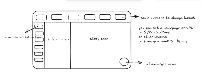
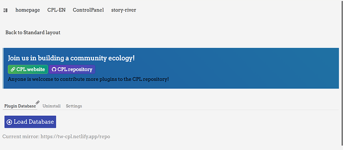
The new layout has a top bar with buttons that can be clicked to toggle the content of the main area below. One of them is to put the sidebar on the left and then the story river area on the right. Some Page Controls buttons are then displayed through a hamburger menu.