Now is the time to help with testing the TiddlyWiki v5.2.6 prerelease

I didn’t live that long, but since I started using a pc (90s-2000s) the floppy disk icon means saving until now

I think the point is what floppy disk represents, not how much can it stored though :laughing:

I did some investigation. Most editors add star to show an unsaved state

Notepad
811_notepad

Matlab
813_MATLAB

Some uses red color. In Notepad++ blue color means saved, red means unsaved. It also adds an star to file name in title bar!

Notepad++
812_notepad++

Below is Jupyter notebook which is work in browser, It shows something like @jeremyruston proposed:

Jupyter Notebook

I’m not really a fan of that. Why didn’t the triangle work out?

How about we leave the check mark, but change the circle? Maybe something like this:
image

3 Likes

What about (maybe disk is pulsing)?

grafik

Saved wiki status remain: grafik

I like this a lot!

It preserves similarity to the “checkmark inside circle” button, but switches to the triangle, which generally means “warning”.

-e

1 Like

It is true that is a good option.
But here is my 2 cents : As the icon works as a push button to obtain the save result, it is a button witch exists un two states (on/off, saved/dirty). So we could use the very same icon with different color AND orientation.

tiddlysave

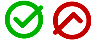
And visualy it convey an image of positive (tick up, like the commercials for watches set to 10:10 because it is like a happy face :slight_smile: ) versus negative (tick down like a sad face :frowning: )

2 Likes

It’s funny, but icons that feature floppy disks seem more antiquated to me than icons featuring quills, shovels, and stop signs even though, technically, quills are hundreds (thousands?) of years old.

Think from many different prospective years. Shall we go swimming in the sea? Quills are so sexy now.


Pensa da molti diversi anni prospettici. Andiamo a nuotare in mare? Le penne sono così sexy adesso.

Far side, TT.

re

Okay. But your thing is potentially an own-.goal putting this in one …

TT, xx

I like this one very much, and it even seems that transition between both states could be animated quite nicely (rotation + color morphing).

Fred

As pretty as I think that is, the red in an otherwise monochrome (default) UI is eye-catching. I’m afraid the green would be as well… in an unfortunate way.

Perhaps a gray uptick paired with a red downtick would be less jarring?

1 Like

Interesting… I do like your basic idea!

I’m noticing that the pair of images in your post share the same diagonal axis (which means they’re less distinct than being “opposite” might imply)… Could an intuitive sense of ratcheting in one direction – potentially followed by an animated “snap to” for saving (whether or not the change is actually animated, or just visually suggestive) – be more intuitive with a difference of less than 180°…

I also like the fact that the shape inside the circle at left is one logical symbol for negation. :slight_smile:

On the other hand, this one gives a sense of “dangling” that is visually awkward… which might be just what we’d want… (Please forgive the terrible image quality of the hasty mockup.):

image

For what it’s worth, these particular red and green shades do seem likely to be reasonably distinguishable according to this one online simulator: Color Blind Vision Simulator | Color Blind Glasses Simulator

-Springer

Where is the own goal?

unsaved status:
actual: grafik → new: grafik (maybe disk is pulsing)

saved status:
actual: grafik → new: grafik

Screenshot 2023-03-14 at 14.44.09

The problem I see with this is, a diamond can represent clarity, purity, cleanliness, even love… none of which represent how I feel about “dirty” or unsaved changes.

@Yaisog’s image on the other hand, is perfect.

If you want to try my solution just bring this in a fresh new prerelease wiki.
$__core_images_save-button-dynamic.json (1.6 KB)
clean dirty

1 Like

@Yaisog’s image reminds me of a famous Pink Floyd album. :grinning:

The idea is nice though I don’t quite understand the purpose of the tick in this icon. I really think we don’t need two different symbols, but just two different states of the symbol. The color change on actual wiki is fine for everyone I think, we got used to it. My rotating solution permit to differentiate the different states even though you would be color blind.

1 Like

That looks great to me!

Hi @Yaisog I felt there wasn’t a strong enough relationship between the triangle and the tick. The diamond shape attempts to fix that by using the same angle/curvature as the arrow. The angle has to be 90 degrees to match the arrow, which doesn’t permit an equilateral triangle.

The problem then is that we still have a tick in the “dirty” image, which doesn’t seem right semantically.

Hi @StS again the problem here is that there has to be a strong relationship between the two images, so that the transition is not perceived as one icon being swapped out for a different one.

Thank you @Thomas_Chuffart I am not proposing to change the colour of the normal state of the save wiki button, but I like the idea of rotating the icon.

Hi @Springer that’s an interesting point. The transition in your mockup seems more arrestingly different but I like the elegance of @Thomas_Chuffart’s original.

I’ve gone ahead and pushed @Thomas_Chuffart’s proposal.

1 Like

Hi @jeremyruston, this seems to have become way more complicated that I would ever have anticipated initially. And I don’t really want to prolong this already extended discussion, but to me @Thomas_Chuffart’s proposal looks like a “mountain” symbol, or at least something pointing “up”. It may have the right angles, but maybe angles are not everything.

I’ll make one final proposal before I shut up for good: Remove the checkmark on dirty, leave an empty, red circle. Like an unticked to-do item. Doesn’t get any simpler. No angles, no polygons, just a circle.

Have a nice weekend
Yaisog

2 Likes

Thanks @Yaisog the redesign of the save wiki button has indeed spiralled into a lot more work than expected.

I’m not totally happy with the inverted design that is currently on https://tiddlywiki.com/prerelease. I think it is because it is perceived as a rotation, and yet there’s no obvious meaning to rotating an icon.

image

I’d love to hear some more views, but at the moment I am minded to return to the rounded rhombus icon

1 Like