Now is the time to help with testing the TiddlyWiki v5.2.6 prerelease

Small glitch with dirty/save dynamic button rendering on this site (and not on the other 4 I converted today, all other problems resolved with troubleshooting overwritten shadows).

The cause is probably something I did, but I’m not finding the problem after a few minutes, so I’ll put it out there in case the issue would affect others as well:

https://quick-demo.tiddlyhost.com/#%24%3A%2Fcore%2Fimages%2Fsave-button-dynamic

-Springer

The problem is that, although it doesn’t show as an “overridden shadow”, your file contains a version of $:/themes/tiddlywiki/vanilla/base that doesn’t have the new CSS rules for
tc-image-save-button-dynamic-clean and .tc-image-save-button-dynamic-dirty .

Without these CSS rules, $:/core/images/save-button-dynamic displays both the clean and dirty SVG images.

-e

1 Like

I agree the floppy disk icon is better idea for saving. It has been meaning save for 4 decades!

The red dot currently using is really not that clear at least for me. It makes me wondered for a while to understand it is to save the file.

1 Like

For me the new “dirty icon” resembles a “record button” which is close enough to a “store a snapshot” action associated with images in our days.

If you live that long. … Given that all the disk-icons picture a 3 1/2 inch disk which started adoption in 1986 we are closer to 3 1/2 decades :wink:

I honestly think that this icon is not up to date anymore. There is almost nothing, which could be stored on it. 1.44MByte … That’s a quarter of an JPG image taken with a modern phone. … Even an icon of a memory stick would be outdated already.

A contiguous circle and slash imposed over the top of a check-mark would work. A “record” button means something is happening right now, which isn’t the case.

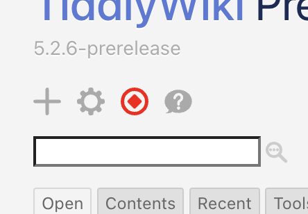
I did some more experiments starting with the rounded triangle, and ended up with a rounded diamond in a circle that might have potential. I think it avoids looking like a record button and also maintains the simplicity that I like from the current design. The transformation of the tick into a diamond is believable; one can imagine the tick folding over onto itself to make the diamond shape.

Screenshot 2023-03-14 at 14.44.00 Screenshot 2023-03-14 at 14.44.09

4 Likes

I didn’t live that long, but since I started using a pc (90s-2000s) the floppy disk icon means saving until now

I think the point is what floppy disk represents, not how much can it stored though :laughing:

I did some investigation. Most editors add star to show an unsaved state

Notepad
811_notepad

Matlab
813_MATLAB

Some uses red color. In Notepad++ blue color means saved, red means unsaved. It also adds an star to file name in title bar!

Notepad++
812_notepad++

Below is Jupyter notebook which is work in browser, It shows something like @jeremyruston proposed:

Jupyter Notebook

I’m not really a fan of that. Why didn’t the triangle work out?

How about we leave the check mark, but change the circle? Maybe something like this:
image

3 Likes

What about (maybe disk is pulsing)?

grafik

Saved wiki status remain: grafik

I like this a lot!

It preserves similarity to the “checkmark inside circle” button, but switches to the triangle, which generally means “warning”.

-e

1 Like

It is true that is a good option.
But here is my 2 cents : As the icon works as a push button to obtain the save result, it is a button witch exists un two states (on/off, saved/dirty). So we could use the very same icon with different color AND orientation.

tiddlysave

And visualy it convey an image of positive (tick up, like the commercials for watches set to 10:10 because it is like a happy face :slight_smile: ) versus negative (tick down like a sad face :frowning: )

2 Likes

It’s funny, but icons that feature floppy disks seem more antiquated to me than icons featuring quills, shovels, and stop signs even though, technically, quills are hundreds (thousands?) of years old.

Think from many different prospective years. Shall we go swimming in the sea? Quills are so sexy now.


Pensa da molti diversi anni prospettici. Andiamo a nuotare in mare? Le penne sono così sexy adesso.

Far side, TT.

re

Okay. But your thing is potentially an own-.goal putting this in one …

TT, xx

I like this one very much, and it even seems that transition between both states could be animated quite nicely (rotation + color morphing).

Fred

As pretty as I think that is, the red in an otherwise monochrome (default) UI is eye-catching. I’m afraid the green would be as well… in an unfortunate way.

Perhaps a gray uptick paired with a red downtick would be less jarring?

1 Like

Interesting… I do like your basic idea!

I’m noticing that the pair of images in your post share the same diagonal axis (which means they’re less distinct than being “opposite” might imply)… Could an intuitive sense of ratcheting in one direction – potentially followed by an animated “snap to” for saving (whether or not the change is actually animated, or just visually suggestive) – be more intuitive with a difference of less than 180°…

I also like the fact that the shape inside the circle at left is one logical symbol for negation. :slight_smile:

On the other hand, this one gives a sense of “dangling” that is visually awkward… which might be just what we’d want… (Please forgive the terrible image quality of the hasty mockup.):

image

For what it’s worth, these particular red and green shades do seem likely to be reasonably distinguishable according to this one online simulator: Color Blind Vision Simulator | Color Blind Glasses Simulator

-Springer

Where is the own goal?

unsaved status:
actual: grafik → new: grafik (maybe disk is pulsing)

saved status:
actual: grafik → new: grafik

Screenshot 2023-03-14 at 14.44.09

The problem I see with this is, a diamond can represent clarity, purity, cleanliness, even love… none of which represent how I feel about “dirty” or unsaved changes.

@Yaisog’s image on the other hand, is perfect.