re
Okay. But your thing is potentially an own-.goal putting this in one …
TT, xx

I like this one very much, and it even seems that transition between both states could be animated quite nicely (rotation + color morphing).
Fred
As pretty as I think that is, the red in an otherwise monochrome (default) UI is eye-catching. I’m afraid the green would be as well… in an unfortunate way.
Perhaps a gray uptick paired with a red downtick would be less jarring?
Interesting… I do like your basic idea!
I’m noticing that the pair of images in your post share the same diagonal axis (which means they’re less distinct than being “opposite” might imply)… Could an intuitive sense of ratcheting in one direction – potentially followed by an animated “snap to” for saving (whether or not the change is actually animated, or just visually suggestive) – be more intuitive with a difference of less than 180°…
I also like the fact that the shape inside the circle at left is one logical symbol for negation. 
On the other hand, this one gives a sense of “dangling” that is visually awkward… which might be just what we’d want… (Please forgive the terrible image quality of the hasty mockup.):

For what it’s worth, these particular red and green shades do seem likely to be reasonably distinguishable according to this one online simulator: Color Blind Vision Simulator | Color Blind Glasses Simulator
-Springer
Where is the own goal?
unsaved status:
actual:  → new:
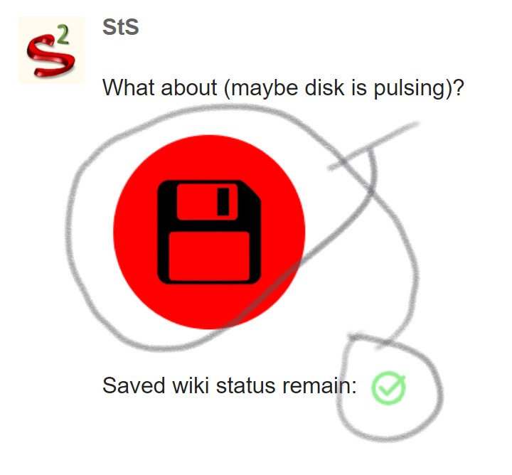
  (maybe disk is pulsing)
saved status:
actual:  → new:
The problem I see with this is, a diamond can represent clarity, purity, cleanliness, even love… none of which represent how I feel about “dirty” or unsaved changes.
@Yaisog’s ![]() on the other hand, is perfect.
on the other hand, is perfect.
If you want to try my solution just bring this in a fresh new prerelease wiki.
$__core_images_save-button-dynamic.json (1.6 KB)
@Yaisog’s ![]() reminds me of a famous Pink Floyd album.
reminds me of a famous Pink Floyd album. 
The idea is nice though I don’t quite understand the purpose of the tick in this icon. I really think we don’t need two different symbols, but just two different states of the symbol. The color change on actual wiki is fine for everyone I think, we got used to it. My rotating solution permit to differentiate the different states even though you would be color blind.
That looks great to me!
Hi @Yaisog I felt there wasn’t a strong enough relationship between the triangle and the tick. The diamond shape attempts to fix that by using the same angle/curvature as the arrow. The angle has to be 90 degrees to match the arrow, which doesn’t permit an equilateral triangle.
The problem then is that we still have a tick in the “dirty” image, which doesn’t seem right semantically.
Hi @StS again the problem here is that there has to be a strong relationship between the two images, so that the transition is not perceived as one icon being swapped out for a different one.
Thank you @Thomas_Chuffart I am not proposing to change the colour of the normal state of the save wiki button, but I like the idea of rotating the icon.
Hi @Springer that’s an interesting point. The transition in your mockup seems more arrestingly different but I like the elegance of @Thomas_Chuffart’s original.
I’ve gone ahead and pushed @Thomas_Chuffart’s proposal.
Hi @jeremyruston, this seems to have become way more complicated that I would ever have anticipated initially. And I don’t really want to prolong this already extended discussion, but to me @Thomas_Chuffart’s proposal looks like a “mountain” symbol, or at least something pointing “up”. It may have the right angles, but maybe angles are not everything.
I’ll make one final proposal before I shut up for good: Remove the checkmark on dirty, leave an empty, red circle. Like an unticked to-do item. Doesn’t get any simpler. No angles, no polygons, just a circle.
Have a nice weekend
Yaisog
Thanks @Yaisog the redesign of the save wiki button has indeed spiralled into a lot more work than expected.
I’m not totally happy with the inverted design that is currently on https://tiddlywiki.com/prerelease. I think it is because it is perceived as a rotation, and yet there’s no obvious meaning to rotating an icon.
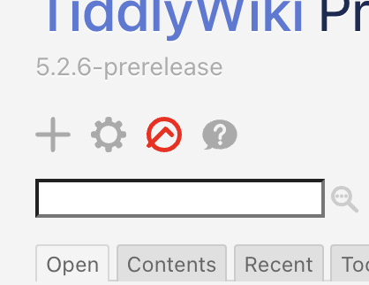
I’d love to hear some more views, but at the moment I am minded to return to the rounded rhombus icon
I felt that one was workable. The problem with any small glyph is that it is subject to lots interpretation.
What I like about the upside down checkmark is the potential for nerd humour. When anyone asks why there is an icon for a mountain, we can say it’s because it’s not in the cloud.
One thing I noticed about the rhombus is that it is not aligned the same as the tick. See the left picture. Moving it to align the same as the tick looks like the right picture.


The advantage of the right picture is more continuity between the two symbols. The result is off-center, but that’s because the tick is also off-center. IMO, the continuity is more important than it being centered.
Just my 2 cents. I’m not sure it is all that important.
Um, guys… please… several of the save button proposals are just outright weird - including the upside down icon used in the prerelease. TW is odd enough as it is so we should try to make newcomers feel at home by sticking to a familiar UI when possible. Do a web search for “save icon” and see what shows up (But I do agree the floppy disc belongs in the past.)
Some ideas. I think the first is the best:
#1:
saved: keep current
unsaved: 
#2 - “the round checkbox idea”:
saved: keep current
unsaved: 
#3:
saved: ![]() (i.e same as “save tiddler”)
(i.e same as “save tiddler”)
unsaved: ![]()
P.S I’ve now tested the prerelease on one of my main wikis and I can’t see any problem. Is there anything particular I should look out for?
Out of the previously discussed options, I’m a fan of this one, personally.
But if we want to distinguish it for all no matter the color, why not use css animation? you can simply make the button wiggle or bounce when save changes is needed.
If we really wanted the above to look good, we could make the arrow rise and fall into the circle, and when a save goes through, move the longest line 45 degrees to the right to form the normal check symbol.
(Or simply replace the symbols on successful save.)
Figured I’d offer the idea in case this is something others would like to try to tinker with.
Afterall, the thing humans notice the easiest is movement in contrast to things not moving.


I just slapped that together quickly using images at Wikimedia.
Although I like the colours, it might be best for colour-blind folk to have no colour.
Maybe replace the green with black, replace the red with black, replace the yellow with white.
To really highlight the difference, it might be worth inverting the colours of the disk with the alert icon.
I think the diamond shape is better, but the original one with the red circle in the middle is the cleanest one.
This one proposed by @mwiktowy seems simple and interesting. Many text editors use a star on the file name to display dirty state!
Best wishes
Mohammad