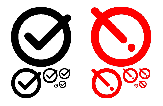
I was thinking something like this:
I would actually opt for a straight ! rather than it being diagonal like the checkmark, to create even more visual difference between the two without color
In the vertical position, it begins to resemble a power button.
Hm, good point. Shame we are already using the download button icon, that would make for a good alternative save button.
Thank you @Justin_H @Mark_S @Brian_Radspinner @etardiff that’s very helpful.
I had avoided a “plain” exclamation mark in a circle because it is a vertically flipped copy of the current “info” icon:

I was thinking along similar lines though - in the experiment above I had added another circle so as to cause the exclamation mark to be inverted so that it was white on dark, instead of dark on white. At that point I started to think that the exclamation mark was redundant because the combination of the icon changing shape and colour was enough to convey that there had been a state change.
Another factor that pulled me towards the present design of the blob-within-a-circle is that it is fairly noticeable in ones peripheral vision, I think because the overall visual weight is different than the usual icon.
I think it’s important to point out the discussion at GitHub which followed the PR. Make save wiki button be accessible to users without colour vision by Jermolene · Pull Request #7232 · TiddlyWiki/TiddlyWiki5 · GitHub again.
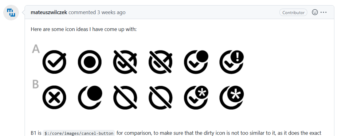
There where a lot of new icons to be considered. They look nice, but all of them except A2 have a much higher visual overhead. ..
I’m exclusively using the prerelease for all my testing .. and it just works as it is.
2 Likes
Has shapes other than a circle been considered?
Triangles are traditionally used for warning symbols because of shape language.
Just curious
2 Likes
One of the constraints is not to change the existing tick-in-a-circle icon that we use for when the wiki is clean (ie doesn’t need saving).
Another is that the variant of the icon used to indicate that the wiki is dirty should be similar enough to the tick-in-a-circle icon that the user recognises them as the same icon undergoing a change, rather than swapping between two different icons.
So, I think that rules out making the overall outline be triangular, but your post prompted me to experiment with a triangle-in-a-circle:
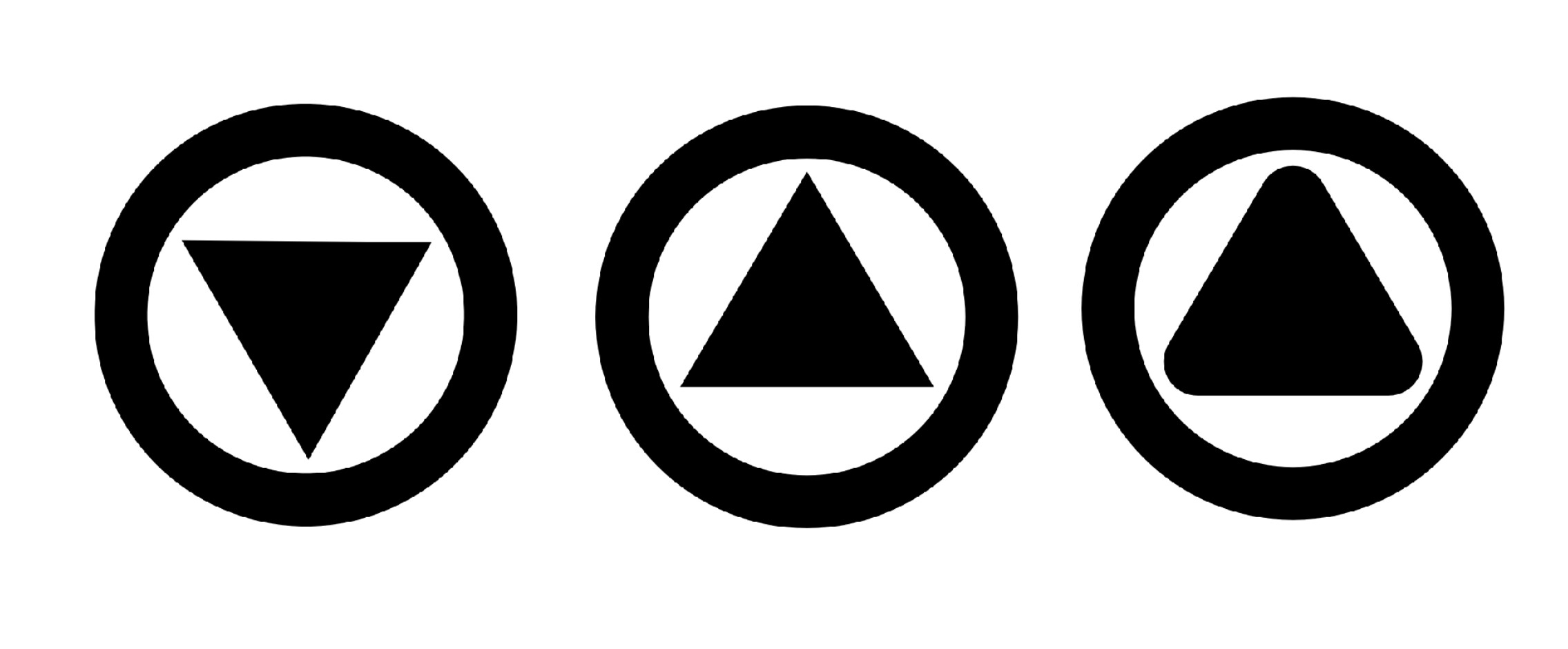
I quite the third variant.
3 Likes
While I had meant the outline, it makes sense not to change that, and I do agree- the rounded triangle in the circle does look good.
I think it works better than the circle in circle, as that gives the impression of a record button IMO
Would it be too small to have an exclaimation mark or download arrow cutout within the triangle?
It will not be really visible, because the real icons are muuuuuch smaller. See: Now is the time to help with testing the TiddlyWiki v5.2.6 prerelease - #23 by jeremyruston
1 Like
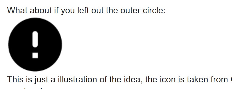
What about if you left out the outer circle:

This is just a illustration of the idea, the icon is taken from Google’s Materials library and should not be used as-is.
That should be distinctive enough to separate it from the info icon.
I do like the rounded triangle in a circle, though. The triangular shape should be familiar as a warning shape to most people, at least everyone that drives a car.
I’m likely an idiot not fully understanding the recent sweat over icons.
(Indeed on net iconology I see a lot of mixing-up with iconography–i.e. visual “mashups”.)
But, TBH, when I see this …
… I’m not so sure what we are talking about???
This is to do with file-saving, right?
NOT emergencies?
Maybe I naïve, but a big exclamation is, is it not, a serious alert not a mild prod (encouragement)???
FYI, @Yaisog Gnasher, I am not lifting you out for critique!
I know you were trying to help.
I am merely trying to make sense of what these images would mean, in context, to a new user?
Just a comment
TT
If you haven’t seen 5.2.6 yet, the issue is that the save icon resembles a “record” button.
An exclamation mark doesn’t necessarily mean “emergency”, it can just mean " pay attention " Losing one’s data can be a kind of emergency.
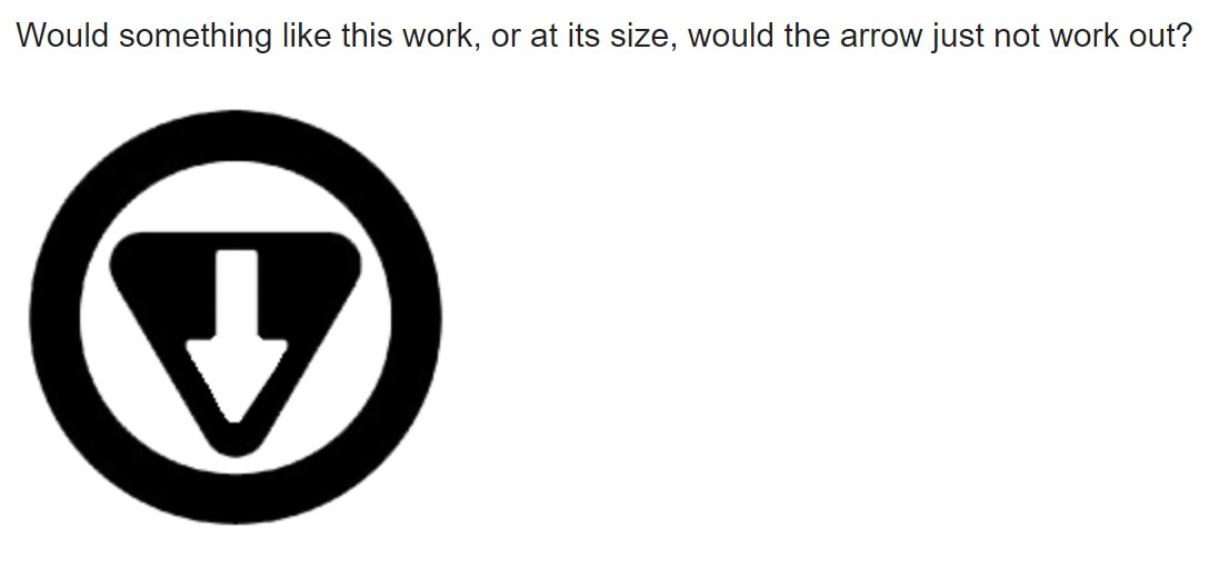
Going back to using the rounded triangle to avoid the record button like Icon, I threw this together in photoshop just as a quick example.
Would something like this work, or at its size, would the arrow just not work out?

The reason I think the triangle should be the go-to is because the exclamation point gives the impression that maybe something is wrong, just from general association, and we already have a download button in the icons, so resembling it gives a sense of uniformity, plus the saving mechanism is basically saying, “Hey, changes have been made, download your wiki to save changes!”
Worst case scenario, if the arrow isn’t ideal, the rounded triangle pointing downwards I think would still look really good.
1 Like
From my own point of view that looks good!
Mainly in that a “down-pointing-arrow**” pretty much implies a download waiting—and nothing much else???
Just an opinion,
TT
Right!
I don’t want to diss it per se! Merely comment that “Exclamation Mark” is likely TOO variant on it’s “visual meanings” now?
A bit of a nest-of-vipers variants?
Just asking for an uncle
TT
I think there are a couple of issues:
- Adding the arrow means that we are combining three shapes: a ring, a triangle and an arrow. That’s a lot of visual complexity to parse at small sizes
- There is no relationship between the triangle/arrow and the ordinary tick-in-a-circle save icon
1 Like
Ah, If the addition of an extra shape is too much then I would just elect to use the downward aiming rounded triangle.
In all honesty I would reuse the download icon we already have, but other than those two suggestions I’m afraid I’ve run dry on ideas ![]()
1 Like
Reduce it to the size of the icon, and that arrow is nearly invisible.
Mr. Internet tells me that, for the most common form of color-blindness, that yellow is visible. In fact, according to one article, it is typically the favorite color of color blind individuals. It’s also the color of alerts. So using the current round icon, but colored yellow (at least in the interior), would serve as an alert without giving the impression of a “record” button.