@Mohammad, amazing developments!
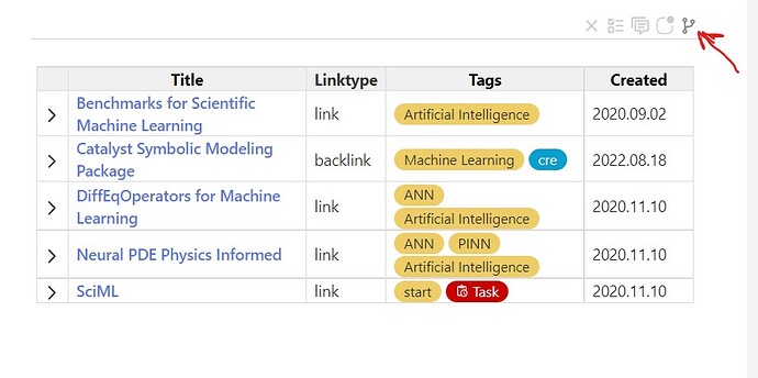
One very small comment, after initial test-drive, is that it would be ideal if the smart tabs at bottom, when collapsed, had some visual indicator (such as darker color) to help us see whether there is something “there”, somewhat like the difference made by the “dirty” version of the icon for saving.
For example, the button/icon for the Comments would display as darker (or with salient background, etc.) where there ARE comments, the button/icon for Todos displayed as darker where there are Todos, etc.
In general, I love the idea of being able to tuck all this stuff away, but in the current design I would often end up often click-browsing through the tab buttons just to see whether there’s something there.
Of course, I wouldn’t be surprised if something like this is already on your development wish-list. If so, please forgive the redundancy.
Looking forward to spending more time with this!
-Springer
