While I have TWs for some family history records, collections organization and photo organization, the TW that I spend the most time on and is the most mature is my TW concerning my research into the railroads of the state of Kansas. I started this a few years ago after my father passed. He was a long time railroad engineer in Kansas where I grew up.
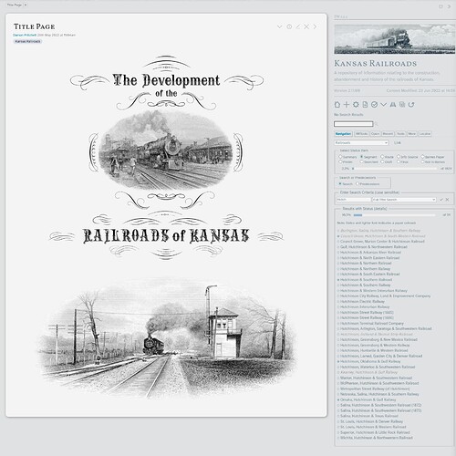
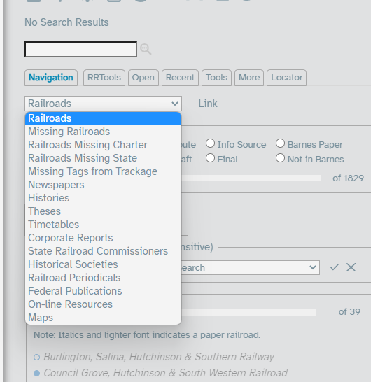
Below is a screenshot of what it looks like on startup.
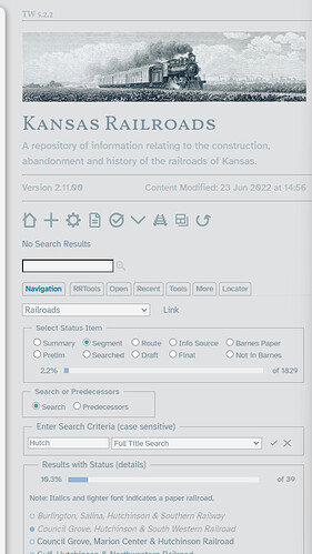
The sidepanel is my main navigation area with a custom tab to get around. I have a select widget to select between various ways of navigating. Below is the railroad selection where I can do various searches to find the railroad tiddlers of interest. The status radio buttons select what I want to show status on with a Harvey Ball showing up next the railroad to indicate complete (solid) or not (circle).
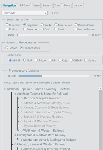
I can also show the predecessors of major railroad companies shown here:
You will note that some railroads are in lighter font and italicized. This indicates that they are “paper” railroads or railroads that were proposed, but never built. There are many more than what are indicated because this is still a work in progress.
The select widget selections between railroads and varioius type of source material which is also in the TW.
The source material is transcribed into individual tiddlers with links back to the railroads that are mentioned in that source. Images from the source material such as figures or maps use external images to keep the TW smaller (it’s still about 14MB as it is). I do use the RefNotes plugin by @Mohammad for footnotes and I intent to start using it for references in the future.
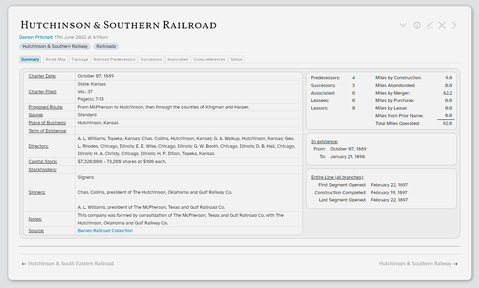
An individual railroad tiddler looks like this:
This uses a view template to display the information and tabbed interface. Each of the tabs contains more detailed information than the summary tab.
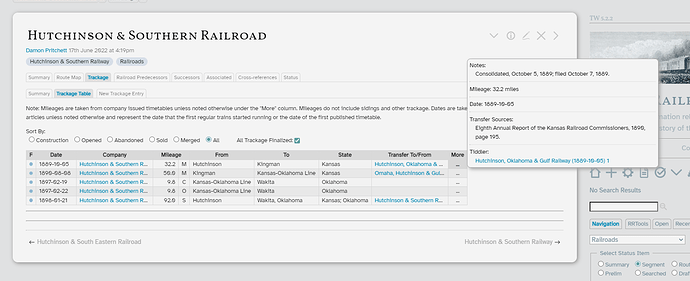
For example, I’m in the process of inputting the construction history for the railroads which is shown in the trackage tab:
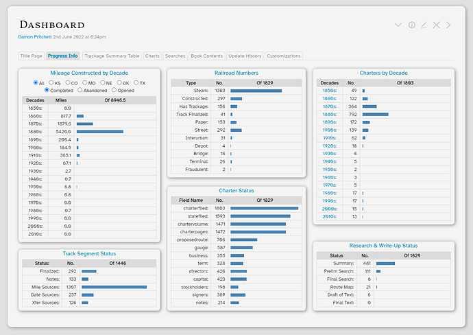
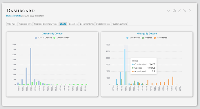
I also have charts using the bar chart plugin and echarts plugin to show various status items:
I initially wanted the dashboard to be the initial screen, but the TW was quite a bit slower when I did that so it’s just a few clicks away.
This has been a hugely fun project and is ongoing. It’s a lot of work to dig up the information and I spend way to much time on it. But it’s better than a lot of other things I could be doing. Thanks to @jeremyruston for creating such a great tool and thanks to this community for being patient with some of my silly questions and help that has been given.
Regards,
HistoryBuff (aka Damon Pritchett)

