How can I make a template that automatically lays a grid over images?

I’ve done that sort of transformation before with qualify and a per-tiddler <style> tag. But what I mostly liked here was the editor/inline view. I have a feeling that the CSS can be simplified if done per-tiddler, but I’m not diving into it now.

Perhaps. But I’m simply filing this away for another time.

I can see wanting to do something similar to apply the 2 horizontal, and to vertical grids to show the “rule of thirds” for photography composition. At least to display the choice made.

  • It seems automatic size values may be possible or using % as the lengths.

Speculation;

Wouldn’t it be good if tiddlywiki could host images, perhaps externally, but then have different views of that same image with or without grids, cropped, zoomed, and filters applied so you can see the same image multiple times with different treatments?

1 Like

Again, I have no immediate need, but that certainly sounds both possible and useful.

I suppose I am talking about a general solution. It may allow adjustments around the source one or more times and may prove as simple as presenting images in a slightly nicer way. So any wiki with images could benefit, in a similar way perhaps it could be used to generate thumbnails or icons as a content factory for other wikis. Meaning it becomes a utility for effective design and presentation.

  • Some of the lightbox solutions may go part way.

Further speculation:

I would love to extract exif data from images and store them in fields, and ideally be able to write them back.

Imagin importing a set of pictures then;

  • Using and building tools for easy edits, categorisations and photographic review then save the image back with new subject and categories applied. This would allow tiddlywiki to act as a integral part of a photographers workflow.

Hi @Scott_Sauyet and @Charlie_Veniot , I am trying to achieve this give me some time.

1 Like

Hi @Scott_Sauyet and @Charlie_Veniot ,
I modified and renamed some of charlie veniot’s Tiddlers Pluginstyle:
Imagegrid to be Pluginified.json (7.7 KB)

  • $:/plugin/ImageGrid/ViewerModal >>> Charlie’s Viewer as a modified Modal 100vh/100vW to work with it.
  • $:/plugin/ImageGrid/Macro >> Creates a macro that launches the viewModal
  • The temporary data (ImageURL, Scale) is stored in a temporary tiddler: $:/temp/ImageGrid
  • the config data in (lines, size of squares) in a config tiddler: $:/config/ImageGrid

What remains to be done

  • Make the grid zoomable (x+y proportionally)
  • Make the image autoscale to the right dimension within the grid.
  • Make the div scrollable form left to right also
  • Perhaps: Create a grid of squares filling the entire screen.

To see the modal at work just press the image, charlie’s grid is below the scalable image

That looks really good.

Thank you @Charlie_Veniot …but when putting the grid-thickness to 20px I discorvered a problem in how this is made:
It is distorting by cutting the image. I have to find how to repair this…I guess putting the image behind the table or using one of the two other ways.

That’s by design, because I did not want the grid to cover any part of the image.

Really, the image is broken up into tiles, and the “grid” is actually borders for the tiles.

You might find it better to use a different “engine” for gridding images.

I did get around to trying this, and I have a fairly simple approach that does much of what I would like.

We have one ViewTemplate, GriddedPicture ViewTemplate, which checks if the tiddler has the tag GriddedPicture (there’s got to be a better name!) and then uses the qualify widget and the fields of that tiddler to generate

  • an empty table with the grid-size described in the fields
  • a stylesheet tied (via qualify) directly to that table, incorporating the remaining fields, putting the image as the scaled background image of the table, and using the height, width, grid thickness and color.

A tiddler might look like this:

title: Cat Behind Bars
tags: GriddedPicture
board-height: 135px
board-width: 240px
grid-color: #ffffff
grid-thickness:	 1px
image-tiddler:	Motovun Jack.jpg
pieces-x: 5
pieces-y: 3

This POC version has no defaulting, so you have to supply all those fields, and the dimensional ones need the unit (e.g. 135px). That could be cleaned up for a more production-ready implementation. We would probably also want to give an alternative to the image-tiddler field for external images, and then extend the template to handle them.

It would also be quite helpful to combine this with an extension of something like Charlie’s form, to allow us to create these with input boxes, dropdowns, sliders and such. It would also be nice, as Charlie mentioned above, to be able to find the intrinsic dimensions of an image tiddler, and then allow the user to fix to that ratio. I don’t know how, but I imagine it’s possible.

The template looks like this:

<% if [<currentTiddler>tag[GriddedPicture]] %>
<$qualify title="grid-image" name="id">

<table class=<<id>> >
<$list filter="[range[1],{!!pieces-y}]" variable="y">
<tr><$list filter="[range[1],{!!pieces-x}]" variable="x"><td></td></$list></tr>
</$list>
</table>


<style>
<$text text ={{{ [<id>addprefix[.]] }}} /> {
  background: url(<$macrocall $name="datauri" title={{!!image-tiddler}} $output="text/plain"/>);
  background-size: 100% 100%;
  width: {{!!board-width}};
  height:{{!!board-height}};
  border-collapse: collapse;
  border: {{!!grid-thickness}} solid {{!!grid-color}};
  td {
    border: {{!!grid-thickness}} solid {{!!grid-color}};
  }
}
</style>

</$qualify>
<% endif %>

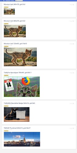
And it generates tiddlers like this:


You can try it out on tiddlywiki.com by downloading the following and dragging it to there:

GriddedPictures.json (4.2 KB)
1 Like

Wow,
Very neat. This persistent approach is cute - but nothing for me because the Users of my wiki shall be enabled to use the grid on every of the 600+ image linked in my wiki dynamically.
After an experiment with @buggyj’s SVG solution ImagegridSVG.json (6.0 KB) also already in a modal and with controls, but I encountered scaling and zooming issues I could not resolve.
So now I have come back to the first version by @saqimtiaz.
This seems to be the easiest way to scale the gridded image to the right dimensions and zoom in to draw. Can anyone tell why this css won’t work in TW? Downward, you can find a json with the style and test.

Finally I have what I wanted: A scalable, customisable, fullscreen gridviewer which now follows the first concept proposed by @saqimtiaz
ImageGridViewer.json (6.6 KB)

  • $:/plugin/ImageGrid/ViewerModal is a modal covering the entire screen, autosizing the grid either to squares or to a customizable grid. To have a square grid set vertical to zero
  • $:/plugin/ImageGrid/Macro defines the macro <<gridpic "url" "caption">> to call the modal
  • $:/config/ImageGrid stores the config data in (lines, size of squares) in a config tiddler

To see the modal at work just press the image generated by the macro … and enjoy.

There has been multiple great propositions in the thread: If you need static grids per image applied by a viewTemplate you should consider @Scott_Sauyet’s solution.

I want to thank for all the help @saqimtiaz , @buggyj , @Charlie_Veniot and @Scott_Sauyet

One discovery of this thread for me was the syntax for beautiful optionfields that Charlie showed in his demo, I am sure I will use this again.

<fieldset> <legend>''Zoom''</legend>
<$range tiddler="$:/temp/ImageGrid" field="scale" min="150" max={{{ [{$:/info/browser/screen/width}multiply[4]]}}} increment="1" default="0.5"/><$edit-text tiddler="$:/temp/ImageGrid" field="scale" tag="input" size="3"/> <br>
</fieldset>
3 Likes

BINGO! :medal_sports:         

1 Like