I’ve got a partial solution to my problem, but not one I love. I’m wondering if there are other useful techniques.
I’ve gotten back to working on my SQL Playground, and I would like to have some notes floating alongside the content. These would be footnote-style commentary on the text. I’m pretty sure I’ve seen working examples of this in various styles, but I’m not finding them at the moment. The solution there I have so far is… meh. It’s based on my suggestion in our earlier discussion of Cornell Notes, with a number of modifications. (And yes, I suppose an implementation of my bible wiki idea would also solve this, although it’s a bit different.)
Making a tiddler handle such notes is just a matter of adding the tag Noted.
Creating a note is just a simple macro call, which could be created by an editor button (if I ever start using those.)
The look-and-feel is centralized in CSS and can be relatively easily changed in one place.
What I don’t like
The note precedes the content it annotates. If you cut and paste the text, this really feels out of order. Ideally, I would prefer that this content didn’t even get copied along with the main text, but if it does, it really should come afterwards.
The note is block level, and it makes otherwise flowing content break into separate lines. (Perhaps this is not a big deal; I think I can fix this by replacing the <DIV>s with <SPAN>s and add a display: inline block. I’ll test that soon.)
While I try to deemphasize these notes, they are still more prominent than I’d like. (I haven’t spent any time on this, and there are probably good :hover techniques, at least for desktop.)
This is custom code that I will need to maintain. I would love to find a plugin that just works and not have to maintain this.
Improvements?
Any suggestions for how to do this better or references to other implementations would be appreciated.
What are your thoughts on using modals over a dedicated sidebar within the tiddler?
That way, they would be togglable or can be set to dissapear when clicked off or even when not being hovered anymore.
I would imagine something like the following be how its used:
Placeholder text found here, <<float-note "note here." "Note text here, or {{note tiddler}}">>
Where it would appear like “Placeholder text found here, note here.” And when clicked would show hovering over the text.
The positioning would probably need to be set to relative using css, but one thing I’m unsure of is how to make it so it doesnt overflow from the tiddler and potentially run off the page .
You could also have it use the reveal widget where on click it shows more as inline text using spans like you mentioned, but at that point its not really in appearance to a note.
That’s definitely worth considering. If I’m going to go with hidden-by-default, though, I might try to replicate the technique FiveThirtyEight uses for footnotes. There’s a footnote number marker as a link. When you click on it, the footnote opens in place, splitting the current paragraph, and showing in an interstitial paragraph with contrasting typography, with the number marker now replaced by an X to close it. It’s a useful technique, but I don’t think I’ve ever seen it done elsewhere. You can see it in the second paragraph of Section 1 in this article.
The note precedes the content it annotates. If you cut and paste the text, this really feels out of order. Ideally, I would prefer that this content didn’t even get copied along with the main text, but if it does, ideally it should come afterwards.
Good idea! The following achieves this (make sure the tid is narrow enough to wrap the text so to see the effect clearly.) It is styled to show clipped as a small tiddler-gutter thingy that expands when hover.
\procedure note(text)
<div class="hover-to-show">
<<text>>
</div>
\end

Lorem ipsum dolor sit amet, consectetur adipiscing elit. Sed elementum sollicitudin pulvinar. Donec imperdiet turpis vel sem blandit, at ultricies diam porta. Aliquam volutpat eros nibh, vel tempus felis rutrum et.

Fusce augue sem, pulvinar eu dolor vitae, cursus vehicula neque. Curabitur mauris velit, lacinia nec tincidunt et, eleifend mattis mi. Phasellus bibendum nisi sit amet sapien lobortis accumsan. Sed sit amet orci libero. Morbi bibendum pretium sollicitudin. Nullam in nisl ultrices, egestas ex fermentum, tristique ipsum. Integer eu lorem id dui cursus eleifend. Integer tincidunt augue velit, et lacinia lectus maximus sed.<<note """hey there this is a note belonging to "Fusce augue sem" """>>

Morbi efficitur nisi vitae turpis porta luctus. Suspendisse dignissim urna quis lacus consequat volutpat. Curabitur scelerisque massa ut mi sollicitudin dictum. Sed ut pellentesque ex. Etiam at laoreet nulla. Integer eu erat vel orci maximus egestas. Pellentesque lorem libero, malesuada et eleifend sit amet, euismod quis eros.

<style>
p:has(.hover-to-show) {
display:grid;
}
.hover-to-show {
position: absolute;
right:4px;
width:3em;
height:2rem;
margin-top:-4px;
padding:4px;
overflow-y:clip;
white-space: nowrap;
text-overflow: ellipsis;
background:cornsilk;
}
.hover-to-show:hover {
width:initial;
height:initial;
overflow-y:initial;
white-space: initial;
box-shadow: 1px 1px 5px rgba(0,0,0,0.3);
}
</style>
This reminds me quite a bit of Tobi Beer’s appear plugin, which you could certainly style to show a number/an X (though getting the numbers to increment automatically might be trickier.)
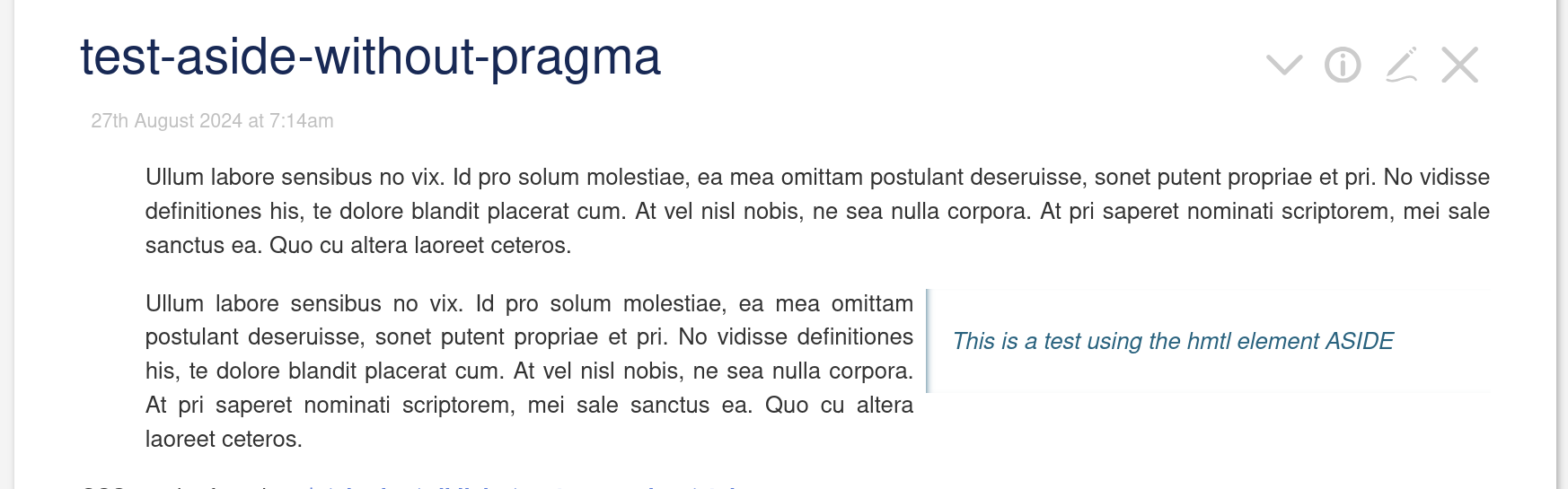
I did experiment with the html ASIDE element with my custom-markup plugin. But it has the same downsides that you describe in your “I don’t like” section.
It looks a bit different, since it is only part of the paragraph that it extends. It always starts with the first line of the paragraph, as seen in the screenshot.
The problem is, that it only “blends in” nice if the paragraph itself is longer than the aside element. Otherwise the aside can span several paragraphs, that may not really belong to aside not. (But that’s the same thing with your approach.)
The main advantage is: It is very simple CSS rule and does not need complex templates and tags
This looks to be a good idea. The demo is somewhat broken in the current version of TW, but the intent is clear.
I like the look of this. You mention your custom-markup plugin; was there any specific use of that required to get this to work, or simply some useful CSS?
I’d have to see it in action, but I might prefer that. The 25% column in mine is a waste of a lot of valuable real estate when there are no notes.
I haven’t double-checked to see whether I’ve broken this since, but fixing that was part of what my Cornell notes complexity was handling. Any long aside would simply push down the remaining main text beyond its end. Not a beautiful solution, but not terrible either.
Do you have a markup sample I could look at?
Ah, that looks like it might really be the approach I want. Thank you very much! And yes, autoincrementing numbers would be ugly in a document full of complex transclusions, but they also shouldn’t be necessary; I could just use an asterisk. Dynamically-rendered footnotes really don’t need numbers.
Thanks to everyone for the great suggestions! I am going to put this aside for the moment to focus on content, and try to make a decision once I see just how many notes I really need.
 .
.