Below is:
Cornell Notes work on paper and in Obsidian

We can have the same in TiddlyWiki.
Below is:
Cornell Notes work on paper and in Obsidian
We can have the same in TiddlyWiki.
Mohamad we could implement a summary as an additional text area field and provide a layout with an empty left column, then generate a macro to display the cue to the left, often to left of headings.
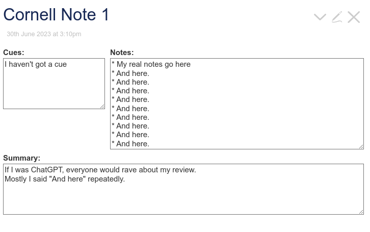
Here is a simple Proof of concept Cornel notes as an approach to taking notes.json (2.5 KB)
This would work nicely with your section editor as well.
There are a lot of “soft algorithiums” out there that are easy to adopt in tiddlywiki and they inspire more generic ideas we can introduce to tiddlywiki, such as the idea of tiddler margins that you can use a macro using a float, to “throw content into”.
Perhaps view and edit cascades that appear as soon as you add a left or right margin field with an optional width, then a macro where needed to address the margin.
The important thing (at least for me) is: Do the Clues still make sense for me in the context of the plain text?
If I do need a GUI for it to make sense, I think we lost. .. The piece of paper is “self contained”. There are 3 distinct areas.
In HTML terms, for me and screen readers it may be:
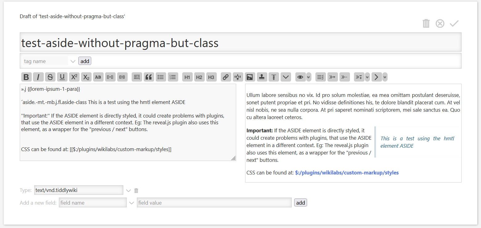
I did some experiments with the ASIDE tag nearly 2 years ago with the custom-markup plugin at: Custom Markup — create your own wikitext
Summary
If the AI does the summary, it may be an extra summary-field that can be “written” by AI helpers.
If a human (me) makes the summary, it will be a HR element and some text at the end of the plain text. No special view template needed. Just some CSS adjustments for the layout
-m
PS: just some thoughts
Another POC:
cornell-note.json (2.7 KB)
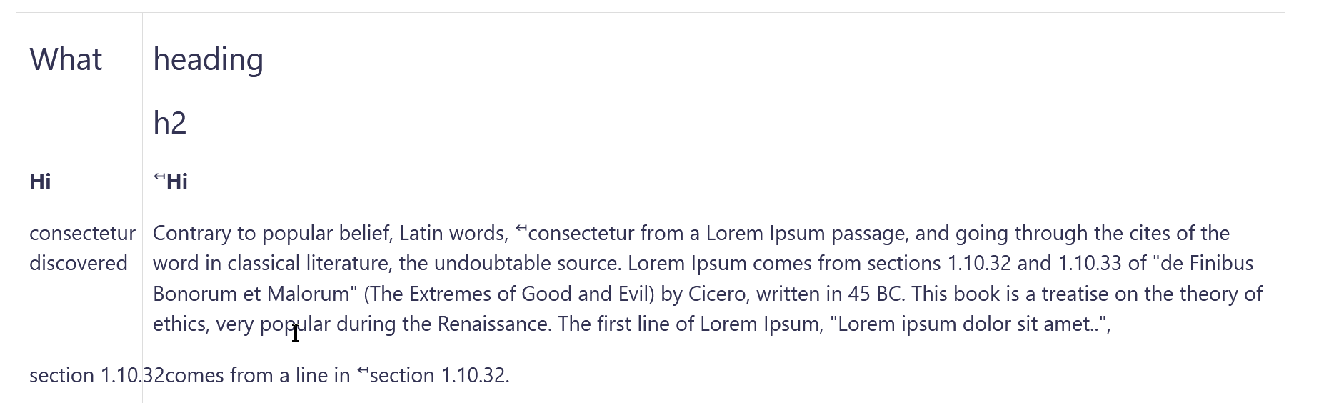
Here the summary is simply in its own field, summary. The tiddler is tagged Cornell (hardcoded for the POC, and it might be better with a field such as note-type: cornell.) The cues are written inline, using a custom <cue>content</cue> tag. They go immediately above the content they should float next to. Obviously one would want editor support for the cues and probably a separate text input box for the summary. None of that sounds hard.
I haven’t played around with with what would happen if there were too many cues, or if they were too close to one another. I would love to have a subtly different color for the background of the cues column, but it’s not its own element and its difficult to target with CSS. (I tried to use a border, but they cannot have widths specified in proportional units.)
In any case, it was a fun half-hour trying to get something working. (That it was only half an hour shows that I am progressing in my TW journey. Six months ago, I think this would have been a day-long demo for me!)
I actually use this for my meeting notes, however I found it’s simpler to use grid with fr units.
you can actually ask chatgpt to create a simple cornel notes layout using grid layout and html / css
Here is what I use ![]()
$__jmh_itemTemplate_cornell-notes.tid (2.0 KB)
It doesn’t place the cues along the same line as the notes body, but In practice I would use <<cornell header>> and <<cornell-anchor>> to quickly make shortcuts to where I am making a note of, ie
<<cornell-anchor "blah blah">>: Lines 1-4 probably needs to be apart of the monthly survey
Though, I do like what others have done where you have a <cues> tag for making the text appear in the aside column better than what I’ve thrown together. (I’ve also found @@highlighting text@@ to be handy.)
Thank you @Scott_Sauyet and others here. Except for a few cosmetic changes I like this and want to include it as an option for notes and tasks in the next release of the Memory Keeper.
Great! I probably won’t find any time this weekend, but sometime soon, I will try to make this more robust.
From what I gather, I think the cues are supposed to be in line with the part of the notes you take, which was something my design kinda failed at.
Hmm. I’m skeptical that Obsidian is actually doing that. That is, I think they formatted the page with two columns that look nice together, but the items in the left column might get out of sync if you resized the columns, font-size, etc. But I’d have to follow up on the Obsidian plugin to know for sure.
For the left column to match the right, there has to be some mechanism for pairing or anchoring. For TW, I’m thinking of a series of cue/notes. You add a new set with a button. Sort of like a double-fielded Streams.
Or you could format the text as a series of nested divs, with the inner one floating off to the column on the left.
Right, but the cue should probably annotate a certain bit of the main content without assuming that all bits are annotated.
However, that’s not really tricky. My solution was just to intersperse them, with the cue tag coming just before its associated main content. This way, no particular main content has to have an associated cue, but it can. The cue is simply floated left into the large left margin of the main content.
The biggest disadvantage I see of this approach is that the column holding the cues cannot be easily styled. There is no actual left-column element to target. I can’t find a way to use a border for it either, although I haven’t struggled particularly hard to do so; maybe it’s still possible. That would let us at least add a background color.
If you look at the Obsidian example, there’s just a blank space to the left. So, it doesn’t need to be formatted because it’s … blank. So if you have a tiddler structure that leaves a blank on the left, then you could float the text over the blank area. I think.
So, the structure you see in the finished product isn’t what you see as you work (if I understand his write-up). Instead it’s put together with a series of special call-outs, which are kind of equivalent to our rubber-stamp snippets.
Another learning point – he’s selling the kit you need to produce this kind of output. There is a lot more commercialism in the Obsidian world. For instance, there’s people attempting to sell video tutorials for hundreds $$$
In my example above i used a table to have an empty left column and a macro to float left a cue and or display the cue in the text as well.
This idea is not simply a cornell note thing but emulating placing notes in a margin on paper but remaining aligned with movable text when digital.
a workaround (maybe not as nice as the original ) but without adding fields so context plugin still works, I created one additional editor button, which puts highlighted characters in a new table, with two columns,
|selected text|!|
and the cursor after the exclamation point, so you can add your pesonal notes /comments. the notes will have a grey background.
|!selected text| |
is also an option cursor before space in 2nd column, then selected text grey, note text is left aligned.
(as a result all columns will have different sizes )
Seeing this resurrected reminded me that I never went back to see if I could style the cues column.
I found I can do so, fairly minimally, as a border.
sample-cornell-note.json (2.7 KB)
We could easily add a UI button for the <cue> element if desired.
Note though that my solution has a major restriction. If the cue content is taller than the main content between the cues, we’re going to have extremely ugly overlapping cues. I just asked a question on StackOverflow about why my attempted remedy failed. I’d ask any strong CSS users here if they have a moment to review it and see if they have an answer. But until I find out how, this is an important restriction.
Another update. By switching to a custom widget instead of a custom HTML element, I was able to add the markup necessary so that I didn’t have to do the CSS float clearly in the awkward way I was trying.
cornell-note.json (9.0 KB)
The first sample shows what I would expect to be the most likely scenario, where the cues are significantly shorter than the text they’re annotating. The second one shows what happens when a cue is longer than that content; note that the following main text moves down to stay aligned with the cue. But the cue does not retain its block mode. The third sample shows that the cue’s block mode can be restored with an initial blank line.
It’s not perfect—and I may open another topic to ask if the <$slot>-Widget can automatically apply block mode—but it’s not bad either.
I have no interest in trying to figure out proper configuration fields (colors, columns, etc.), and turn this into a plugin. But if this is useful to you, go ahead and use it.
Ciao Mohammad
I am aware of what “Cornell Notes” are.
TBH, ì don’t think they are anything special (apart from the constraints).
Why am a I writing this?
Ultimately I think it would be better to pursue BASIC STRATEGIES TW enables.
IF we had our own more TW-FRIENDLY-LINGO of strategies I believe it would get easier.
Just a comment, TT
of course I like the philosophy behind Cornell notes! BUT yes, how we can use the philosophy and implement it using TW basic strategies?