King James Bible Wiki

Yes. Let’s look at verse numbers first. By far the simplest way of hiding them would be to use CSS, adding

.verse-number {display: none;}

But this will leave some odd spacing artifacts.1

Instead we can change the templates easily enough. Chapters are handled by $:/_/bible/templates/chapter, which then delegates to a specific template for Psalms, $:/_/bible/templates/psalms, and a more general-purpose one for everything else, $:/_/bible/templates/most-books.

We can fix them by removing the related markup from both:

<$eventcatcher selector="a" $click=<<open-verse>>  tag="div" class="chapter" >
<$set name=verses filter="[<currentTiddler>tagging[]tag[Verse]]">
<$list filter="[enlist<verses>get[para]unique[]nsort[]]" variable="thisPara">
  <p><$list filter="[enlist<verses>para<thisPara>sort[seq]]">
    <span class="verse">
      <sup class="verse-number">
        <a class="tc-tiddlylink" data-verse=<<currentTiddler>> href=`#$(currentTiddler)$`>{{!!verse}}</a>
      </sup>&nbsp;<span class="text">{{!!text}} </span>
    </span>
  </$list></p>
</$list>
</$set>
</$eventcatcher>

This looks fine in the rest of the chapters, but it removes the indentation of the Psalms and looks wrong. I would add some CSS for this:

.chapter.poetry p {text-indent: 1em;}

The chapter headers are in the template $:/_/bible/templates/book, and you could just remove this line:

<h2><$link><<header>> {{!!chapter}}</$link></h2>

But I think we’d still want the chapter headers for Psalms, so I think it’s better to replace this:

<$let header={{{ [<currentTiddler>book[Psalms]then[Psalm]else[Chapter]] }}} >
<h2><$link><<header>> {{!!chapter}}</$link></h2>
<$transclude $tiddler="$:/_/bible/templates/chapter" />
</$let>

with this:

<% if [<currentTiddler>book[Psalms]] %>
<h2><$link>Psalm {{!!chapter}}</$link></h2>
<% endif %>
<$transclude $tiddler="$:/_/bible/templates/chapter" />

There’s one more thing we’ve sort of broken in this: The inscriptions above many psalms have an indent they probably shouldn’t. So we can add text-indent: 0; to the p.inscription rule.

To do all that, you can download the following and drag it to the wiki. Once you import, you should see everything looking reasonably good:

HideChapterAndVerseNumbers.json (2.1 KB)

An interesting alternative would be to add a toggle to the sidebar that lets you switch this behavior as you like. I leave that to you, however.

Finally, I just have to quote from an earlier post. This is what I would really like to do:

And now that I think of a toggle button, I would love to do so for this gutter too, if I even spend time on such a change.


1 Also, I see Springer has beaten me to this suggestion. visibility: hidden is an interesting alternative. It leaves all the space where verse numbers had been, which lets you know where the verses start and end, without inserting the actual numbers.

1 Like

Very nice, thank you! There are some good lessons here for me to learn. I will play around with this.

Thank you for both tips!

Better Input Structure

I have done this. It’s in

http://scott.sauyet.com/Tiddlywiki/Demo/KingJamesBible/alt1/

The raw data is now in a nested format: The wiki contains books. Books contain chapters. Chapters contain verses. The other information necessary to display properly is in metadata sections at the various levels. I use a conversion script to turn this into a a JSON tiddler file.

There are four different sorts of metadata, one general, and three Psalm-related:

  • The list of paragraphs in a chapter (including in Psalms, although as far as I can tell, they’re meaningless in this case)
  • The separation of Psalms into Book I, Book II, … Book V
  • The inscriptions above most of the Psalms
  • The stanza breakdown and titles for Psalm 119

Generated Tiddlers

Each of these is in the appropriate place in the input JSON document. They are used to help layout the books and chapters in the wiki; they also get placed into the appropriate tiddlers (mostly as JSON blobs.) This is theoretically unnecessary, since they’re all accounted for in the layout of the book and chapter tiddlers, but I feel it’s still useful to have them there just in case.

Besides this new metadata, there are only a few changes to the tiddler fields, mostly the removal of a few redundant properties. But the book and chapter text fields are now written to match what @TW_Tones suggested:

Instead of templates or cascades for these tiddlers, we use a few procedures, c (for “chapter”), v (for “verse”), p (for “psalm”) and pv (for a psalm verse). The tiddler-generation script uses these together with the metadata to build static pages instead of the dynamic filter-and-list ones from earlier versions.

Static text instead of lists and filters

For example, the text field of 1 John 4 combines the paragraph metadata and the verse procedure like this:

<$eventcatcher selector="a" $click=<<open-verse>>  tag="div" class="chapter" >
<p> <<v "1 John 4:1">> <<v "1 John 4:2">> <<v "1 John 4:3">> </p>
<p> <<v "1 John 4:4">> <<v "1 John 4:5">> <<v "1 John 4:6">> </p>
<p> <<v "1 John 4:7">> <<v "1 John 4:8">> <<v "1 John 4:9">> <<v "1 John 4:10">> <<v "1 John 4:11">> <<v "1 John 4:12">> <<v "1 John 4:13">> </p>
<p> <<v "1 John 4:14">> <<v "1 John 4:15">> <<v "1 John 4:16">> </p>
<p> <<v "1 John 4:17">> <<v "1 John 4:18">> <<v "1 John 4:19">> <<v "1 John 4:20">> <<v "1 John 4:21">> </p>
</$eventcatcher>

And Genesis looks like this:

<<c "Genesis 1">>
<<c "Genesis 2">>
<<c "Genesis 3">>
<<c "Genesis 4">>
<!-- ... -->
<<c "Genesis 50">>

There is some additional handling for the differences in Psalms and specifically for Psalm 119, but it’s a similar approach.

Possible future work

If I play with this further, I will investigate putting the Book, Chapter, and Verse tiddlers into a plugin. I think it makes sense, and it will be easier to do in this version because of the smaller number of filters being used.

At some point, I want to retrofit the other style to use this same input. I think it’s simply more logical. Also the recent plugin compression work from @andrewg_oz could save a lot of bytes. (Speaking of that, this technique does add to the weight of the wiki, bringing it from 11.6 MB to 13.5 MB.)

Pros and Cons

This technique made some real logical sense, as the filters in the other version are never really meant to be dynamic. We’re simply not adding new verses to the Bible!

But it feels harder to reuse many of the parts. We’ve moved from a relational system to a rigid-hierarchical one.

This version is larger, as said above, about 17% larger, or 21% if you ignore the core.

There’s something very right about having a straightforward Book/Chapter/Verse hierarchy. But storing the metadata separately when it’s in fact necessary for proper display feels wonky.

What else?

Which style do you prefer? Why?

What parts of this version could do with some real improvment?

Any other feedback?

1 Like

Yet another version

Ok, didn’t I say I was done making changes to this? :stuck_out_tongue_winking_eye:

I have yet another version:

http://scott.sauyet.com/Tiddlywiki/Demo/KingJamesBible/v7/

This one does two things. First of all it defines its own initial data structure, the nested one discussed in my most recent post, then uses that to create the same structure of tiddlers used in all the previous versions. I think this is a much more logical format than the one I was originally using, which was just a flat list of verses.

The second thing is an attempt to remove the intrusive verse numbers. The previous style was heavily influenced by print. But in a dynamic text environment, there had to be a way to make the verse numbers available when desired but not in your face when you just want to read.

What I came up with is a highlight on hover, with the browser’s automatic title popup to give you the whole Book Chapter:Verse notation when you pause over the verse. If you click on the verse it opens that verse’s tiddler. A short video is below.

I’d love to hear what you think. Do you prefer this to the previous version? Or was it better before I started messing with it?

kjv_hover

Very nice.

Have you thought about touch devices?

Only as far as to check that out works reasonably well on my Android phone (Pixel 7). It treats casual touches like a hover. What you don’t get is the visual title tooltip.

But I don’t know if this is universal across Android nor if there’s something similar in IOS.

Any suggestions would be most welcome.

Can we switch them on again with CSS?

Not as written, but it would be pretty simple to make it so we could do so. Or we could use a boolean-valued tiddler as a flag to hide or show the verse numbers.

Before I wrote this version, I wrote one where the numbers were hidden by default but shown on hover. I tried it two different ways: With visibility: hidden/visible it was nice that nothing jumps around, but it leaves an uncomfortably large space between verses, and the numbers will be included if you copy text from the tiddler. With display: none/inline, of course, things jump around as you move your cursor over the tiddler. I played with various paddings to offset that, but with 1 - 3 digits for verse numbers, it’s extremely tricky to do that well enough not to be somewhat jarring.

Of course, we could write a mini-configuration screen to go in the sidebar or control panel and offer the user a choice of several different ways to view or not view the verse numbers, and likely the chapter numbers too. But that’s further than I want to take this at the moment. I’m hoping for a fairly minimal wiki that others can build on as they wish.

Do you prefer having the verse numbers visible?

yes. I did like the version, where everything was visible. I think it’s version 5 but there seems to be a bit too much whitespace

May be there is a \whitespace trim missing in your templates. I did add it to every template and then removed &nbsp; and &ensp; from all templates, since spacing should be done using CSS, instead of non-breakable-whitespace.

I added .text to $:/_/bible/styles/basic. If someone likes more spacing they can increase margin-right to eg: .5em;

.text {
  margin-right: .25em;
}

Or set .verse-number {display:none;} to hide all of them. If verse-number in none, I would increase the margin-right to .5em;

Now everything looks like I like it and it’s easy to modify using CSS only.

Here are the changes I made:

v5-KJB-Styles.json (3.6 KB)

have fun!
mario

There seems to be a sorting problem in v5 too: See 8, 6, 7

And you end up with too little white space for my taste! :slight_smile: I do agree that there was too much in that version.

I have mixed feelings about the &nbsp; here. The &ensp; one was just silly; I added it when I was hoping to have no custom stylesheet at all. Once I found myself really needing one (mostly for the Psalm changes), I forgot to go through and remove it. But the &nbsp; had an important role: preventing the verse number from being separated from the beginning of the verse text by a line break. I know of no other good way of doing this short of adding extra markup around the verse number and first word, to style with something like whitespace: pre, which seems ridiculous. On the other hand, I don’t like having the &nbsp; mixed with text. It leads to unrecognizable characters when copied into many text editors.

But they are gone from my current version, and if I bring back visible verse numbers, I will definitely style them with CSS rather than trying any white-space tricks with entities.

Thank you!

I am investigating a layout that seems to me to offer the best of all worlds. But I don’t know how to do it, and the question I opened on StackOverflow doesn’t look to offer any help.

Hmm, I wonder when that snuck in?! I’ve updated v5 and v7 to fix this. (v6 was just a way station between the two, and I probably won’t do any fixes to it.) It was simply a matter of forgetting to name the necessary sort field. I also noticed that I forgot !has[draft.of] in several places and fixed that, although there may be more.

It’s a matter of taste. That’s why I think CSS is important here. It’s easy to change for users, without the need to touch the template structure.

I see. – As you wrote verse-numbering and &nbsp; cause problems, if text is copy pasted.

According to Wikipedia, there is a WordJoiner &NoBreak;, which has zerro-width. This can be used in combination with CSS.

Since it has 0-width, verse-numbering can be switched off using “display:none;” without visible artefacts.

Not sure about copy / pasting text. Experiments needed.

hmmm – “dragging” the numbering to the left, makes the numbers more visible and “skimable” but it also moves them “out of context”.

Edited: I would experiment with CSS here too. Making the class=“verse” elements a display:flex and give the SUP element or the the TEXT element new rules with a conditional CSS. – experiments needed

TW v5.3.5 does not understand &NoBreak; yet. PR is on the way.

Here is a workaround that add support for &NoBreak; or &nobreak; that can be used as a “Word Joiner” until the PR is merged.

$____html-config-entity-word-joiner.json (635 Bytes)

Some more tests using a config-verse-element which either can be span or sup

If switched to span it will also change the layout in a way you requested on StackOverflow. At least as I did understand it.

It uses display:flex for the verses.

I did also add an aria-label to the verse-link, so screen readers can make more sense.

The JSON should work with KJB version 5:

v5-KJB-templates-styles-02.json (4.9 KB)

2 Likes

Agreed. As I was trying to make the most minimal functional wiki possible, I was avoiding CSS altogether. That didn’t work when I got to the Psalms. But now that I did need a stylesheet, I should have revisited this section.

Wow, several decades of web development, and there’s always something new to learn! It also works reasonably well when cut and pasted into simple text editors.

I have played a fair bit and haven’t found any CSS-only solution that will work. I’m pretty sure that with some work, I can do this with JS, but I’m not sure I want to put in that effort.

Thank you. I hadn’t realized that TW had to deal directly with these. At some point I’ll look to see how these are used. But I tested, and can confirm that this works.

Ahh, so I finally see what the <$genesis ...> widget is for.

This is visually somewhat close. In fact, except for a difference in indentation, it’s the same as what I use in the Psalms in version 5.

But it’s not close enough that I’d want to use it here. It ignores the paragraph structure of the text, which I really want to keep intact. Some printed Bibles and many online ones do the same same thing, but I think the text is most important; the somewhat arbitrary breaks for verses are very much secondary. I also don’t like the fact that the verse numbers are included when selecting text.

What I really want seems to be a combination of line number as you’d see in a coding editor, and sidebar notes you see in some text—footnotes, commentary, etc.— that is shown in parallel with the sections. Now that I think about it, someone here (You? Eric? Saq?) posted an experimental docco-like interface recently. I will check that out to see if the techniques would be helpful.

Yes, that belongs, and I will add it especially if I end up with my attempt to move the numbers to a gutter.

It does. For my own preferences I added a little more space with

.verse-number {margin: 0 .2em 0 .5em}
.verse:first-child .verse-number {margin-left: 0}
.chapter.poetry verse:first-child .verse-number {margin-left: 1em}

Mario, thank you very much for your help with this! You’ve put in a a lot of thoughtful work. I really appreciate it.

2 Likes

That’s funny. Loosing the context with your approach is exactly, why I wanted to have my formatting. The numbering and the related text do not loose the context.

Same here. I do not care too much about the paragraphs. I care more about the verse-numbers and their relation to the text.

That’s a problem. I would tackle that one with a custom js drag-action. But creating a simple toggle, that sets verse-number to display:none for copy pasting seems to be much simpler. Since I do not intend to copy paste stuff, I did not investigate that any further.

-m

I mocked up the sort of interface I would love to have You can see it at

http://scott.sauyet.com/Tiddlywiki/Demo/KingJamesBible/experiment1/

This is not in an actual TiddlyWiki; I just borrowed the HTML structure and CSS. I also generated the text of the tiddler from a real wiki. But then I manually added spacing to the verse number to line them up with their corresponding verses. And I wrote some fairly standard JS event handling to handle the hovering of the verses and of the verse numbers. It looks like this:

Screen Recording 2024-07-28 183307

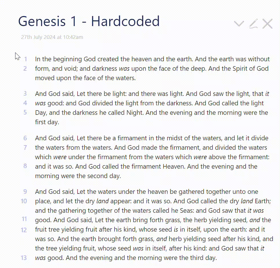
There are two problems with trying to create this in an actual wiki. The one I think is probably solvable (although I don’t know how to do it) is how to do the sort of hover-here-to-highlight-there activity in wikitext. The second one scares me more: finding a way to automatically add the proper vertical offset to the verse numbers, or finding some other way to keep them aligned.

If anyone has suggestions for either of these ideas, I would appreciate hearing them.

But also, is this even worth pursuing? I have a decent inline verse numbers as links version and a version that highlights the verse on hover and links to the verse tiddler. The advantages of this hypothetical version to me is that it keeps the verse numbers closely aligned with the text, but doesn’t disturb the flow of the text with them. The numbers are relatively subtle and will be easy to turn off. My question is simple: Are those compelling enough advantages to make this worth pursuing? Or would you prefer one of the existing views over this?

This is very slick and easily my favorite of the (prospective) layouts you’ve showed us, Scott! Whether it’s worth the fiddling to bring it to life… I don’t know. I don’t have a current need for a bible wiki myself, so my vote probably shouldn’t carry too much weight here. But if I did, this one seems like it’d be a joy to work with, and much easier to use to look up a specific verse.

It does remind me a bit of Cornell notes, which I believe you’ve worked with before. Perhaps you can reuse some of those strategies here?

Mine too!

By that measure, I shouldn’t have much of a vote either. This is all speculative, more on the line of, “What would be the best way to do this with TW?” And for that, both our votes count!

I can’t believe that they never crossed my mind! You’re right, there’s a large conceptual overlap with them. I will look at them again closely. I don’t expect that there will be much that carries over, but I really should have at least looked!