In many ways this is the “First” solution that comes to mind with tiddlywiki. I feel the freedom to create needs to remain open with this edition, it should perhaps Look a lot like TiddlyWiki.com and include features that are not too hard to use, ideally intuitive.
Features to include?
Table Of Contents with simple guidance and easy for users to extend.
Activate all relevant View and Page buttons
Install Menu bar and TiddlyWiki internals
Easy to use history and other features so no Tiddler is Lost
The ability and guidance to make use of categories, keywords and subjects in addition to tagging to organise information -
enhance standard search to include these.
Ability to review and query all of the organising information
Provide additional tag handling tools via the tag pill dropdown such as open/close all tagged
Breadcrumbs
Open tiddler tabs
Jump to tiddlers open in the story - menu bar dropdown
Adjust clone button to store “tiddler-source” in new button.
Provide a simple New tiddler template and creation tool
About button/menu describing this edition
Possible options
Activate code Mirror
-just pallet selection, Basic user interface customisation such as themes and dark mode etc…
You have two buttons, star and heart, for adding to favorites (at least that is what their tooltips say), and stars to rate a tiddler. That is bound to cause user confusion. Also, the heart button adds the tiddler to one sidebar tab, and the star button adds it to another tab. Seems to be duplication.
I would recommend using CSS to make those tabs look more like simple buttons at the top of the sidebar rather than tabs of the navigation tiddler. I expected to open a tab and it was jarring to be taken to another tiddler. And when I realized they were navigation buttons, I was then confused as to why they only appeared for the Navigation tiddler and not above the other tiddlers. That kind of navigation works better in Zoomin view because the buttons stay visible when “navigating” to a tiddler, or alternatively expressed, the tiddler appears under them. It only helps in classic story view if you happen to be at the top of the story river. And the open tab allows you the same functionality, so it is kind of redundant, but given how many sidebar tabs you have, I can see why you wanted it.
(min 3 letters) - good detail, one I always forget to mention in the tutorials I have made
“Tags of all opened items can be found at the top” - they are not tags but navigation buttons. Maybe you meant to say tabs, but I would recommend they not be thought of as tabs since they function quite differently from tabs. Tabs allow you to see different content while staying where you are.
Have you thought about the resizable sidebar plugin? Given how many sidebar tabs you have, that would help a lot. I know you commented positively on that plugin so it is a surprise you don’t have it here.
Nice beginning! I look forward to seeing the other things you plan to add to this. Blessings.
Okay I played with the sidebar a little more. More feedback:
The gear tab looks like something you are working on, and that the notes at the top of it are checkboxes that will be added later. I like this a lot.
Also, it seems like your Appearance and Plugins tabs would be better placed in that gear tab. These tabs clutter the sidebar unnecessarily, so that after the initial set up one does with those tabs, they get in the way of the tabs needed for creating, navigating and editing. I get that you want to make them more psychologically accessible, since everything in the control panel tends to feel ‘hidden’, but this feels like a case where tabs for ‘tweaking’ TiddlyWiki get in the way of tabs for ‘using’ TiddlyWiki.
I am wondering if there is too much overkill or redundance between Open, Recent, History, and the two bookmark tabs (star, heart). Even if you eliminate one of the bookmark tabs, it is not clear how helpful History is, given that Recent and Open are right there. Or vice versa, if you have the History tab for the current session, why Open would be needed.
When I see a Navigation tab, I assume I can use it for navigation. So I go there and find it is only the tutorial tiddler. I can’t “do” anytthing with it. You might think about renaming it? Also, the “Information about getting around” and its checkbox is confusing. From a new user perspective, the Navigation tiddler IS information about getting around. So why is it asking me to perform an action to get information about getting around? I can see that what it really does is add or remove it to the sidebar tabs. Why not just say that. Or better yet, why not just leave that option in the gear tab and not mention it in the Navigation tiddler itself.
You already have a page controls button for the About tiddler. Having it also as a tab feels really redundant. I realize the user can hide it using the gear tab later if they don’t want it, but it adds unnecessarily to the sidebar tabs clutter.
To end on a positive note (the other feedback is given in a friendly spirit too, not in a critical spirit), I like the trashbin tab. I never realized how that worked. Nice. And the journal tab. While I don’t use journals much, it is a nice touch for those who do. And the i’s to distinguish the info tabs help too.
Odd thing I noticed was when I closed all the tiddlers and clicked the Home button the tiddlers that were opened when I went to the page via your link didn’t load. Only “Home” opened.
I would echo almost everything @DaveGifford said above. Many things to me look like they are works-in-progress so I wouldn’t want to be too critical or redundant.
Since you have it public having a status list on that “Home” tiddler of those things that are works-in-progress might save on some of the confusion, maybe via a tag which would then be visible on those tiddlers.
I would also link back to this discussion somehow.
I appreciate all the plain English instructions you’re working on especially for navigation and customization/appearance. This is something I’ve been struggling with myself for a Tiddlywiki I’m building with the intent for others to use.
I would put the Story Tabs as a second layer of the Top Bar menu, that way they will stay in view as you scroll down. I agree with Dave that they should be styled differently then standard tabs, even just plain links with space between them would work.
Thank you very much for your considered feedback. I may respond details of such issues later.
Here is a start;
I have deactivated these plugins but the idea was the user clicks to activate one or more so users can choose the organisation features they want to use. But I will look more closely.
If you have some CSS (not yet a strength of mine) please share. I think itr may be good to follow @Brian_Radspinner suggestion;
We could also allow these tabs to be toggled on/off.
I agree with Brian’s suggestion but don’t know how to implement it.
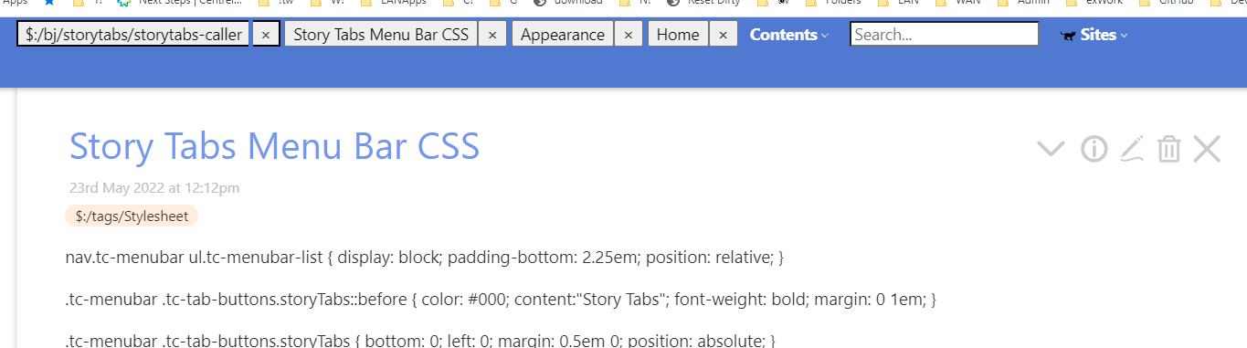
In the meantime I tried my hand at the CSS and added a margin-bottom of 20px to
div.tc-tab-buttons, which looked better, but unfortunately that is a class that affects tabs everywhere, so my CSS hack was not viable. BJ’s plugin unfortunately uses that class. Had he used a custom CSS class I could have adjusted that class and made it position: sticky; The plugin itself would have to be tweaked in order to avoid the problem.
Also, don’t feel you need to reply to each of my suggestions. Just receive them as information and do what you will with them.
You say you deactivated the heart and star bookmarking plugins, but they appear in the tiddlers and they do in fact add items to their respective sidebar tabs. So either they are not actually deactivated or deactivation means something specific that does not have to do with those two characteristics.
I have applied many changes or taken notes to rework.
Not on my copy please try a reload; Version 0.0.5 now?
BJ’s story tabs
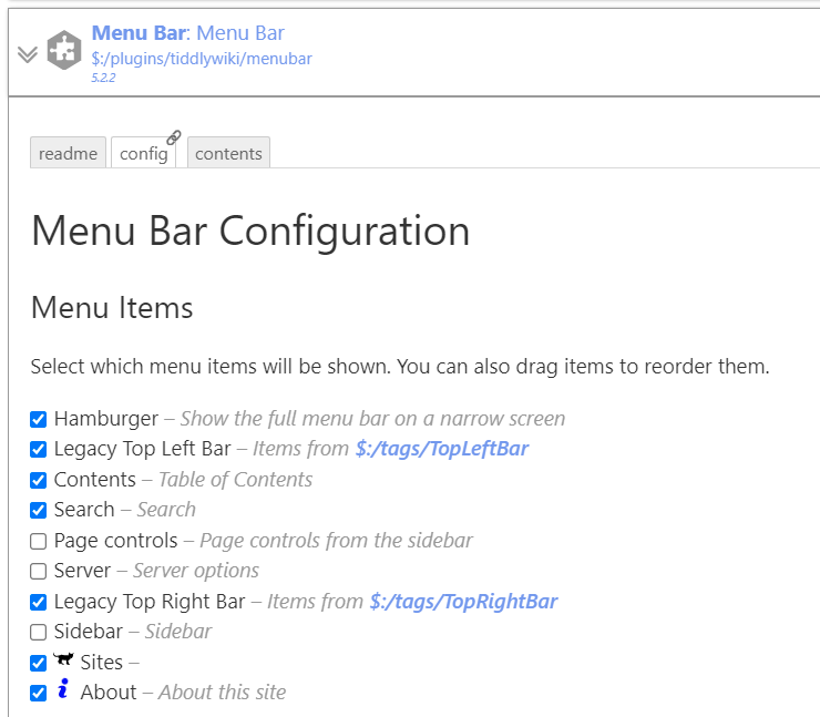
I would consider moving these into the menu bar, but Ton Gerners Tabstory plugin is not using the core Menu Bar. Although his site has a lot of good principles.
I tested it in your wiki Tones. I works. But it takes the colour from tag-foreground. Therefore the color is black in your wiki.
Remove $:/tags/AboveStory from $:/bj/storytabs/storytabs-caller and tag with $:/tags/TopLeftBar.
Then add the storyTabs class as described in $:/plugin/bj/storytabs.
I think it looks rather good. Maybe a little less space between the buttons/tabs .
Thanks @Birthe still not quite right for me, this apparent fragility concerns me, with the addition of your instructions after @Brian_Radspinner I am getting this;
@TW_Tones It looked the same here at first…but as soon as I edited $:/plugin/bj/storytabs
First line: <div class="tc-tab-buttons storyTabs" > it looks okay.
It does not look good, if we open too many tabs, though. It kind of moves upward.
 Table Of Contents with simple guidance and easy for users to extend.
 local browser storage but not active