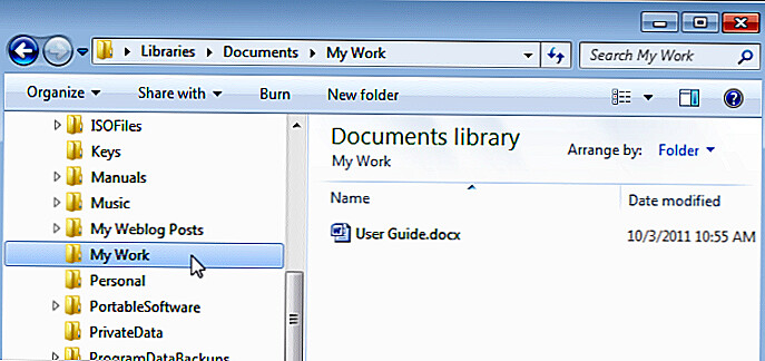
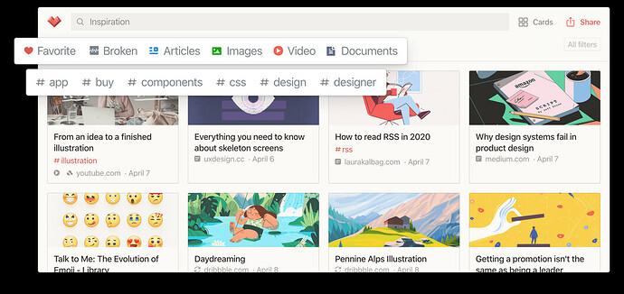
Hi all! I’m thinking of creating a plugin that changes tiddlywiki visual interface. Some visual concepts to make tiddlwiki more attractive:
I would suggest making something around the built-in functionality of the Alternative Page Layouts since 5.1.23 release.
There are also already a few TOC macros that would just need some additional styling to get a more Windows-like tree view.
For the card view, you can further add to Charlie’s tiddler thumbnail template, just like I did.
Mohamad’s plugin Shiraz also has a range of css and macros for formatting cards etc… within tiddlers. @Mohammad
Yes Shiraz has a complete implementation of Bootstrap cards, alerts, tables, buttons, badges, color palette switch (day/night), …
It also supports two columns story river out of the box.
Shiraz actually is a small css framework for Tiddlywiki based on Bootstrap 4.5.1
Json in TiddlyWiki by standard - after having received a lot of feedback, i thought i would have something visual in tree as Windows 7 or Google Drive etc
Tiddlywiki has a tree macro which creates something like left panel in treeview windows 7
having preview pane can be implemented see: Grid CSS to Create a Vertical Tab Like Structure - Tips & Tricks - Talk TW (tiddlywiki.org)
By the way, I think the main factor here is time and money! There is no limitation or restriction on Tiddlywiki side! You can simple shape Tiddlywiki in many forms!

