Ever since @TW_Tones and @Springer were fiddling with chemical element information in tiddlers in My only wish in tiddlywiki: is this possible? Where should I start from?, I’ve been playing around with how to write a periodic table of the elements with Tiddlywiki.
While it’s certainly not complete, it’s in good enough shape to share. It’s at Periodic Table. (It’s just barely useful in mobile, and only in landscape mode with the sidebar collapsed. More on that below.) Update: I will continue to add releases and notes below, and the current published version will be at https://crosseye.github.io/TW5-Chemistry/. Between publishes, especially if I’m asking for help, I may post to https://crosseye.github.io/TW5-Chemistry/latest/.
I started with the tiddlers that Tony used, but found a number of enhancements that were needed. and wrote a script to apply various fixes. If you’re interested, the Node.js script that I used is inside https://crosseye.github.io/TW5-demos/periodic/enhance.zip, along with the original data. It’s not code to be proud of. It grew by accretion as I found more parts that need to be fixed, and it shows in the script design. But it works. If you run node buildTiddlers (using Node.js 17.5+ – otherwise you’ll need to add an import for node-fetch), it creates three formats: a list of tiddler files suitable for a tiddlers folder, the file tiddlers.json (attached: tiddlers.json (141.4 KB)), which has all the new data tiddlers included, plus a somewhat different version of Tony’s Headers_Tiddlers, and the same thing as a plugin (which may or may not work now.) This content also includes a Wikipedia extract.
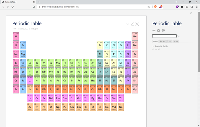
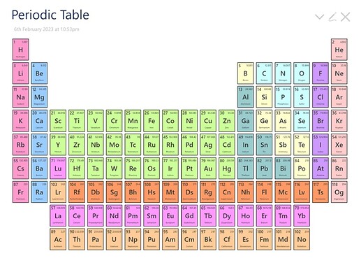
It looks like this:
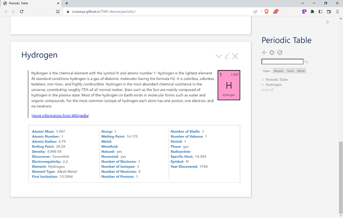
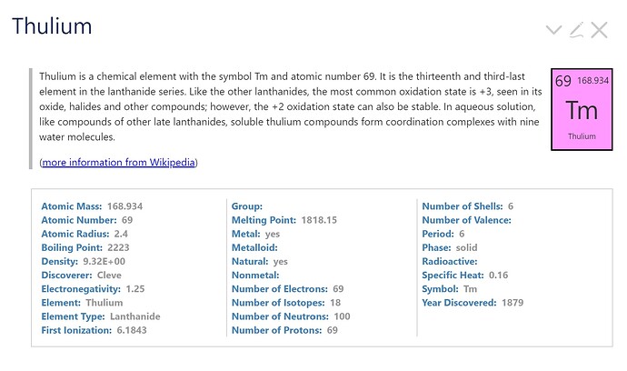
and when you choose an element, you get something like this:
(This also demos why I raised the discussion How to float the output of a ViewTemplate next to other body content?. Thanks again, @EricShulman!)
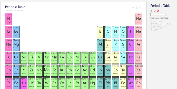
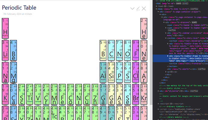
There’s plenty still to do. The biggest thing is to make this fully scalable. As you can see in the image, it fits fine in the screen I was using, but it looks way too small on a larger one, and is too large on mobile, overflowing the sidebar. I’d love to get this to fill the width of the story river. If anyone has suggestions for how to do that, I would love to hear them. The current TODO list is on the page
I have no practical need for this, and except possibly for Chemistry students, I doubt anyone does. Nonetheless, I’ve had a lot of fun making it, and would love to hear suggestions for how to improve it.
