Demo: Periodic Table

Yes, I will, thank you.

Rather, they weren’t there in the original data I started from and haven’t yet seen the need to add them. I’m not changing these tiddlers, so I’m not expecting to see them in the recent tab, but I will add those fields at some point. Is there any problem if they all get the same created value, or should I ensure that they are unique? I assume created and modified can be the same for a single tiddler (what else would you do on creation? Or do we not fill the modified at all at first?).

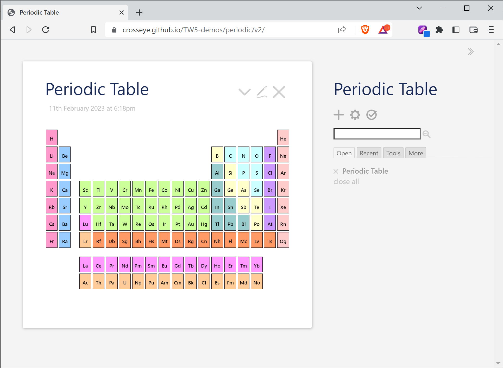
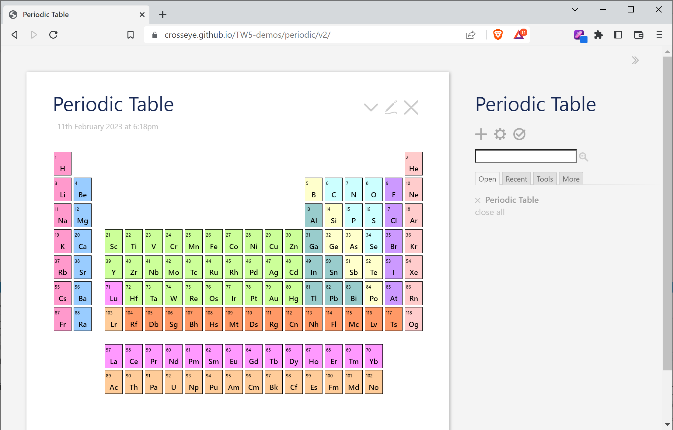
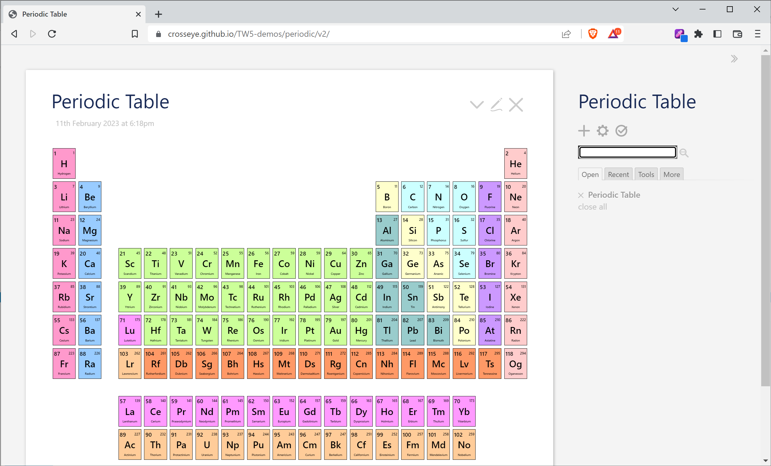
There’s a number of similar things that I think I would like to do to help group, sort, and otherwise organize the data. I may well borrow steal @Springer’s sortable table implementation of this data. I would definitely have a tiddler for each Element type. And there’s many other glosses on the data that seem likely to be useful. I hadn’t specifically considered any view sorted by discovery date, but I can see it being interesting and useful.

I will approach all this once I’m satisfied with the presentation.

1 Like

Right.

This is just a comment. I’m not expecting you to do anything from it :slight_smile:.
I just thought you might find it interesting?

I’m a social scientist, not a chemistry boffin.

What is interesting to me is that your approach potentially fosters a wide range of uses of the PT. Some likely never done yet? :blush:

For instance, I’m particularly, currently, very interested in the economics and sociology of “Rare Earth Metals” and their extraction and uses. They play a big part, for instance, in the manufacture of electronic goods (e.g. China Dominates the Rare Earths Market. This U.S. Mine Is Trying to Change That. - POLITICO).

Having a PT which you can annotate with information about where they are and how they are extracted and by whom for what at what social and economic costs could be very useful to folk so interested.

As I say, just a comment
TT

The more people suggest realistic uses, the more additional uses I can see. At the moment I’m fighting a valiant battle with CSS, but assuming I can eventually win that, I will start looking at some additional content I would want and think about how I can make it easy for other to add more themselves.

Version 2 is now out. This cleans up the presentation of the table. It now works reasonably well at much smaller screen sizes, including in my fairly minimal tests on my mobile.

This uses css-container-queries, which caniuse says have an 80% penetration rate. I can’t think of any other reasonable way to get this behavior, so I might just accept this rate, knowing it’s likely to improve soon.

(But if you test it and want to report a UI error, please tell me the browser/version and OS; thanks!)

Using the container queries, we progressively remove content from each tile as it shrinks. So at a small size, the tiles include only the symbol:

When we get a bit larger, the atomic number is also included.

And when we get large enough, the atomic mass and full element name are added:

I haven’t tested on very large screens yet.

There is an unusual range in which we seem to go backward. I think it’s around the story river size, but it’s not clear to me.

There is only the most minor change to the element tiddlers: the tile now shows atomic mass rounded to the nearest integer, rather than the full value. That full value is in still in the footer.

In any case, next up is dealing with data and functionality.

2 Likes

@Scott_Sauyet do share your final product since it has generated some interest.

  • I would appreciate a demo package I can put on the test-data site (below).

I chose the Periodic table as data because of a long held interest in this subject stimulated by a great book on the subject I read years ago, see below;

There is a lesson here about shared data plugins!

I want the community to start building and sharing these.

I believe I am not wrong, that this was stimulated by my use of the data here focus-tiddler and the data hosted/documented here test-data.

I believe this has being a valuable demonstration of the value of shared public datasets. It has generated a cascade of interest, but also has the following benefits;

  • We can share solutions with the SAME detailed test data underling it
  • TiddlyWikis qualities and flexibility is demonstrated with real world data shared with multiple contributors
  • Publicly available information follows the Open source model and supports TiddlyWikis approach to open source (Avoids proprietary hidden data)
  • Provides a genuine example for someone to build their skills which they can then compare with other users.
  • The data itself suits people with a shared interest
  • Once you have reference data in a tiddlywiki users and designers can use it as a structure on which to collect and build notes and other research in their own projects.
  • Wikis built to interrogate data sets, lend themselves to updates if updates to the underlying data becomes available.

This was my inspiration The Periodic Kingdom : A Journey into the Land of the Chemical Elements

The Periodic Kingdom is a journey of imagination in which Peter Atkins treats the periodic table of elements - the 109 chemical elements in the world, from which everything is made - as a country, a periodic kingdom, each region of which corresponds to an element. Arranged much like a travel guide, the book introduces the reader to the general features of the table, the history of the elements, and the underlying arrangement of the table in terms of the structure and properties of atoms. Atkins sees elements as finely balanced living personalities, with quirks of character and certain, not always outward, dispositions, and the kingdom is thus a land of intellectual satisfaction and infinite delight.

Call to action

  • What data sets do people want?
  • What data sets can people provide or nominate?
  • What sources and subjects can we get shared test data on?
  • Let me know Personal message if you have ideas, I will start a topic on this if it garners sufficient interest.
1 Like

Version 3 is now available. Note that the location has changed. As I’m clearly going to be continuing to work with this, it’s been promoted from my demos area to its own GitHub repo, and is being served on its own GitHub page.

This version is mostly about solidifying the approach. @TW_Tones will be happy to know that the data is in a reusable plugin. Tony, feel free to grab the plugin to post on your site. At the moment, it’s the data for each chemical element. I will likely proceed to wrap the current UI that adds the element tile, the footer, and the periodic table itself into a separate plugin.

The element tiddlers are built from rawData.json. I’m now considering this the source of truth, although it was initially built from Tony’s version. I’ve found many corrections to that data necessary as I went along, and I almost certainly have not found everything. But there is a simple node script which regenerates the element tiddlers from this if I need to make a change (by running, from the root, node scripts/buildTiddlers.)

This was mostly about reorganization, but I did want to show some other progress, so I added the simple By Year tiddler @pmario requested.

You can find the current version on the latest demo. It’s not pure data as it also includes a (mostly-empty) README tiddler and a license tiddler. I also add title and tags fields to the element Title seems essential in making a tiddler and [tag[Chemical Element]] seems a much cleaner way of querying for these elements (although my code is still mostly using [has[atomic-number]].)

I’ve not seem data tiddlers the way you seem to be promoting them anywhere else. Is this a common pattern, or is it something new you’re trying to investigate?

Ordered. Thanks for this suggestion!


Overall, I like the model you’re talking about. As I understand it, your main focus is on using some common datasets that many users might find enlightening, and creating a simple mechanism for sharing them. Is that the core idea? An expansion of this idea is that of ways to link overlapping data sets. I can see, for instance, one dataset that contains country-by-country demographic information, and another of Covid stats by country. If they can be linked by country-code, users might be able to create very interesting reports pretty easily.

  • demographic information (by country or by administrative regions within a country, such as US states.)
  • sociological stats (crime rates, for instance)
  • cancer types and treatments
  • open source project adoption
  • books by genre, author, publisher, date, sales volume, etc

I can see all sorts of things. Much of this sort of data is available already in other formats (Wikipedia is often a good starting place.)

1 Like

Excellent demo (3)!
Great step!

Please note the CSS layout still breaks down a bit on Element Names under some configurations. in my case on a Chromebook tablet running the Chrome browser (in landscape) when the sidebar is hidden .

The problem? Only when long Element Names are shown (like Lawrencium that wraps at “-ium”) .

Could be a rare minority-sport to have to deal with that?

So a, just saying. Not an expectance of a salve.

Best, TT

I’m not surprised. I’m trying to figure out magic bullets, but I think there may not be any. I’m going to set aside formatting for a bit to focus on content. (And with a short vacation coming up, I’ll probably set aside everything for a while soon.) But I will come back to this and try to figure out if there’s a nice universal solution. Yours is not the only environment where this is a problem, and some of the issues seem Tiddlywiki specific – somewhere around the wiki’s story river width, things get odd. I may give up the flexbox, and try absolute positioning within the tile. It might make more sense.

But for the moment, my next steps are to make the current element formatting and table into a plugin, and start adding some functionality.

One thing I was trying to work out that you have done really well is the COLOURING.
How do you do that so well? :slight_smile: (Please note I don’t program so it may be an obvious I missed!)

Colour in PT’s, as you know, is a variant way to depict aspects of Elements that can follow an additional logic to atomic weight. As far as I grasp it, there is no fixed standard. Variant colours in PTs can be very helpful on variant use cases!

Just a comment
TT

Rightly. I’ll shut up till you stepped-onwards (though I do have a couple of queries, they can wait).

Good stuff, thank-you.
TT

The colors I chose with some hit and miss, in trying to find colors that worked together and allowed obvious contrast when placed in the table. I chose them from the lighter end of the list of web-safe colors, but mostly out of long habit; there is no longer any important reason to use this set.

The implementation is actually pretty simple. I define these colors in one of my css tiddlers:

.element.actinide {background: #fc9;}
.element.alkali-metal {background: #f9c;}
.element.alkaline-earth-metal {background: #9cf;}
.element.halogen {background: #c9f;}
.element.lanthanide {background: #f9f;}
.element.metal {background: #9cc;}
.element.metalloid {background: #ffc;}
.element.noble-gas {background: #fcc}
.element.nonmetal {background: #cff;}
.element.transactinide {background: #f96;}
.element.transition-metal {background: #cf9;}

Then when I have an element, say Zirconium, of type Transition Metal, when I call my tile macro, I pass it the class that matches the above CSS. (This is wrong. The tile should do it itself. I’ll fix that soon.) The className is calculated like this:

<$set 
  name="className" 
  filter="[all[current]get[element-type]lowercase[]] +[search-replace:g[ ],[-]]"
>

We take Transition Metal and call lowercase to get transition metal and use search-replace to change any spaces to hyphens, achieving transition-metal, which is one of the of the CSS classes in my list. It will then generate the tile HTML that looks like:

<div class="element transition-metal">
  <div class="info">
    <div class="number">40</div>
    <div class="mass">91</div>
  </div>
  <div class="abbreviation">Zr</div>
  <div class="name">Zirconium</div>
</div>

Note that this has two classes: 'element', and 'transition-metal'. The first is used throughout my CSS for layout. The second only dictates the color.

On my mental to-do list is making the colors user-definable. But that’s a pretty low priority right now.

1 Like

This is one the best example of Tiddlywiki usecase in real life. It is unbelievable such amazing app can be constructed using Pure Tiddlywiki.

Thank you @Scott_Sauyet
Why not announce this elsewhere like twitter?

It’s an amazing tool!

I don’t think it’s nearly ready yet, but when it is, I’ll find somewhere to announce it. I’m off Twitter since the Musk takeover though.

1 Like

https://basicanywheremachine.neocities.org/About_BASIC#BASIC%20Dialects%20Word%20Cloud

@Scott_Sauyet Check out this tiddler. It’s taken from a creation of @Charlie_Veniot.

Try clicking on the tags in the tag cloud. It will open a modal window for the corresponding tiddler. May be you can use it in your periodic table for mobile use.
It based on this template - Charlie's About BASIC — A TiddlyWiki creation about the BASIC Programming Language (dialects and "closely inspired" derivatives)

Thank you. I’ve seen several word cloud implementations, and I’d seen Charlie’s Basic Anywhere Machine, but I hadn’t seen his particular word cloud.

Is your idea that the individual chemical elements would be launched in modals in that same manner when selected from the periodic table? It might be interesting, but I’m curious as to why. Do you have an objection to their launching in the story river in mobile? Or is it something else?

I’m actually thinking (dreaming really – no deep thoughts yet) of offering a side-by-side mode allowing you to compare two (or more?) elements, but I didn’t know if that would be in a two-column story river or inside a single tiddler. But I’ve had no thoughts of modals for this. Is there a reason I should?

I am not against opening of individual elements in the storyriver. But for mobile use, I thought it would be easy if we could minimize the number navigations needed. This template has also a small button to open the link in storyriver. Just give it a try before deciding on the final version.

1 Like

I’ll definitely try it out. The biggest wiki I’ve been doing lately is behind corporate walls, and can’t be shared outside the company. But it’s not at its core an actual wiki. Users would have to work to do any editing. This periodic table will have tweaking and editing central. So I’ll be playing around with all sorts of layout, formatting, and editing tools. I’ll definitely include this.

Thanks for the suggestion!

You’ll find that in most whatever I do, I go out of my way to eliminate the story river from view.

I have a cognitive disability, and the story river is a cognitive poop-storm for me, having me playing a game of “Where’s Waldo”. I get quickly dysfunctional when things move on me and aren’t exactly where I expect them to be.

I’m not happy with the default options, but found Move to top which works in a way my brain is happy with. I have no idea if it would make sense to you as well, but you might want to check it out.